


여성의 삶과 고민에 진솔한 공감을 느끼고 소통하는 브랜드, gynolax
지노렉스(GYNOLAX)는 여성들의 진정한 휴식을 위해서 자연유래 특허성분으로 전문 연구진들의 연구를 통해 만든 여성 Y존 케어 전문 브랜드 입니다. 지노렉스는 공감과 전문성으로 바탕으로 Y존 케어뿐 아니라 마인드, 감정에 대한 케어까지 신경을 쓰고 있으며, 이를 효과적으로 표현하고 느껴질 수 있도록 아이덴티티를 구축하였습니다.
Gynolax sympathizes with and communicates about women’s life and concerns.
Gynolax is a specialized women's Y-zone care brand created through the research of professional researchers using natural patented ingredients for the true relaxation of women. Gynolax not only focuses on Y-zone care but also cares for the mind and emotions, built upon empathy and expertise. We have established an identity to effectively express and convey this holistic care.


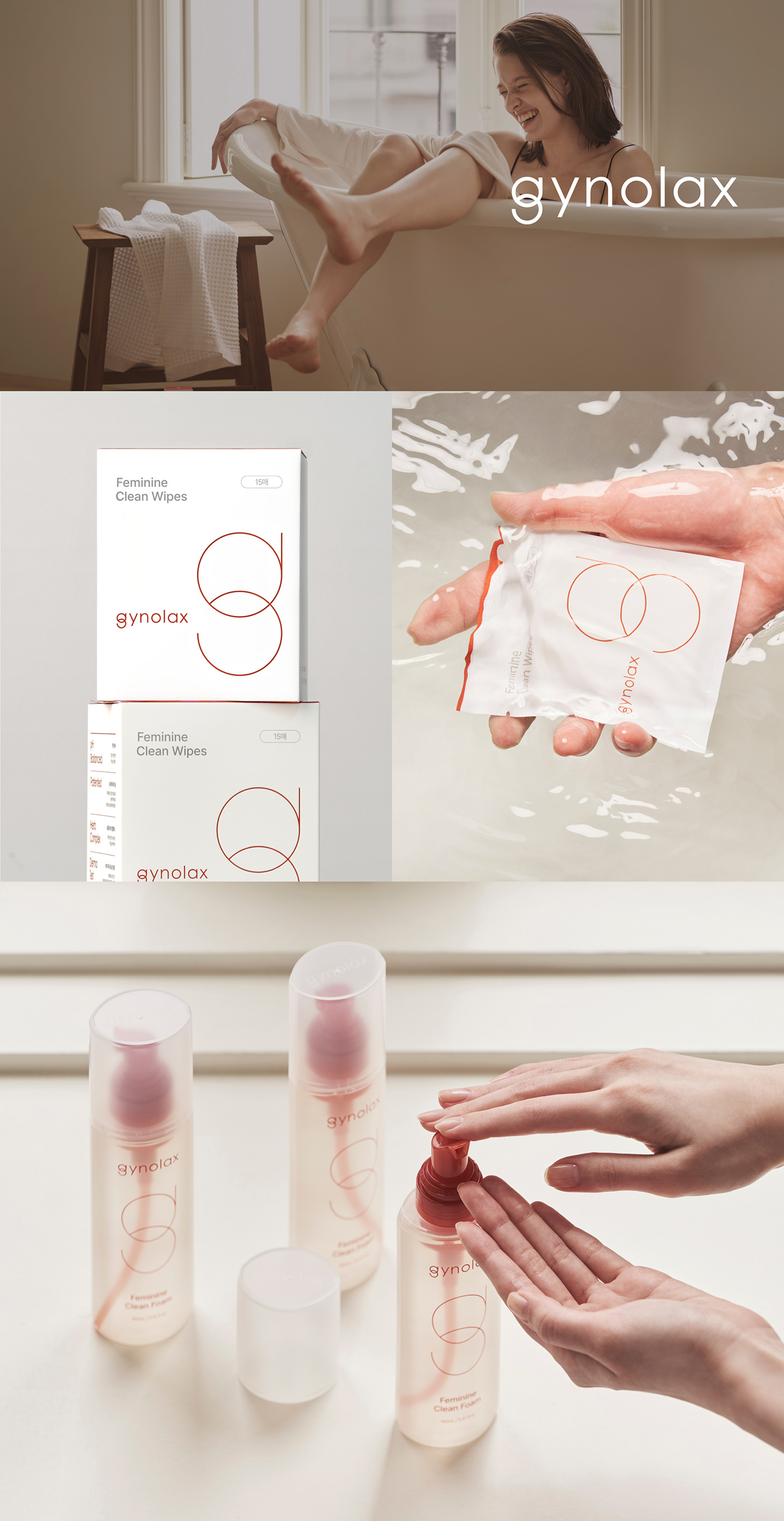
LOGO CONCEPT
여성의 질을 나타내는 ‘gyn’과 지노렉스의 g심볼을 결합하여 워드마크 타입의 BI를 디자인 하였습니다. 지노렉스의 심볼 grossover g는 엄마로서, 직장동료로서, 딸로서 여성이 가지고 있는 다양한 고민과 역할을 표현하기 위해 교집합을 모티브로 하였습니다. 또한 이 심볼은 petri dish를 연상케 하는데 이는 Y존 전문 브랜드의 전문성을 드러냅니다.
The watermark-type BI design combines “gyn” for vagina and “g” symbol of Gynolax. The brand’s symbol of grossover g is inspired by intersection to express various concerns and roles as mother, co-worker, and daughter. The symbol also reminds of petri dish to reveal the brand’s specialty as a Y-zone brand.


BRAND COLORS
지노렉스 브랜드가 추구하는 공감과 휴식, 릴렉싱에서 떠오로는 심상을 구체적 이미지화 하고 그 안에서 지노렉스만의 컬러를 추출합니다. 이는 empathy brown이라는 지노렉스만의 컬러가 됩니다. 지노렉스는 이 컬러를 통해 ‘여성들의 고민에 대해 이해할 수 있는 브랜드’ 라는 컨셉을 소비자들에게 전달합니다.
Gynolax's brand essence of empathy and relaxation is visualized through concrete imagery that evokes the feeling of serenity and relaxation. From within this imagery, we extract Gynolax's unique colors. this becomes the brand’s original color of empathy brown. Gynolax uses this color to deliver its concept of a “brand that understands concerns of women.”
TYPOGRAPHY
지노렉스의 다양한 요소에 활용되는 지정서체는 로고와 심볼에서 느낄 수 있는 교집합의 조형을 자연스럽게 이어받을 수 있는 영문서체 ‘Century Gothic’ 을 사용했으며, 국문서체 ‘Pretendard’ 를 사용하여 깨끗하고 신뢰감을 줄 수 있도록 하였습니다. 상황에 따라 서체별 Family font 내에서 선택하여 사용할 수 있 있습니다.
Century Gothic' in English text is used as the designated typeface to seamlessly continue the intersection of forms that can be felt in the logo and symbol elements of Gynolax. For Korean text, 'Pretendard' is used to provide a clean and trustworthy appearance. Depending on the context, different styles within the font families may be selected for use.


APPLICATIONS


Gynolax Branding and Packaging design 2023
Dong-A pharm
Designer : Hyejin Kang
ohSeven Design
Director : Sukyoo Bae
Project Manager : Song-yi Gu
Designer : Kwangpyo Hong, Yunje Park, Song-yi Gu, Boyeon Yeon, Chaelin Kim, Yujin Oh, Jahee Lee
Motion Design : Chaeyeon Kim
Designer : Kwangpyo Hong, Yunje Park, Song-yi Gu, Boyeon Yeon, Chaelin Kim, Yujin Oh, Jahee Lee
Motion Design : Chaeyeon Kim
동아제약 Dong-A pharm
디자이너 : 강혜진
디자이너 : 강혜진
오세븐 디자인
디렉터 : 배수규
프로젝트매니저 : 구송이
디자이너 : 홍광표, 박윤제, 구송이, 연보연, 김채린, 오유진, 이자희
영상디자인 : 김채연
디자이너 : 홍광표, 박윤제, 구송이, 연보연, 김채린, 오유진, 이자희
영상디자인 : 김채연
일부 사진은 동아제약으로부터 제공받았습니다.
Photograph provided by DongA Pharm.


