


A new brand identity for Nationale Opera & Ballet
Creating a strong recognizable brand
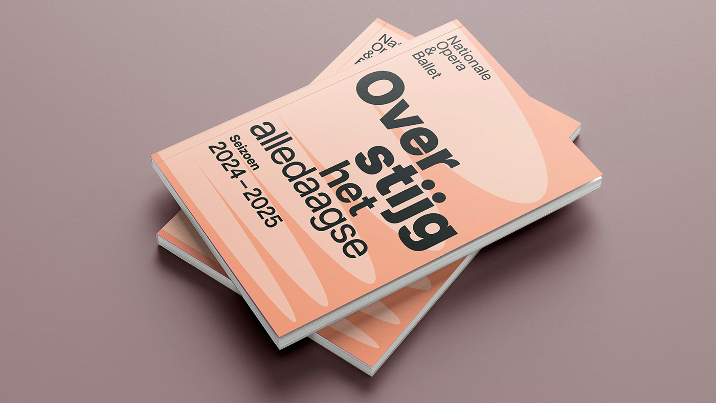
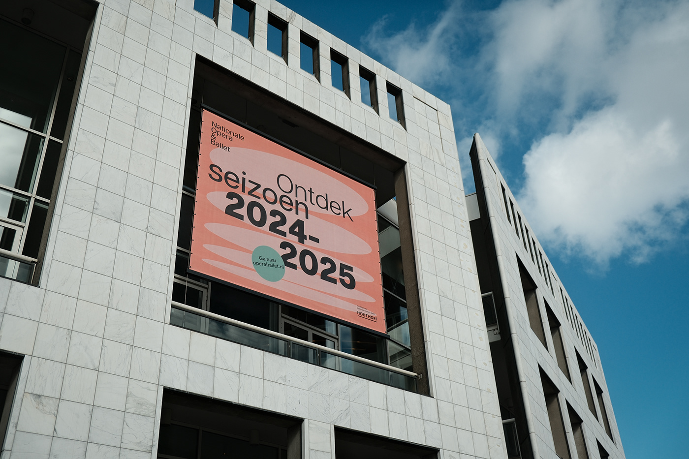
Nationale Opera & Ballet proudly launches its new brand identity with the new season brochure 2024 – 2025.
It is a magnificent challenge to be allowed to develop a new brand identity for Nationale Opera & Ballet – a brand where aesthetics and expression are central to everything they do.
But how do you convey that and capture it in an identity?
The reason for the rebranding was to make the mission of the Dutch Nationale Opera & Ballet ‘to enrich the lives of as many people as possible with opera and ballet’ tangible for current audiences and new target groups. The new identity had to position Nationale Opera & Ballet as one brand and provide the necessary tools to put a digital-first approach. The goal was to create an open and inviting ambiance that provided space for the various disciplines of the institution.
The brand had become fragmented by a plethora of logos, labels, and initiatives aimed at different audiences. Moreover, although the Dutch Nationale Opera and the Dutch Nationale Ballet were visually united under one umbrella, they still operated as separate entities. In effect, therefore, we were dealing with three separate brands. The Nationale Opera & Ballet brand, The Nationale Opera and The Nationale Ballet. We had to bring unity and structure to this.
We first went into a thorough exploration of the issue, going deep into the content to get to the essence. NO&B has a great mission statement, but what does Nationale Opera & Ballet mean to the recipient? NO&B was missing a guiding brand promise. Therefore, we did internal brand promise workshops with all stakeholders.
From these workshops, the brand promise “United in something greater than yourself” emerged.
Opera and ballet are one of our oldest forms of art. It is the live expression of human emotions and experiences. It speaks the language of the soul. A language in which we feel connected and become part of something greater than ourselves. The synchronicity between creators, artists, orchestra, and audience is exceptional. It is a deeper experience that transcends the everyday.
From this brand promise, we created a monolithic brand and developed a brand identity where the labels and all the Institute’s initiatives receive attention at the content level.


From three brands to one brand with one identity.
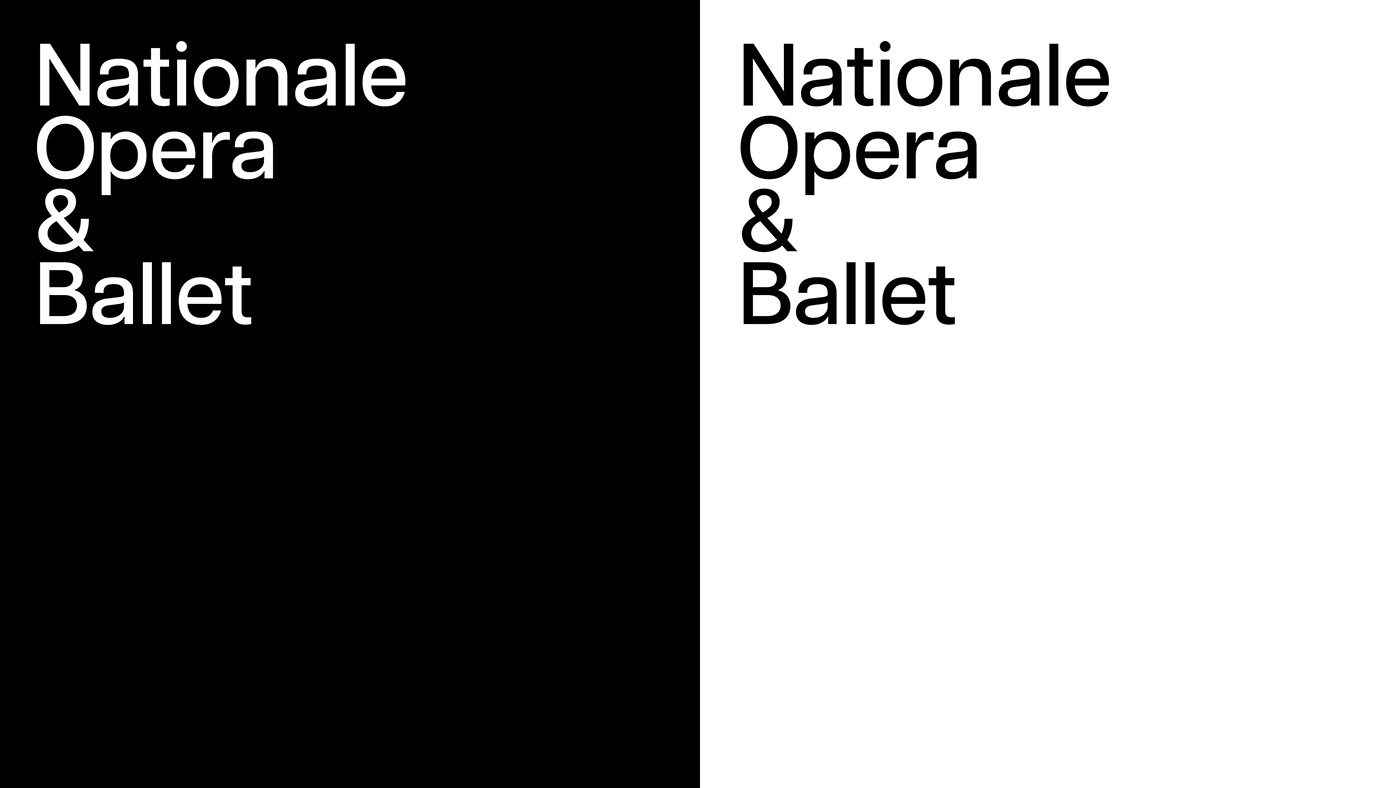
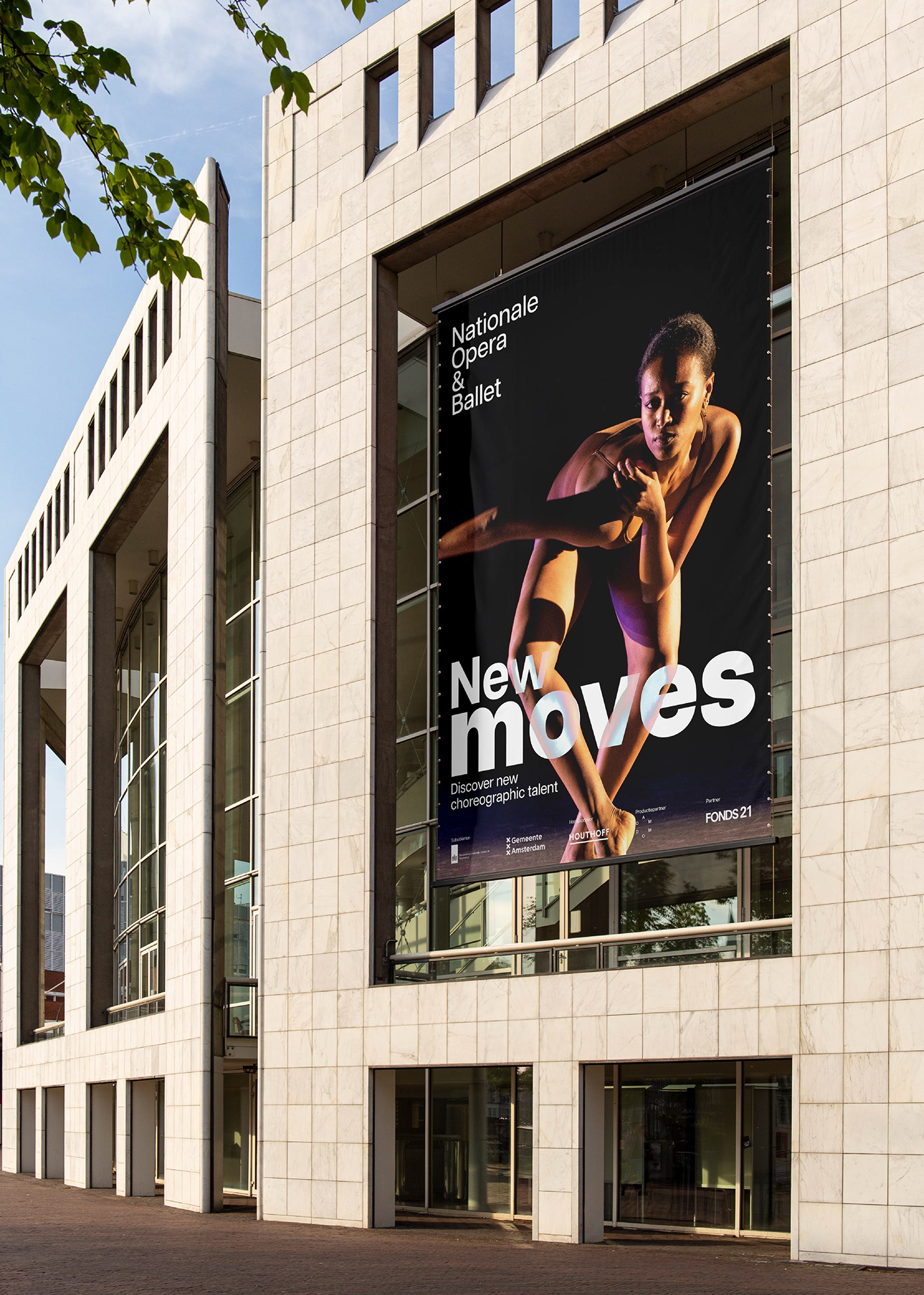
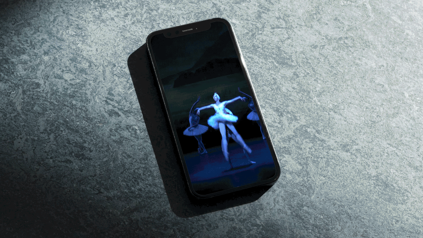
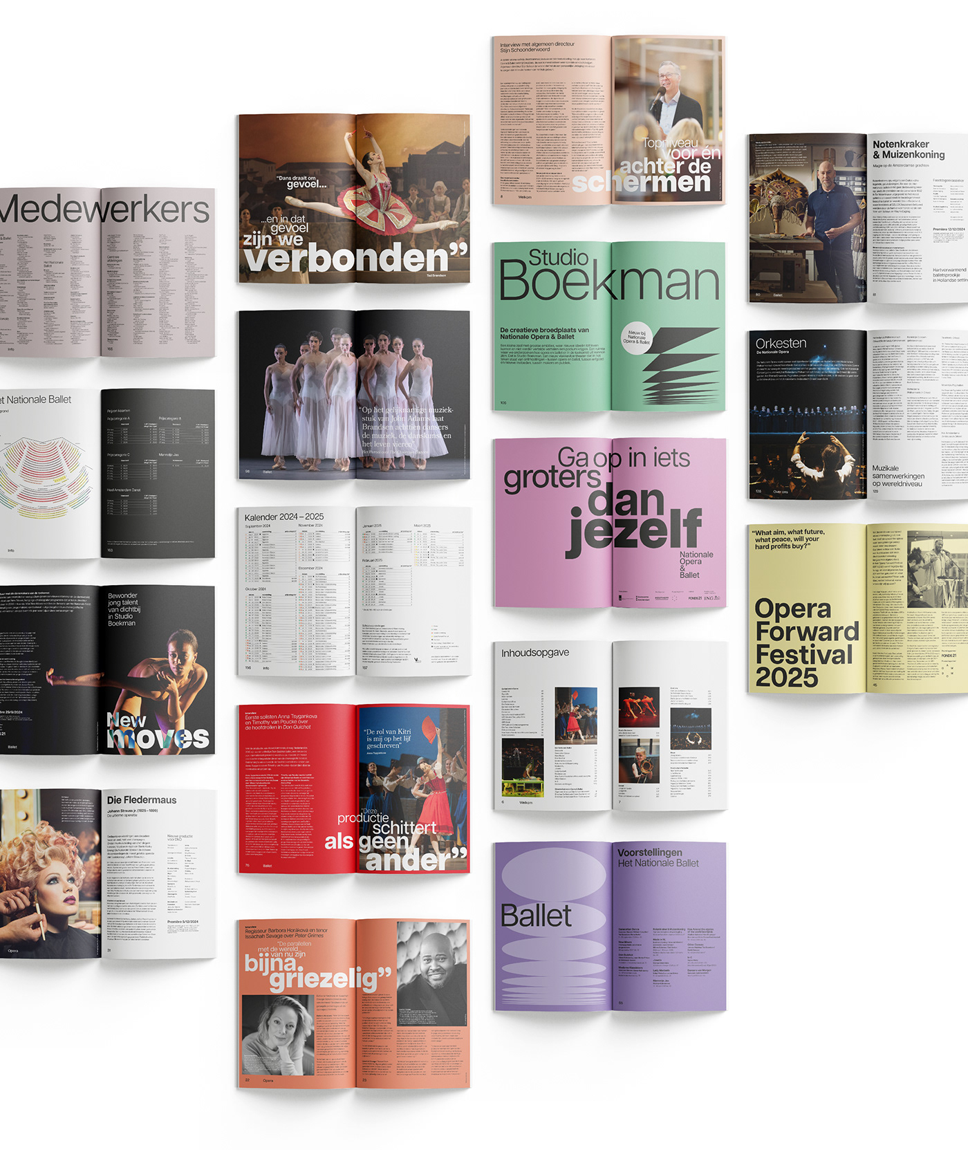
We created one strong brand with a very distinct identity. The design starts from the brand promise and image – an upward and transcendent movement – with the art of omission at its core. This creates a choreography of typography, imagery, and layout. A beautiful composition that enchants the recipient.
The visual identity is choreography with typography. With the perfect composition and layout.
Choreography with typography, giving text imagination. Formatting and layout create a composition that not only conveys content but also manages to touch emotion. The placement, size, and thickness of the typography visualize the emotions. With or without supporting imagery.
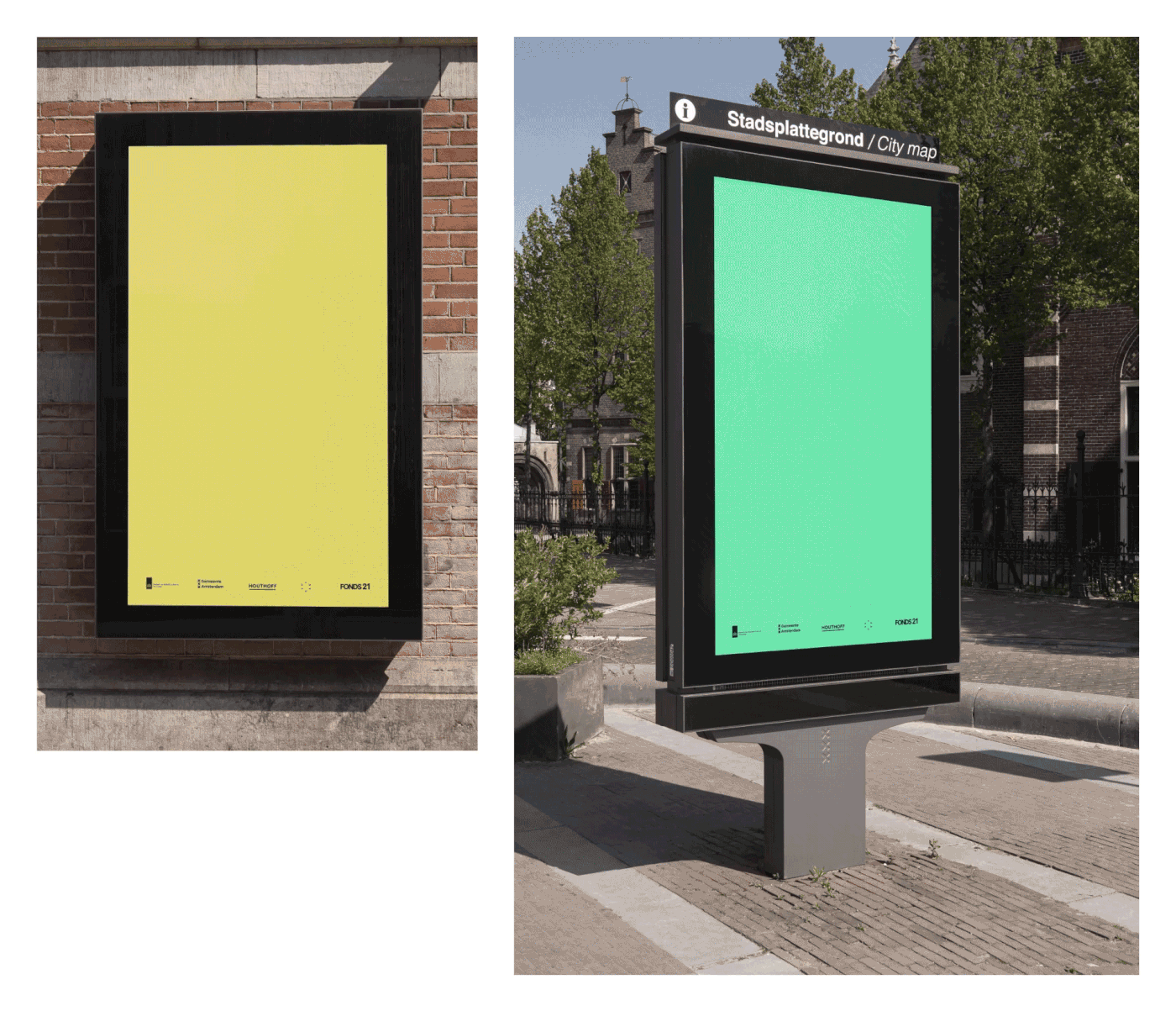
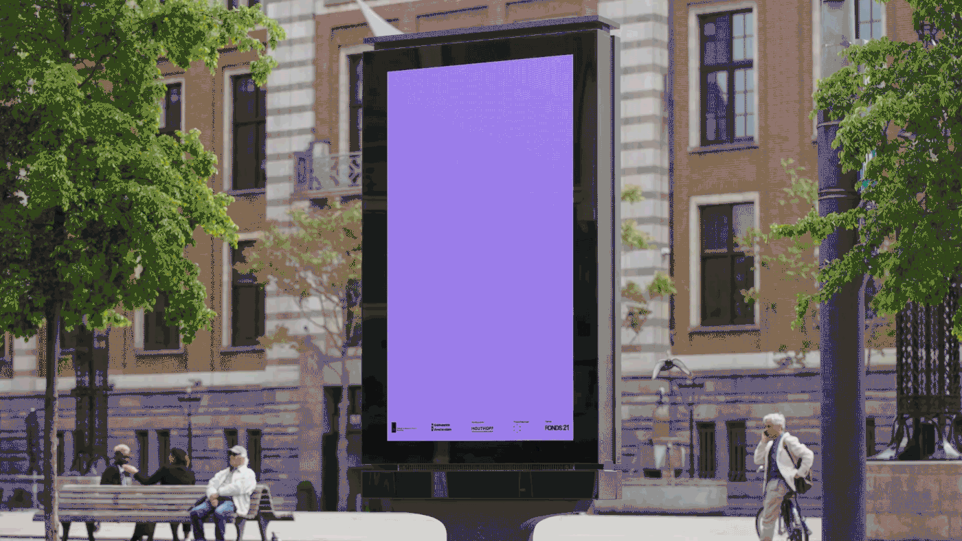
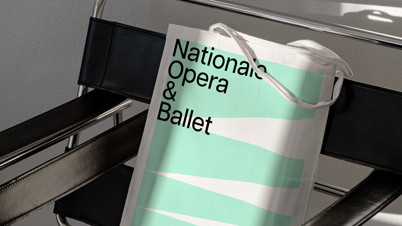
Motion Design emphasizes the upward movement, the feeling of being part of something bigger than yourself. The movements of the logo, text, and graphics offer the brand freedom of movement. A flexible grid provides the stage for perfect execution and ensures consistency.
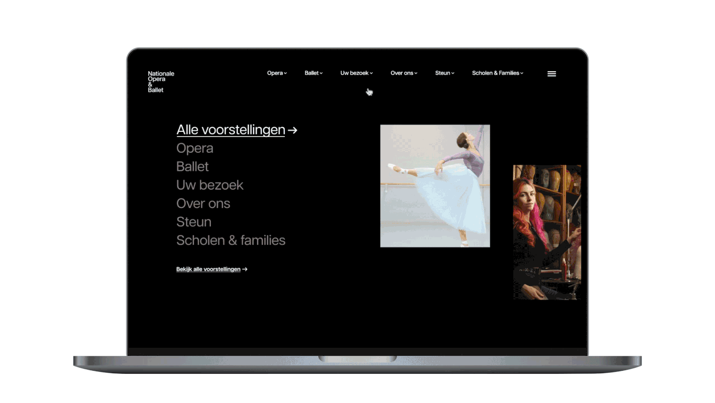
The logo is reduced to its essence. Choosing only the wordmark makes the logo open and accessible. Because the logo is right aligned, from top to bottom, you always read NO&B. This draws attention to the two art forms: opera and ballet. Perfection lies in simplicity. Together with the upward motion design, this reinforces the brand promise.
Digital-first
Communication and ticket sales at Nationale Opera & Ballet are mostly digital. This was incorporated into the design from the beginning, and the UX design was also reviewed and improved.


Facts
Client: Nationale Opera & Ballet (Dutch National Opera & Ballet)
Project: Strategy, Branding, Brand Identity, Motion design, Web design
Agency: TD (Total Design)
Agency: TD (Total Design)
Credits
Head of Branding: Henriette Verkerk
Strategy: Trudelies van der Poel
Strategy: Trudelies van der Poel
Executive Creative Director: Edwin van Praet, Martijn van den Brakel
Art Director: Adam Lane
Head of Web: Erwin van Ekeren
Designers: Adam Lane, Alicia Castro, Edwin van Praet,
Martyna Piskorz, Rogier Bisschop, Rosan Gleijsteen, Timon Weerstand
Designers: Adam Lane, Alicia Castro, Edwin van Praet,
Martyna Piskorz, Rogier Bisschop, Rosan Gleijsteen, Timon Weerstand
Motion Designer: Kassahun Villa, Dennis Roverts
Video Editor: Joost Olsthoorn
Client management: Sjanet Benschop, Marloes Pijning
Implementation Designers: Arjen Firet, Floris Holander
Thanks to
Stijn Schoonderwoerd, Sophie de Lint, Ted Brandsen,
Kate Harriman, Marijn Maas, Lenny Gerdes, Emma van den Berg
Kate Harriman, Marijn Maas, Lenny Gerdes, Emma van den Berg
Thanks for watching


