/identity /packaging
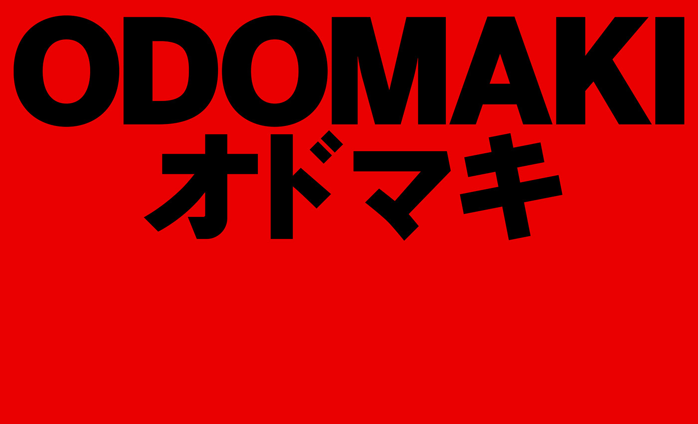
ODOMAKI
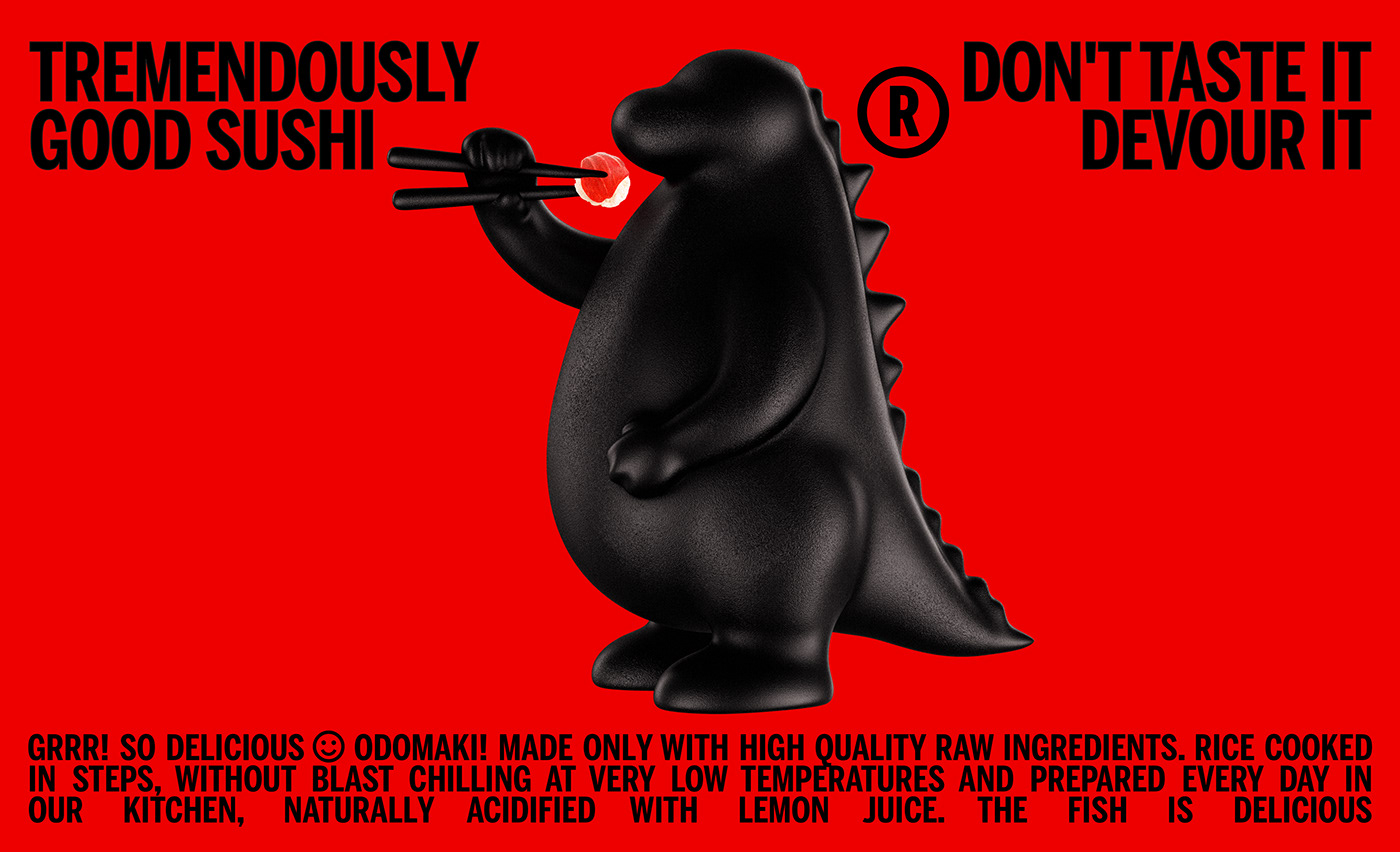
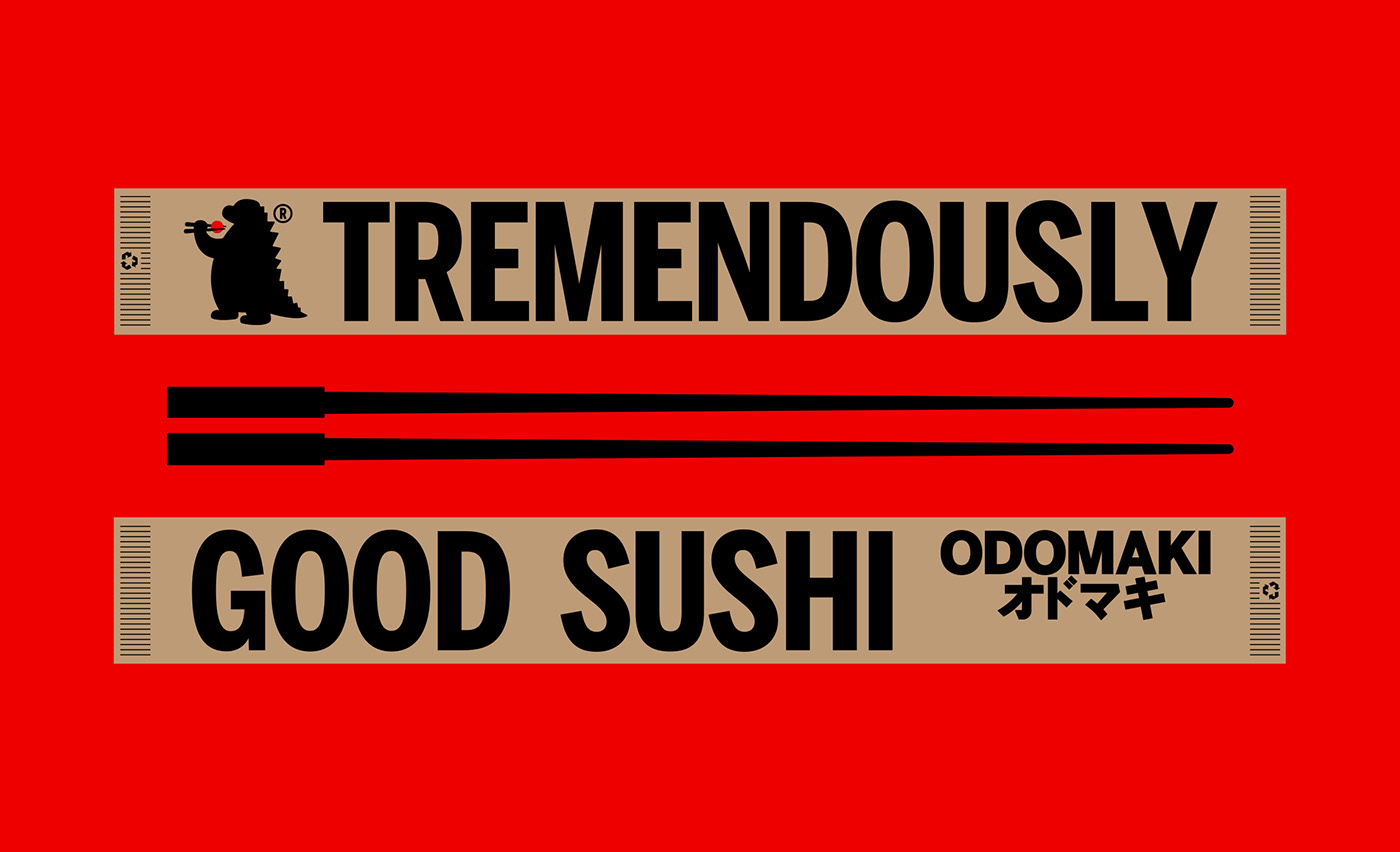
Tremendously good sushi. Don’t taste it. Devour it!
CLIENT
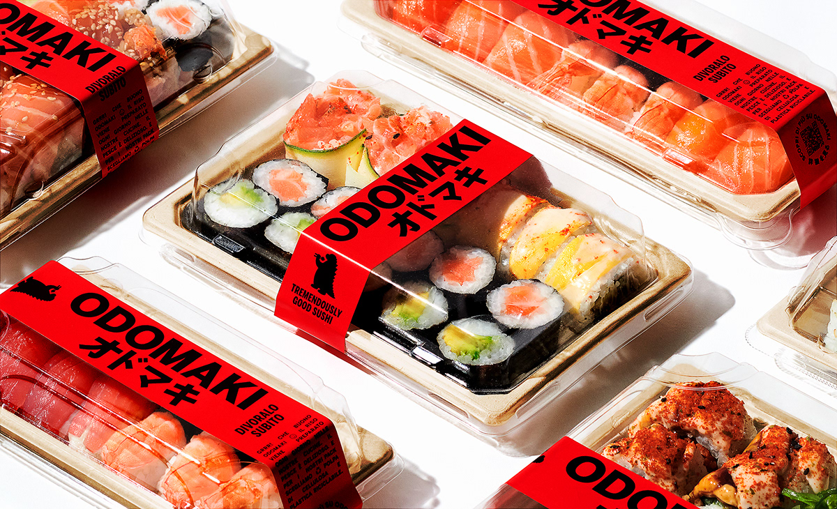
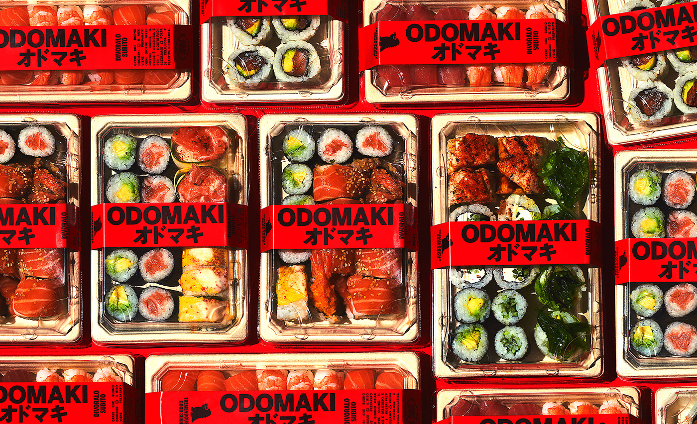
Odomaki is an Italian sushi brand made with high-quality raw ingredients and recyclable packaging sold and distributed in the Italmark supermarkets.
ASSIGNMENT
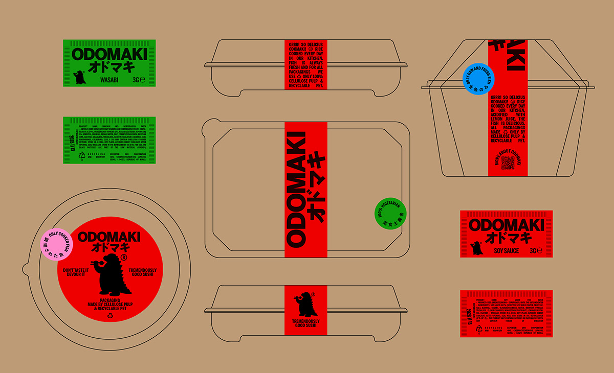
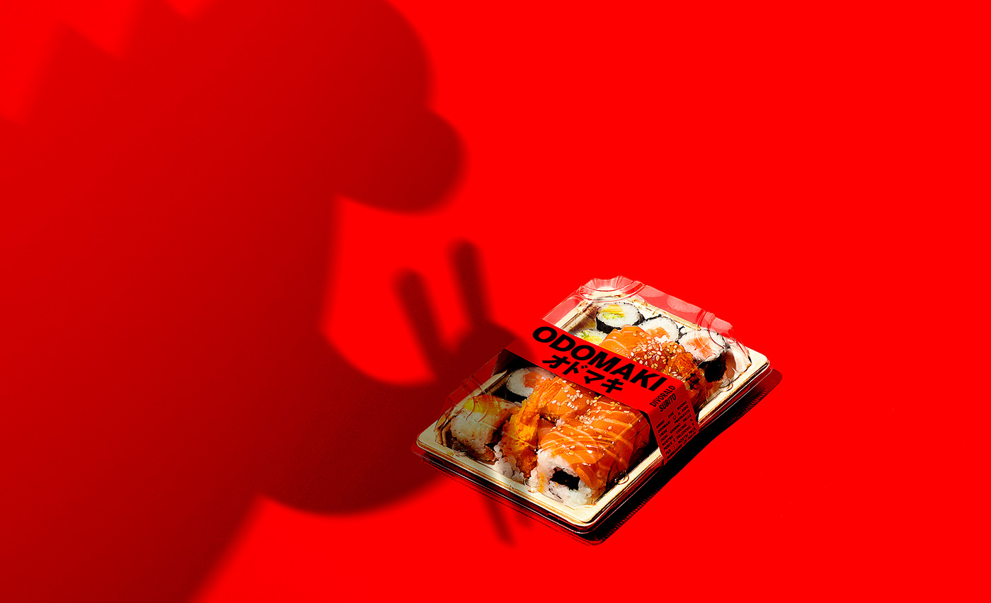
We were tasked with developing an identity with a strong character and high recognizability within retail locations. The main packaging formats are the typical sushi trays, in various sizes, as well as bowls and containers for tartare.
SOLUTION & PROCESS
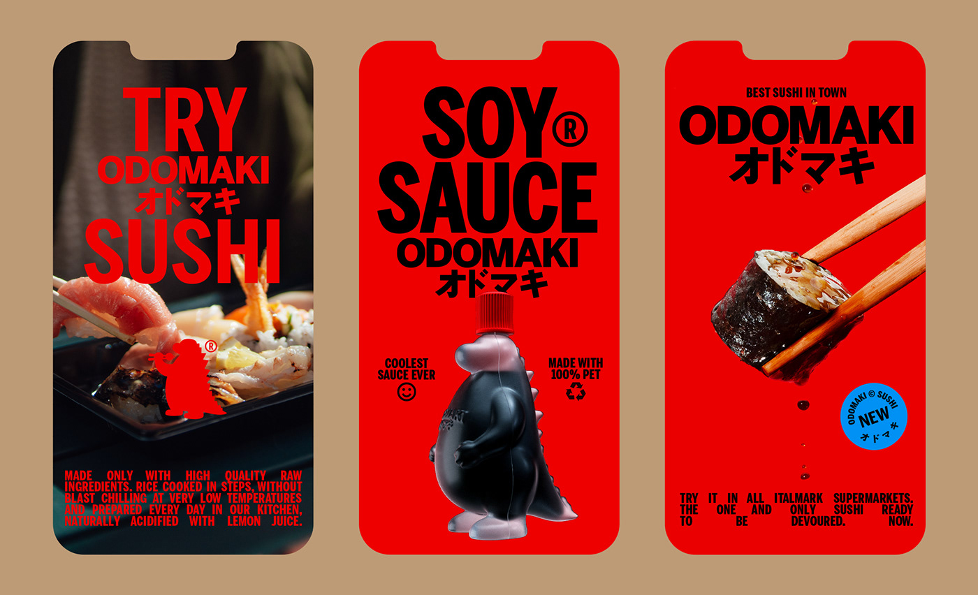
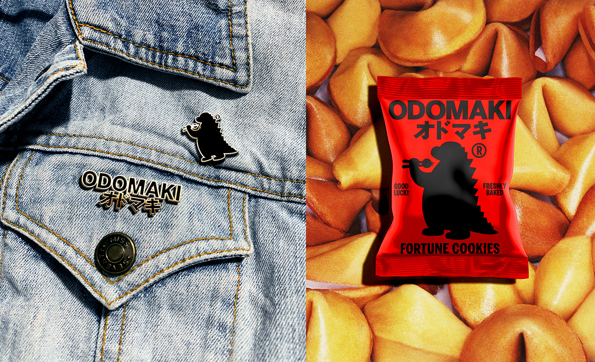
We developed a logo that celebrates the meeting of two cultures. European and Asian typography merge and give life to an international logo. The red of the identity is a tribute to Japan. "The land of the rising sun" is also honored by featuring the red sun among the chopsticks of our custom designed mascot; a monster ready to fight to devour the sushi (also the trays bands indeed evoke the oriental culture of martial arts). From shopper to chopsticks, from labels to sauce, the mascot thus becomes an iconic symbol.
Executive Creative Director: Davide Mosconi
Designer: Liviu Andronic
Copywriter: Andrea Azzolini
3D Artist: Alessandro Rovatti
Photography: Agata Eliseeva