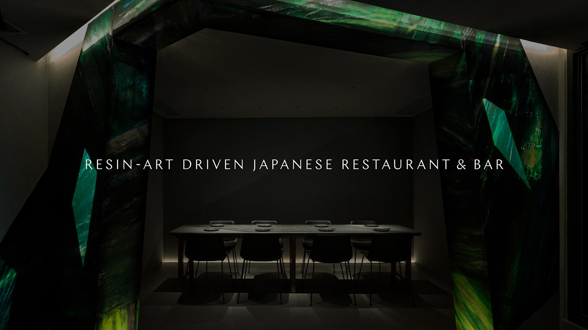
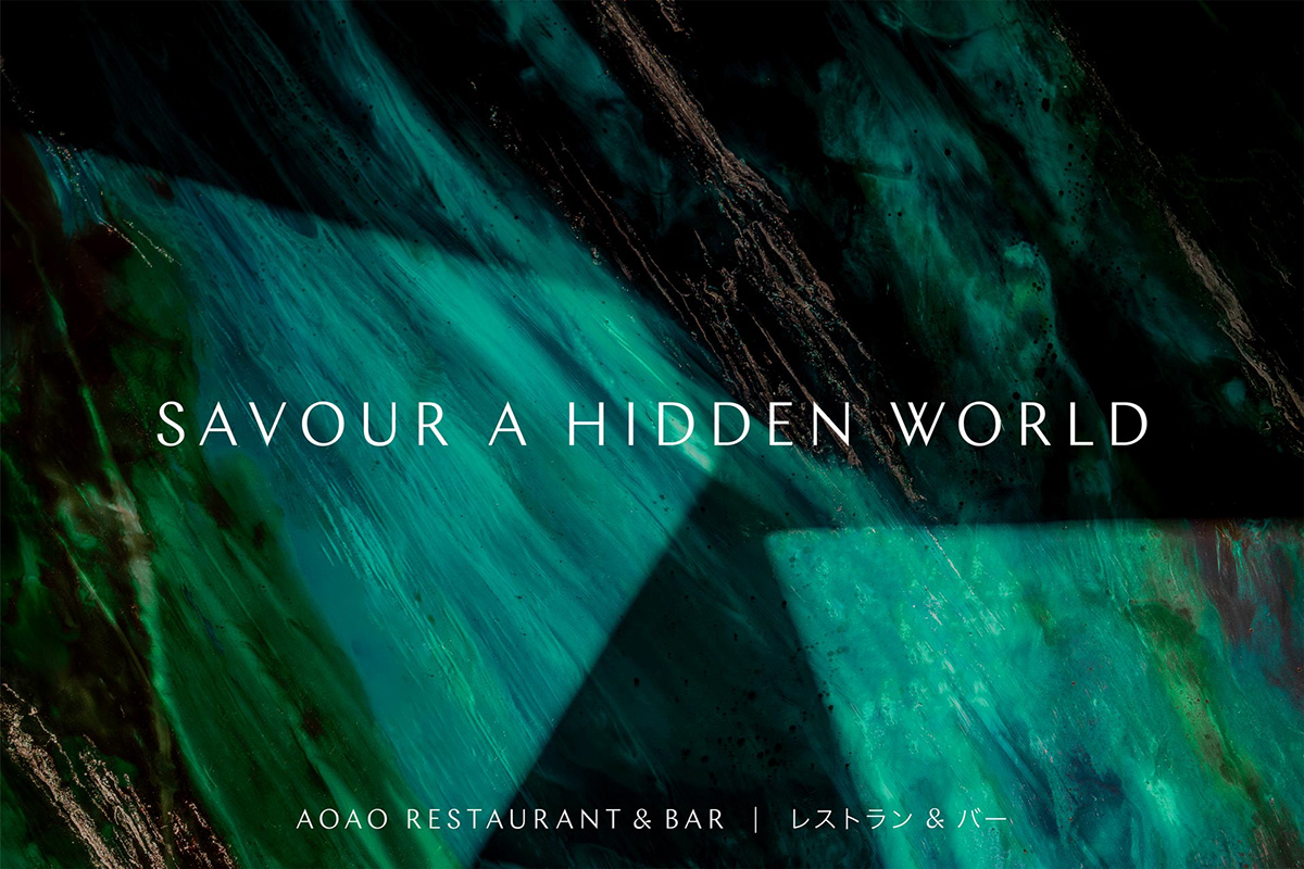
AOAO
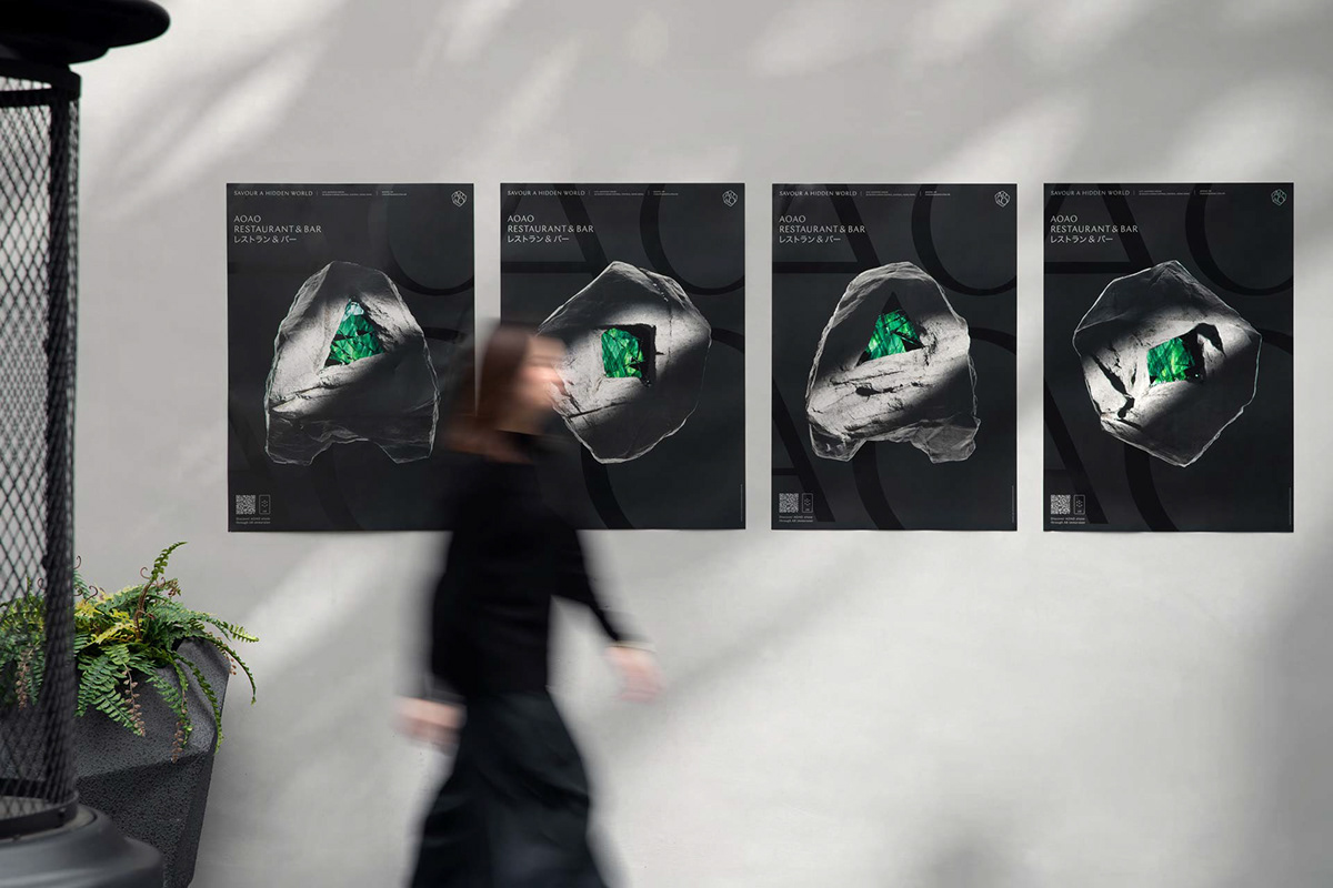
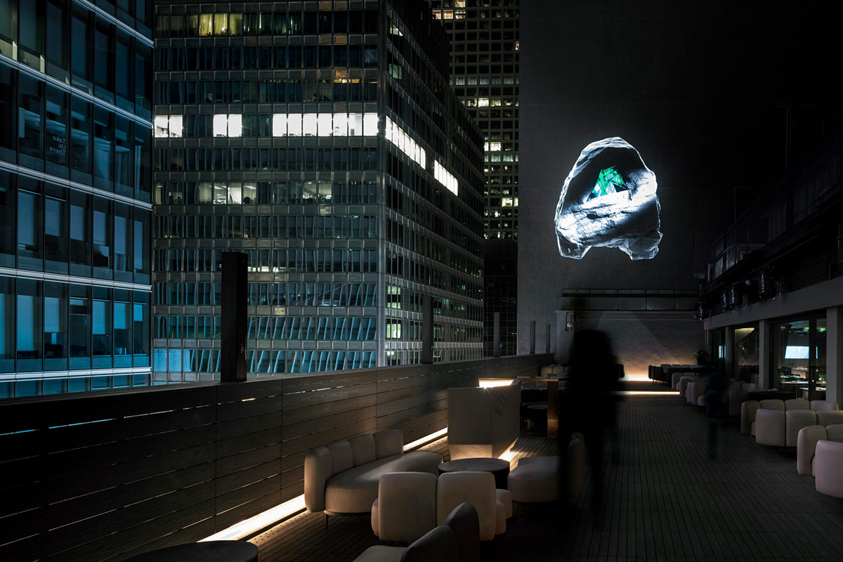
AOAO, a resin-art driven Japanese restaurant and bar, is located on a rooftop in the heart of Central Hong Kong’s concrete jungles. Toby Ng Design has named the restaurant AOAO, a term signifying lush green in Japanese. The brand’s overall strategy has been created, with its narrative built around the multiple shades of green in a raw natural gemstone.
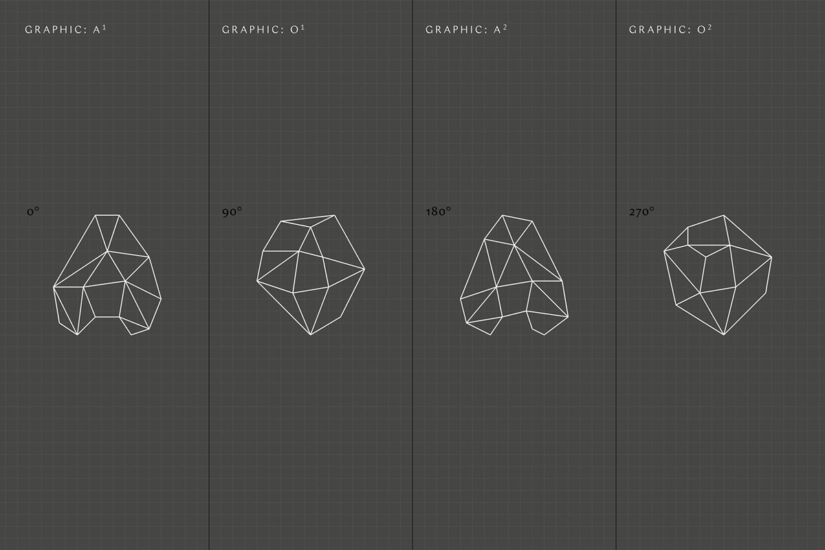
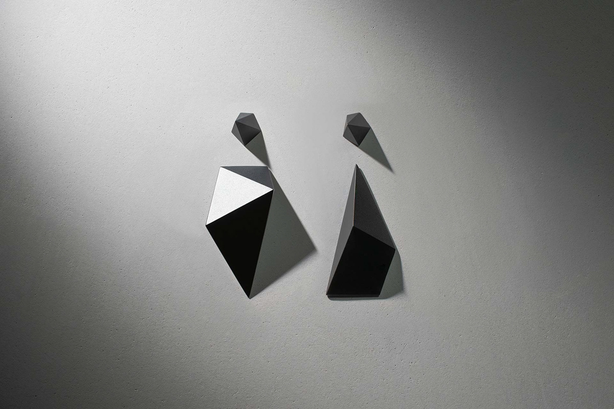
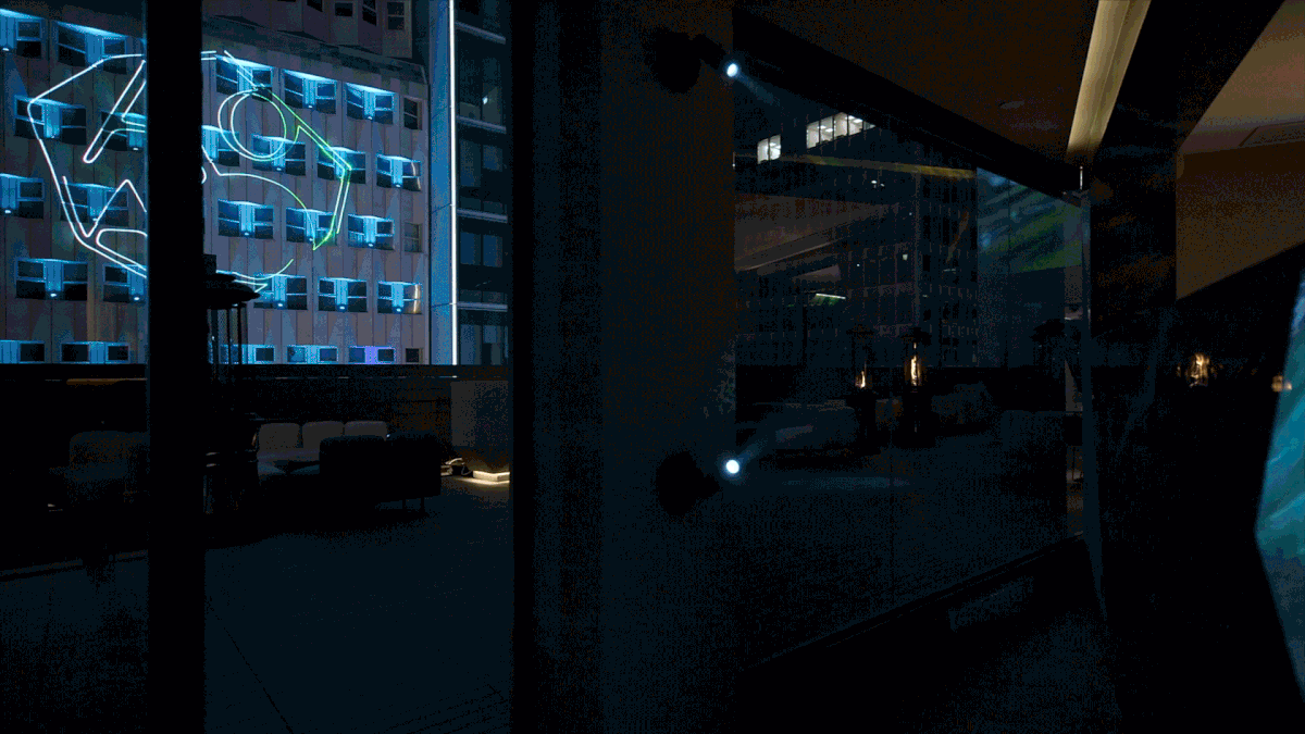
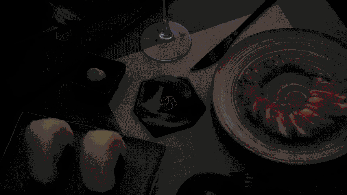
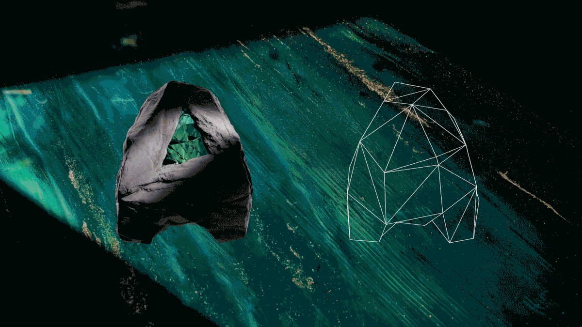
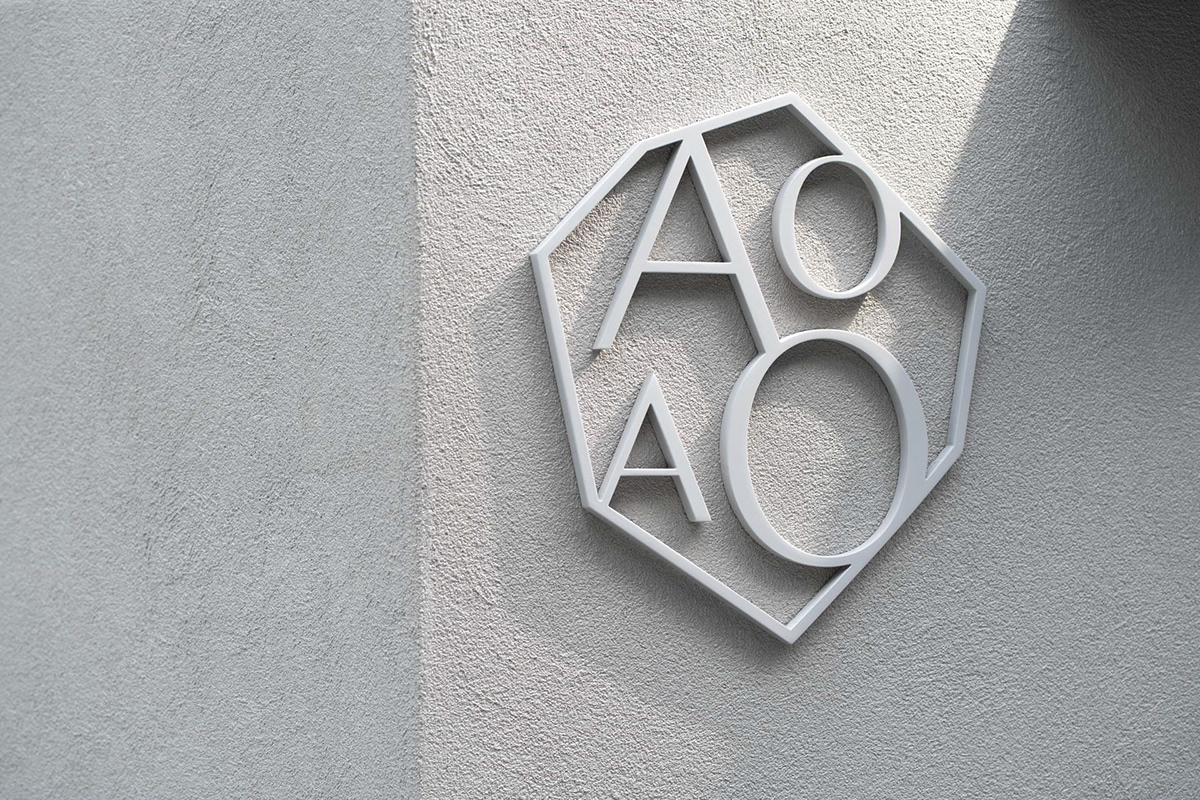
Given the restaurant’s unique artistic positioning and the extensive use of green resin artwork in its interior, Toby Ng Design has crafted the identity to reflect artistry and a touch of quirkiness. The identity is rooted in the typographically carved stone as the signature brand symbol, with each of its faces crafted in the characters ‘AOAO’ and featured an opened window to reveal the hidden green world amongst the concrete jungles.
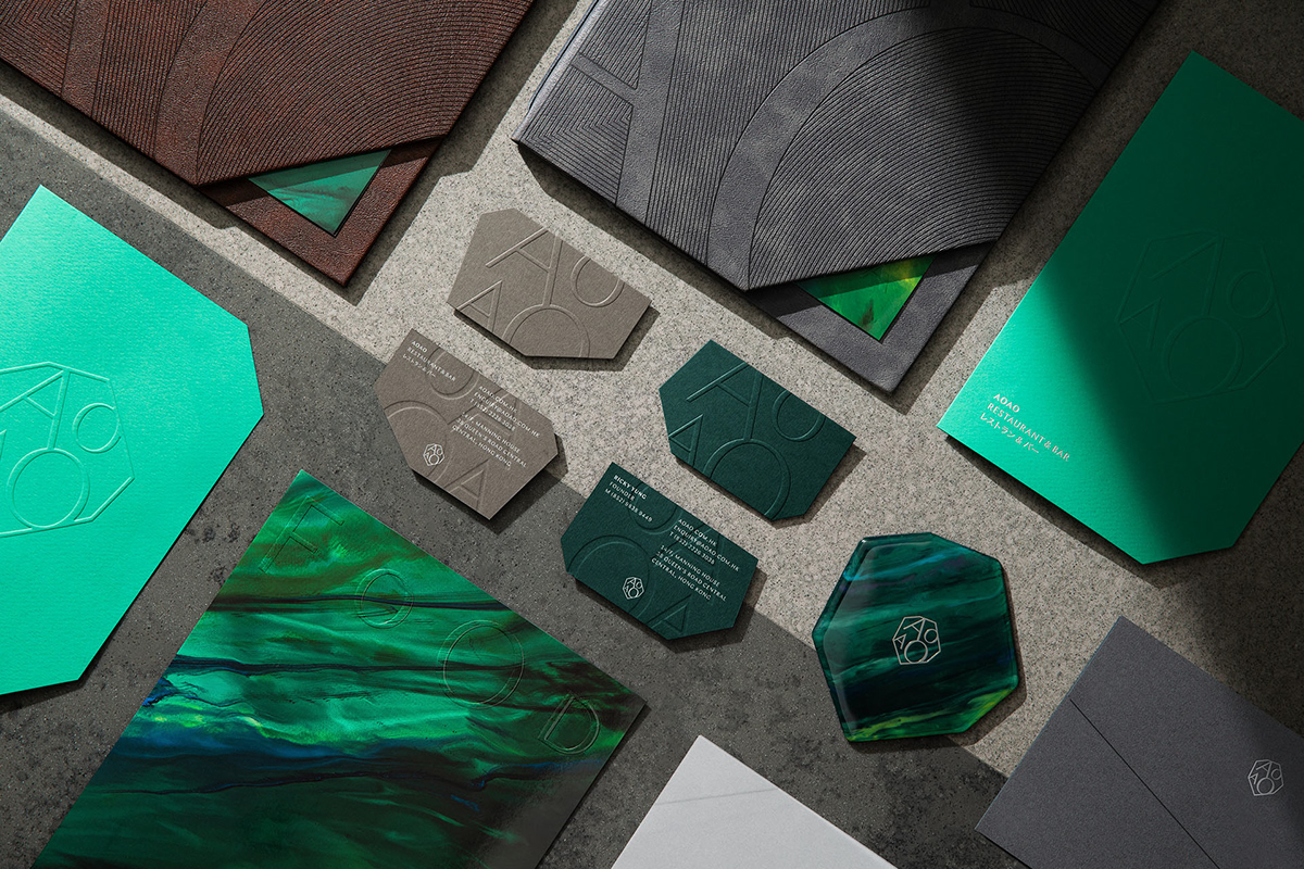
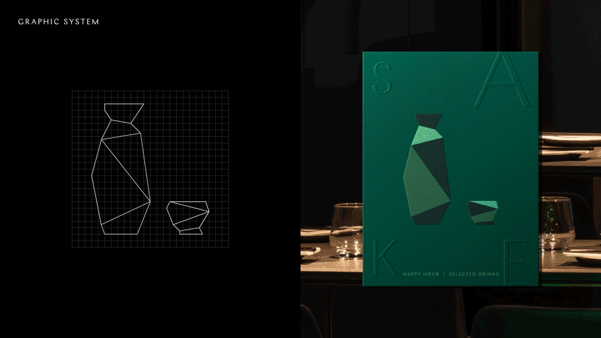
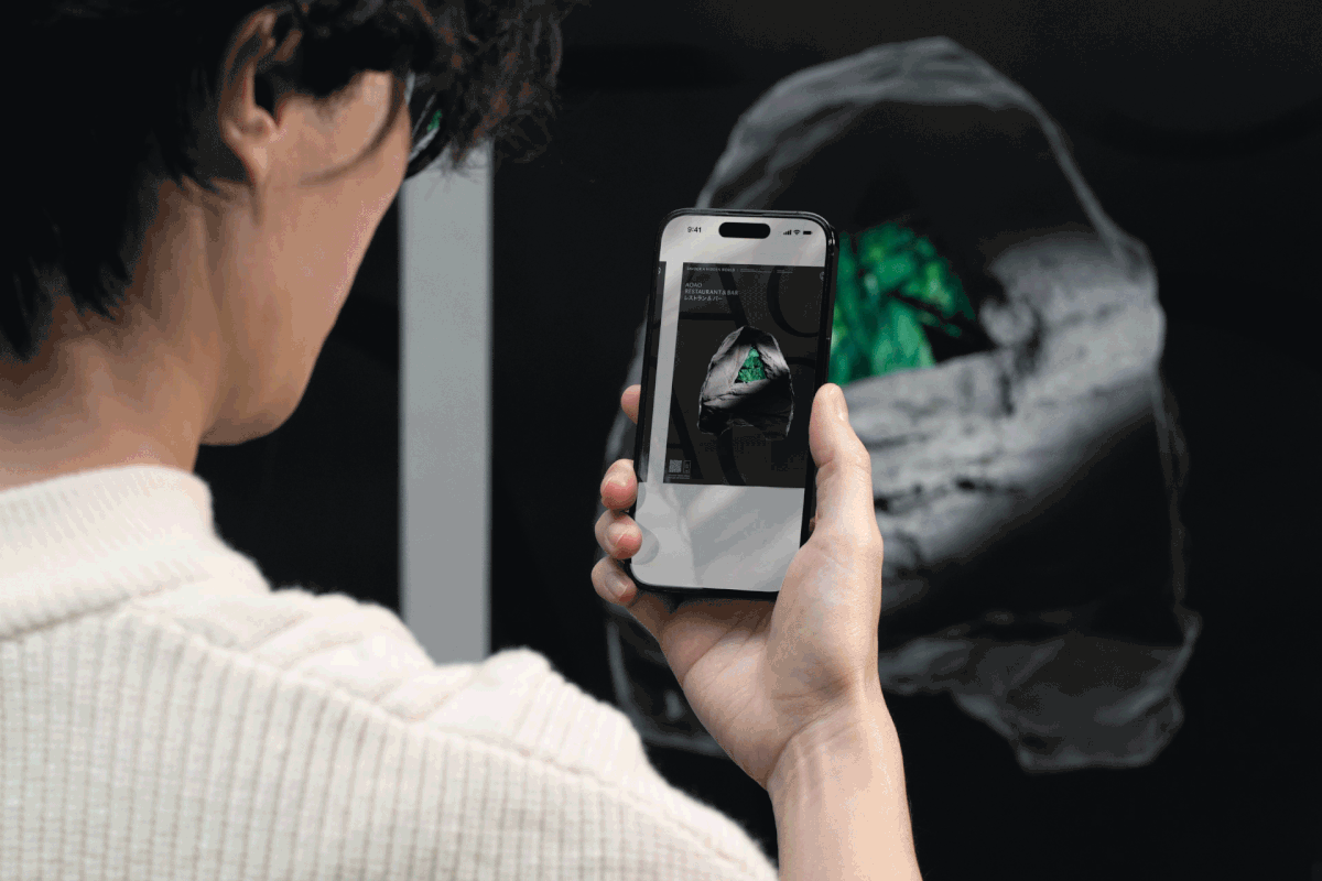
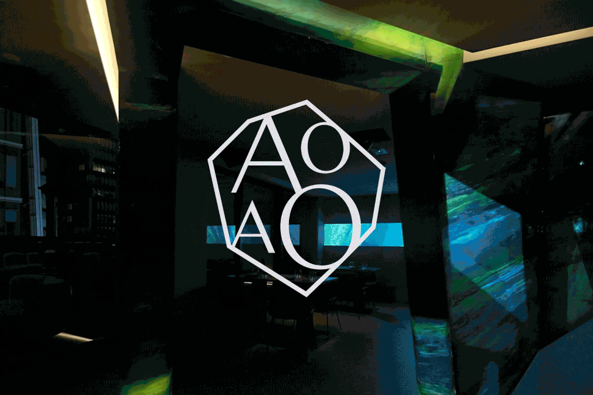
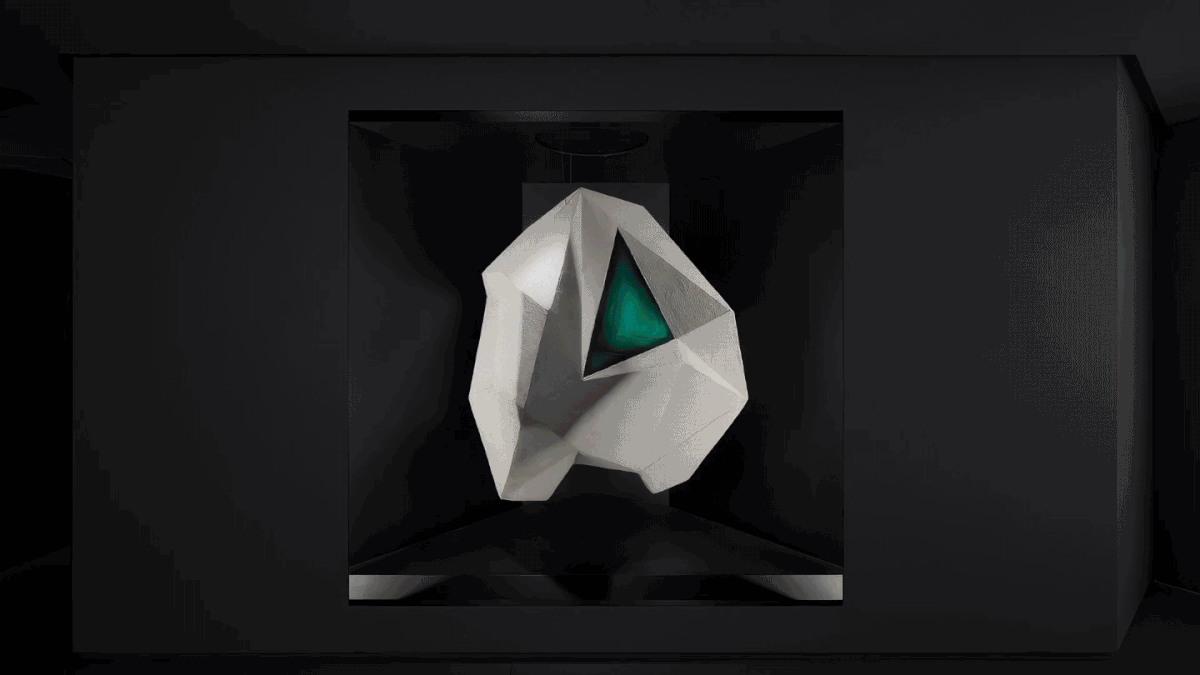
This 3D AOAO gemstone was crafted into a signature life-sized sculpture at the entrance and graphically transformed into a 2D wordmark as the brand logo, with a series of stone outlines and green resin patterns. This transformation results in a unique brand element and graphic device that is adaptable and widely applied across the brand identity. It provides a versatile toolkit for applications ranging from signages, restaurant collaterals to environmental graphics and digital materials, creating a consistent visual language that helps reinforce the brand.

A signature, human-sized AOAO brand stone graces the entrance. This rotating sculpture has ‘AOAO’ crafted on each face and features an open window, revealing a hidden green world amidst the concrete jungles.
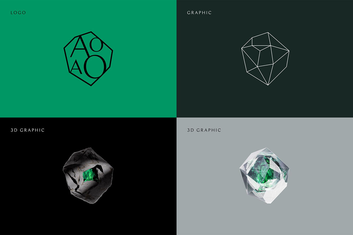

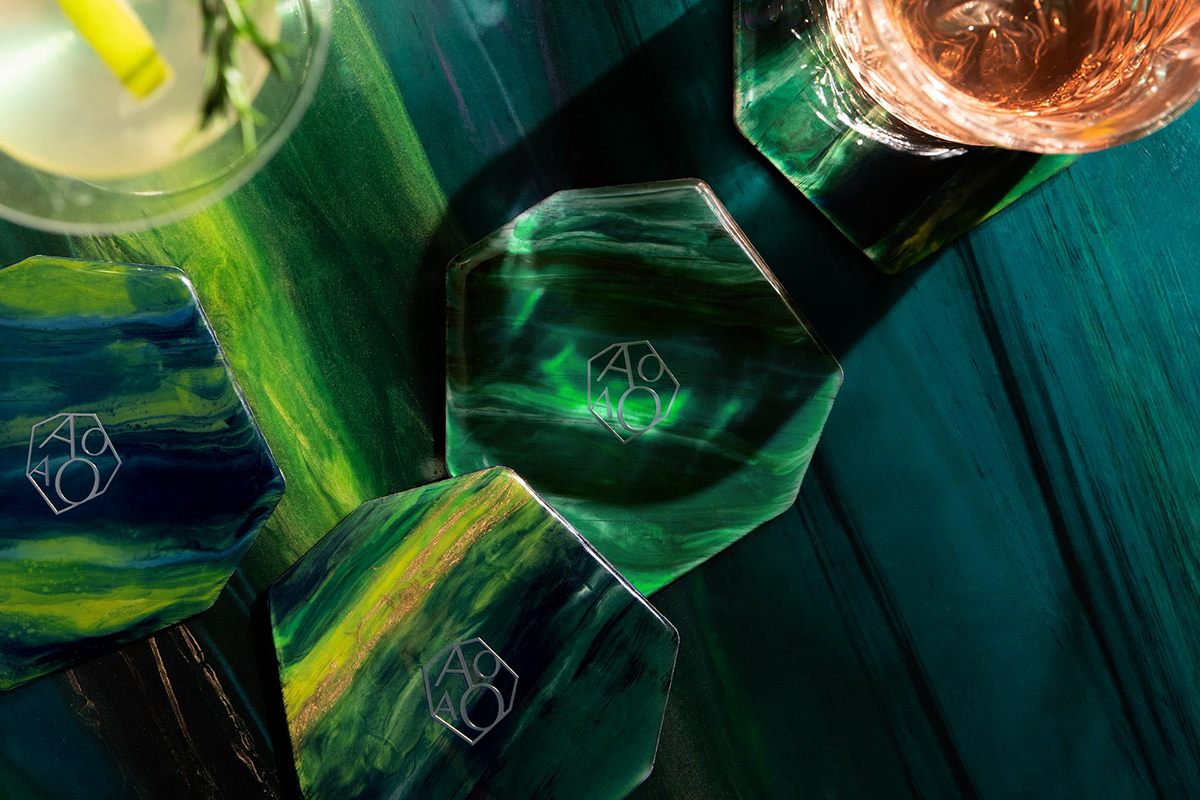
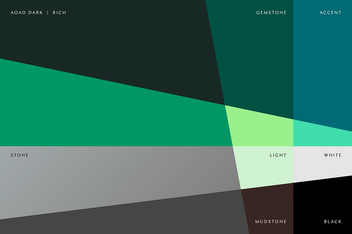
The brand’s colour palette is composed of multiple shades of green, which mirrors the extensive use of green resin artwork in the restaurant’s interior.