/branding & packaging
POGGIO DEL FARRO
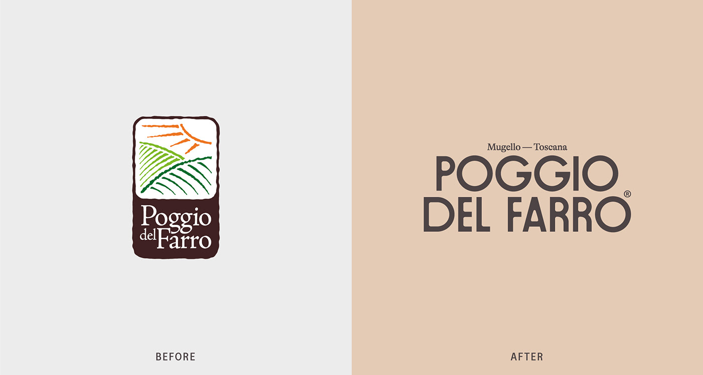
A rebrand that starts in the heart of Tuscany
CLIENT
Poggio del Farro is an Italian company dedicated to the cultivation and promotion of Farro (emmer), an ancient grain with deep roots in Italian culinary tradition. Nestled in the heart of Tuscany, this family-owned enterprise has garnered acclaim for its commitment to preserving traditional agricultural practices while also innovating in the realm of organic farming.
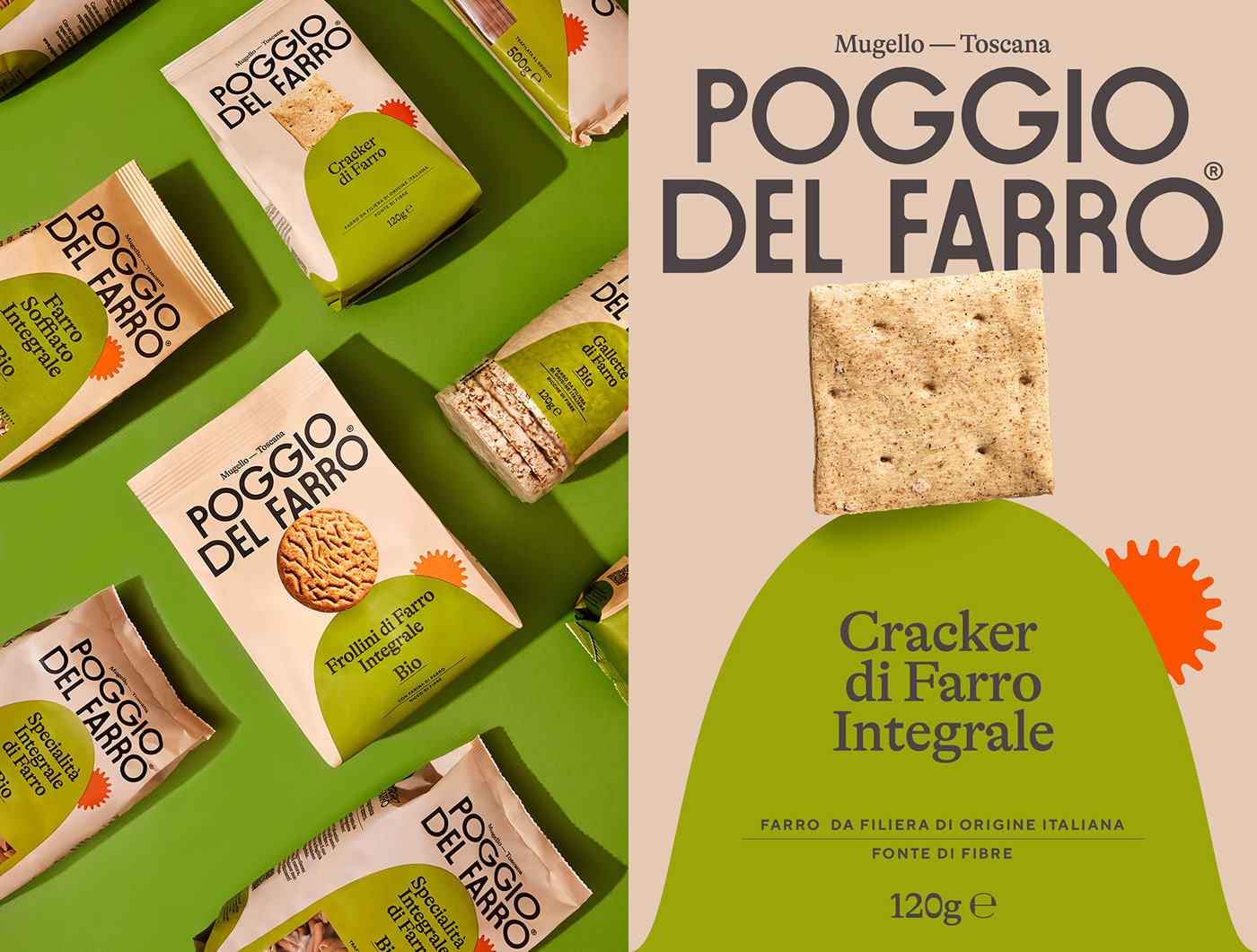
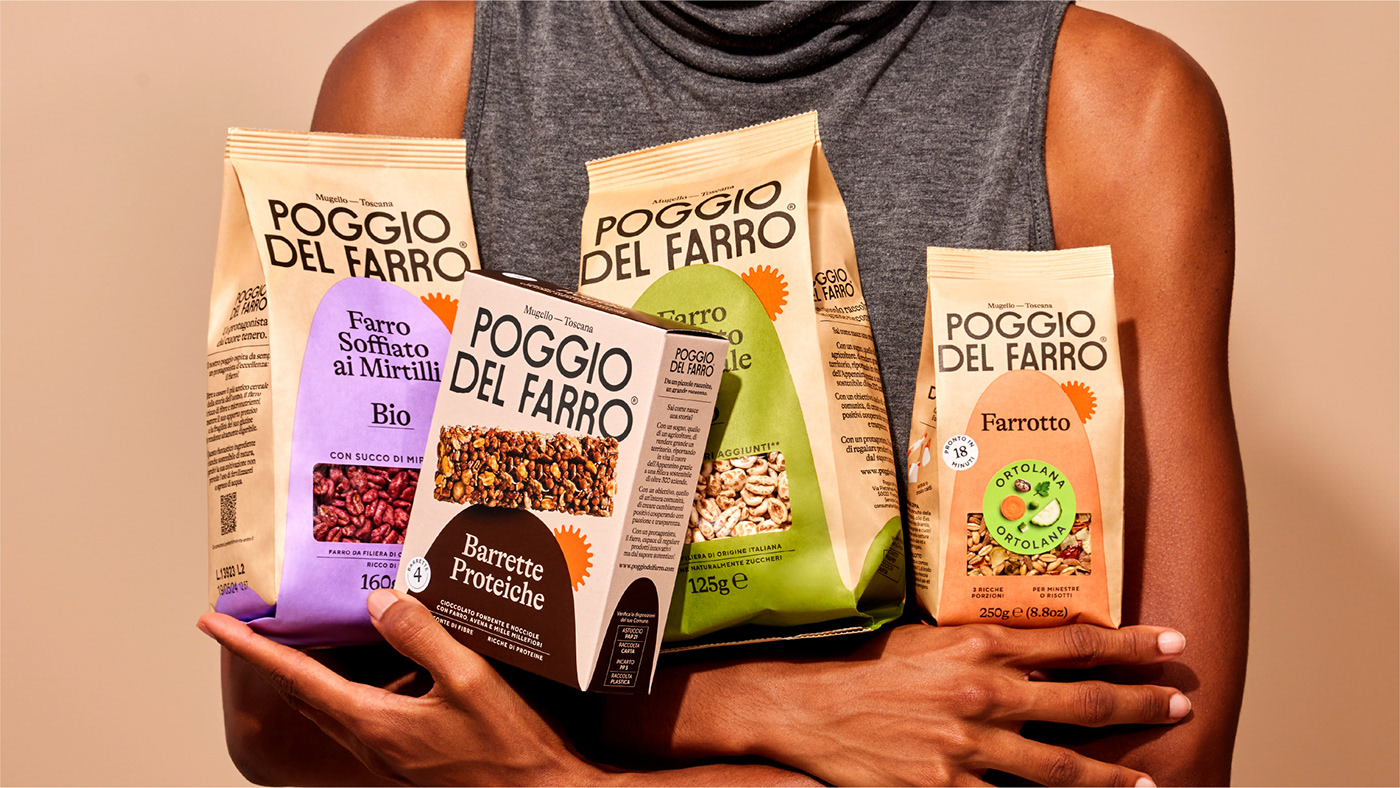
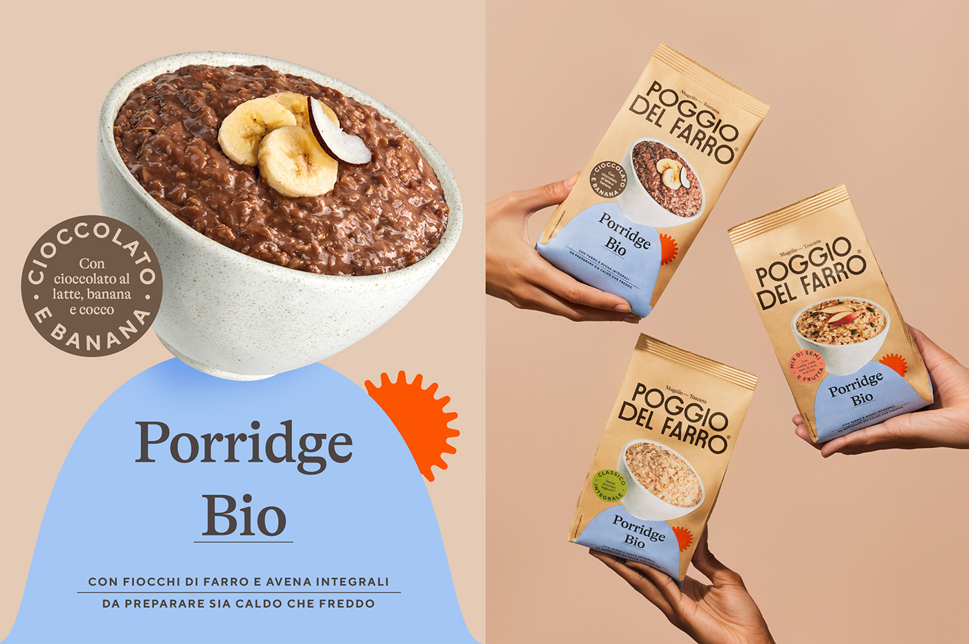
Poggio del Farro offers a diverse range of farro-based products, including whole grain farro, breakfast cereals, porridge, pasta, snacks and many more.
ASSIGNMENT
With a product portfolio comprising over 40 distinct offerings, the brand asked a strong new visual identity, which would be impactful and recognizable across its different product ranges.
SOLUTION & PROCESS
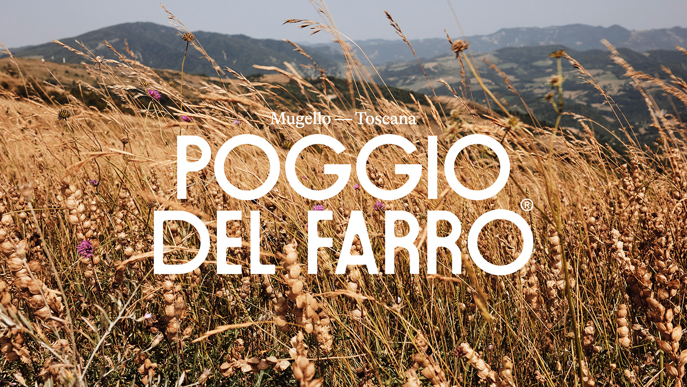
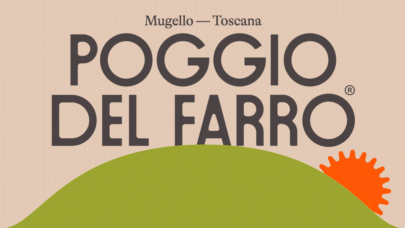
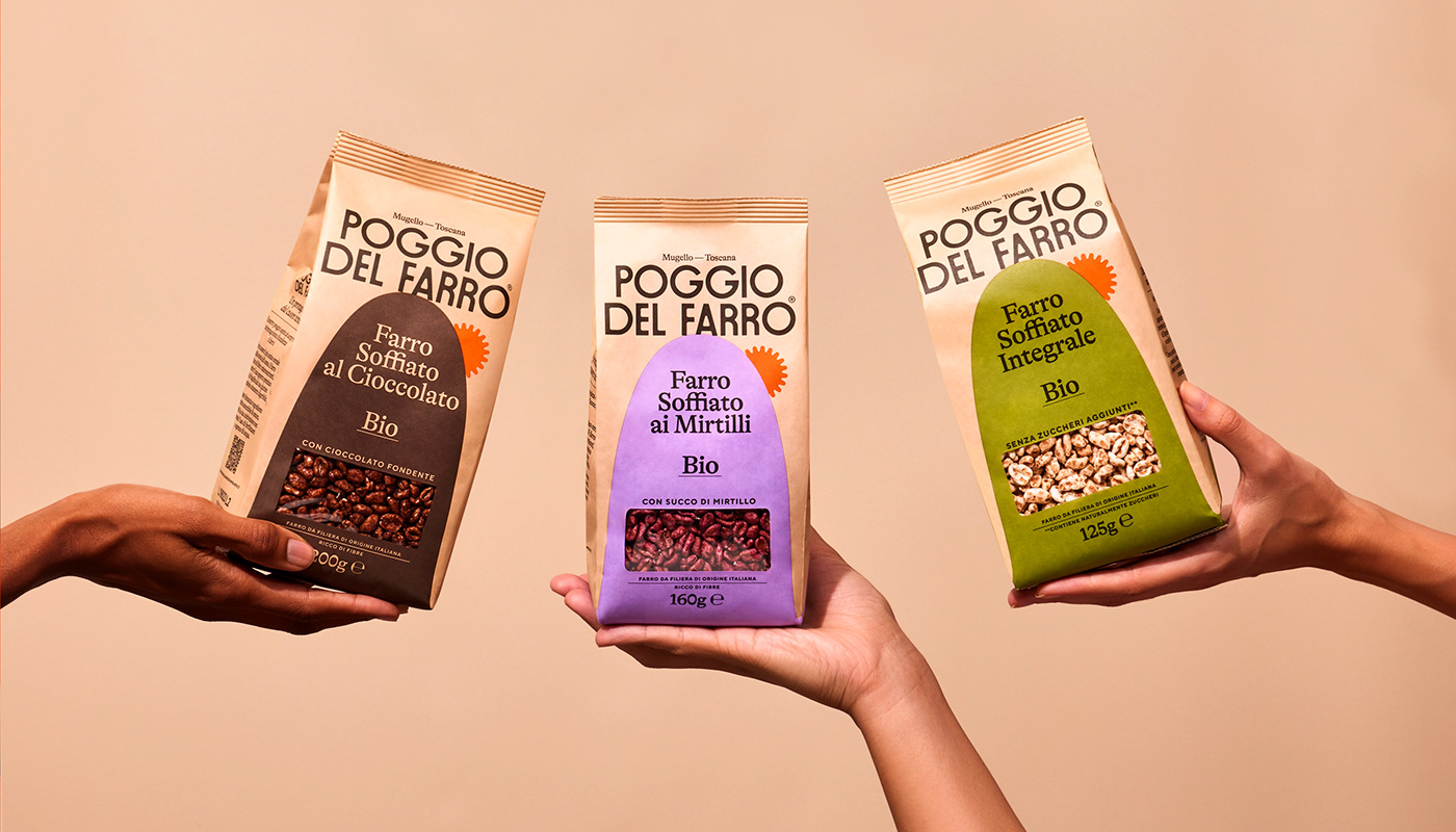
We started from the name of the brand, Poggio del Farro in fact means “Emmer Hill" in Tuscan, and underlines the geographical position from which the brand comes, the heart of Mugello in Tuscany.
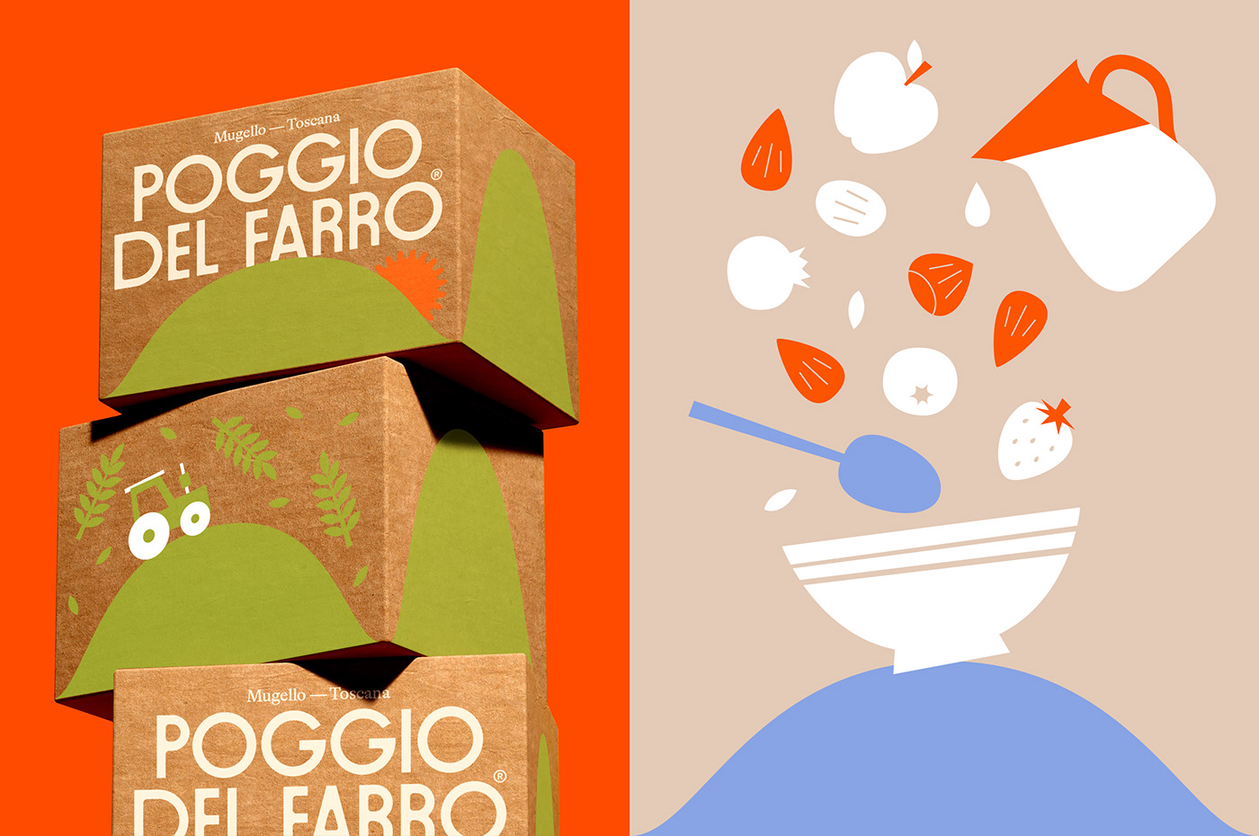
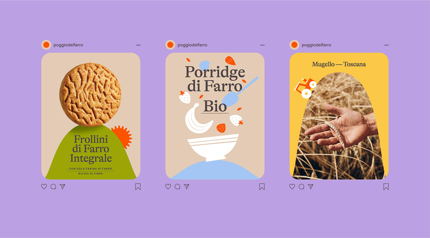
The hill has become the main element of the visual identity, together with a sun, which recalls the old logo used previously and reinforces the idea of a hilly landscape.
For each product the hill takes on a different color and its shape can be adapted to different formats, this makes it possible to adapt the visual identity to a wide range of products and package sizes.
The hill also acts as a support for the entire photographic and illustrative system.
YEAR / 2023