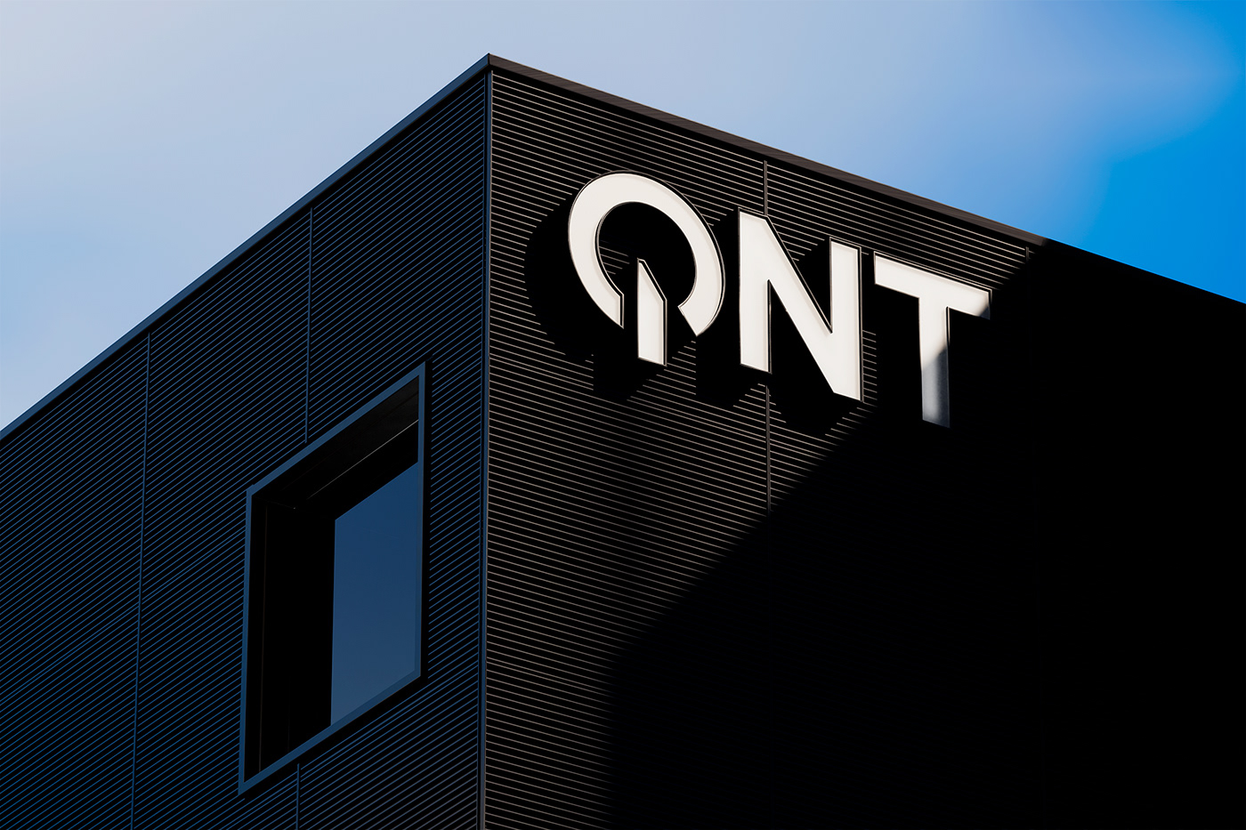
It's on
QNT is one of the leading supplements manufacturers in the world but due to this success and a constant strive for innovation, their portfolio was becoming increasingly cluttered. We built a brand around the persona of a smart nutrition coach, urging you to take on the challenge, and guiding you where necessary. The new icon and wordmark are based on the universal ‘on’ symbol, referencing the activating nature of the rebrand.
We created a design system based on the concept of the 3 macronutrients, represented by three quadrants, with the QNT supplements filling in the missing element. These quadrants are filled with a modular system of concentric arches, giving each product a unique composition built with different constellations of these shapes.

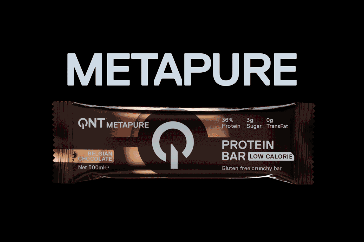
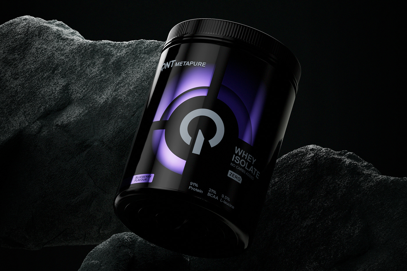
QNT Metapure
Metapure is QNT’s flagship brand, catered to professional athletes. A premium brand with pulsating shapes created with colored metallic inks on a matte black packaging.

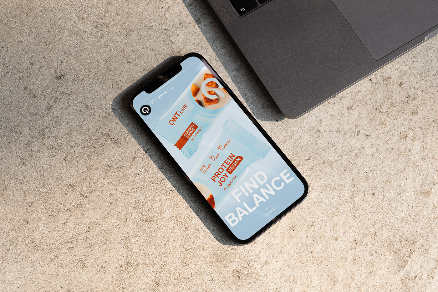
QNT Liife
With a more feminine touch and feel, Liife targets those aiming for healthier lives. Think vitamins, metabolism boosters and energy enhancers.