Rebranding for Avenga IT Company
Welcome to the new look of Avenga, a top-notch IT company diving deep into innovation and digital progress. Avenga's rebranding isn't just about a fresh coat of paint; it's about reimagining their identity and ensuring they remain experts in digital technology.
Identity Idea:
At the core of Avenga's identity lies the iconic 3D logo silhouette - the globe. This symbol not only represents the company’s global reach but also serves as a dynamic emblem of their digital expertise. From the simplified globes of Avenga's logo-mark, we've crafted a dynamic pattern reminiscent of binary code. This pattern on the one hand symbolizes the digitality of the company,,and on the other conveys Avenga’s highly organized yet fluid approach to technology. So the pattern, blending mathematical precision with organic fluidity, adorns all marketing communication, website, and social media, embodying the essence of Avenga's digital presence.


We simplified Avenga's logo to enhance readability and clarity. By enlarging the logo text and reducing the number of colors, we've refined the visual identity while designing a new font with a unique character that sets Avenga apart in the industry.

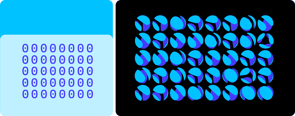
Pattern Design
The brand pattern, derived from Avenga's 3D logo globes, symbolizes the company's digital prowess and conveys the feeling of a highly organized complex system, akin to binary code. Each sphere in the pattern represents binary code elements, with zero (no globe) and one (globe) elements forming a rhythmic sequence. Rotating spheres reflecting the ordered chaos of the digital world. This pattern adorns Avenga's merchandise and corporate materials, reinforcing their digital prowess and innovative spirit.

Color Palette
Central to Avenga's brand identity is the primary brand color, carefully selected to stand out in a crowded marketplace. We've chosen a unique shade that distinguishes the brand from competitors and resonates with its innovative spirit. Our color palette exudes vibrancy and modernity, reflecting Avenga's dynamic approach to technology and business.


Website Design
Avenga's website is more than just a digital storefront; it's a testament to their people-centric approach to technology. The team at Avenga understands that technology is driven by people, and their website reflects the collaborative spirit of the team. Through engaging visuals and user-friendly design, Avenga showcases their team's ease of work and commitment to innovation. They're not just selling code; they're offering a team of like-minded professionals dedicated to bringing innovative solutions to businesses. The website design is a window into Avenga's culture of innovation, highlighting their passion for driving digital transformation and delivering unparalleled value to clients.


The rebranding of Avenga is more than just a visual overhaul; it's a reimagining of their identity and a reaffirmation of their commitment to excellence in the digital age. With a refreshed visual identity, streamlined logo, dynamic pattern design, vibrant color palette, and user-centric website, Avenga is poised to lead the way in digital innovation and transformation. Join us on this exciting journey as we redefine the future of technology and business together.
Thank you for watching