

Bafood rebranding for a Diverse Culinary Experience
Bafood, a pioneering delivery app that originated as a virtual kitchens without a physical restaurants, embarked on a transformative journey to expand its brand. With the evolution came the introduction of several new sub-brands, each meticulously tailored to offer a unique culinary experience, ranging from Asian and Italian to American and Polish cuisines. We worked closely with Bafood stakeholders to bring this new brand to life. We teamed up to understand what makes food look good and how to make a brand stand out. This collaboration helped in creating a brand that not only looks great, but also feels right for Bafood's diverse audience.

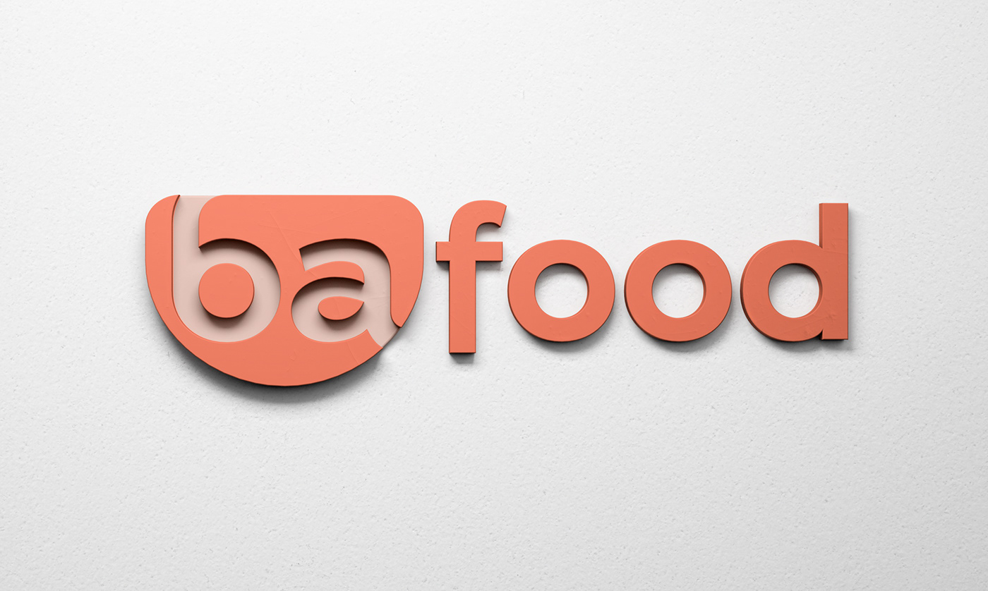
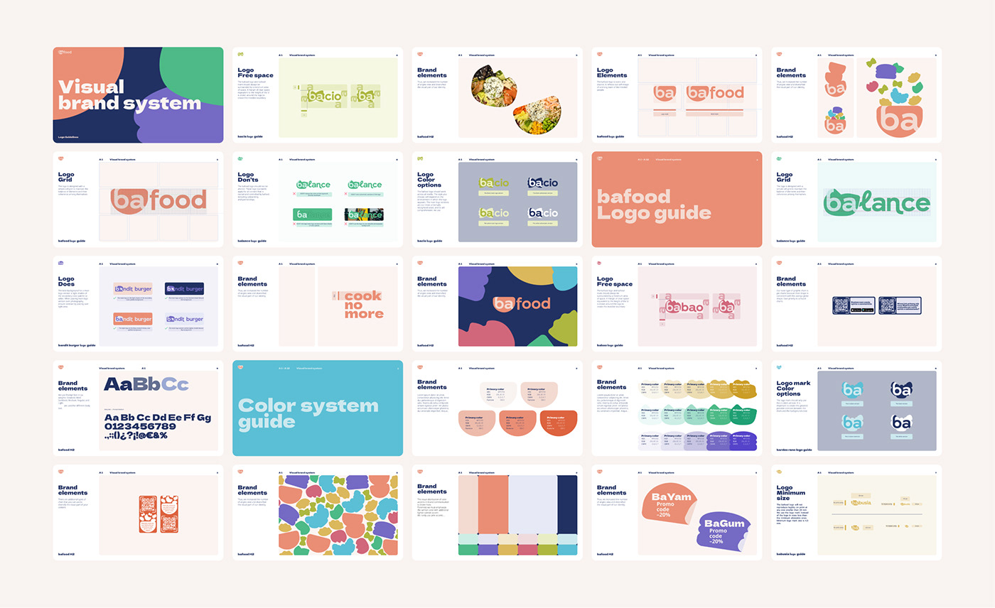
Logo Concept
The core concept behind the logo design revolves around the idea of a plate as the emblem for the mother brand. This plate symbolizes the inclusivity of Bafood, showcasing its ability to cater to diverse tastes. Corresponding symbols of food were ingeniously incorporated into the sub-brands, emphasizing the variety of cuisines available under the Bafood umbrella.

Typography
We introduced a bespoke Bafood font - a testament to its commitment to a distinct brand identity. This distinctive typeface strikes a balance between playfulness, recognizability, and a corporate character. Inspired by the free-flowing lettering found on food packaging, the font exudes an appetizing quality while maintaining a foundation in modern geometric sans serif design.

Color Palette
We picked a non arbitrary color palette for Bafood. It reflects the tastes associated with the diverse cuisines represented by the sub-brands. Each color is carefully selected to evoke the essence of a particular culinary tradition, contributing to a visually cohesive yet culturally diverse brand identity.
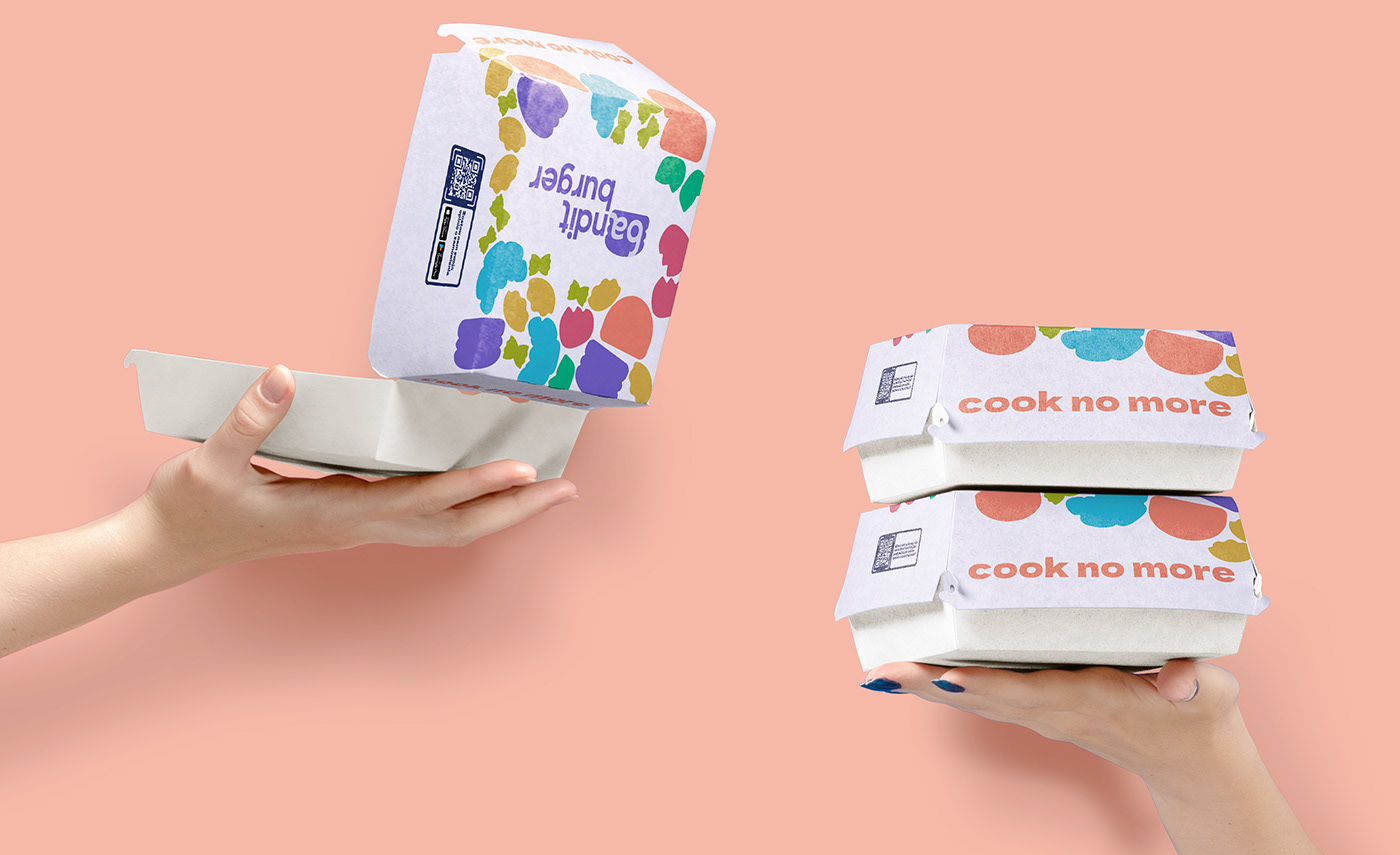
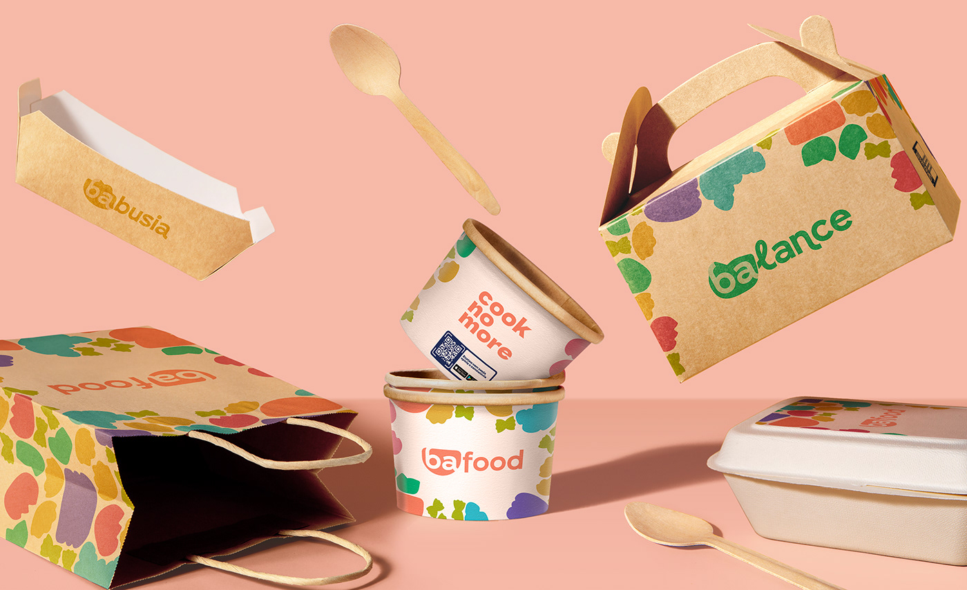
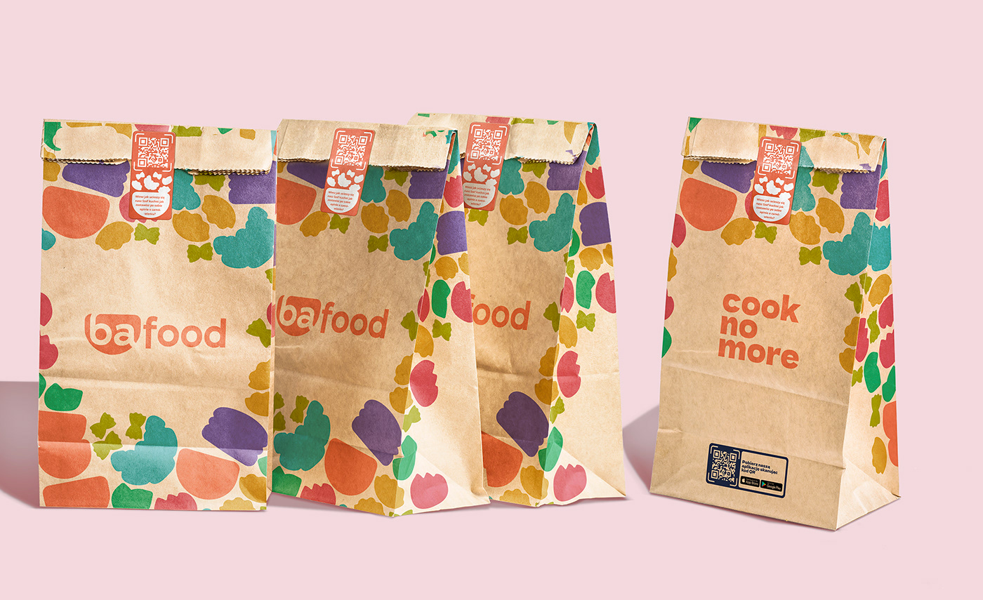
Brand Pattern
One of the standout features of the branding strategy is the creation of a brand pattern. This pattern, composed of randomly ordered logos, provides an infinite array of recognizable combinations. With this simple and consistency visual language we designed unique yet cohesive packaging for delivered dishes across different cousines.


Packaging Design
We developed the laconic visual language to extend to Bafood packaging design, allowing for simplicity and recognition. Each sub-brand has its distinct packaging, ensuring the visual identity remains consistent within the broader Bafood brand. This approach enhances brand recognition and provides a seamless and enjoyable experience for customers as well.


Our branding for Bafood delivery app transcends mere visual aesthetics. It encapsulates a commitment to diversity, a celebration of global cuisines, and a dedication to delivering a consistent yet personalized experience. The fusion of logo concepts, typography, color palettes, and brand patterns culminates in a cohesive and memorable brand identity, positioning Bafood as a versatile and delightful culinary destination in the digital realm.


