


With the ambition of becoming a global energy company, the Angolan oil company Somoil initiated expansion on two fronts: renewable energy and refueling stations with its own brand. A significant rebranding accompanied this process, involving the creation of a new name: Etu Energias, which means "us" in Bantu. The name and identity are aligned with the brand's purpose of "Bringing energy for development" and reflect pride in its origin and people. To connect the past and future, two elements from the Somoil brand continue in Etu: the blue and yellow colors, and the Kisanji, an Angolan musical instrument that merges with a hand to create a proprietary symbol with fluid and expansive traits, unfolding into textures and graphic elements in the identity system.
Com a ambição de se tornar uma empresa global de energias, a petrolífera Angolana Somoil iniciou expansão em duas frentes: energias renováveis e postos de abastecimento com marca própria. Uma expressiva mudança de marca acompanhou este processo, passando pela criação de um novo nome: Etu Energias, que significa “nós” em Bantu. Nome e identidade conectam-se com o propósito da marca de “Levar energia para o desenvolvimento”, e refletem o orgulho da sua origem e das suas pessoas. Para conectar passado e futuro, dois elementos da marca Somoil seguem em Etu: as cores azul e amarelo; e o Kisanji, instrumento musical Angolano que se funde com uma mão para dar origem a um símbolo proprietário de traços fluídos e expansivos, que se desdobra em texturas e elementos gráficos no sistema de identidade.

A NEW NAME
Highlighting the people of Angola and the pride in bringing energy to their community and the world was a fundamental principle in creating both the name and visual identity. Alongside this, there was the challenge of crafting a name that clearly indicated its Angolan origin while also possessing enough strength to compete in the global arena, standing shoulder to shoulder with established players, mostly European and North American. Lastly, a name subtly marking the brand's shift towards renewable energy was needed.
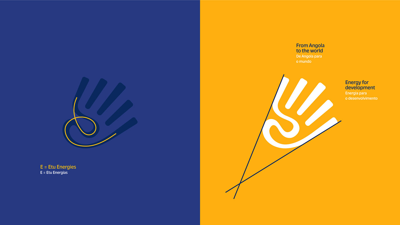
The new name, Etu Energias, expresses pride in the Angolan origin, the energy for and from people, and the new energy sources. In the Bantu linguistic root, "Etu" means "us" – referring to the people in the company, Angolans, Africans, and even all humans united by the need for a more sustainable future. Even without knowing the etymology of the word, those familiar with the Portuguese language can infer "eu" and "tu," another way of saying "us." The descriptor "Energias," in plural, signifies that oil is no longer the sole energy source. In fact, removing "oil" from the name was the main reason for adopting a name so different from the current one, Somoil.
UM NOVO NOME
Evidenciar as pessoas de Angola e o orgulho em levar energia para sua comunidade e para o mundo foi uma premissa da criação tanto do nome quanto da identidade visual. Junto com isso havia o desafio de criar um nome que deixasse evidente a origem Angolana, mas que ao mesmo tempo tivesse força suficiente para se posicionar em uma arena global, lado a lado com players consolidados, em sua maioria europeus e norte-americanos. Por fim, um nome que demarcasse, ainda que de forma sutil, o movimento da marca rumo às energias renováveis.
O novo nome Etu Energias expressa o orgulho da origem Angolana, a energia das e para as pessoas e as novas fontes energéticas. No tronco linguístico Bantu, “Etu” significa “nós” – que pode se referir às pessoas que atuam na empresa, aos Angolanos, aos Africanos e até mesmo a todos os seres humanos, unidos pela necessidade de um futuro mais sustentável. Mesmo sem conhecer a etimologia da palavra, quem está familiarizado com a língua portuguesa consegue inferir “eu” e “tu”, do nome, outra forma de falar em “nós”. O descritivo “Energias”, no plural, demarca que o petróleo não é mais a única fonte energética. Aliás, retirar o “oil” do nome foi a grande justificativa para se adotar um nome tão distante do atual, Somoil.


A NEW BRAND EXPRESSION
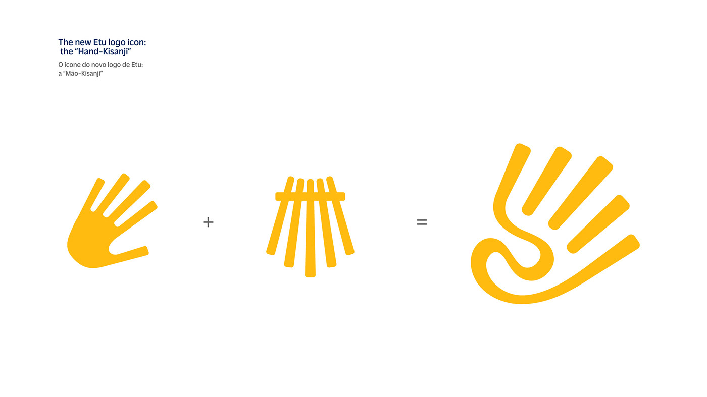
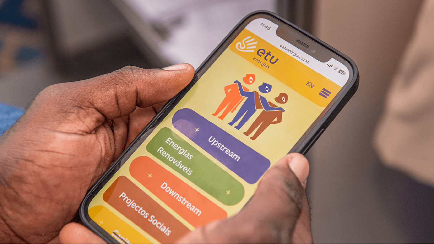
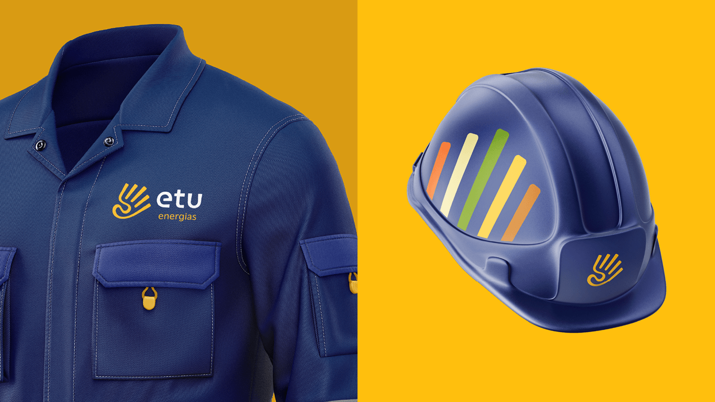
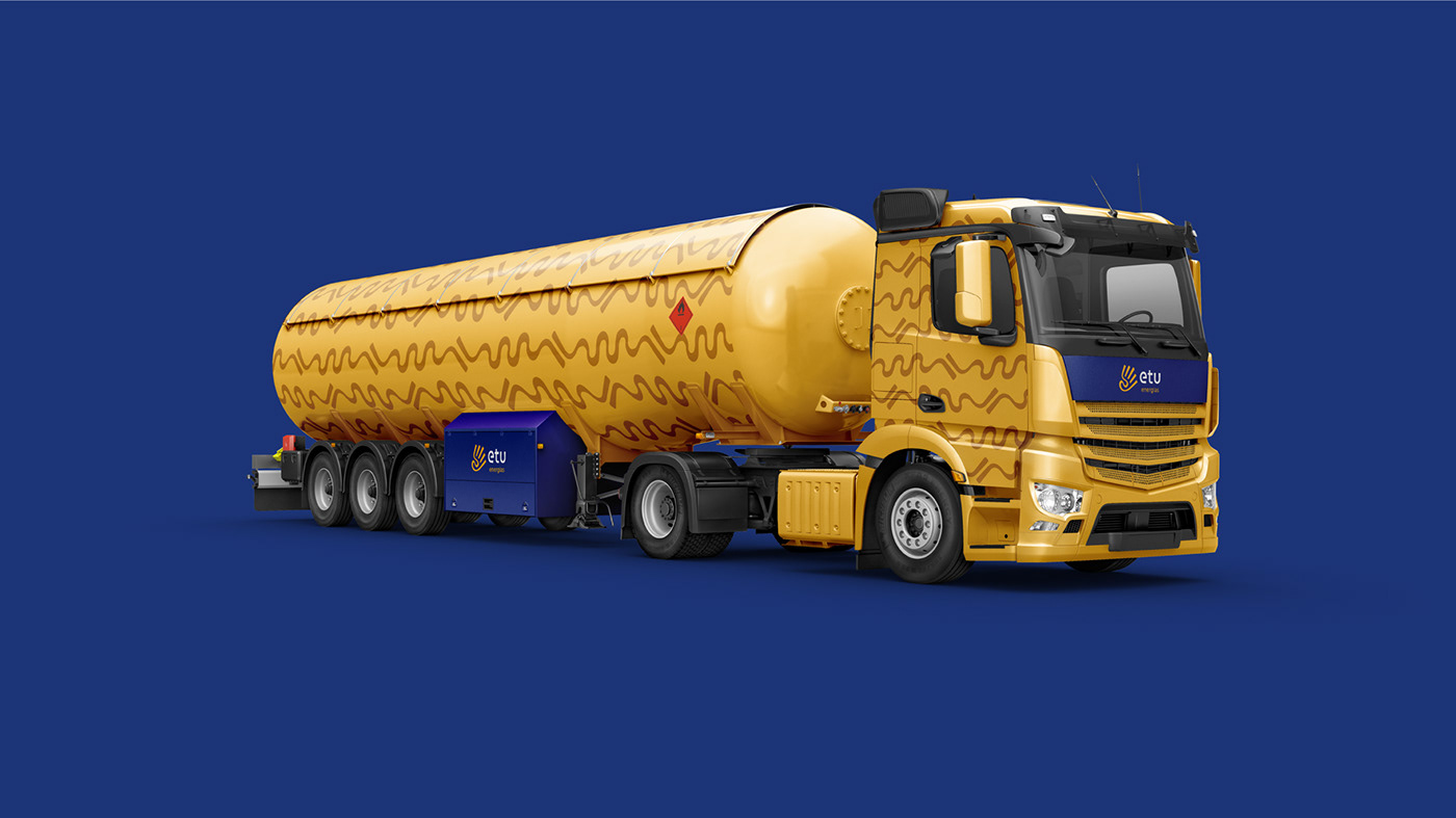
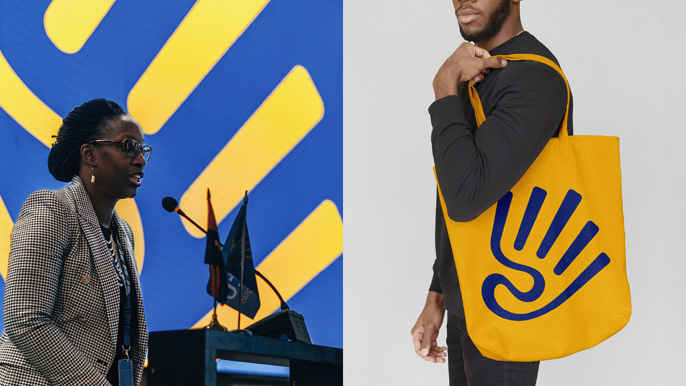
There was also the challenge of creating a brand active in the local market yet prepared to compete in the global arena, alongside established players, mostly European and North American. To address this, we opted for a symbol that further reinforces the African origin marked in the name. This symbol combines the shape of a hand with that of a Kisanji, an Angolan musical instrument present in the current logo and highly cherished by the company as representative of its history. Its strokes carry the fluidity of an adaptable company and expansive forms that reference energy in motion, from Angola to the world. The letters composing the logo, specially designed for it, follow the same style of fluid and expansive strokes as the symbol.
UMA NOVA EXPRESSÃO DE MARCA
Havia ainda o desafio de criar uma marca atuante no mercado local mas também preparada para competir em uma arena global, lado a lado com players consolidados, em sua maioria europeus e norte-americanos. Para isso apostamos em um símbolo que reforça ainda mais a origem africana demarcada no nome. Este símbolo mistura a forma de uma mão com a de um Kisanji, instrumento musical Angolano presente no logo atual e muito apreciado pela empresa como representativo de sua história. Seus traços carregam a fluidez de uma empresa adaptável e formas expansivas que fazem referência à energia em movimento, de Angola para o mundo. As letras que compõem o logotipo, desenhadas especialmente para ele, seguem o mesmo estilo de traço fluído e expansivo do símbolo.
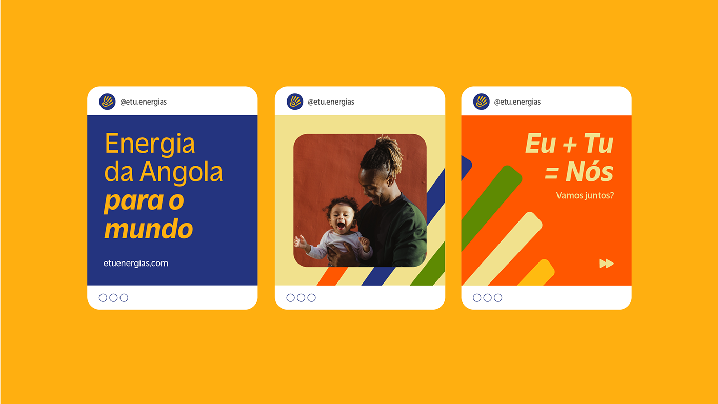
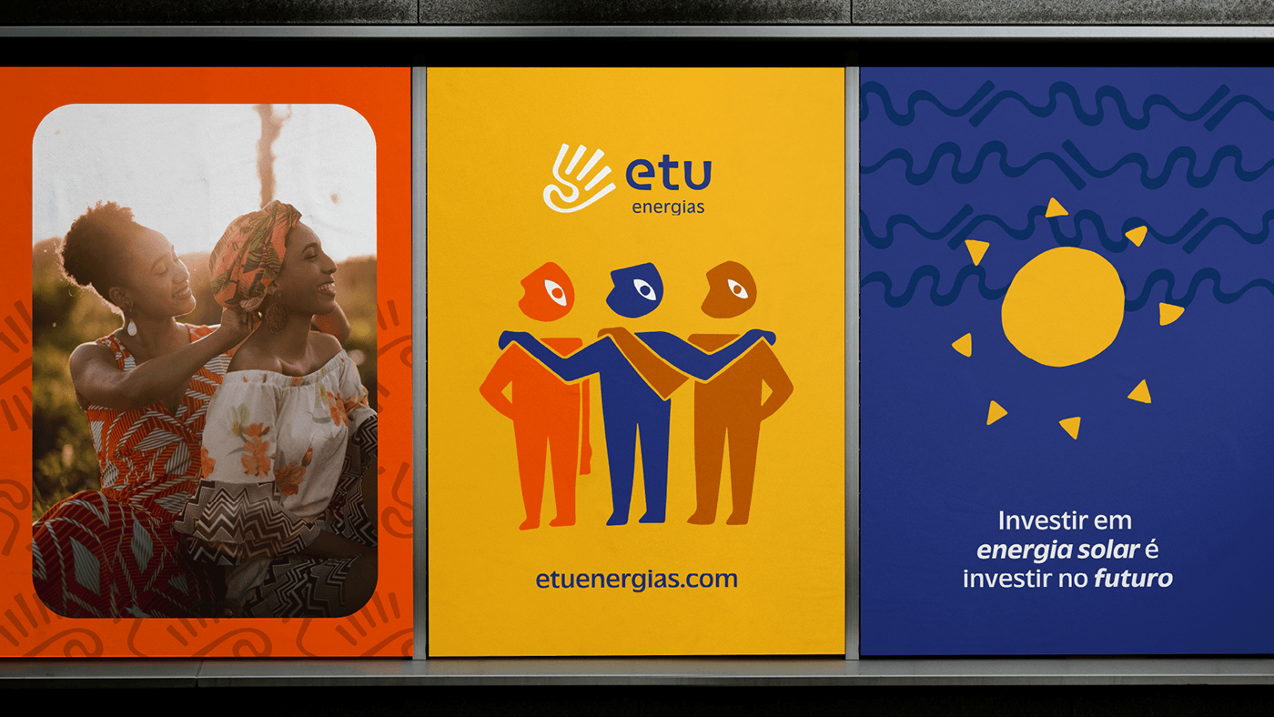
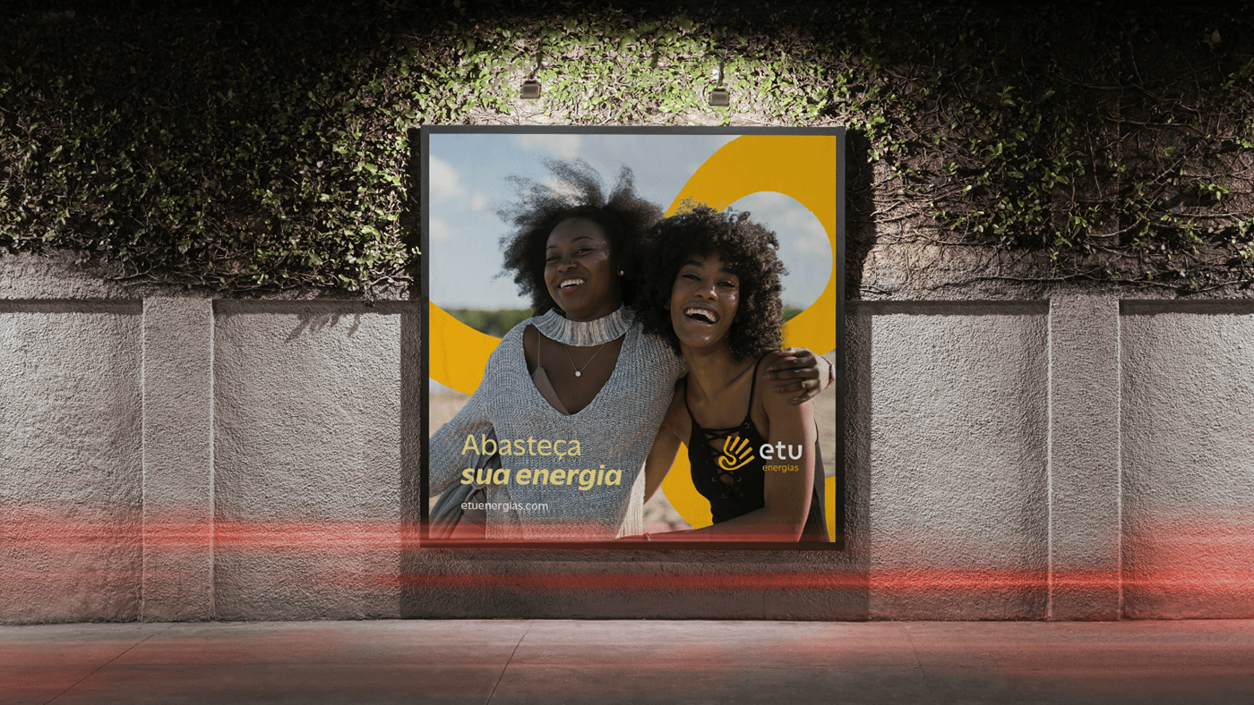
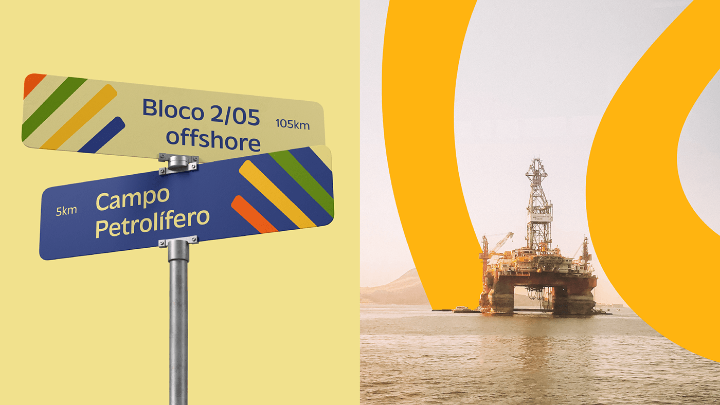
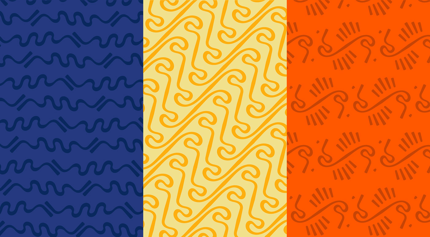
The curves that give personality to the new logo transform into graphics in the visual universe, interacting with images and contributing to forming a vibrant mood. They also give rise to a set of energetic patterns and an illustrative style that complements the visual universe. Alongside the inherited Somoil colors, blue and yellow, a new palette is proposed, adding warmer tones such as orange, brown, and green to compose the visual identity.
As curvas que conferem personalidade ao novo logotipo convertem-se em grafismos no universo visual, interagindo com imagens e ajudando a formar um mood vibrante. Elas também dão origem a um conjunto de padronagens energéticas e um estilo de ilustração que complementa o universo visual. Junto com as cores herdadas de Somoil, o azul e o amarelo, uma nova paleta é proposta, agregando mais tonalidades quentes como alaranjado, marrom e verde para compor a identidade visual.


CREDITS | CRÉDITOS
Creative direction | Direção criativa: Gil Bottari
Strategy direction | Direção de estratégia: Anne Grecco
Creative coordination | Coordenação criativa: Laila Rotter
Brand strategy | Estratégia de marca: André Bastos e Cristiane Scaff
Visual Identity | Identidade Visual: Laila Rotter, Taís Andrade e Thiago Thomé Marques
Verbal identity | Identidade Verbal: Jéssica Naveira
Illustration | Ilustrações: Gabriel Deda


