


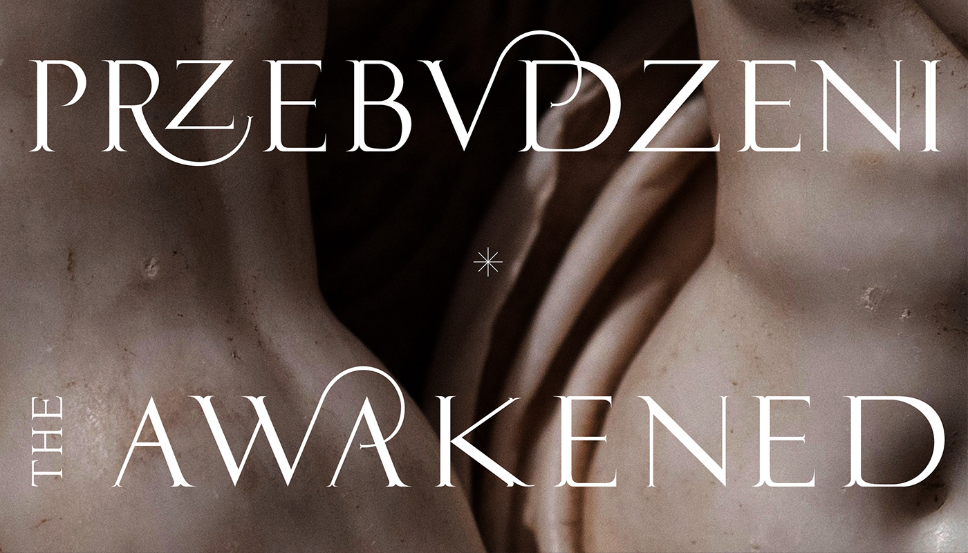
The exhibition logo and visual identity
T H E A W A K E N E D
*
The exhibition logo & visual identity inspired by Renaissance typography.
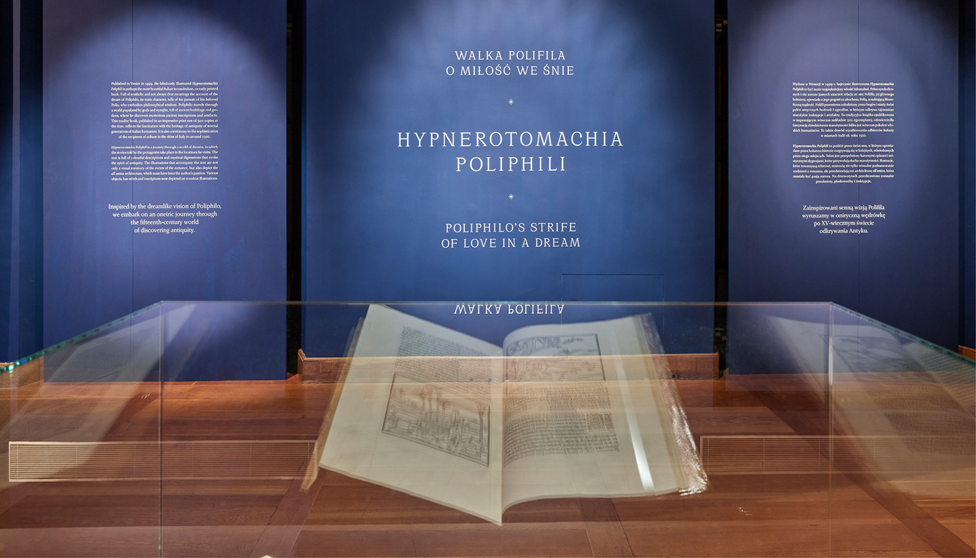
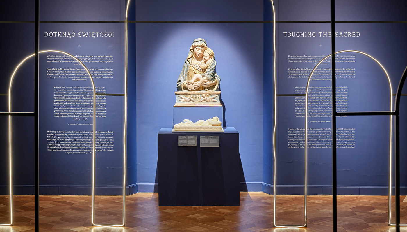
The theme of the exhibition "The Awakened" was the Renaissance revival in Italy (XV century), which was primarily inspired by the rediscovered heritage of antiquity.
*
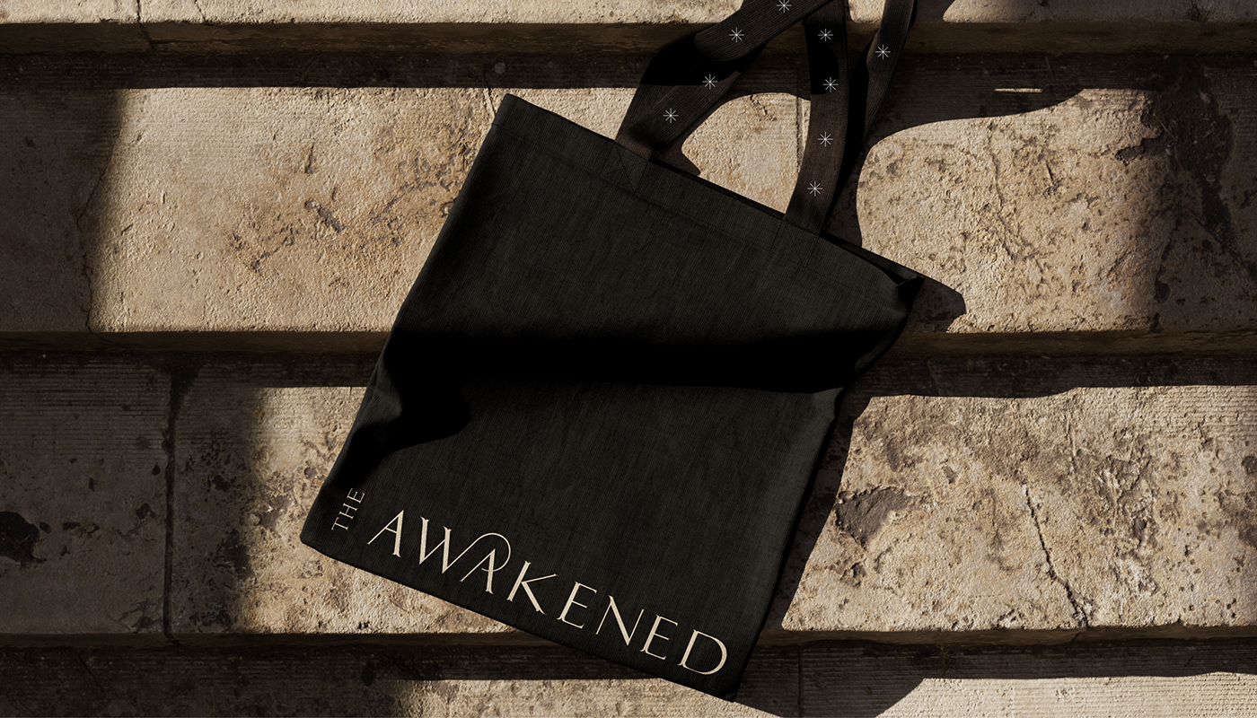
We designed a custom "The Awakened" font which we used in the logo, posters, ads, accompanying prints, promotional video, exhibition catalog and exhibition typography.
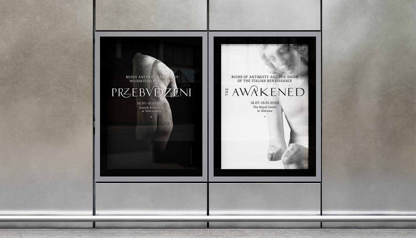


Typography at exhibition


Client: Royal Castle in Warsaw
Curator: Mikołaj Baliszewski
Typography design for "Awakened": Diana Makulska / Podpunkt
Graphic design and visual identity for the exhibition: Diana Makulska / Podpunkt
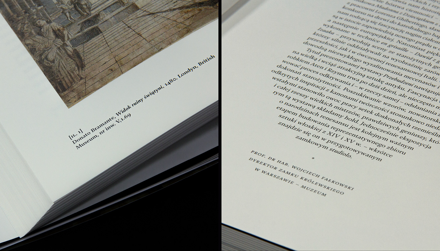
Exhibition catalog: Diana Makulska / Podpunkt
Promotional video: Ewa Najnigier Galińska / Podpunkt
Promotional materials: Diana Makulska / Podpunkt
Exhibition folder: Emilka Bojańczyk / Podpunkt
Animation for mirrored cubes: Zuzanna Charkiewicz / Podpunkt
Graphic design and visual identity for the exhibition: Diana Makulska / Podpunkt
Exhibition catalog: Diana Makulska / Podpunkt
Promotional video: Ewa Najnigier Galińska / Podpunkt
Promotional materials: Diana Makulska / Podpunkt
Exhibition folder: Emilka Bojańczyk / Podpunkt
Animation for mirrored cubes: Zuzanna Charkiewicz / Podpunkt
Photography: Royal Castle in Warsaw & Marcin Czechowicz
Scenography: Anna Met
Exhibition production: Perfect Events
Exhibition production: Perfect Events
Typeface: Cirka by Pangram Pangram, Fazeta by Adtypo
*


