
















L O U M I N O L O G Y
New York
Brand Identity / Brand Strategy / Copywriting / Packaging
Brand Identity / Brand Strategy / Copywriting / Packaging
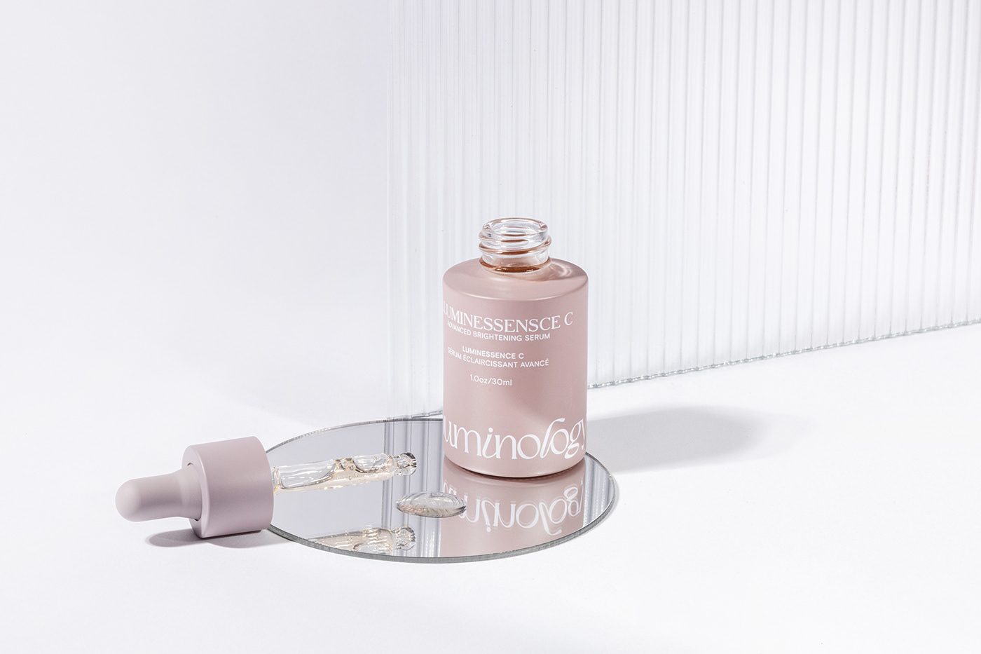
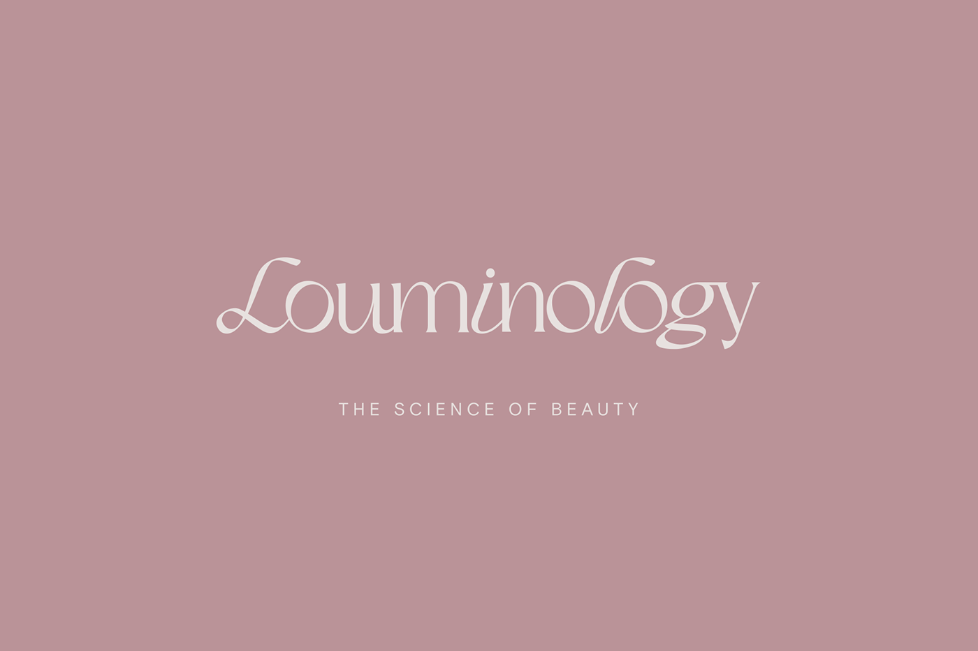
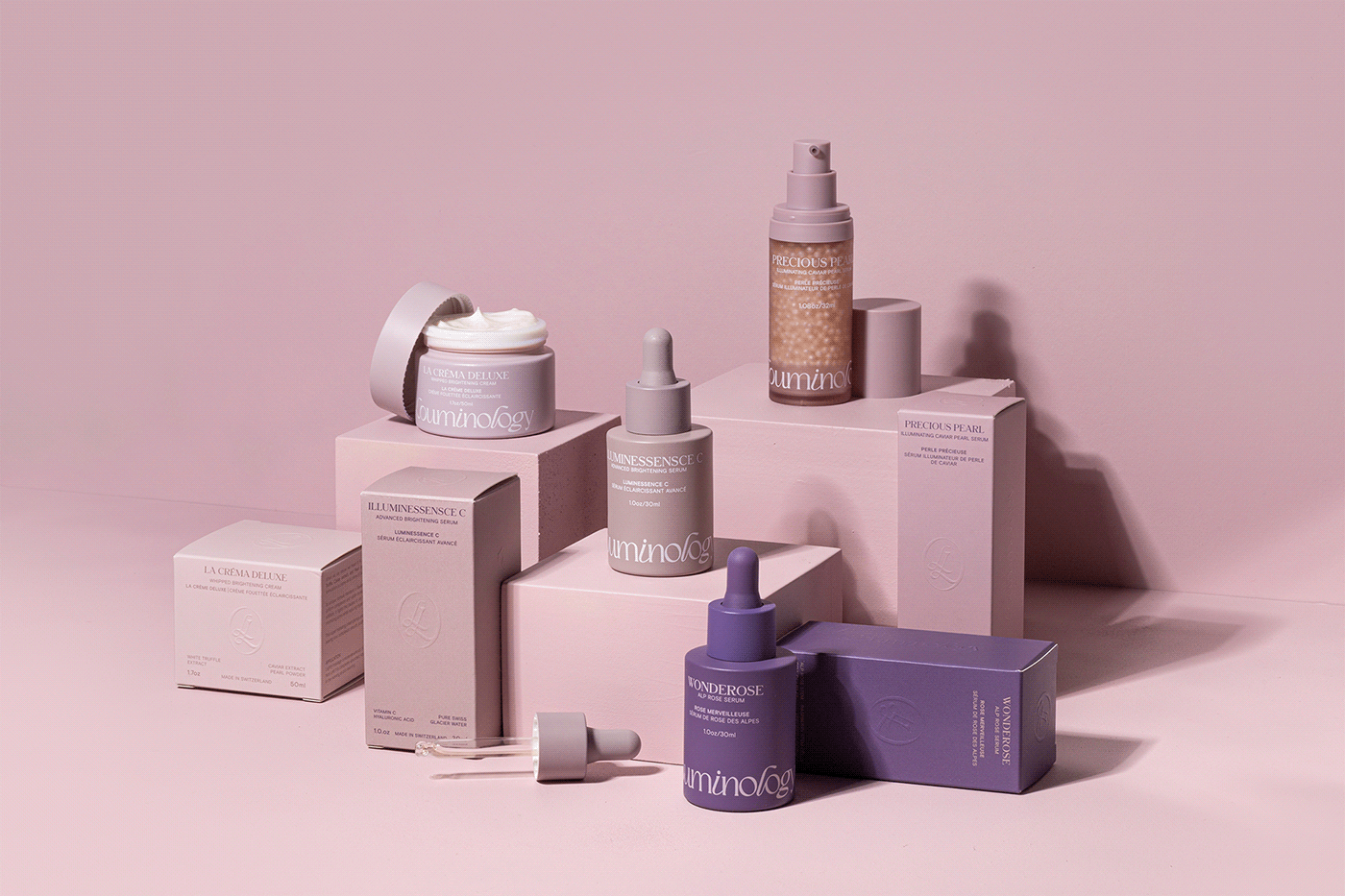
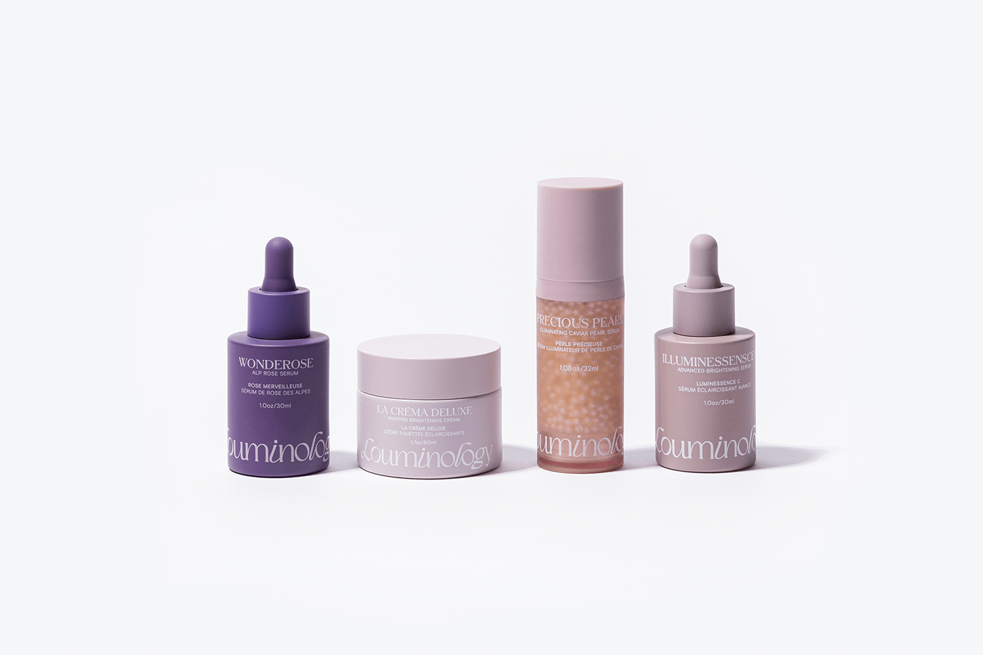
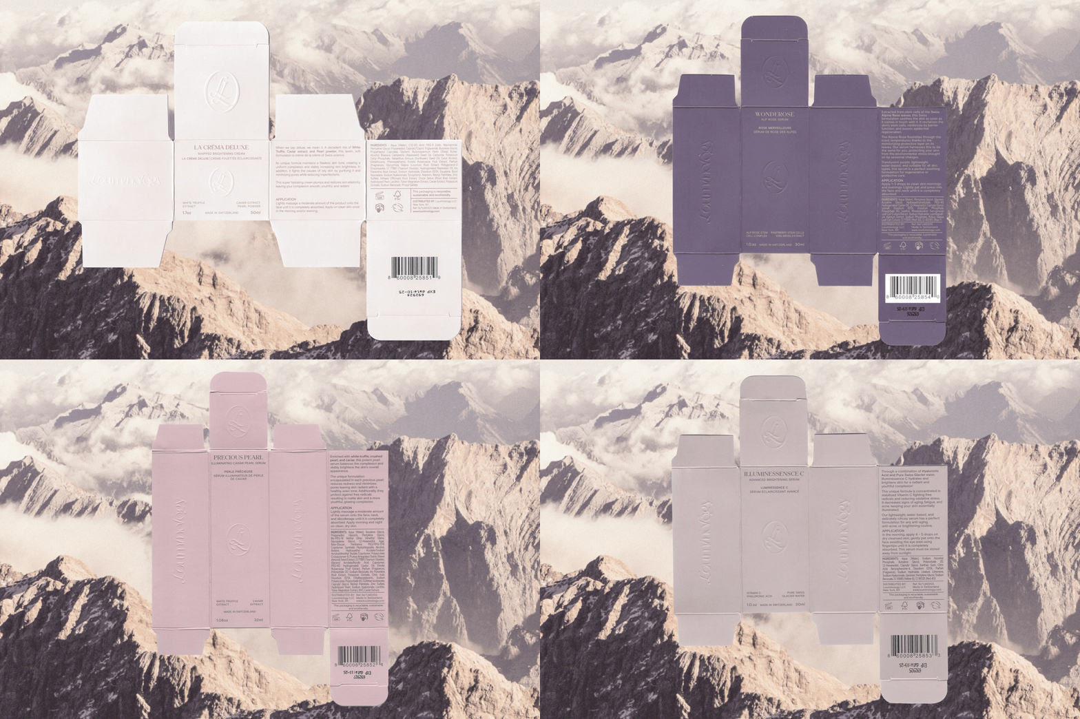
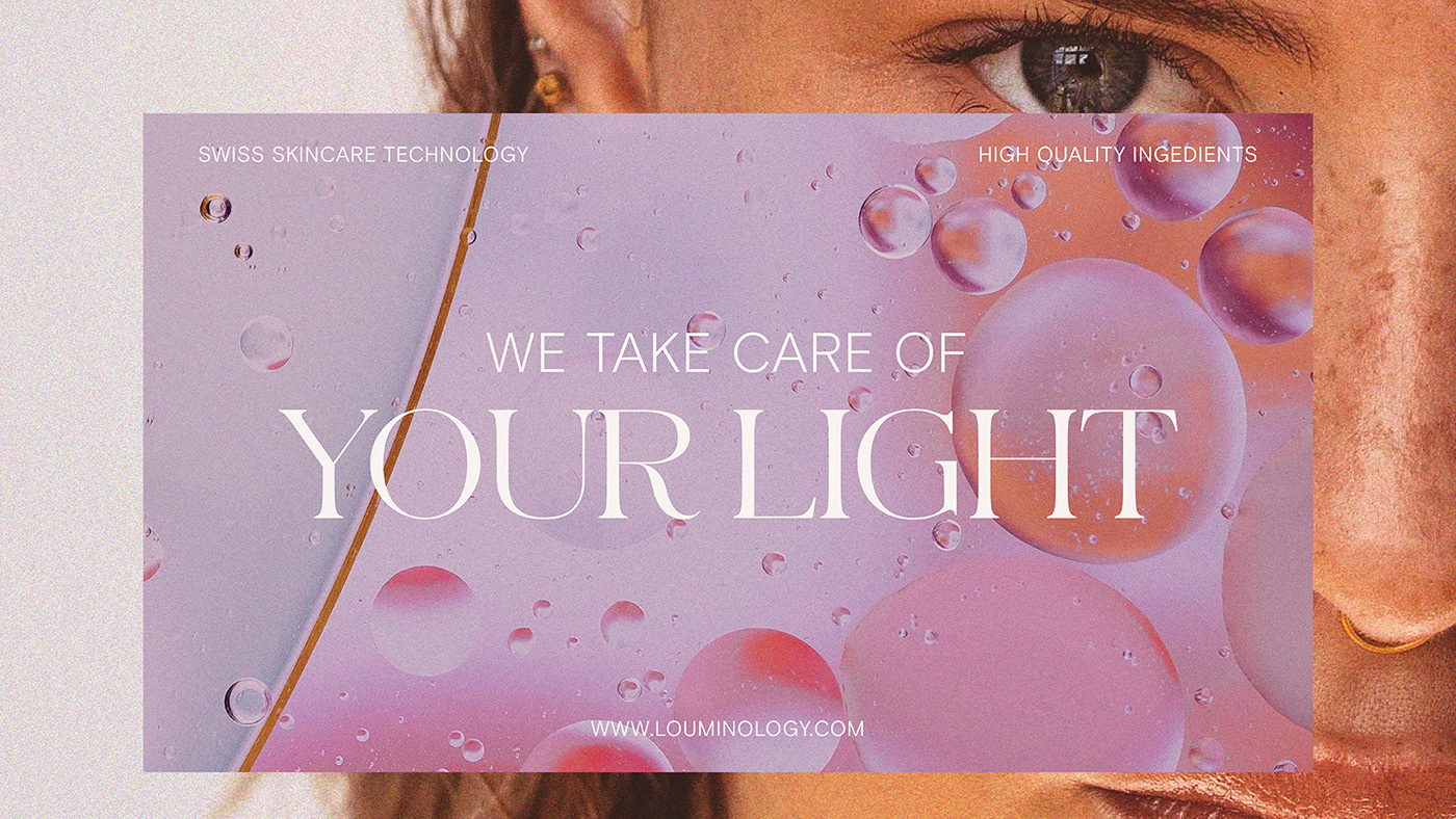
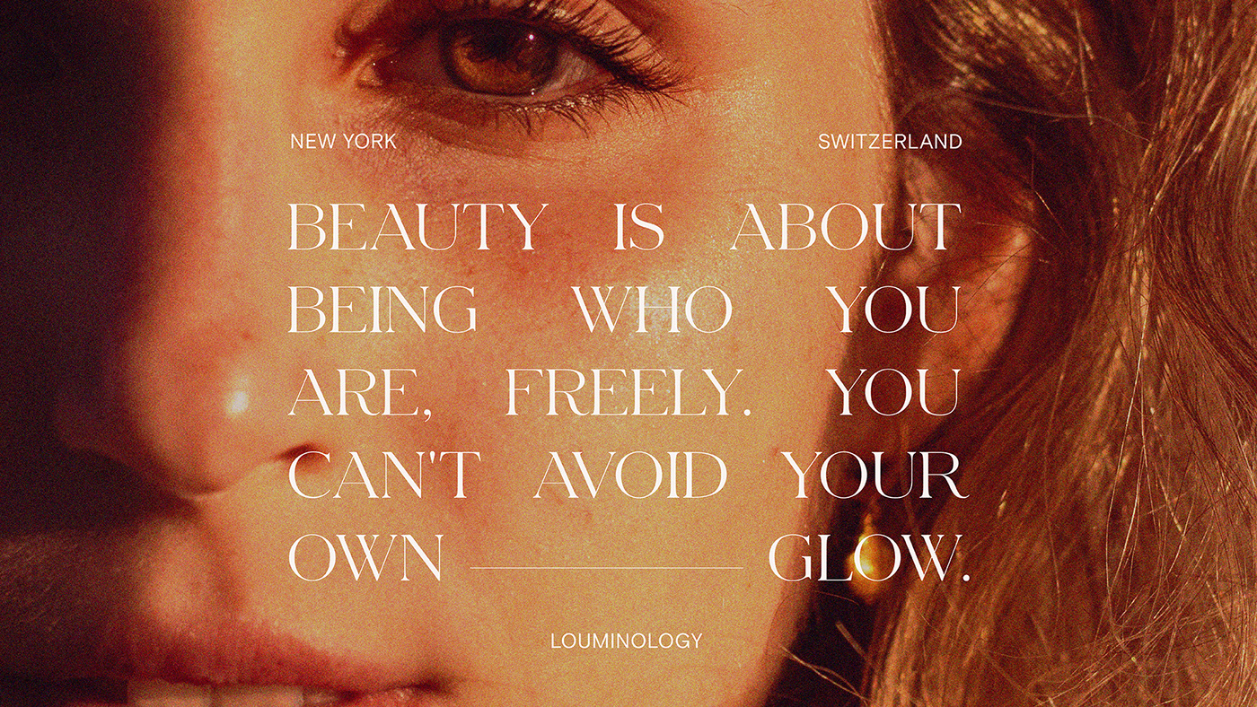
The concept behind the name and products of Louminology is based on the science of each person's inner light and how the brand helps the consumer highlight it. With this in mind, our approach to the brand had a strong focus on soft light with colors and features leaning towards the feminine, working within a range of purples to differentiate the products. The logo is a custom serif-based typography that uses links and italic characters to play with the rhythm of the word in a smooth manner. In addition to this, we created an oval monogram that serves as the brand's seal in more formal applications. The typefaces used include an expanded serif and a geogrotesque that create contrast between the feminine and the scientific, allowing for clarity of reading and hierarchy without sacrificing personality. Although the typography on packaging applications is of moderate size, digital and editorial elements use display sizes to create dynamism in compositions.


