


M A Y A W E L L
Re-branding / Brand Strategy / Copywriting / Packaging / Illustration
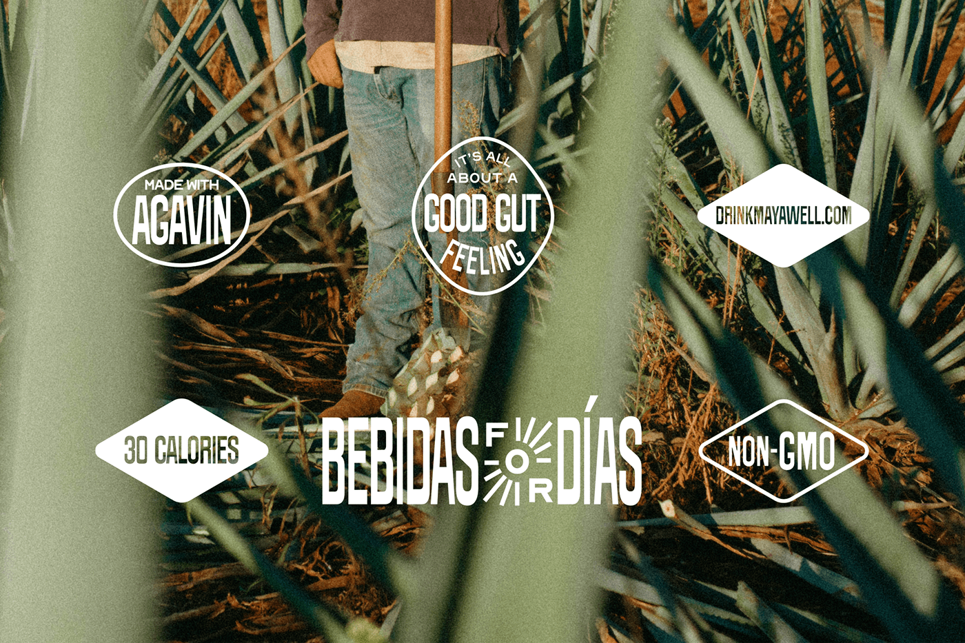
Mayawell is a proudly Mexican-owned, Austin-based beverage company that put its roots on full display. Mayawell isn't an average soda; it's a tribute to mexican heritage, a celebration of its culture, and a commitment to healthy living — to being fresh and fantástico.
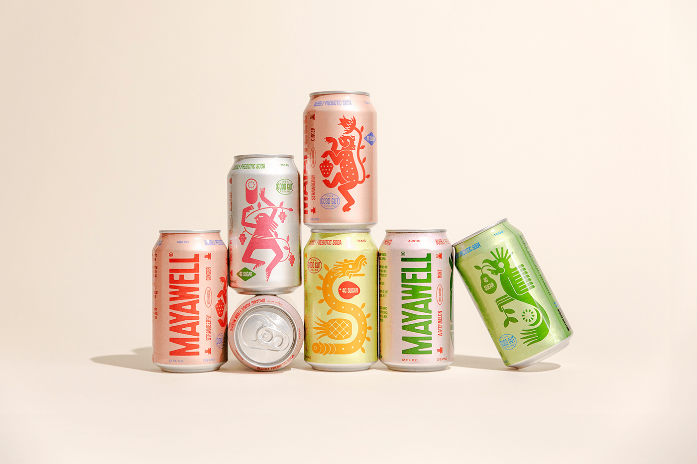
Their carefully crafted prebiotic beverages pair sustainably sourced Active Agave™ inulin with flavorful botanical ingredients to boost gut health and keep it tasty. Unlike traditional sodas loaded with sugar, stevia, and other nasty stuff, Mayawell is a natural and organic alternative that will leave you wanting uno más and feeling zero guilt about it.
The result is a crisp, refreshing bebida that your taste buds — and your gut — will thank you for.
Solution
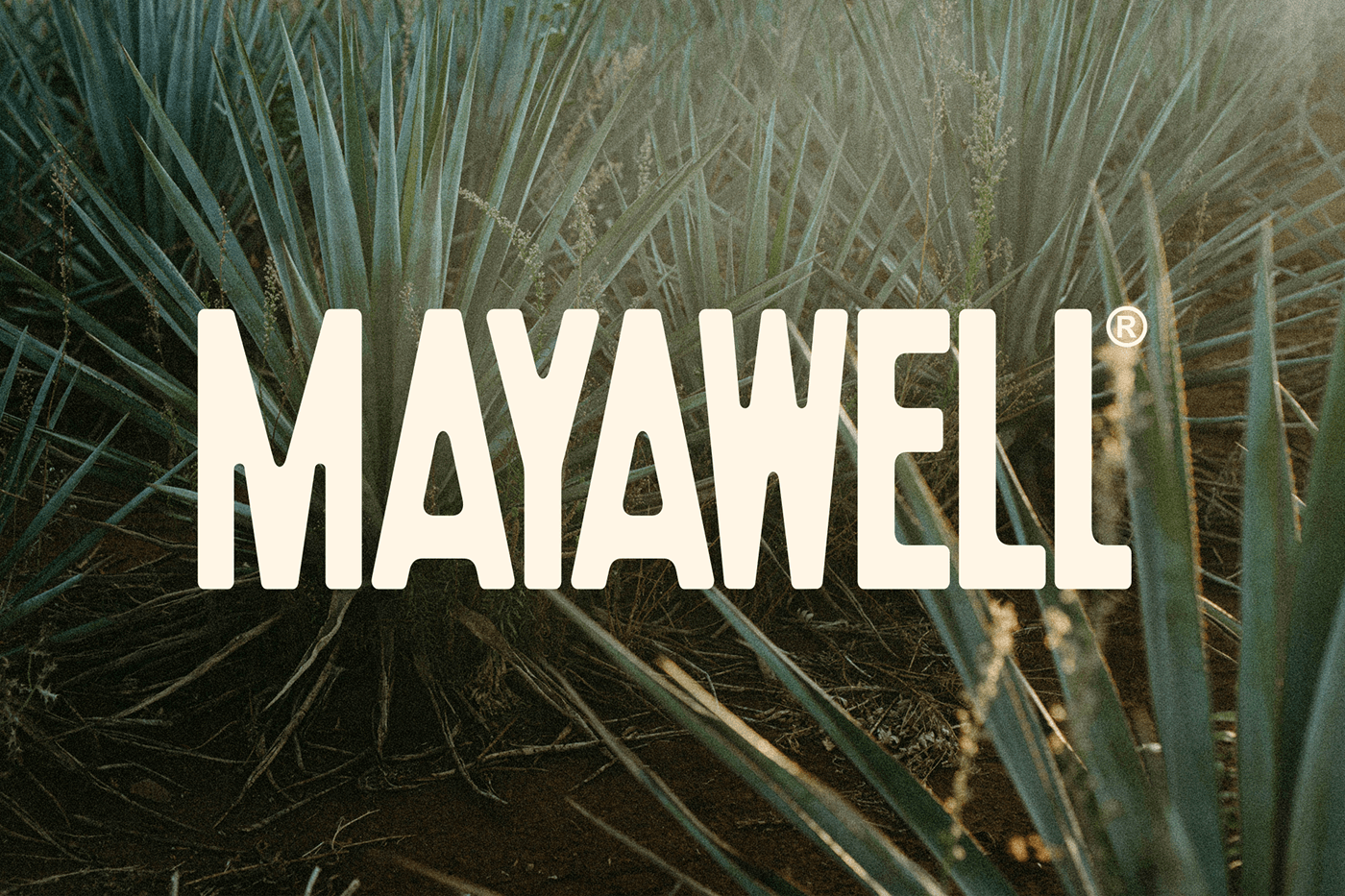
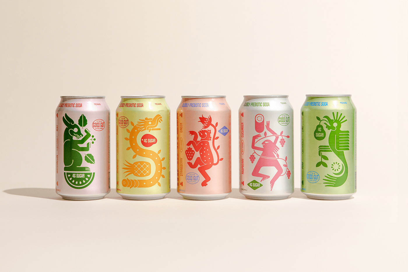
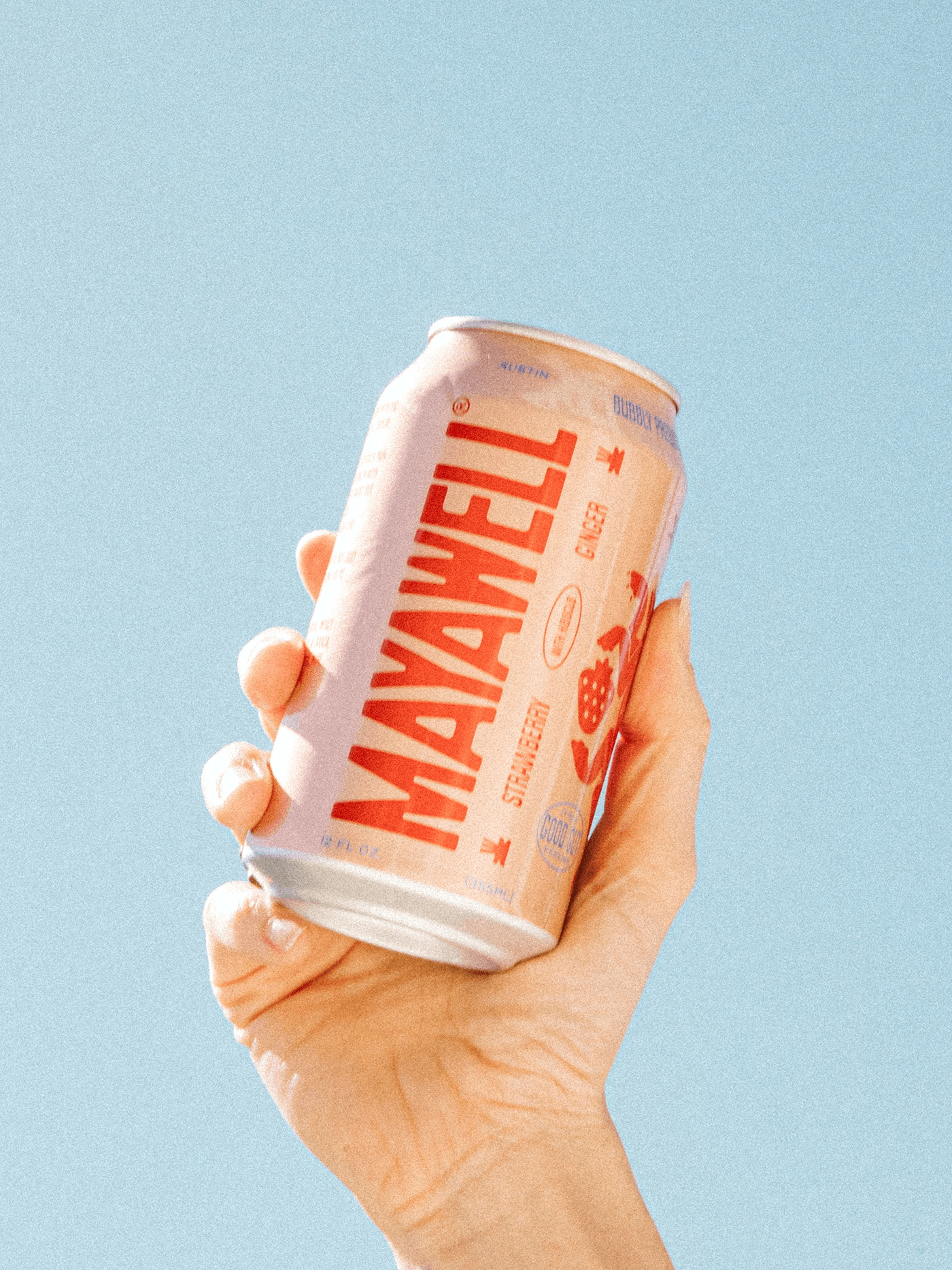
One of the main goals of the rebranding was to reflect the Mexican heritage behind the brand and its ingredients, so our first references were based on a mix of mid-century fonts and prehispanic codices for illustration.
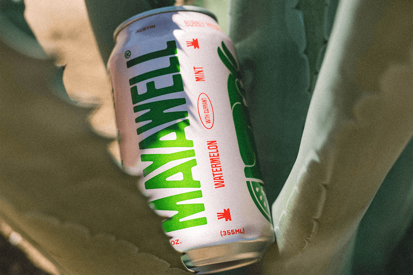
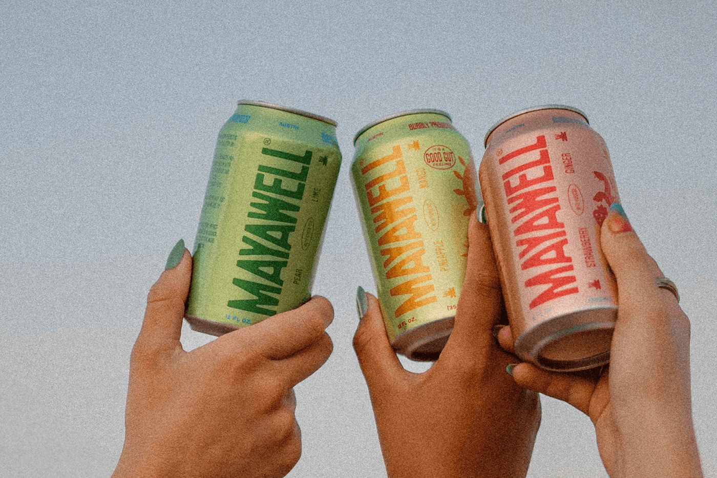
For font selection, we used a common type motif from all across Mexico, where condensed fonts are used in tight rectangular compositions. This was used as a base for the logo and most of the approach to layout. This condensed style also allowed for bigger and better positioning on the can, making the brand name stand out before anything else.
Illustrations were made for each flavor depicting classic prehispanic animals and elements paired with the flavors' fruits. When making these, we were careful to ensure that the style was contemporary and visually inspired by the reference material, but not an exact replica.


