Location
Brazil
Role
Branding & Packaging
—
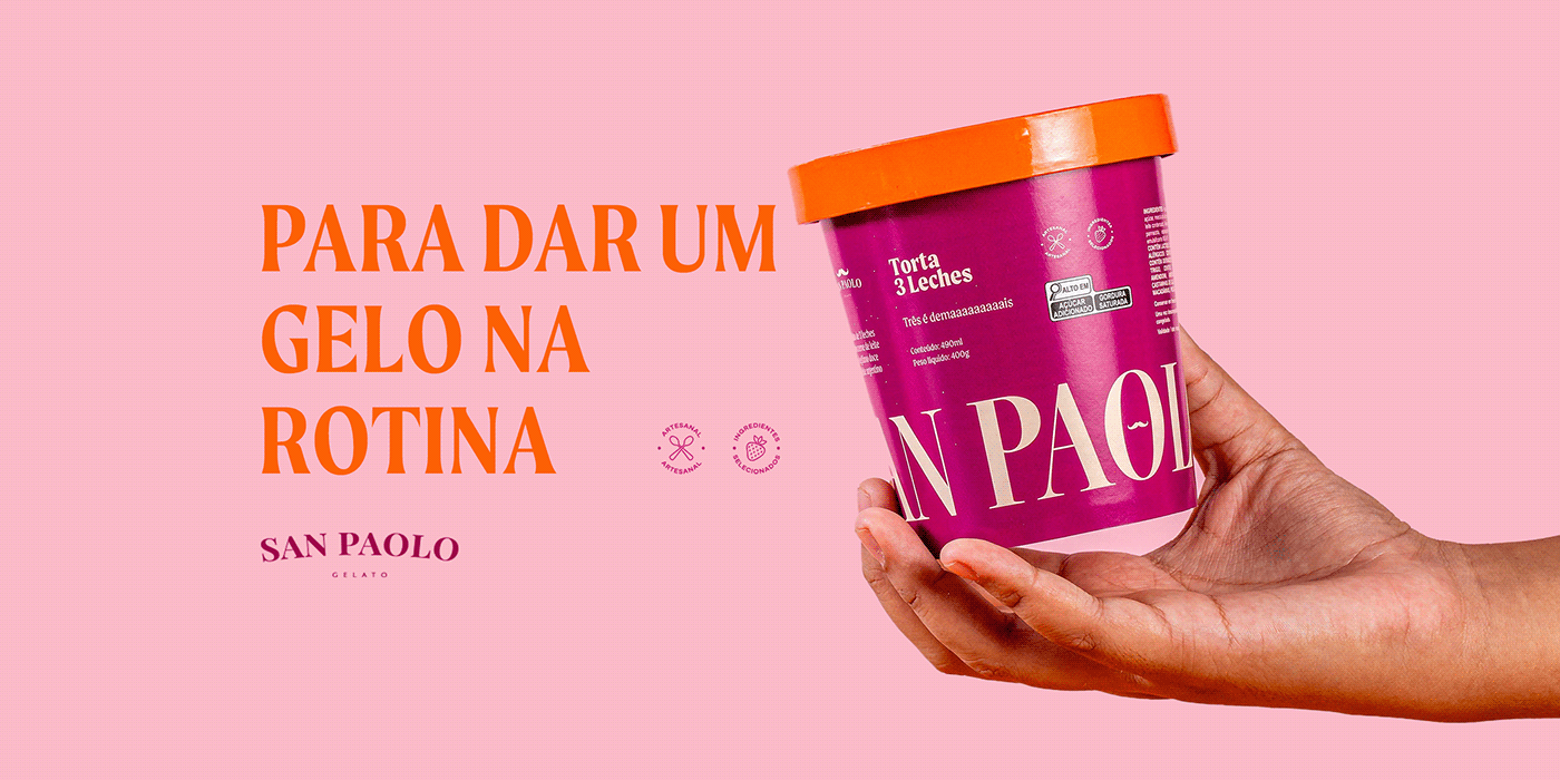
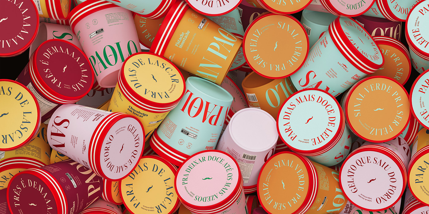
FOR THE LAUNCH OF SAN PAOLO ICE CREAM IN SUPERMARKETS, WE CREATED UNIQUE NAMES FOR THE SIX NEW FLAVORS AND THEIR RESPECTIVE VISUAL IDENTITIES ON THE PACKAGING.
The Challenge
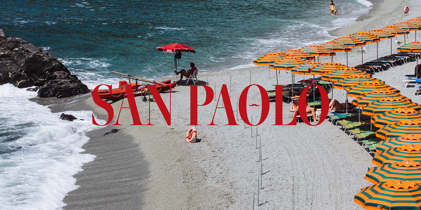
Our goal was to create a striking line of gelato packaging with unique names that stand out on the shelves due to their contemporary design, inspired by the world of italian gelato adapted to the brazilian palate. Drawing from the italian saying 'dolce far niente,' which evokes the idea of finding pleasure in every moment of life, this product line invites consumers to discover joy and flavor in their everyday life, especially during moments of pause or relaxation.
The Solution
With a fun and impactful visual design that evokes the artisanal aspects of gelato preparation, the project introduces a contemporary, conceptual packaging line inspired by the world of italian gelato. In this concept, we propose a visual approach that seamlessly combines the beauty of southern italian culture with the joyful spirit of brazil. This results in colorful, geometric, and elegant visual compositions combined with modern and bold typography.


For the naming, the chosen path consisted of descriptive yet appetizing names that set us apart from our competitors. To further explore the brand's personality through language, we crafted phrases to complement each flavor, adding an even more playful aspect to the entire experience.