Crafting character
The Brief:
“Take us from an old man beer to a future-proofed brand that’ll entice a new generation of beer drinkers.”
The Insight:
‘Old’ isn’t such a bad thing. As a nation, we’re obsessed with nostalgia and spend a lot of our time reminiscing and paying homage to tradition. From the food we eat to the clothes we wear and even the homes we buy – we celebrate the past by reimagining things for the future.
The Idea:
Characterful brews, colourful tales. Spark imagination with a brand worth sharing.
Positioning:
True character, by true characters. Inspired by Badger’s love for local tales, generational craftsmanship and passion for home and family, we created a brand as unforgettable as their beers.

Design strategy
A bolder Badger. To assert themselves as a category leader and a brand to explore within, Badger needed a kit of parts to feature clearly and consistently across everything. We crafted their existing logo to create a more iconic imprint, and created a bold new wordmark to unify the range and give the brewery the presence it deserves.


Tone of Voice
A beer you can’t put down. We gave each brew its own backstory, loosely based on a tale of local legend. Whether it’s true, half true or just true to us, each chapter offers the drinker a moment of escapism.
“We adopted the voice of a narrator, telling each story the way locals would do in a pub. Fun, intriguing and a little unbelievable – with Badger, you’ll always read the label.”
Lizzie
Copywriter
Illustration
Crafty characters. Alongside our colourful tales, we created a collection of characters that represent the personality of each beer. Then commissioned the talented Bob Venables to help make them jump off the page.
“Previously, every beer appeared like its own brand – and there was no obvious Badger identity on the labels to unify the range. Now each one features a crafted ‘masthead’ and type style that translates across the wider brand world too.”
Rich
Design Director


Look and Feel
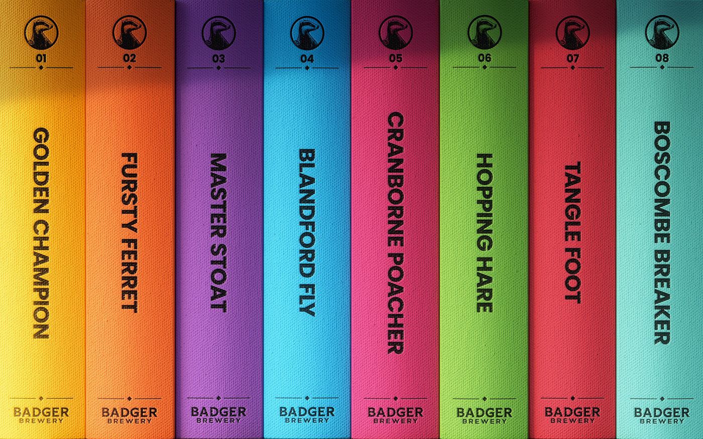
Future classics. For the typography, we took inspiration from the typesetting used in classic books to make each story feel like it had been ripped straight from your favourite novel. And chose bold, juicy colours to keep the brand feeling fresh, not fusty.

"Badger is strongly positioned to lead the charge within the premium ale category but to do so, we needed a bolder approach. Our time-honoured, traditional values appeal to all, but our visual identity kept us from attracting a younger audience.
Robot Food has helped us to adopt an exciting, contemporary approach whilst amplifying everything we stand for."
Giles Mountford
Badger Brewery


