How do you make a tech platform more human?
If you’ve eaten out lately, you’ve probably scanned a Mr Yum QR code. The mobile ordering and payments service is not just a critical part of the dining experience, it helps venues grow. Mr Yum needed a design system to convey their new positioning of ‘Better Together’, one that could power all parts of their business and capture the energy of their incredible culture.


Better together
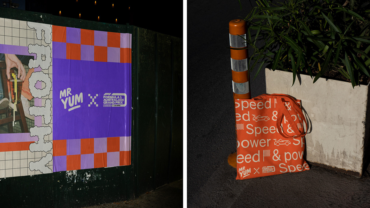
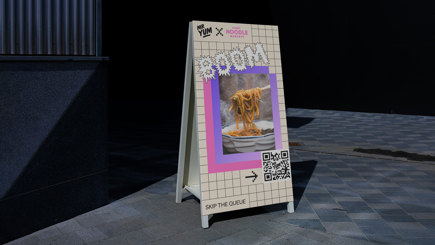
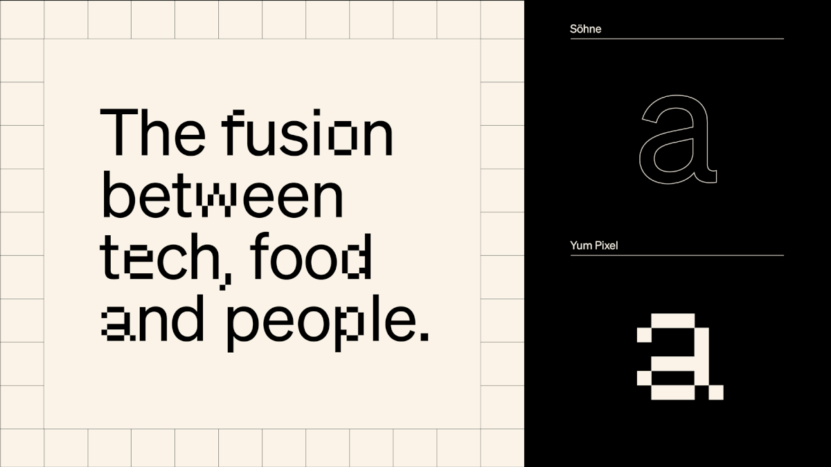
At its core Mr Yum is a fusion of food, technology and people. The refreshed brand features tech-inspired touches such as a visible grid that sits beneath every layout and a custom typeface by Wei Huang that nods to QR codes, which is designed to be interchangeable with Söhne by Klim Type Foundry. At the same time, it’s chock full of personality thanks to a super cute iconography suite and a set of flavour-filled secondary colours that complement the predominantly black and white palette.


Enhancing the experience
Mr Yum is a product-first brand, so the ordering experience keeps things simple with a dynamic digital frame that conveys the seamless transition from device to table. On the website, things get a bit more expressive. Content targeted at partners is balanced by moments of fun introduced through colour, language and iconography.


The rebrand has been a total game-changer. Starting a new design feels like a choose-your-own-adventure story, with no limits on where we can take it. The rebrand has also had a massive influence on our events, creating a buzz that's hard to ignore.
ANAIS, SENIOR LEAD - BRAND & VISUAL DESIGN


We've gone from entree sized creative options to a full banquet.
CHARLIE, SENIOR COPYWRITER