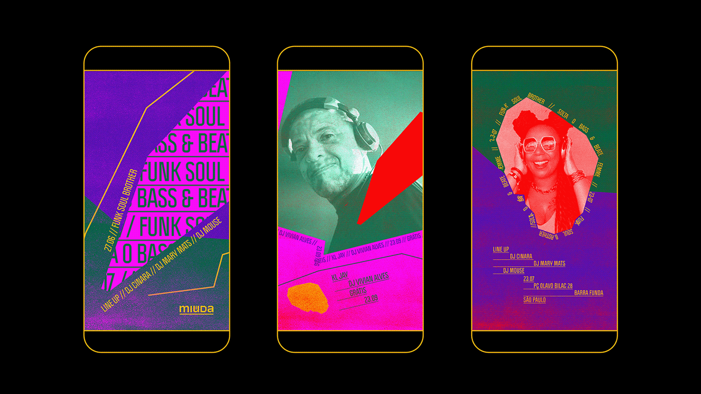
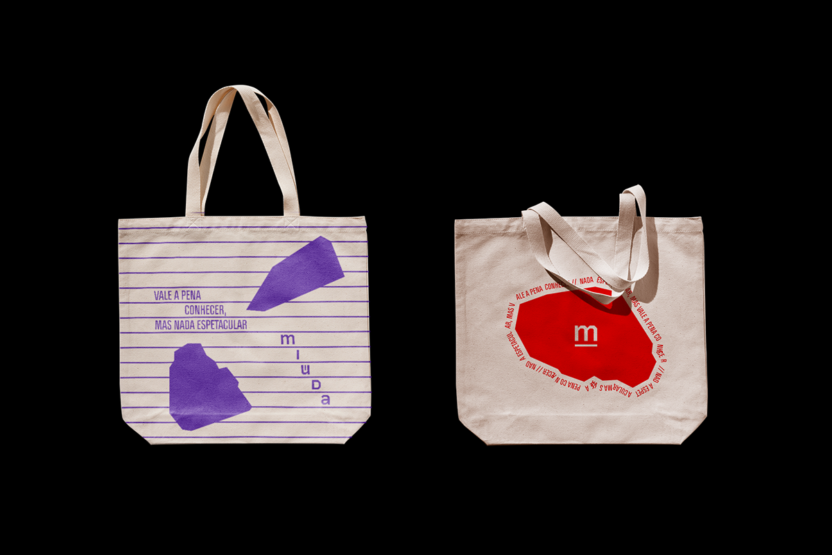
Introducing the new visual identity we created for Bar Miúda, located in downtown São Paulo. The logo we designed was inspired by the verticality of São Paulo and the establishment's concept of providing a free and open space for interaction, movement, and expression of its audience - something rare in the capital city. The spaces between the letters in the logo were intentionally left open to symbolize this idea.
---
Apresentamos a nova identidade visual que criamos para o Bar Miúda, localizado no centro de São Paulo. O logotipo que criamos foi inspirado na verticalidade de São Paulo e na proposta do estabelecimento de oferecer um espaço livre e aberto para a troca, movimentação e expressão do seu público - algo raro na capital paulista. Os espaços entre as letras no logo foram propositalmente abertos para simbolizar essa ideia.


For the identity, we also created graphic elements inspired by physical aspects of the Bar, such as the gravel floor of the former parking lot and the view of São Paulo city. By incorporating these two elements into the graphic compositions, it helps convey the bar's connection to the city.
---
Para a identidade criamos também grafismos inspirados em elementos do espaço físico do Bar, como o chão de britas do antigo estacionamento e a vista para a cidade de São Paulo. Esses dois elementos, ao serem incorporado nas composições gráficas, ajudam a transmitir a conexão do bar com a cidade.


We aimed to reflect the diversity of audiences and events that are part of the Bar's agenda through the color palette, and we incorporated typography as a graphic element to represent the buzz and excitement generated by the bar. With this visual identity, we hope to help Miúda communicate its main objective to its audience, which is to be a space of freedom, exchange, connection, and celebration in the city of São Paulo.
---
Buscamos refletir a diversidade de públicos e eventos que fazem parte da agenda da casa através da paleta de cores e trouxemos a tipografia como elemento gráfico para representar o barulho e burburinho que o bar gera.
Com essa identidade visual, esperamos ajudar o Miúda a comunicar ao seu público seu principal objetivo, que é ser um espaço de liberdade, troca, conexão e festa na cidade de São Paulo.