
Comprehensive rebranding
Gorilla IT was a well-run organization looking for professional growth. Both internally and externally. After a previous collaboration with another client, they asked Total Design to reposition their company and develop appropriate branding and visual identity to go with it. From a brand strategy to website development, and everything in between.
Professional development
Through a series of content sessions, we worked with Gorilla IT to get to the core of their brand. This was the starting point for the new positioning and branding process. The positioning also formed the beginning of a business formula that gave direction to the portfolio, their position in the market, and sales.


A new perspective
The new brand story provided direction for the organization and made employees recognize themselves in the organization. A sharp finding from space travel represented Gorilla IT perfectly. For example, during his 1961 space mission, Allan Shephard said “All systems go!” All his systems critical to his mission functioned flawlessly. Exactly what Gorilla IT also does every day for its customers.
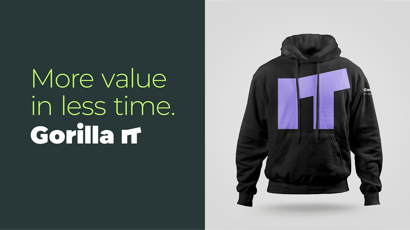
The brand story offered a whole new perspective on communication with (potential) customers. From now on, Gorilla IT looked at everything from the customer’s perspective instead of from its own services. All systems go! became their payoff. This made the connection between the worlds of the customers and the business of Gorilla IT.


More than modular
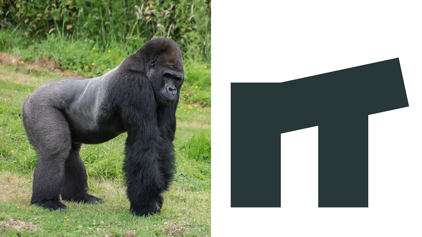
A busy creative session and an exciting brand story provided the starting point for the development of the new visual identity. To be fair, it wasn’t easy. How do you visualize an organization that provides quite complex processes and services for non-IT experts? The logo provided the initial insight and became a natural representation close to home. Within the logo you read “IT” but if you look further you also see a gorilla in a distinctive position. This visualizes Gorilla IT’s leadership positioning and also implies that problems can be solved in a powerful but simple way.
The unique form elements and colors were based on the organization’s USPs, thus expressing all the benefits without saying a word about it. The emphasis on icons helps Gorilla IT easily explain its processes, models and services to its target audience using what we call “graphic storytelling.
The personal photography style, striking colors and the additionally clean infographic and icon style create a perfect combination of serious business and playful collaborations. As such, it perfectly matches the organization’s internal mentality portrayed: work hard play hard. The result? An identity that both the mostly young employees and the experienced CEO and CFO target groups can identify with.
The more than modular visual identity has a strong digital-first character. For example, the font was selected based on an enjoyable experience for Developers and the logo’s non-100% white and black primary colors provide a user-friendly screen experience for everyone. This makes it smart branding for a smart organization.


Facts
Client: Gorilla IT
Project: Strategy, Brand, Identity, Activation, Tone of Voice, Website
Agency: Total Design
Agency: Total Design
Credits
Head of Branding: Henriette Verkerk
Head of Smart Builds: Ilse Rombout
Head of Smart Builds: Ilse Rombout
Strategy Director: Martijn Arts
Creative Director: Martijn van den Brakel, Edwin van Praet
Designers: Adam Lane, Alex Tidby, Martyna Piskorz, Timon Weerstand
Front-End Developer: Erwin van Ekeren, Lex van Hees, Rosyl Budike
Client manager: Marloes Pijning
Implementation Designer: Arjen Firet
Thanks to
Kaiton Buitendijk, Daan ter Avest, Theo Schammeijer, Klaas Jan van der Bent and more involved
Awards
International Design Awards (IDA), Gold, Print Corporate Identity
International Design Awards (IDA), Silver, Multimedia Brand Identity
International Design Awards (IDA), Silver, Multimedia Brand Identity
York, Silver, Branding
Thanks for watching

