Context
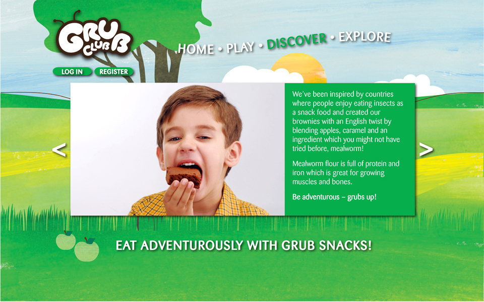
As the global population continues to grow, there is a growing move towards eating insects as a staple part of our diet. However consumer disgust remains a large barrier in many Western countries.
Self Initiated Brief
Create a brand which challenges perceptions about eating insects, making it an appealing prospect
Concept
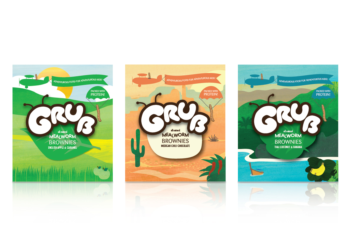
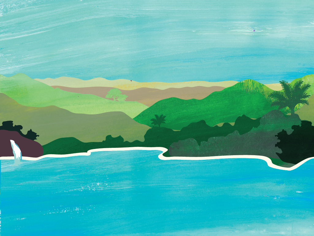
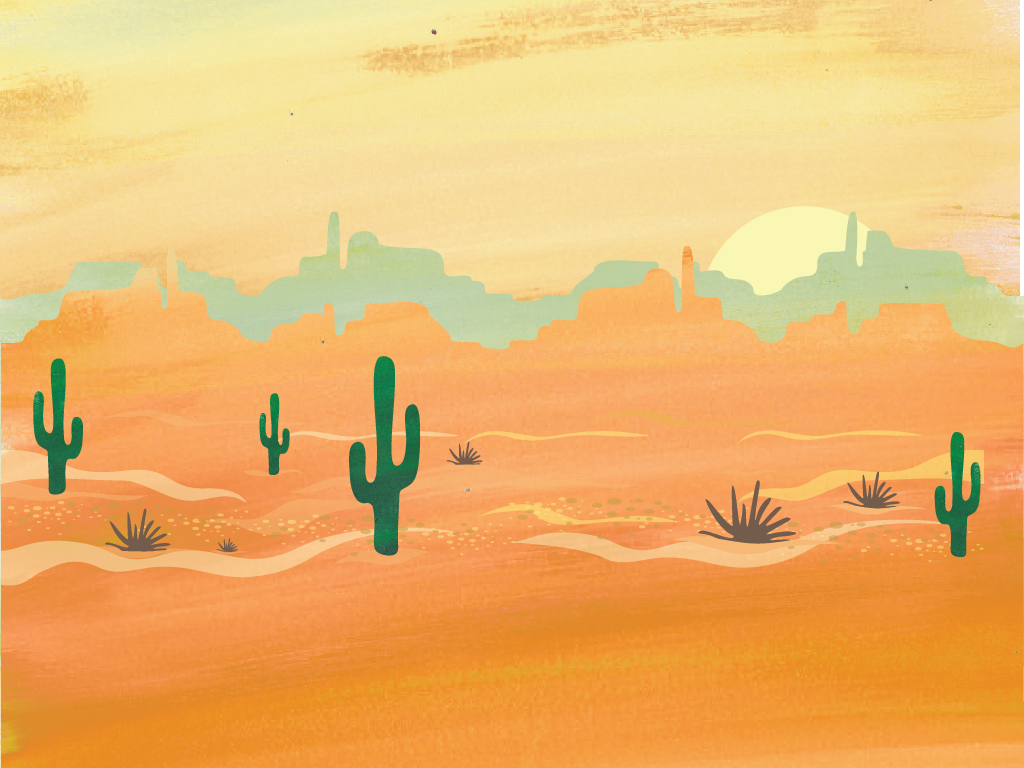
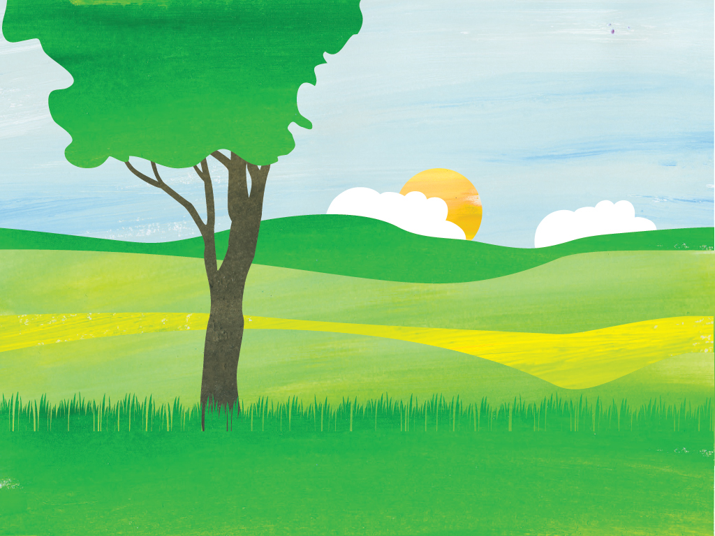
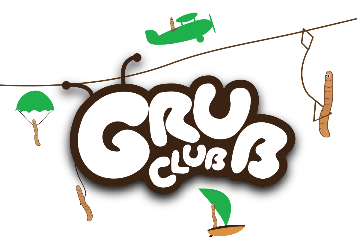
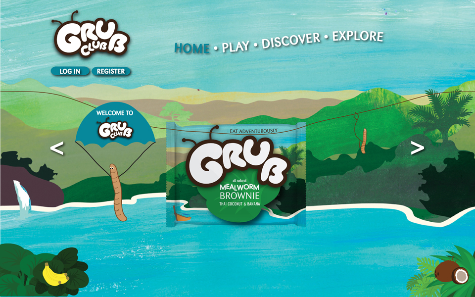
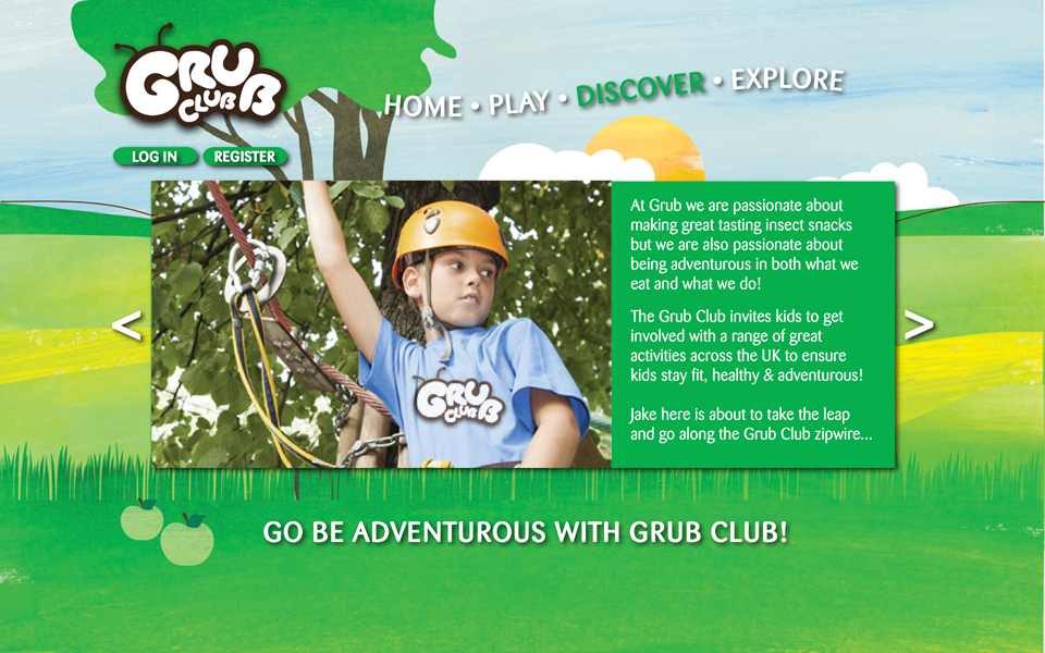
The Grub identity is an engaging, playful brand aimed at children, making eating insects a less daunting venture. Kids act as a great target market since their prejudices associated with insects may not have been built up as strongly, which may in turn influence the adults! Adventure is at the heart of the Grub brand with the motto being 'adventurous food for adventurous kids'.
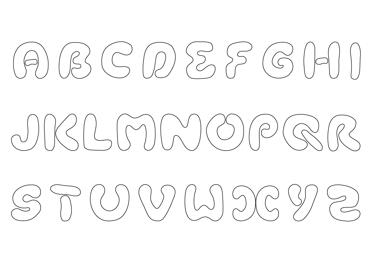
Grub Logo Typeface
The typeface began with the letter 'G' which forms a curled up grub shape, the rest of the typeface evolved by using one continuous tube shape to mimic the rounded nature of a grub.
The typeface began with the letter 'G' which forms a curled up grub shape, the rest of the typeface evolved by using one continuous tube shape to mimic the rounded nature of a grub.