OWNING THE EW
The Brief:
“We need a brand that balances ‘good for’ with ‘good fun’ – and celebrates our all-natural nature.”
The Insight:
Whether it’s training them or spoiling them, we use treats to bond with our dogs. But with so many brands using humanisation to tug on our heartstrings, it’s easy to mistake what looks good to us with what’s actually good for them.
The Idea:
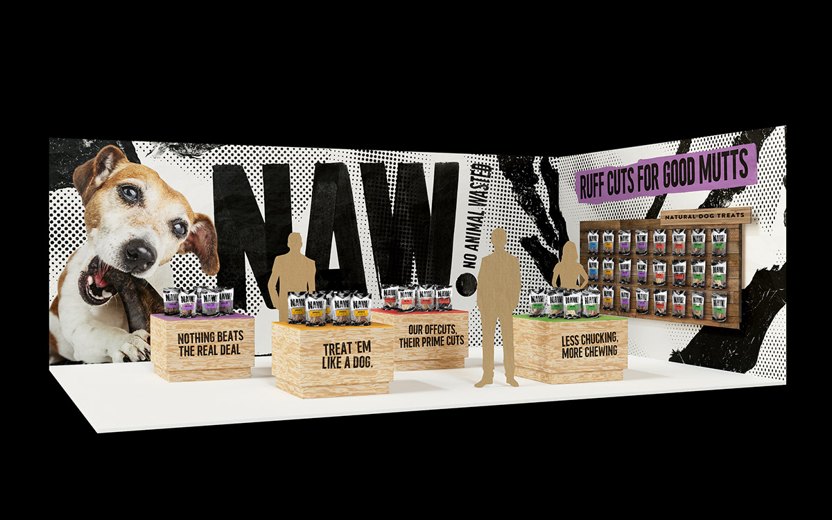
Treat ‘em like a dog. Create a brand that embraces the hairy, the chewy and the ewwy – because let’s be real, that’s what our dogs really want.

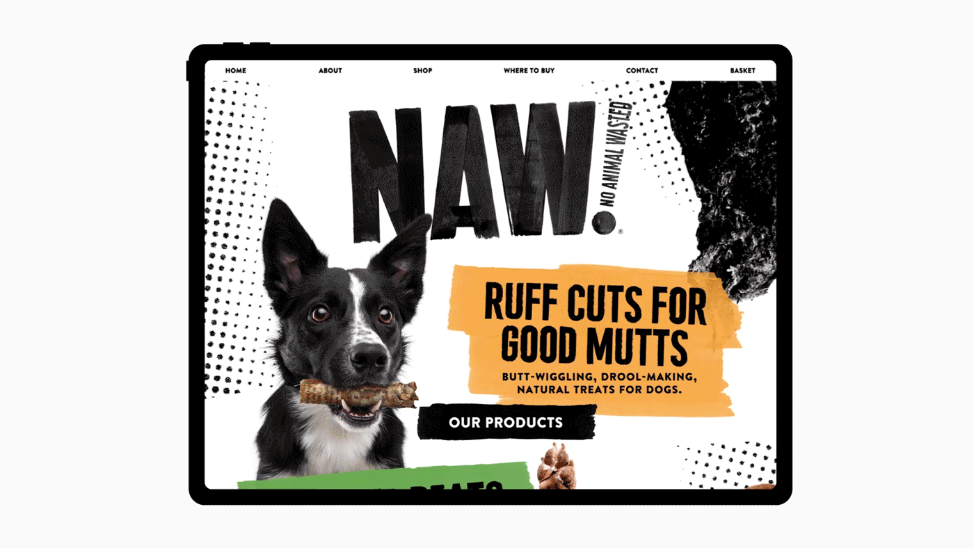
Our offcuts, their prime cuts. The brand needed an attitudinal name that would stand out amongst all the cuteness in the category. With its double meaning, ‘NAW’ (No Animal Wasted), reflects the dog’s experience, as well as the key product benefit of minimally processed, ‘ears to tail’ treats that reduce waste.

Channelling the unapologetically natural nature of the products, we gave NAW its own font, ‘Ruff Cuts’, complete with nuanced, hand-painted characters for added edge.

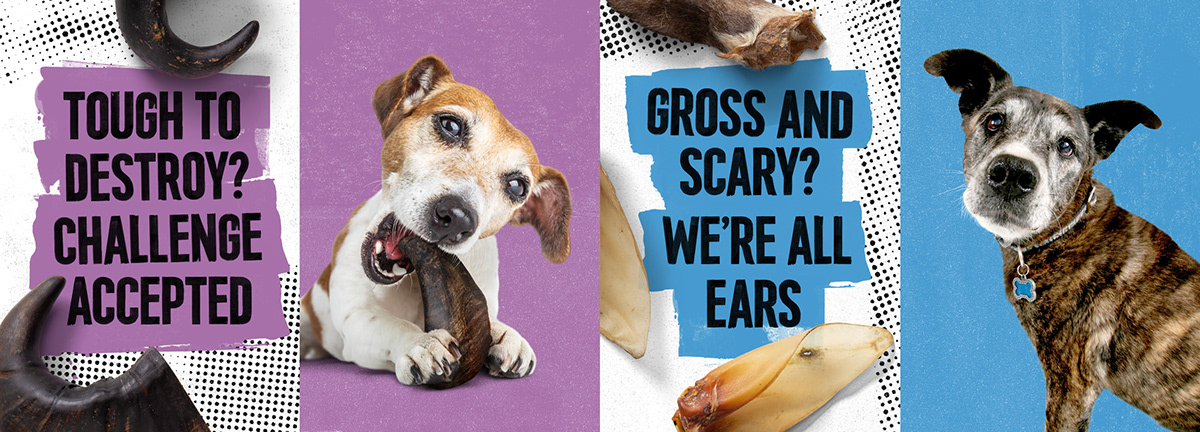

We’re not eating these treats, our dogs are. So for the tone of voice, we put ourselves in their paws, unleashing the personality of our inner dog and writing from their point of view.


Taking inspiration from progressive human foodie brands, we used photos of the treats to create textural patterns for a raw and expressive feel.


“The products are no more gross than a butcher's shop window or a cured sausage so we wanted to show them off – no cutesifying or trying to mask what they really are. This idea influenced every design decision we made, including which dog imagery we chose. No fur babies, just real dogs, slobber and all.”
Julia
Senior Designer

“Whether it’s crunchy chicken feet, pig’s ears or hairy lamb’s tails – with NAW what you see is what you get. The messaging had to strike a balance between saying it how it is and not putting us humans off! We chose to always lead with the positive, explaining why something gross to us is actually bloody great for them.”
Lizzie,
Copywriter