


Client: Interior design school American Academy of Interior Design; new branding and a refreshed image.
Aim: Image that is equal parts solid and established; approachable and open.
Solution: For the logo mark, custom letters were created using basic shapes; suggesting the principles of design and reminiscent of modern art.
A beautiful humanist sans serif grounds the logo and brings an air of stateliness befitting the academy.
The deep burgundy, sharp navy and stark white color palette is a sophisticated take on the red, white and blue of the American flag.
To balance the square, blocky look of the logo, a fun, engaging collateral pattern was designed; thereby creating an approachable atmosphere.


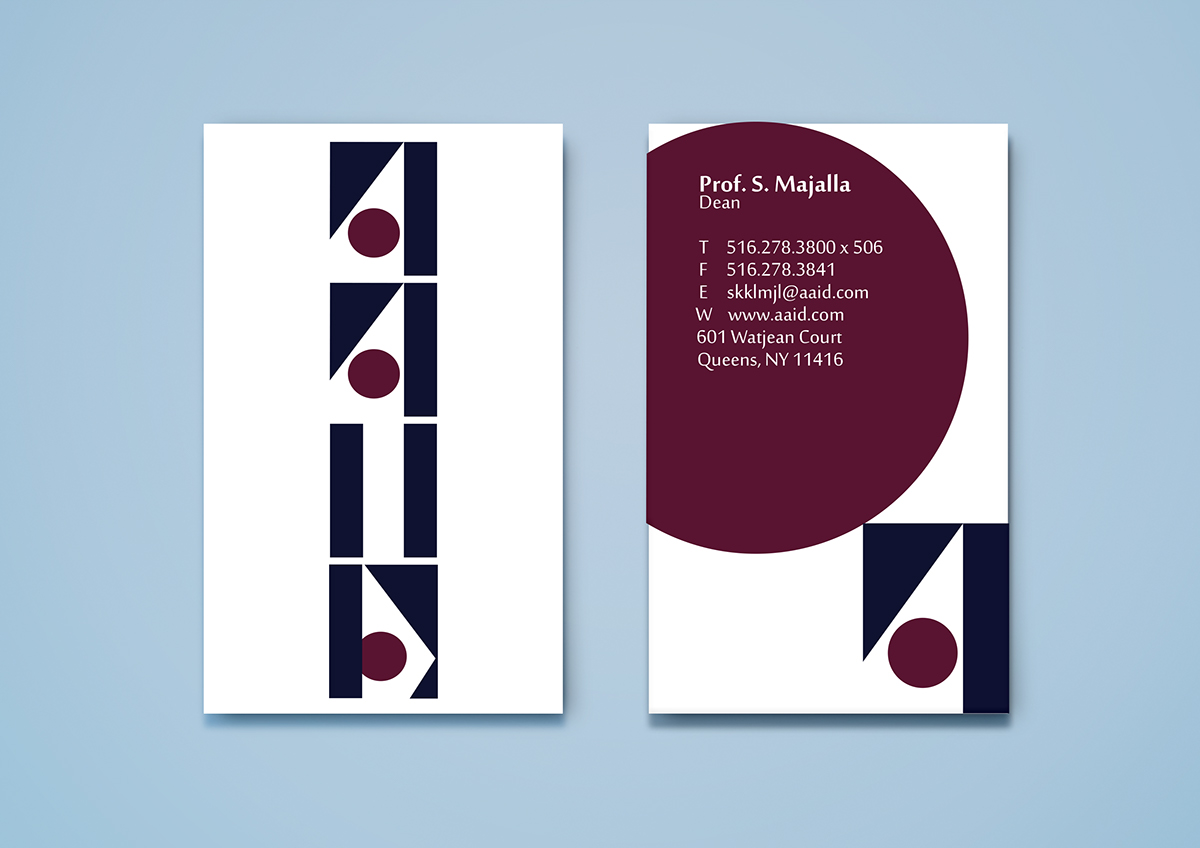
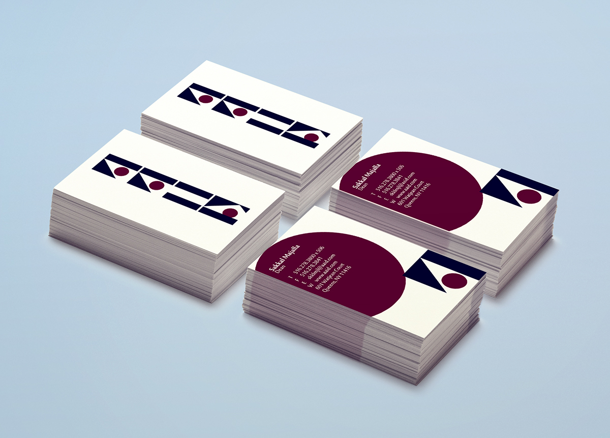
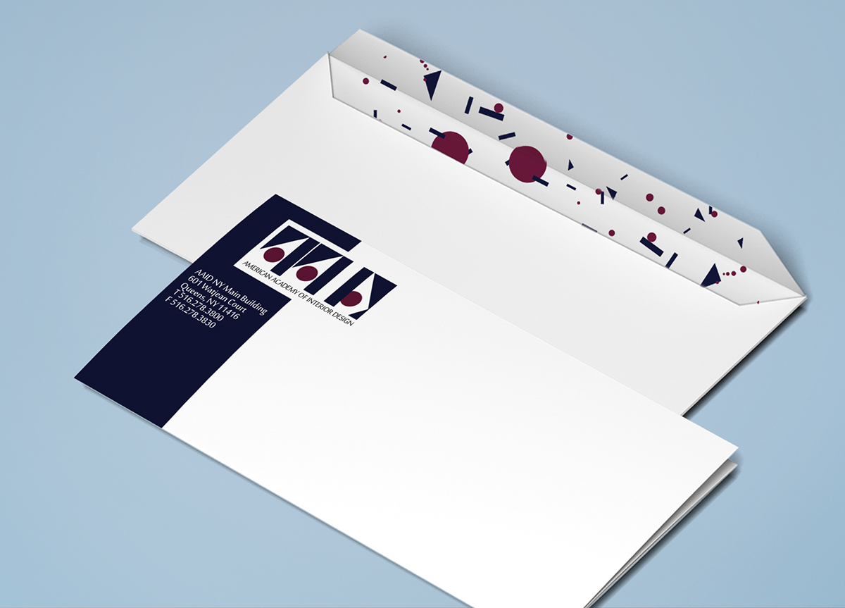


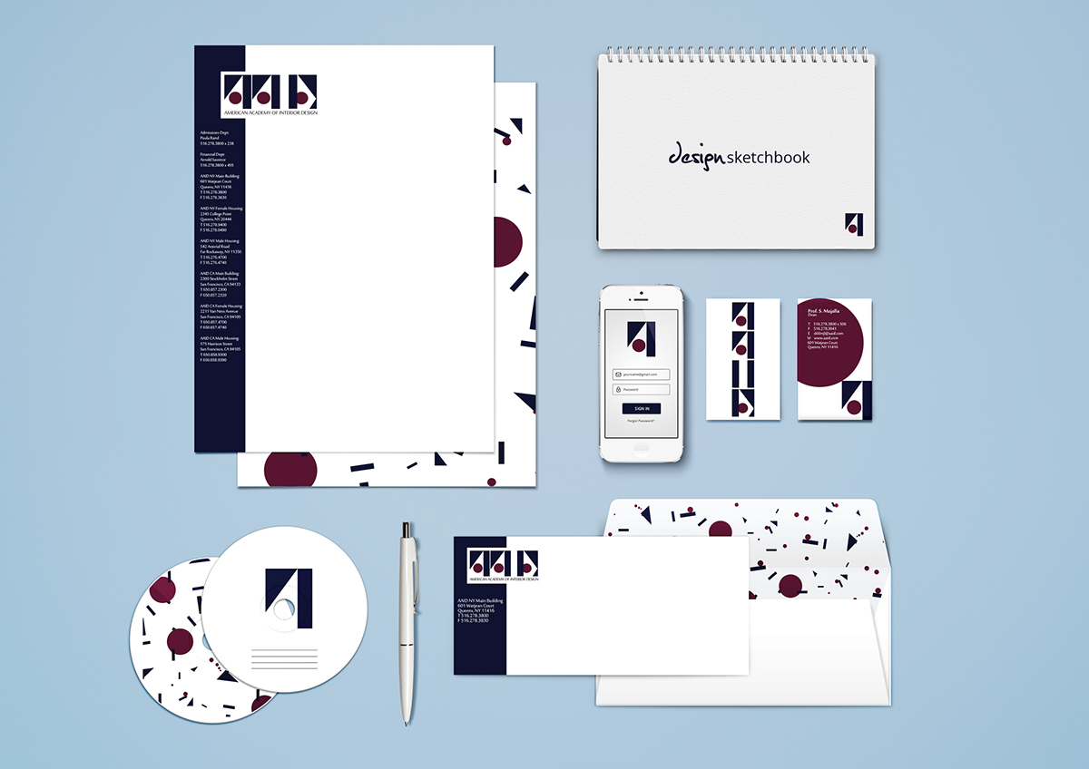
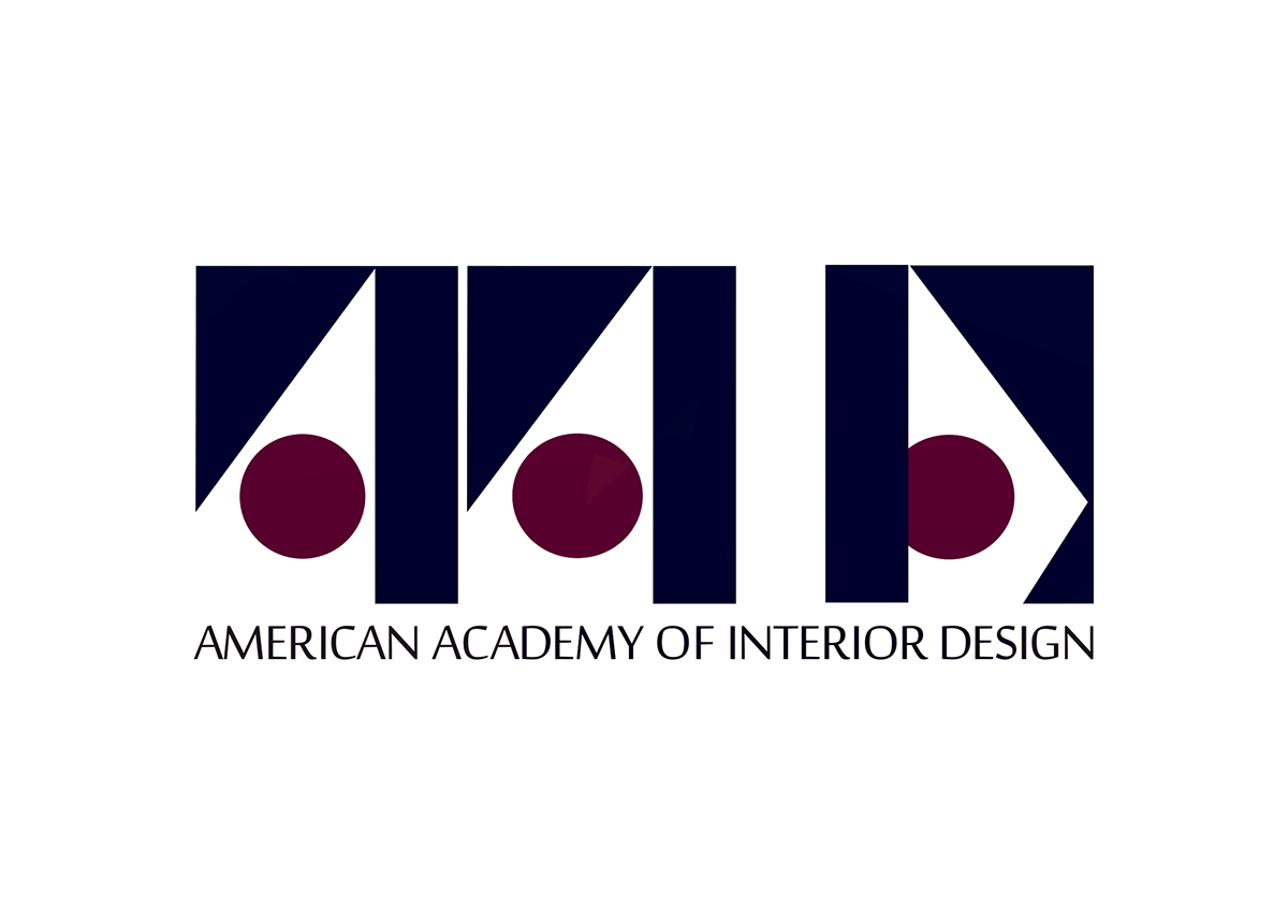
Custom letters built from basic shapes suggest modern art and the principles of design. The logo is versatile and can be used in its horizontal and vertical forms, as well as the single letter 'A'.


