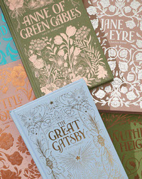
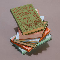
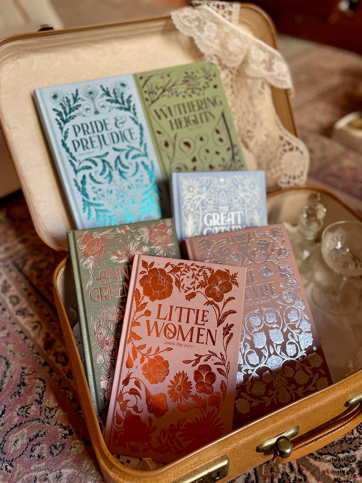
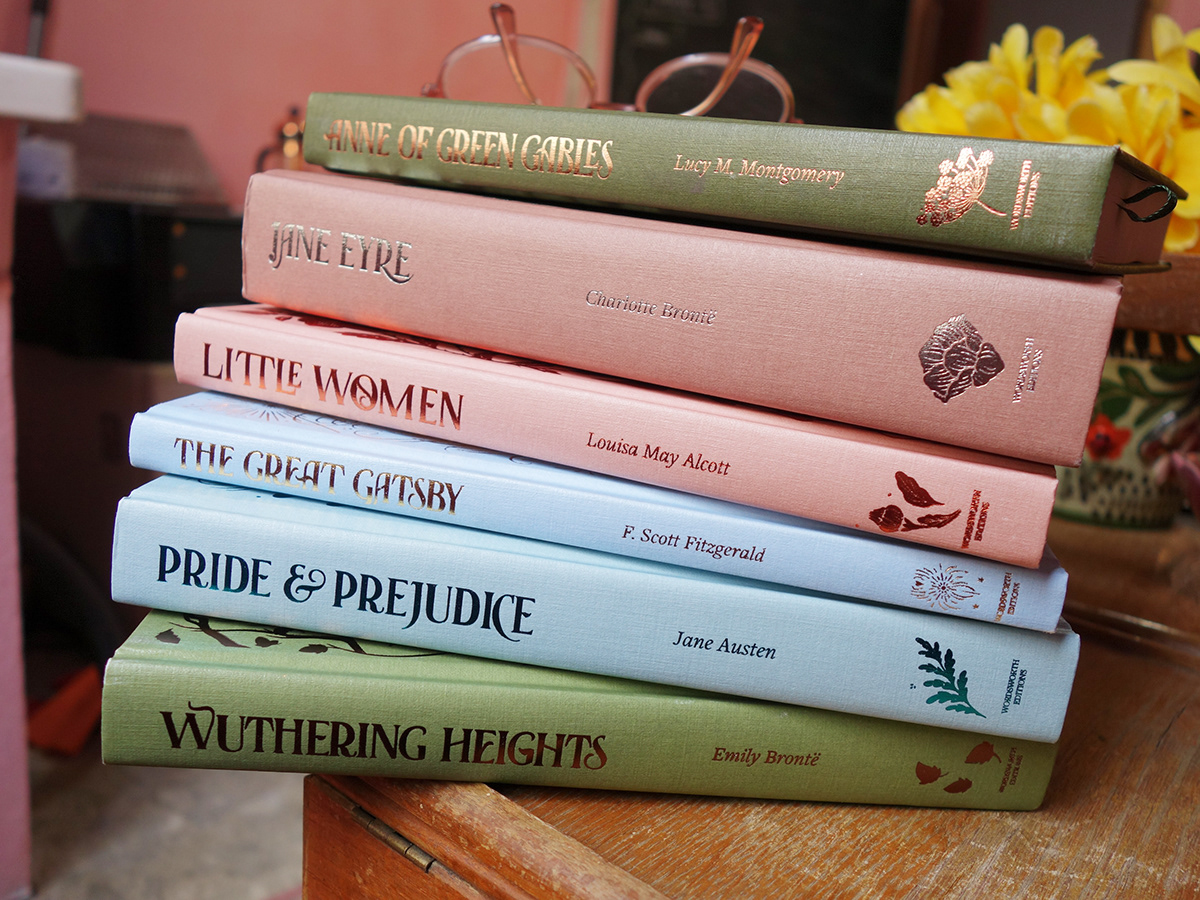
• Six Classic covers for Wordsworth edition •

They are finally here. Oh joy ! Six classic books dressed up in gold, copper and silver foils on fabric covers. Please enjoy these little marvels illustrated for Wordsworth edition.

For this project Rémy came back to the studio to work on the typography part and I must say the result is beyond expectation. Typography and botanic, we reunited with our very own identity !
For this project we thought a lot about how to create a series effect without loosing every book’s spirit. For that we chose to create one single bold and elegant typography that would suit every stories. This one would have variations in it to recreate unicity on every book cover. Same same but different
On the illustration aspect, we tried to evoke the spirit of every book before opening it.
Can you feel it ?
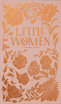
Little Women
Four flowers for the four sisters.
On little women, each flower represent one of the girls March. The proud rose Amy, the reasonable daisy Margaret, the fearless pansy Joséphine, and the charitable bindweed Elisabeth.
Just like Jane Eyre, the illustration was here right from the beginning ! The composition, the four flowers chosen for there symbolism.
. The composition was set right from the beginning and hasn't move. It happens sometimes ^^.


from sketch to final


We also created an inside pattern for the first and the last pages of each books
Pride & Prejudice
Simplicity and elegance of the fern and the feather.
It is hard to choose between all of these stories, but I think my favorite is Pride & Prejudice. I've read the book, I've watched the films. I just love Jane Austen.
Pride & Prejudice you can find the typical English countryside Fern & wildflowers where the book is set plus the peacock feather symbol of pride. All of these merging and dancing in elegant arabesques.


We even isolate a tiny part of each illustrations to be set on the spine. Every elements are connected to each other.

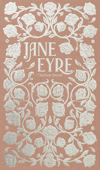
Jane Eyre
Blooming roses and Arabesques
For this cover I wanted a modest and elegant composition. Intricate roses arabesque, symbole of love convolution as a reflection of the story of this excellent book.While sketching I knew, like an intuition that the illustration was settled. It came so naturally. And you can see that there hasn't been any changes since that time.


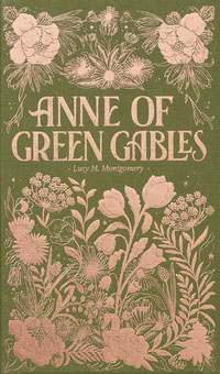
Anne of Green Gables
A countryside feeling.
For this cover I wanted a springy feeling, the view of a field in full bloom, It is joyous, generous and ephemeral. From the sketch to the final file some slightly changes has been made. The composition is less symetrical more vibrant like a bouquet of spring flowers, poetical and wild.


Great Gatsby
An explosion of sparkles
Champagne bubbles, fireworks, shooting stars, your eyes can literally glide from one arabesque to the other, it is a bright rollercoaster.


I hope you enjoyed this project. It was a dream of mine to illustrate book covers and I thing I just ticked this box on my dream job wishlist. Next would be a deck of cards and a proper wallpaper. Finger crossed.