Colour Mill
The delightful crew at Colour Mill wanted an identity that would reflect the vibrance of the food colouring products (pigments, not dyes!) they offer. We whipped up a top-to-toe rebrand that’s as fun, exciting and enticing to look at as the things their customers create and cements their status as the best, brightest and boldest in the biz.
What's all this then?
Colour Mill is an Australia-based, market-leading food colouring brand that’s been making mess in the kitchen for more than 30 years. In a category filled with subpar products, they pride themselves on their specialty pigments (rather than dyes), which achieve unmatched creative results for their incredibly dedicated, cake-making and baking customer base.
Any insights?
The cake-making and baking community is vivid and vibrant. They’re dedicated to delightful creations, rich in colour and joy, and yet the majority of the brands providing their products are dull and uninspiring. And whether they’re hobbyist bakers or it’s their full-time business, they take cakes seriously — they’re not an afterthought, they’re a work of art, and they want their decorating products to deliver.
And what seems to be problem?
Though the quality of Colour Mill already made them a household name among cakers and bakers, their branding didn’t pack the same punch their products do. Wanting to set themselves apart from the subpar, they needed an identity do-over that would express what they’ve got to offer — premium, playful and kaleidoscopic with colour. And, as a large amount of their customer conversion comes from social media (cake-decorating Insta and TikTok is a world of its own), they wanted to give their dedicated community products that look as beautiful on the bench as they do in their baked goods.
So how'd you go about it?
It made sense for the brand to reflect what its community creates, so it began with the idea of “colour play” — a concept that celebrates the joy, play, mess and finesse throughout the cake-decorating process, from kitchen counter to baking tray to final touches. We wanted the brand system to be expressive, imaginative and flexible, allowing it to reflect the spectrum of baked goods — from sophisticated and elevated right through to sweet, sugary chaos.
The cherry on top of the brand system
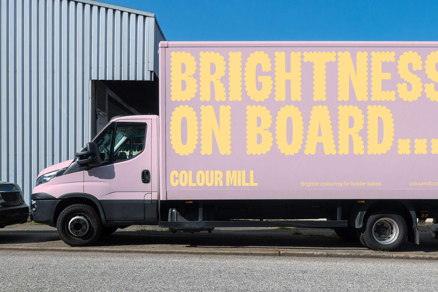
Among all the brand elements, the logo acts as an anchor. It needed to speak to everyone from hobby bakers to wholesale bakeries while maintaining the playful personality of the brand. It’s made from a custom typeface — a bold, condensed san serif with subtle appendage quirks that imbue a little life. It’s a solid base — friendly, approachable, always open to decoration, but clean enough to talk business when it needs to.
An appropriately piped typeface
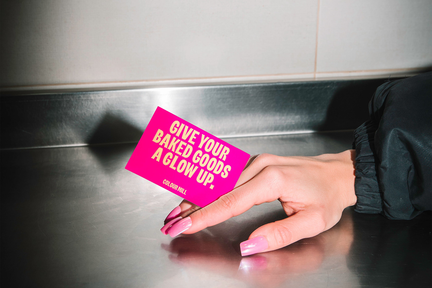
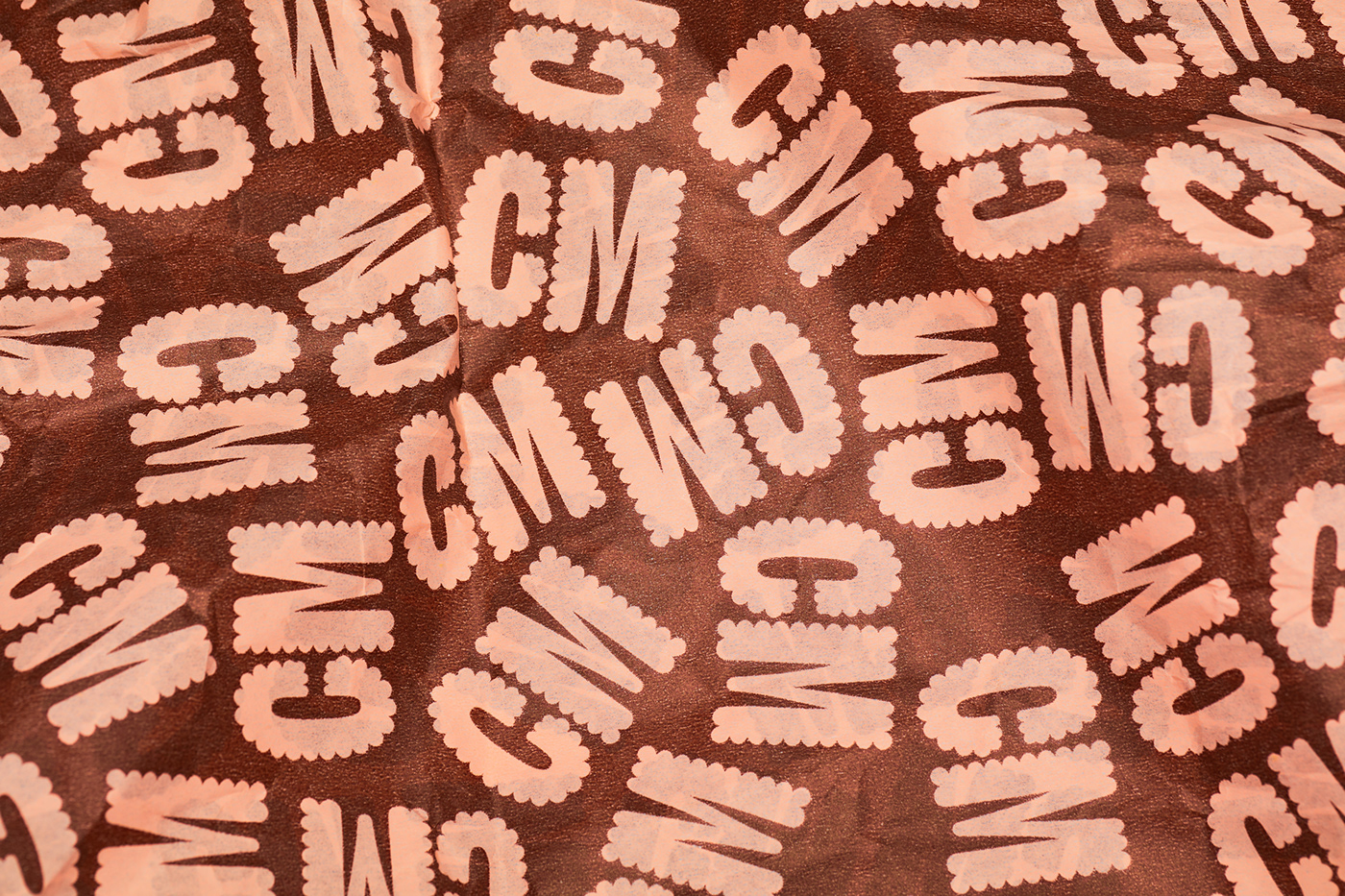
When we said the logomark was open to decoration, we meant it. What started with two letters, the Colour Mill “CM” brand mark, grew into an entire font family. Inspired by piped icing textures, “Colour Milled” is a simple, ownable asset that makes any application immediately recognisable to the brand. It pairs with Studio Pro — a modern, neutral sans serif workhorse that carries larger bodies of content while still standing strong on its own.

Giving the brand a vibrant voice
It’s no use having a typeface full of confidence and fun without the words to match. Working with copywriter Cat Wall, we carefully measured out all the ingredients necessary for a verbal identity that’s as colourful as its visual counterpart. A solid foundation of simplicity and approachability, tied together with confidence, lightheartedness and a (glitter) dusting of cheek. Rolled out into a suite of messaging that’s sweet without being sickly, the brand talks as brightly as it walks.

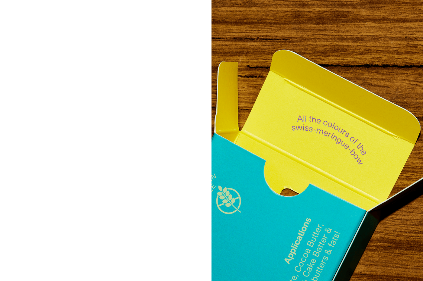
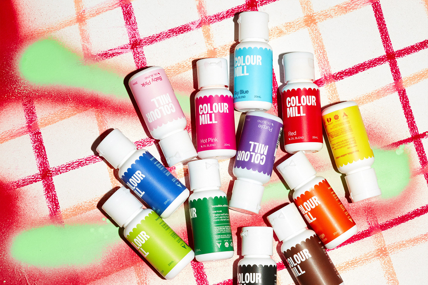
All the colours of the swiss meringue-bow
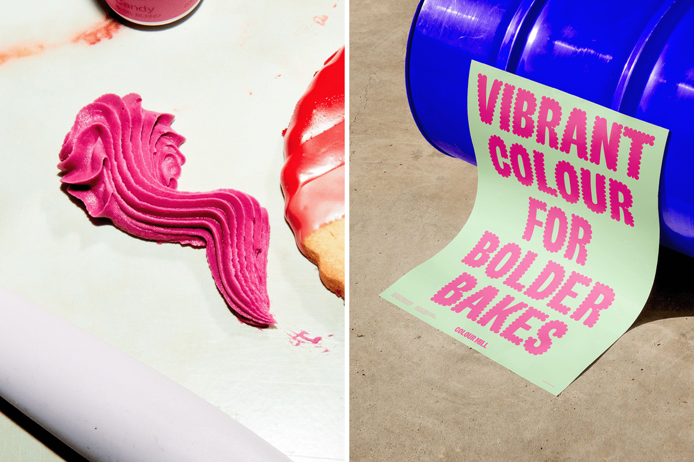
When working with a colour brand, an explosive palette was a no-brainer. We devised a flexible system that allowed the team to play with the expansive spectrum of colours they offer in their products and sets. There’s a curated collection of complementary colour combinations that can be used across campaigns and marketing, making it easy for the client to take the expressiveness up to 10 without compromising on the premium feel.

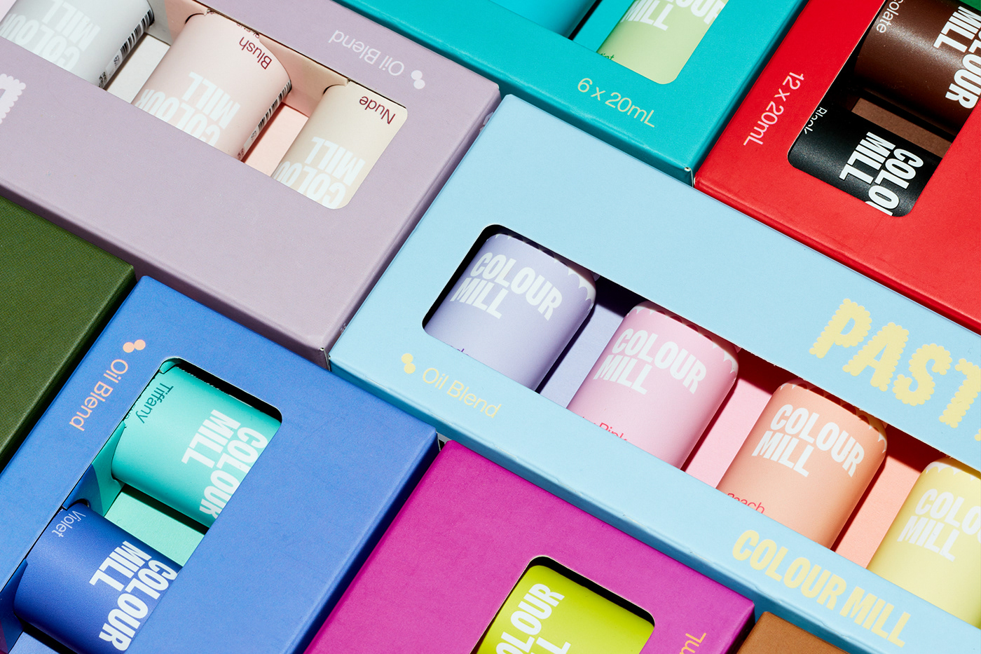
Packaging full of punch
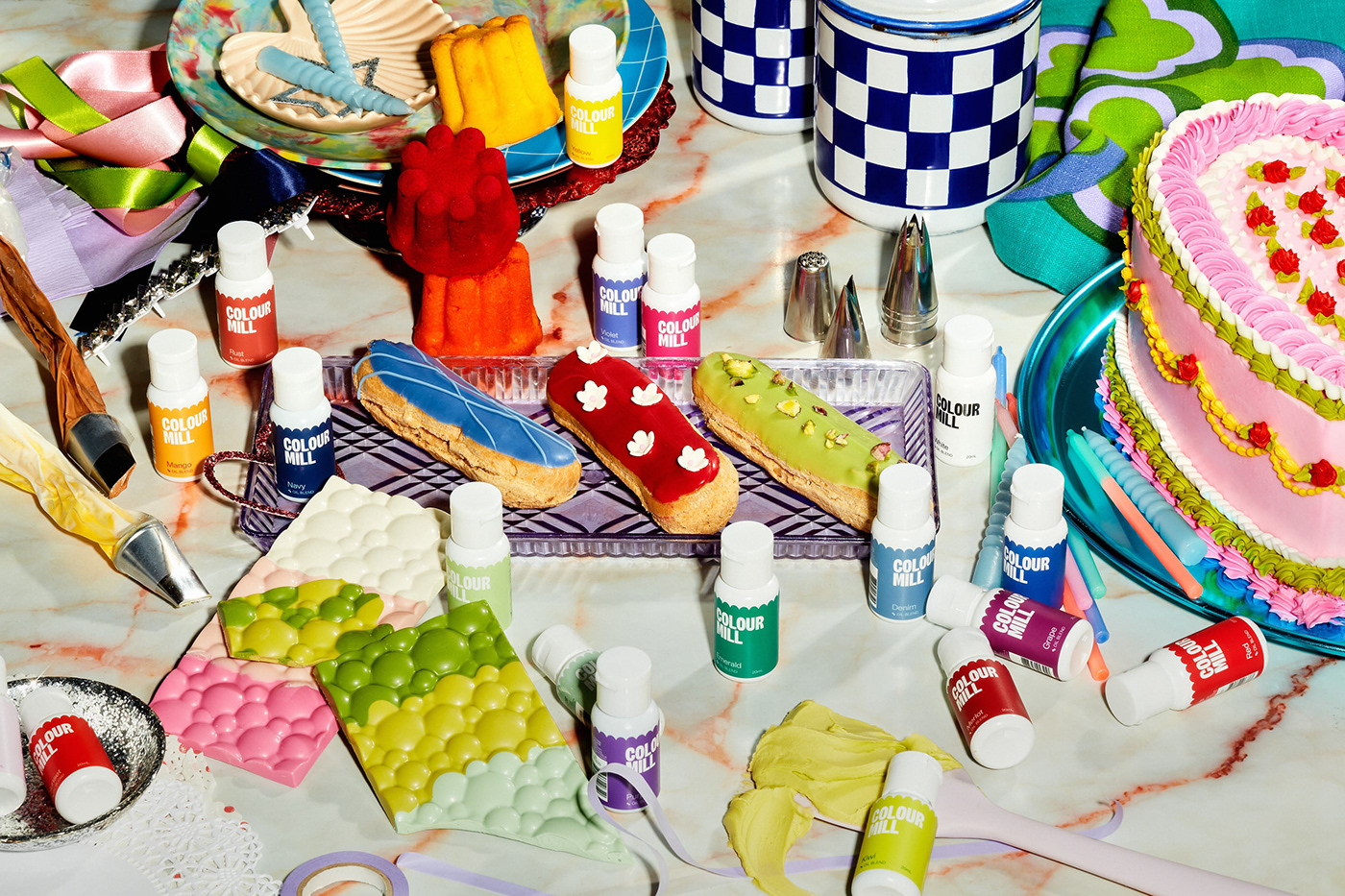
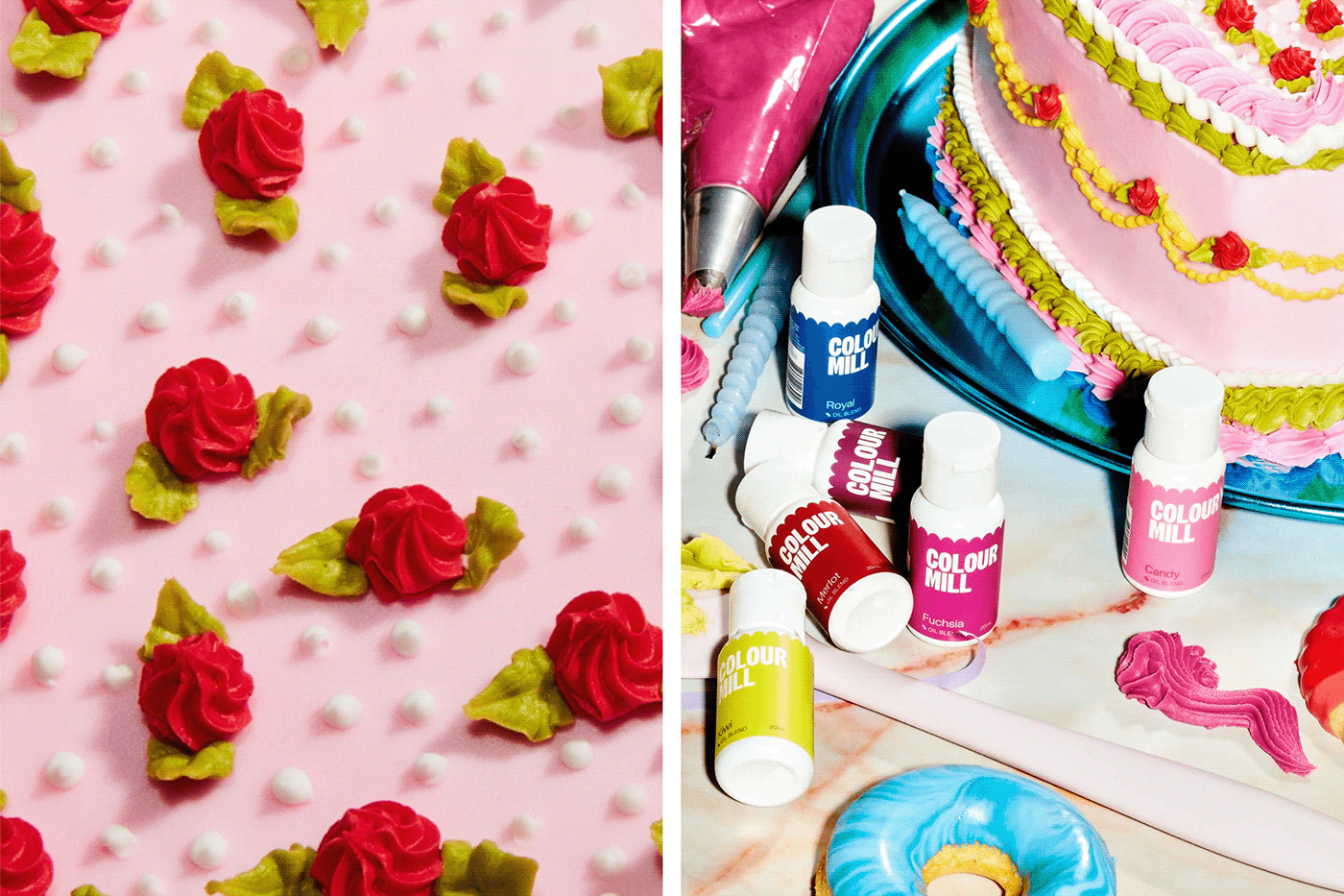
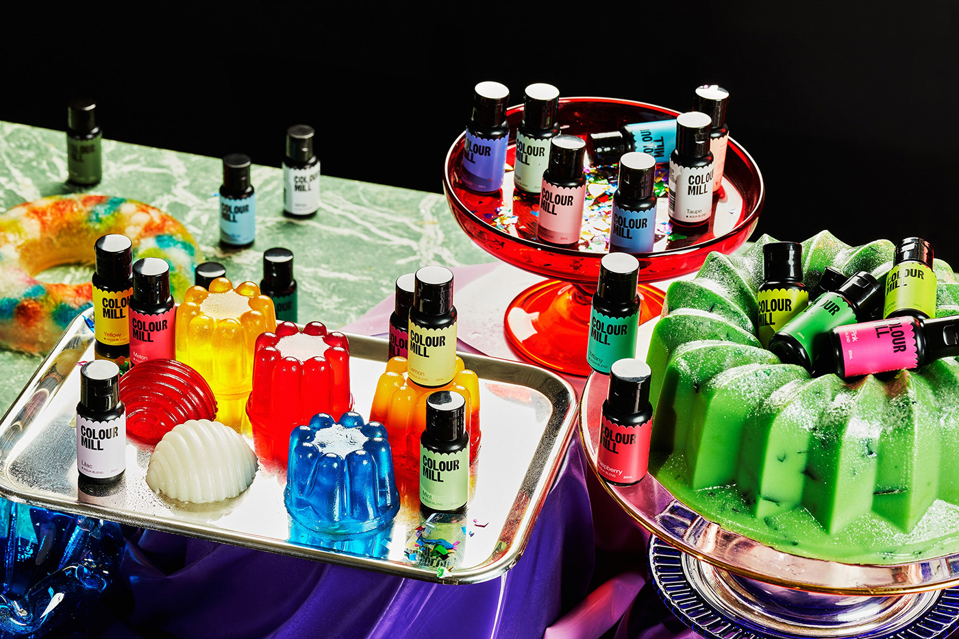
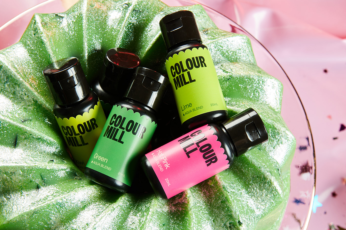
Striving to reach an audience of aesthetically-driven bakers and cake content creators, the #shelfie is a key consideration. Working with Colour Mill’s existing bottles and manufacturing methods, we made a full-bleed label design for each colour, setting them apart in the category while feeling at home in the flamboyant cake world. The size of the bottle posed an interesting challenge — how do you create a distinct brand presence on a tiny canvas? We brought our piped edge into the label dieline and, alongside the colour pairings for copy, the brand shines through despite the size of the application. Each bottle looks as beautiful alone as it does in a collection.
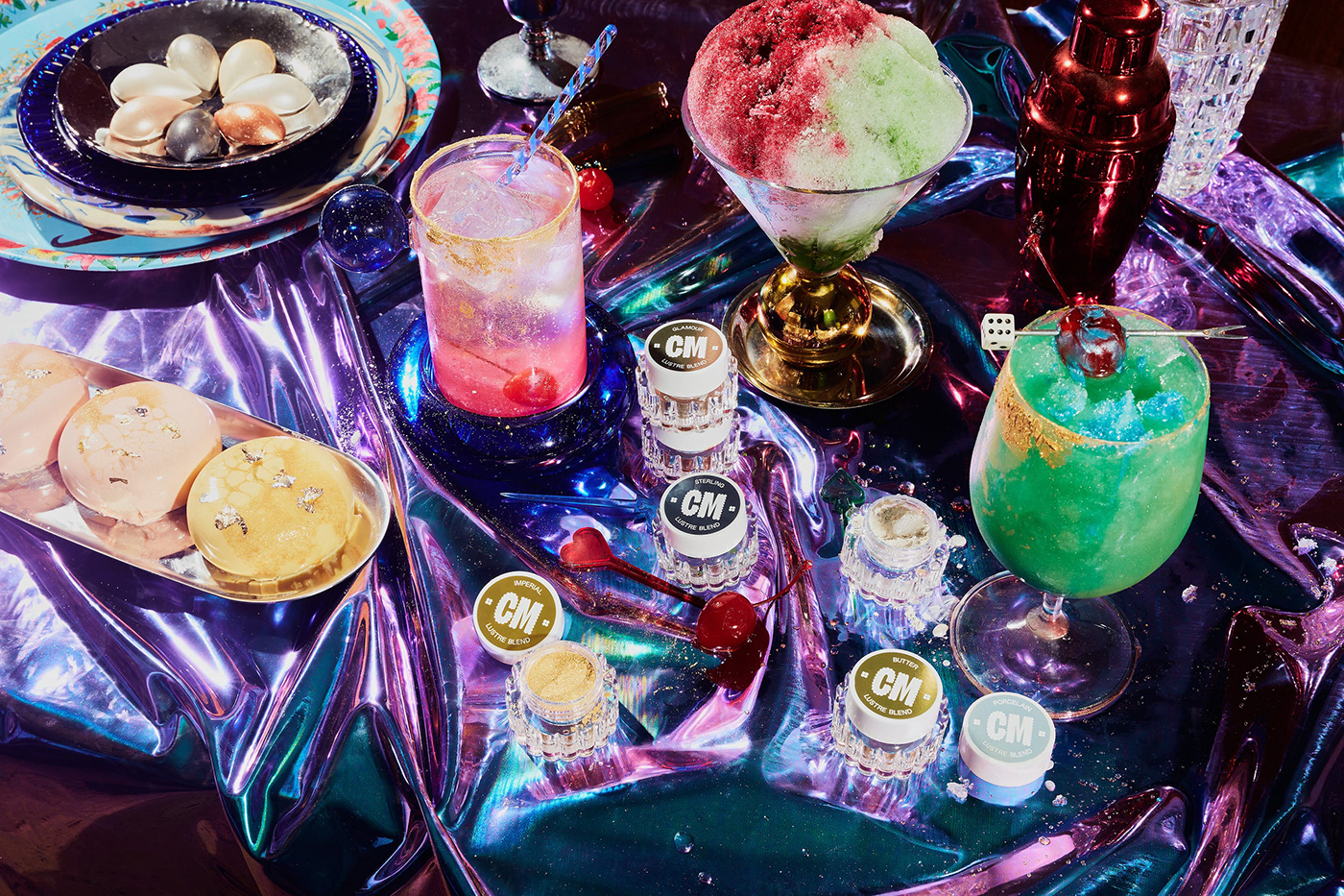
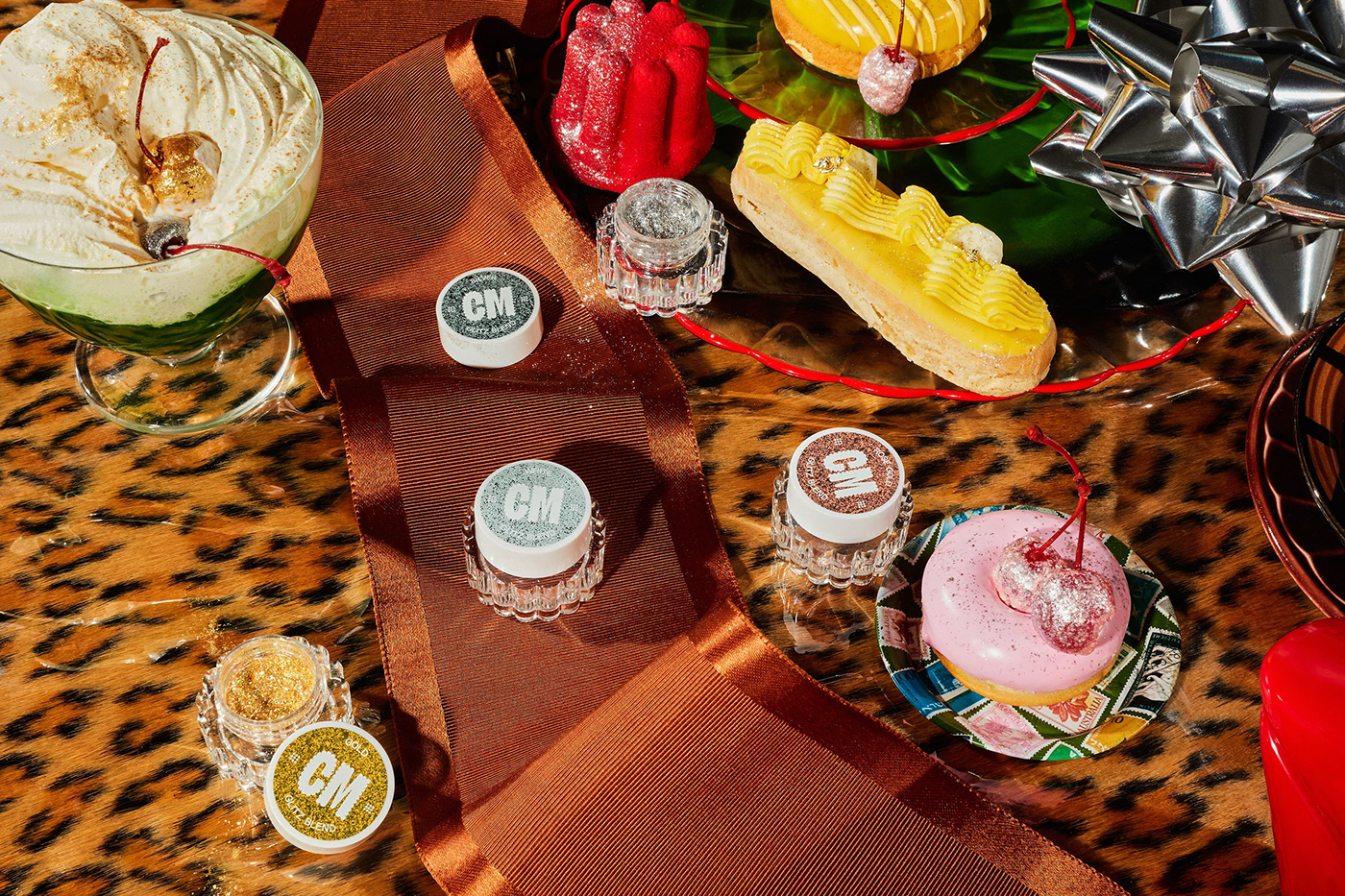
With the launch of the new brand, came the launch of two new ranges — glitter and lustre. Starting with a blank base, Colour Mill asked us to bring the brand system into the design of these products’ packaging. Alongside their manufacturers, we brought the piped edge look into the physical shape of the jars, tying it in with the wider collections.
Connecting the team at Colour Mill with our friends at THINK gave the in-house creative crew an opportunity to put their new brand into practice. The two powerhouse teams worked together to create various packaging solutions that would stand out on the shelf and delight their customers on arrival.


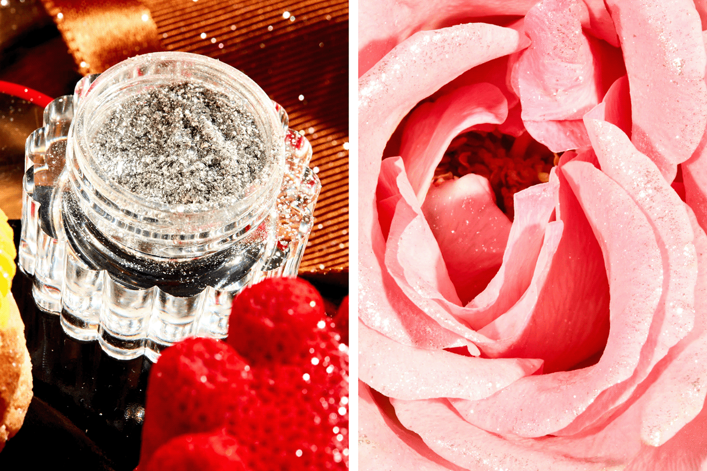
Photographing finesse, process and mess
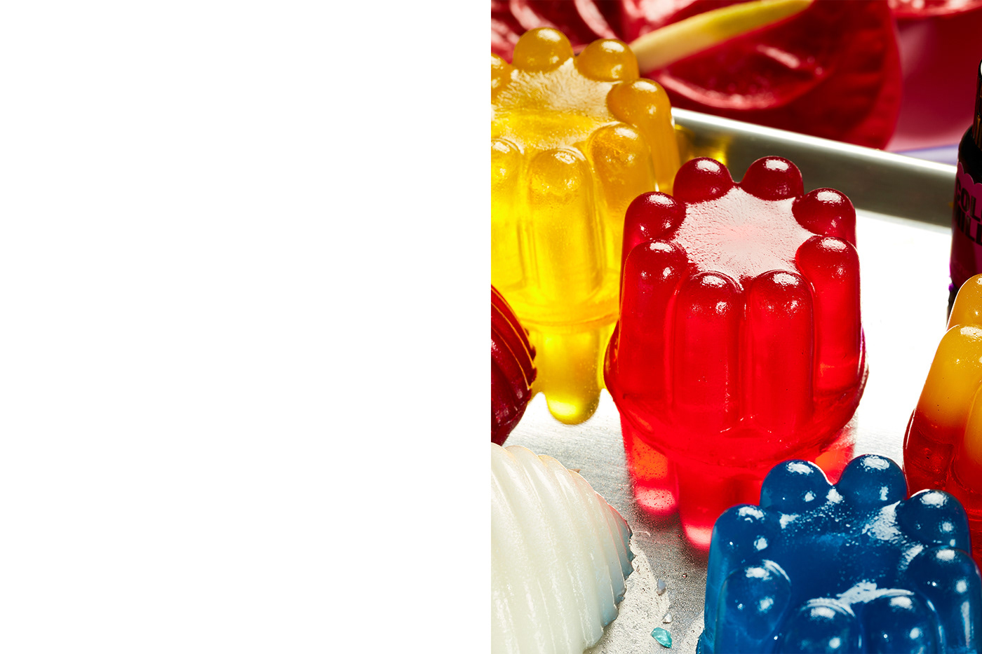
Until now, Colour Mill had been borrowing imagery from their own online community and partners. They had no distinct style of their own and were mostly showing cakes piped to perfection. The thing is, Colour Mill is more than the end result — it’s the process. With photographer Shelley Horan and stylist Jerrie-Joy Redman-Lloyd, we wanted to show it all — the piping bags, the cookie cutters, the almost-empty bowls of ganache scraped clean by greedy fingers. The shoot also shows how Colour Mill can be applied outside of just cakes. We corralled bakers, decorators and patissiers to concoct everything from cookies to cocktails, jelly and macarons. It was all hands on deck to deliver a mesmerising mess that’s no doubt familiar to the brand’s adoring fans.

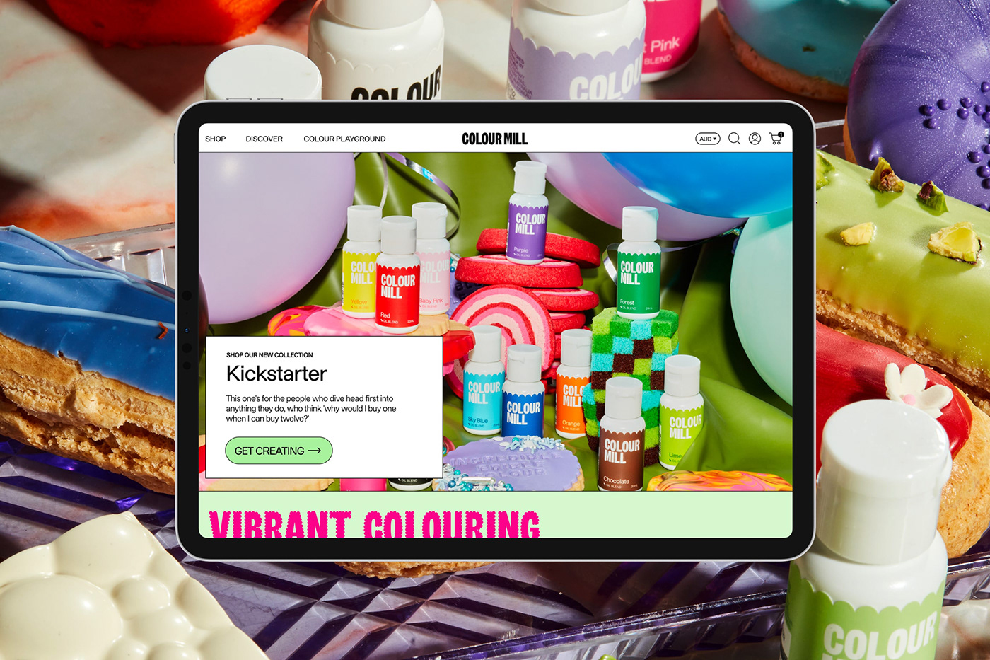
A deliciously considered digital experience
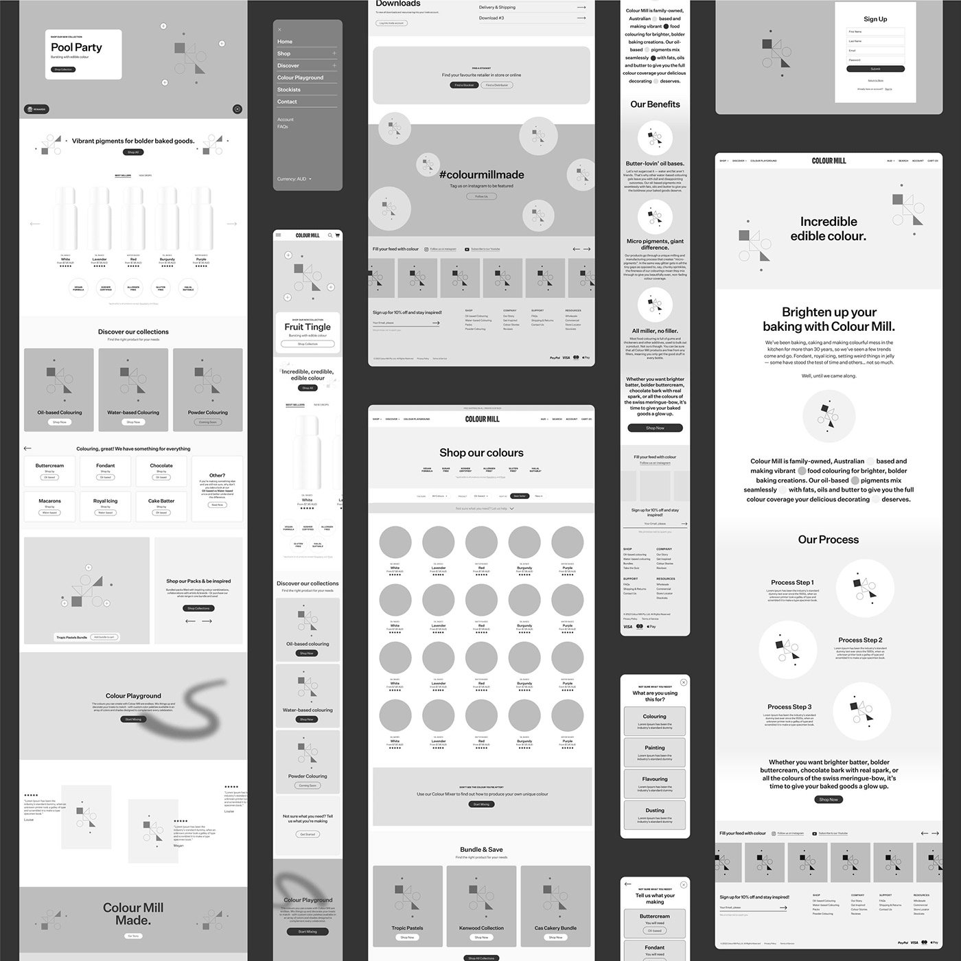
A key part of the rebrand was an overhaul of Colour Mill’s eCommerce experience. In the spirit of the new look and feel, we wanted to create something that was fun, interactive and a source of inspiration, but worked as seamlessly and effectively as the products it was selling.
We teamed up with TenTwo to create a custom CMS that allows for the site’s global colour palette to be easily changeable. This gave Colour Mill licence to get creative on their website with each new release and stay ahead of the curve with each new style and trend. Customers can experience a fresh new look and bout of inspiration with every visit to the site and discover playful easter eggs sprinkled throughout.
Turning ordinary into enticing with illustration
The digital illustration style acts as a storytelling device, sugarcoating what’s ordinarily a sterile, industrial process. We commissioned artist Steph Ramplin to reimagine the inner workings of a food colouring factory and bring it to life in her playful and whimsical style. Inspired by cake, jelly, fondant and all things fun, the mechanics are nonsensical but charming.
The brand’s inventory of products can also be overwhelming at first glance, so we needed a way to differentiate between them all. Steph created a suite of material swatches that symbolise each product’s purpose — royal icing for oil blend, macaron shell for water blend, iridescent dusting for lustre blend and sparkling glitter for the glitz blend. The result is both visually rich and practical, making each product’s use and colour easily identifiable.
And the end result?
Colour Mill have been at the forefront of food colouring for a long time and now their identity lives up to their offering. Each touchpoint has been carefully considered to illustrate the vibrance and energy of the brand’s audience, making it as appropriately playful on packaging as it is online. The result is a brand experience enticing enough to eat and truly does justice to the creators of such incredible, edible colour.