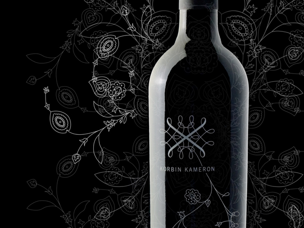
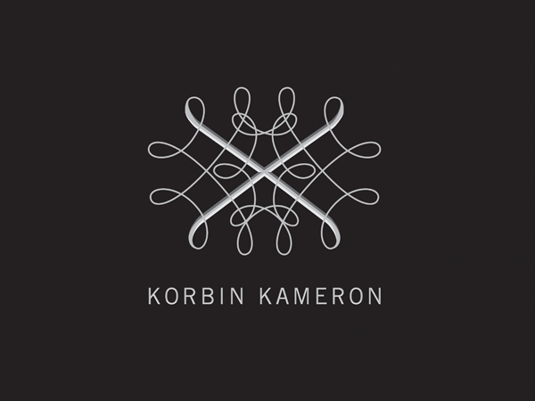
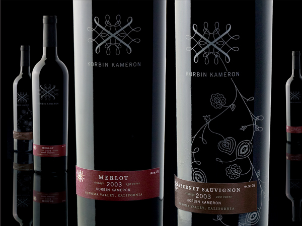
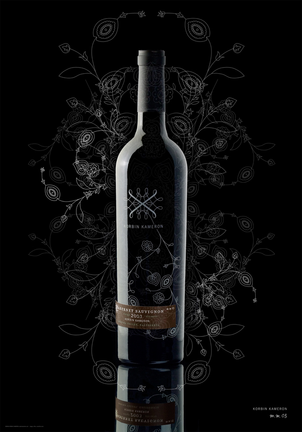
Office helped launch Korbin Kameron’s limited-production wines by developing the brand’s visual identity. The logo was created as a modern interpretation of vine tendrils; their free-form, yet geometric nature reflect the art and science aspects of wine-making. The simplicity of the packaging sets the brand apart from more traditional approaches to wine labeling, providing a sense of modern elegance and sophistication.

