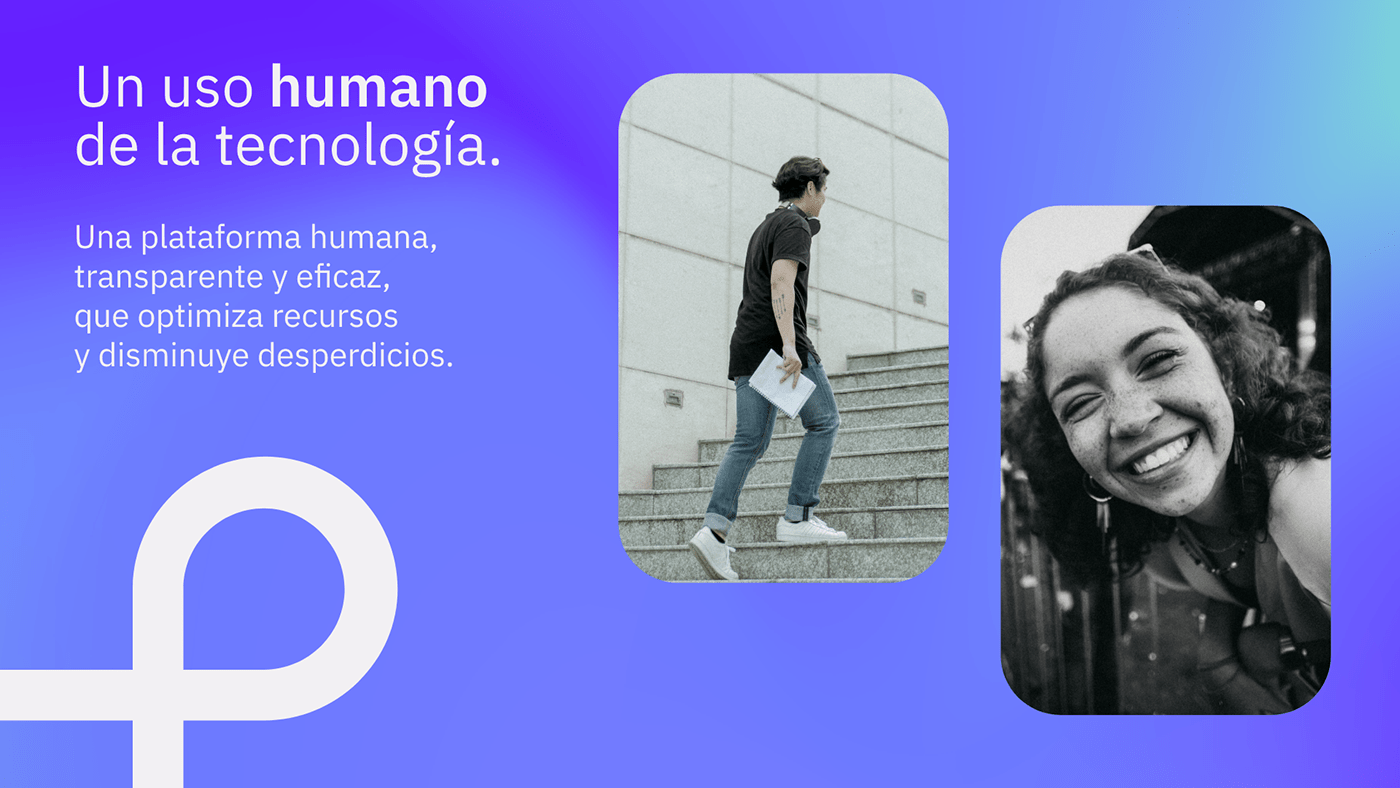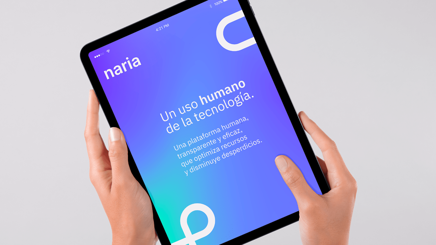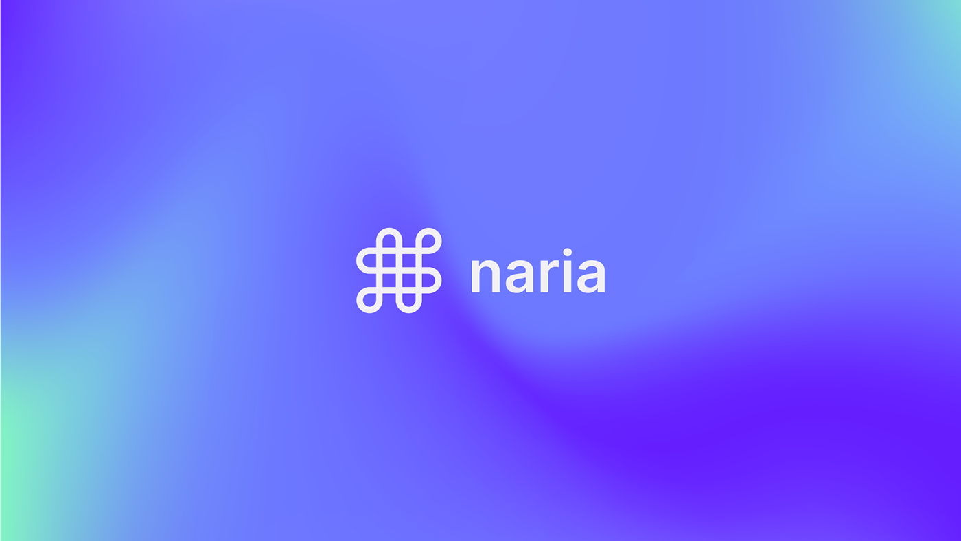
An innovative initiative with triple impact is born: the international digitization of the third sector. We present Naria, a human, transparent and efficient platform that optimizes resources and reduces waste, and for which Brandsummit designed its graphic identity and its entire visual universe.
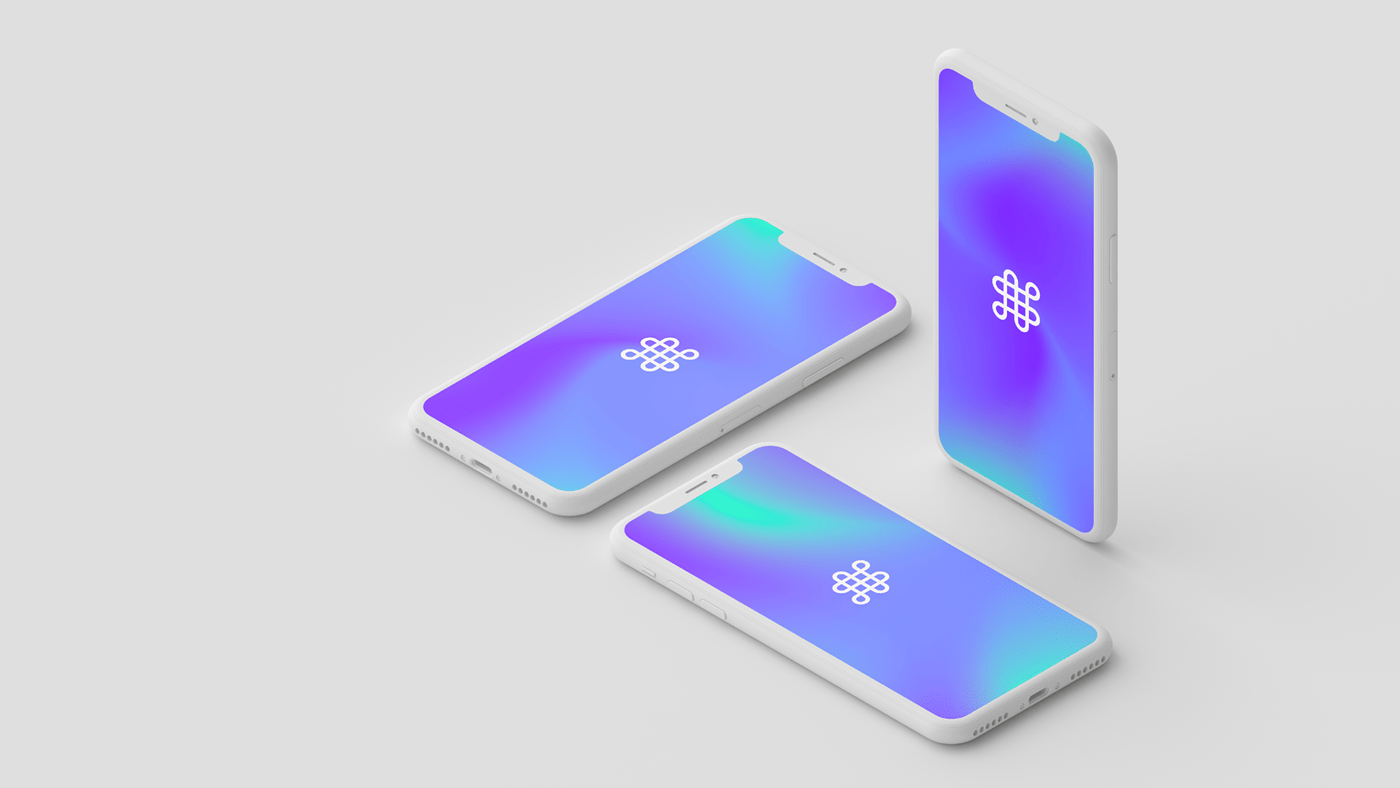
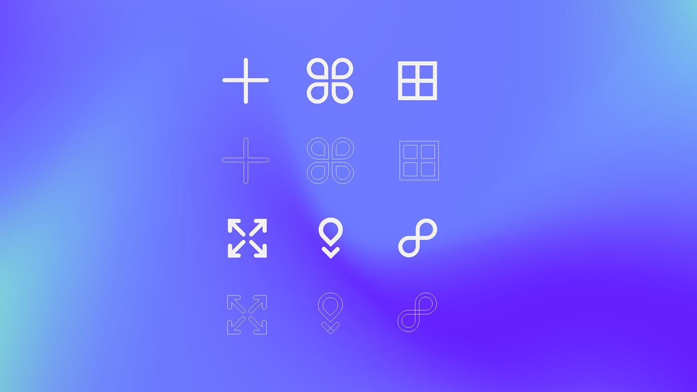
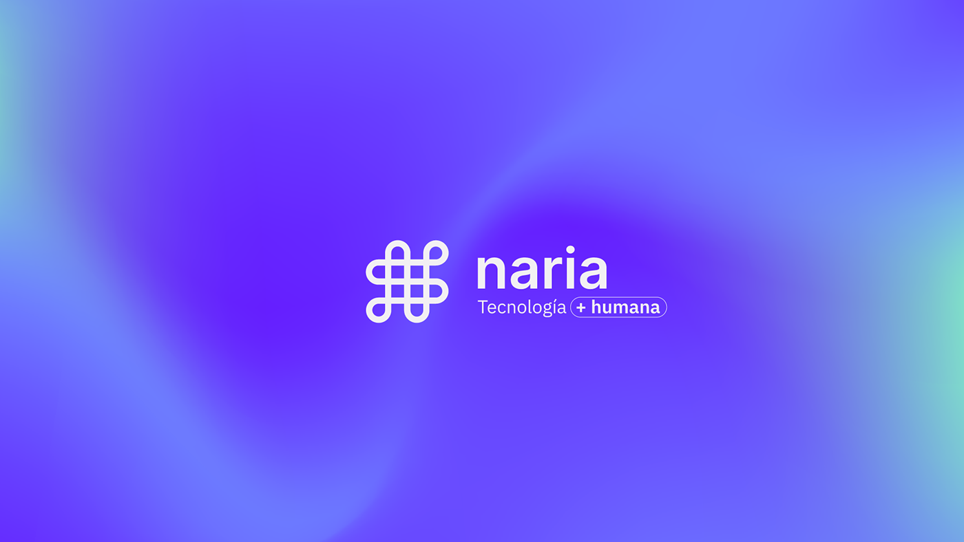
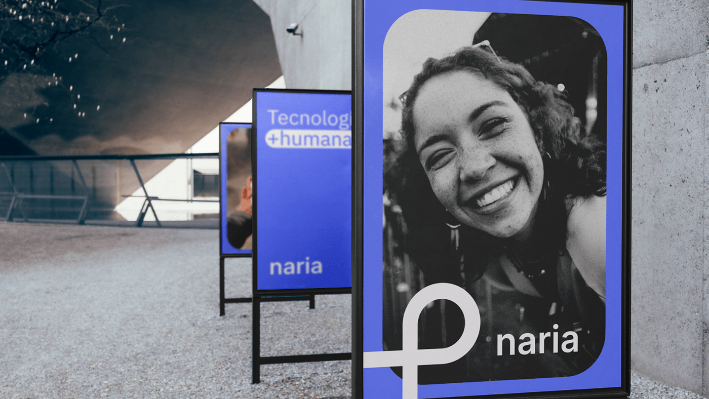
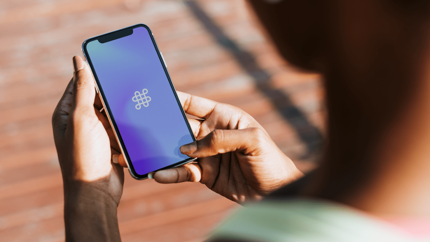
Under the purpose of saving, reusing and optimizing the distribution of resources at a social level, the creative concept that accompanies the visual identity of Naria is: circular. Thus, its logo expresses honesty and closeness, with the visual ability to unite people and resources. For its development, the colours lavender blue, violet blue and mint green were chosen, combined with black, bluish gray and off-white together with gradients that bring dynamism to the brand and help its positioning in the public mind, in addition to connecting with its users.
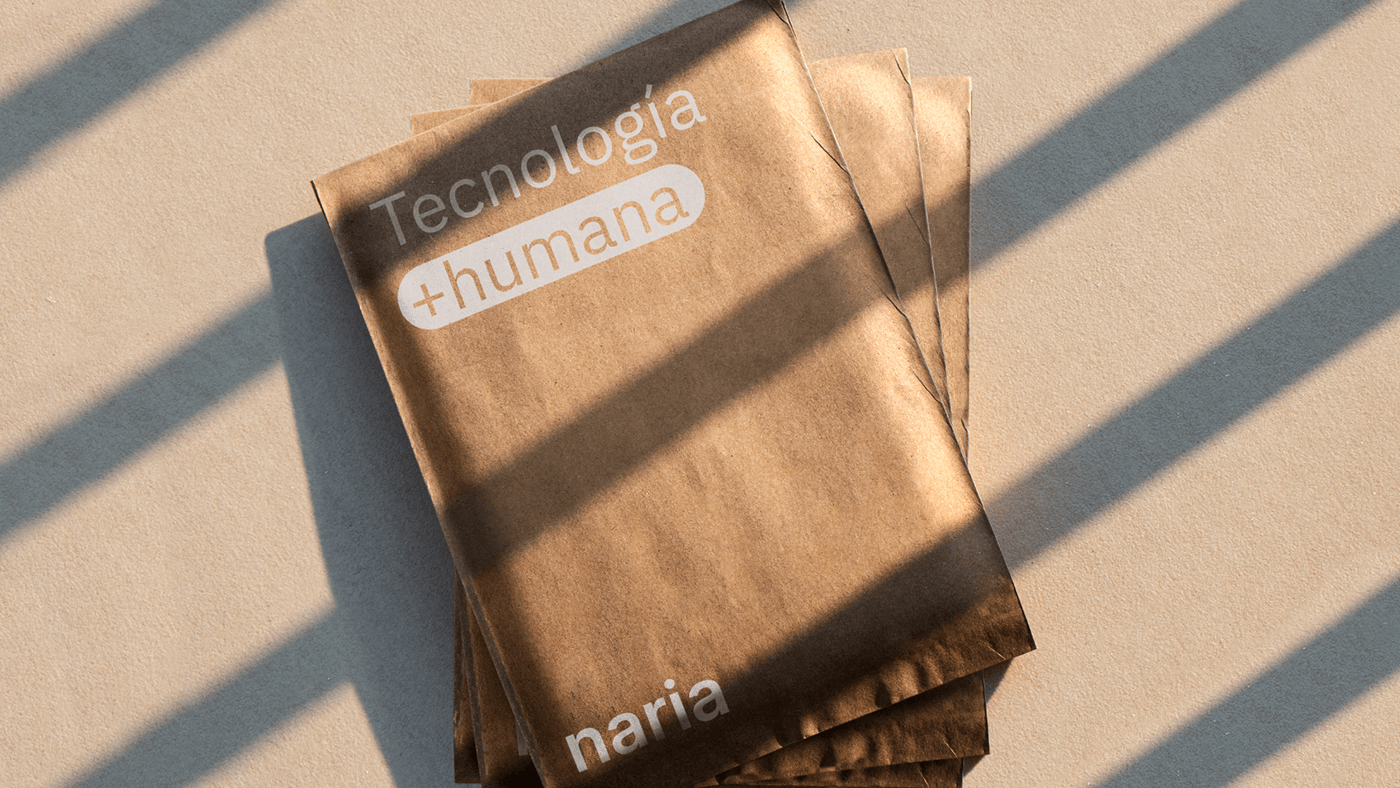
Naria, more humane technology.