ODORAUBE Brand Identity Design & Art Direction
Mar ⏤ Oct 2022
Project Overview
ODORAUBE is a brand that was launched to suggest various ways to create a better rest and a healthy mind through the medium of scent. It was necessary to establish brand identity to clearly reveal ODORAUBE's characteristics among various lifestyle cosmetic brands in a refined voice.
오도어오브는 향(Fragrance)을 통해 더 나은 휴식과, 건강한 마인드를 만드는 방법을 다양하게 제안하는 브랜드입니다. 다양한 라이프스타일 코스메틱 브랜드들 사이에서 오도어오브가 가진 정체성을 정제된 목소리로 뚜렷하게 드러내기 위해 브랜드 아이덴티티의 정립이 필요했습니다.


Extraordinary Lifestyle
ODORAUBE offers their brand value to those who want to create a unique lifestyle. We does not present uniform methods and directions, but encourages people to discover their own beauty of life they already have. For this reasons, ODORAUBE takes attitude of "Empathy" and "Respect" as their core value.
오도어오브는 개성 있는 라이프스타일을 만들어가고자 하는 사람들에게 브랜드의 가치를 제시합니다. 획일화된 방법과 방향성을 제시하지 않으며, 스스로 이미 가지고 있는 고유한 삶의 아름다움들을 발견할 수 있도록 독려합니다. 이를 위해 오도어오브는 공감과 존중의 태도를 브랜드의 핵심 가치로 삼았습니다.


A Powerful, Poetic Naming
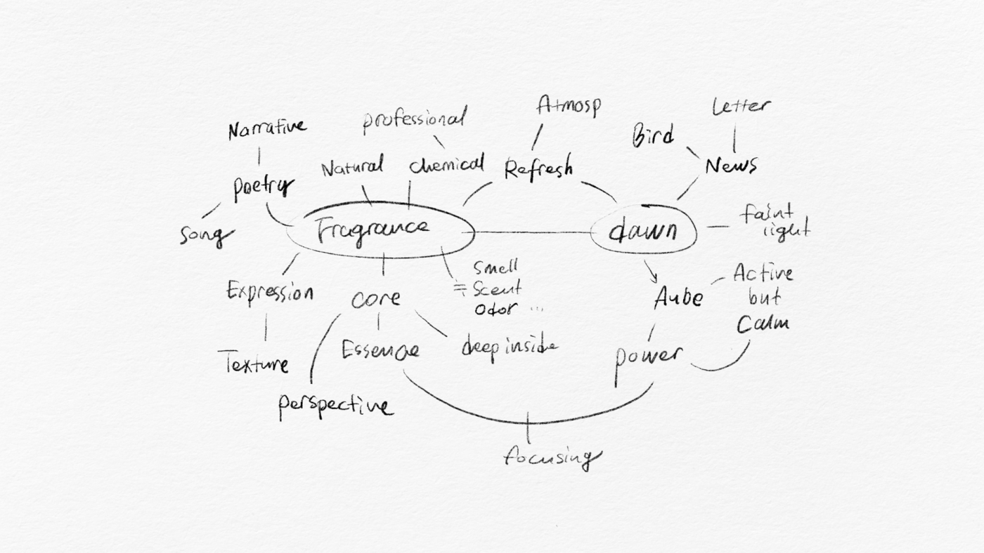
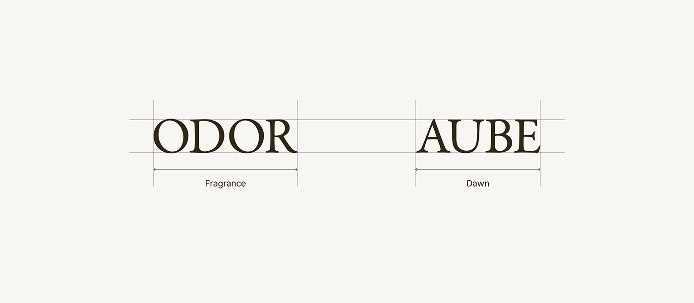
Brand name of ODORAUBE is designed as a combination of words that imply the power of the medium of scent. Dawn is a quiet and busy time when you touch a person's emotions and inner feelings delicately. We compared the paradoxical and dynamic power of dawn to the power of scent and included it in the brand name.
오도어오브의 브랜드 네임은, 향이라는 매개체의 힘을 함축하여 표현한 낱말들의 조합으로 디자인 되었습니다. 새벽(Aube)은 사람의 감정과 내면을 섬세히 터치하는 고요하고도 분주한 시간입니다. 새벽이라는 시간의 역설적인, 역동적인 힘을 향(Odor)의 힘에 비유하여 브랜드 네임에 담아내었습니다.

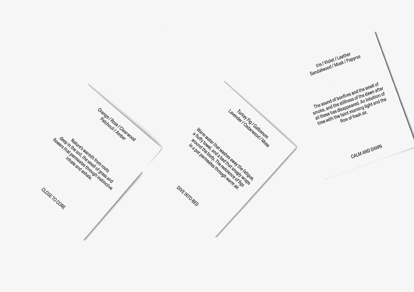
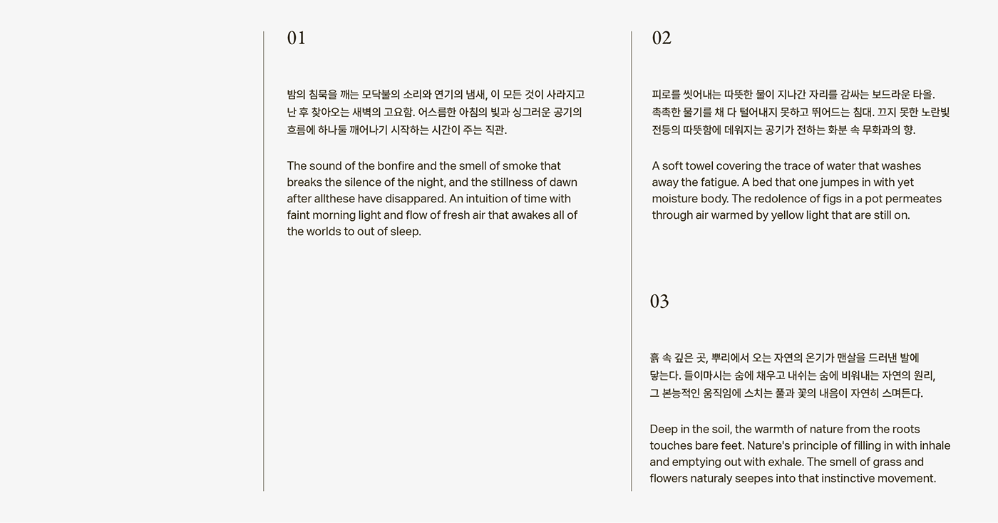
Product Narrative
ODORAUBE has given their product a metaphorical, soft-toned narrative to explain the character of each scent to the customer. The product narratives created for the first collection are the standard for application to various products to be released later.
오도어오브는 각각의 향이 가진 특징을 고객에게 설명하기 위해, 은유적이고 부드러운 톤의 내러티브를 제품에 부여했습니다. 첫번째 컬렉션을 위해 작성된 프로덕트 내러티브는, 추후 발매될 다양한 제품들에 적용하기 위한 기준이 됩니다.
Layer Means Detail
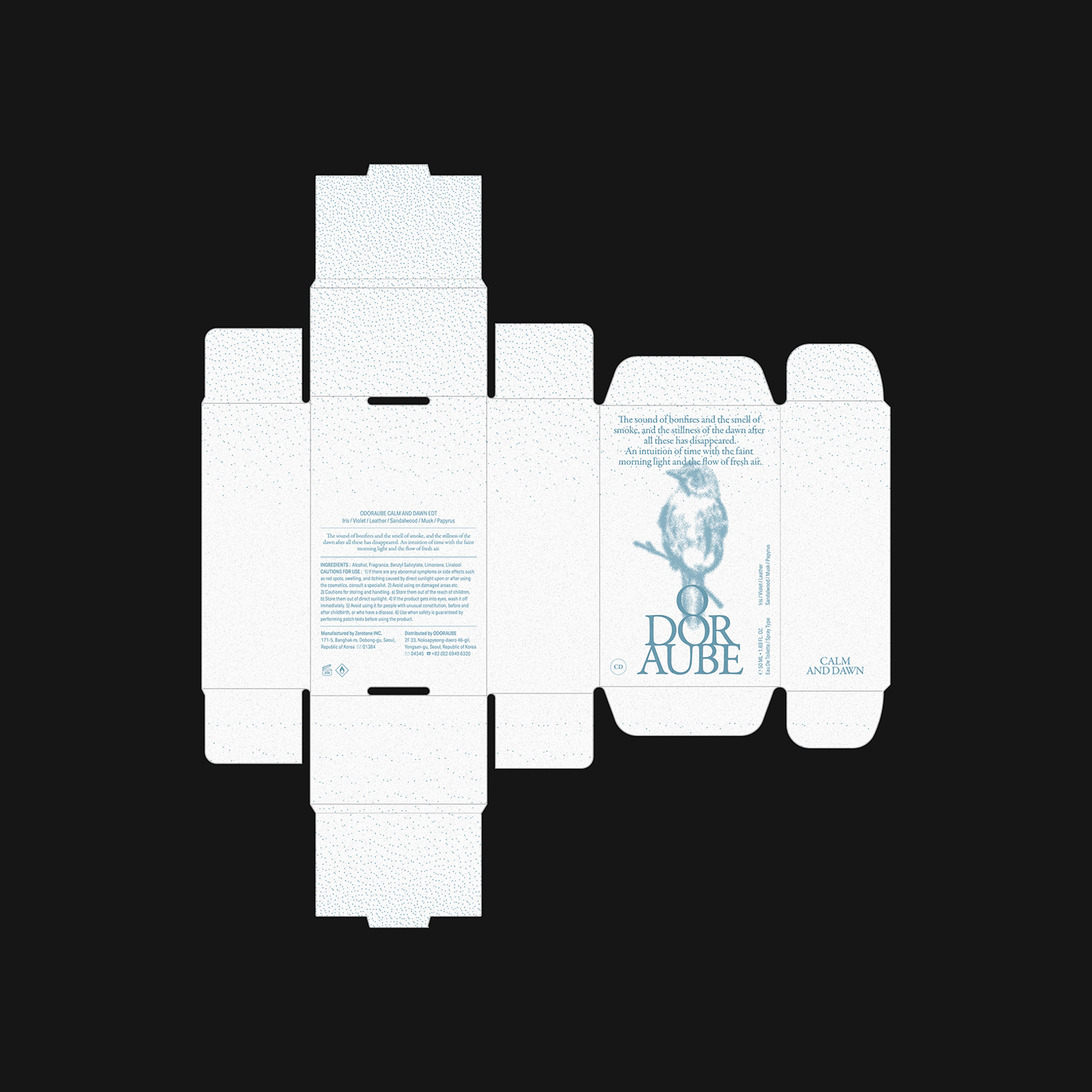
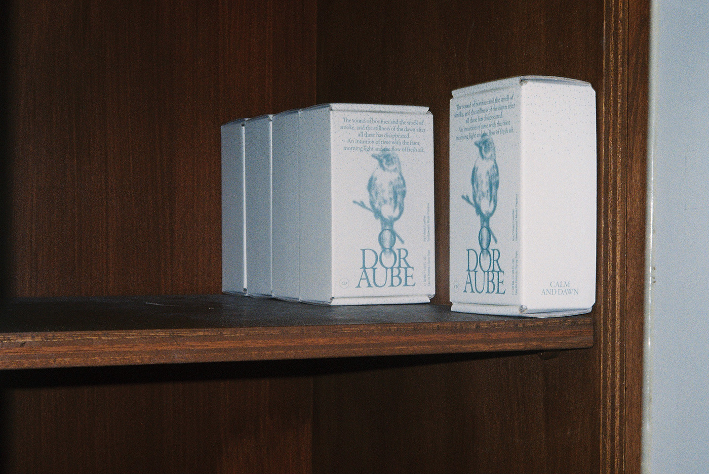
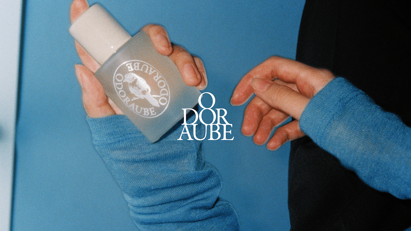
All the scents of ODORAUBE are composed of layers to create detail. By applying the concept of three layers of fragrance notes used in the fragrance design, we developed a layered brand mark. In addition, as a brand character, we borrowed the the Lark (Bird) motif, giving it the role of a messenger to deliver the power and good news of dawn.
오도어오브의 모든 향들은 디테일을 만들기 위한 레이어들로 구성되어 있습니다. 프래그런스 디자인에서 사용되는 세 층의 향 노트(Note) 개념을 적용하여, 층층이 쌓여가는 형태의 브랜드 마크를 개발하였습니다. 브랜드 캐릭터로는 종달새 모티프를 차용하여, 새벽의 힘과 좋은 소식들을 전달하는 전달자의 역할을 부여했습니다.


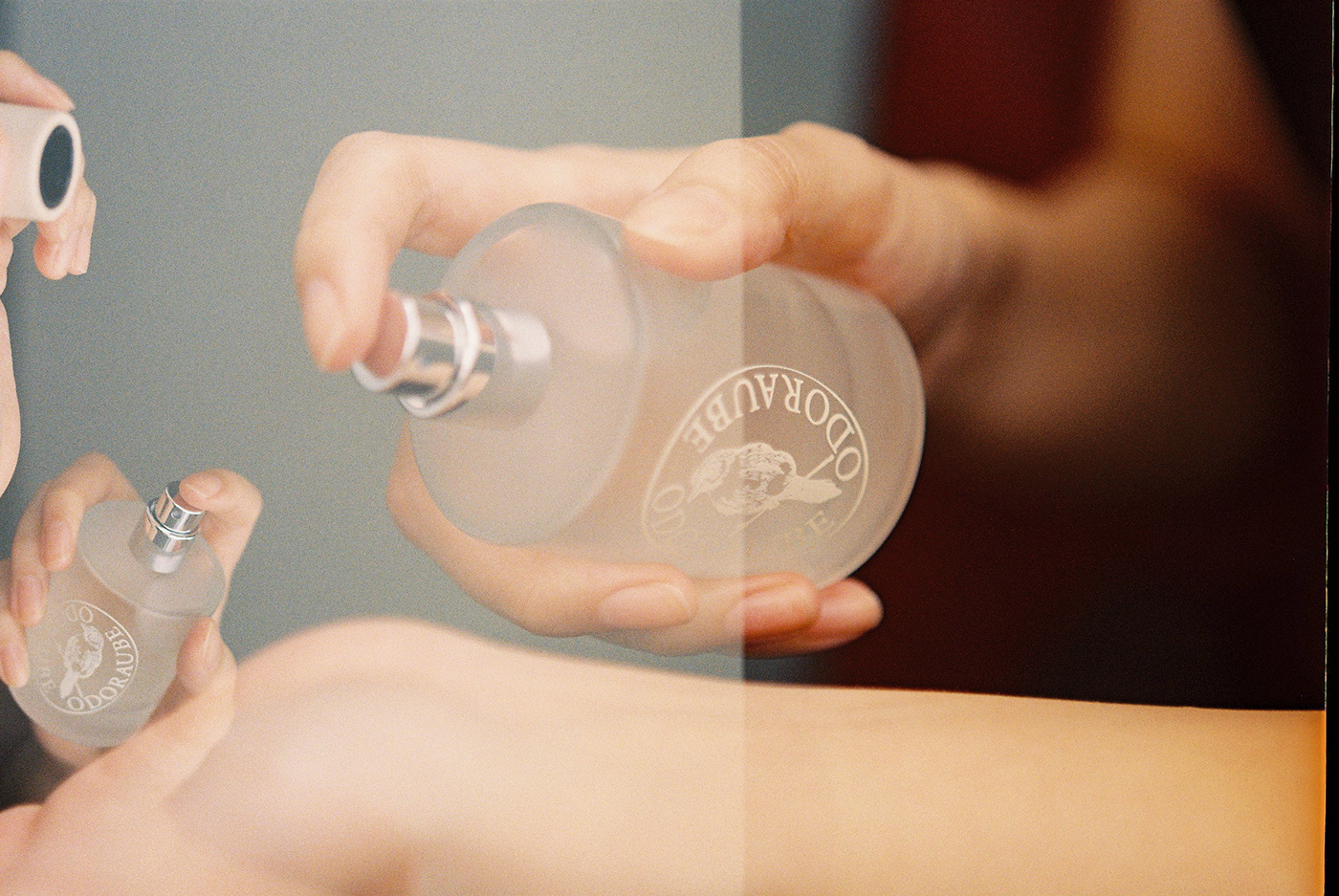
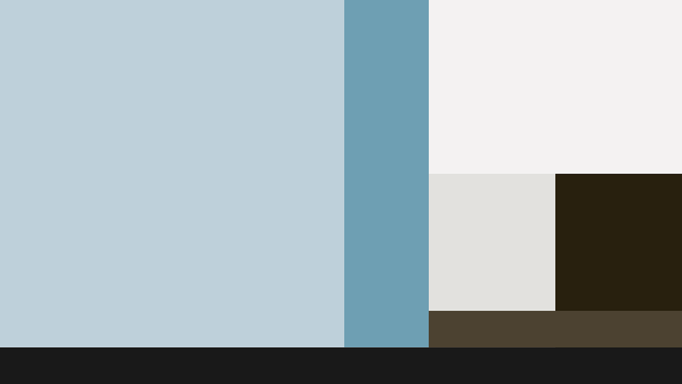
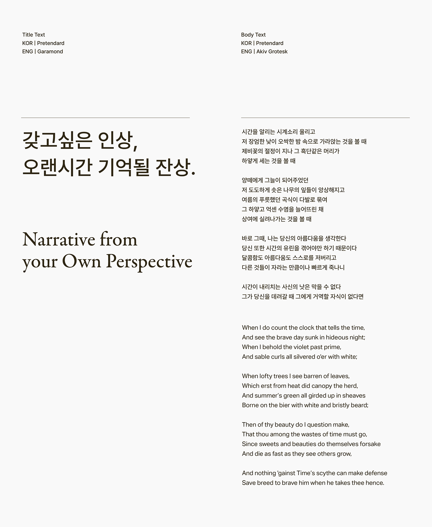
The main color of ODORAUBE is Light Blue, which resembles a faint light of dawn. The color system is composed of colors that mean the sky, earth, and sea, which are the standards of all living things in nature. The main typography of ODORAUBE, Garamond, is a classic serif typeface with a hand-drawn, sincere mood. We focused on delivering the information well that should be accurately communicated by mixing the Sans serif typefaces Akiv Grotesk and Pretendard.
오도어오브의 메인 컬러는 희미한 여명을 닮은 라이트 블루(Light Blue)입니다. 자연의 모든 생물들의 기준이 되는 하늘과 땅, 바다를 의미하는 컬러들로 컬러 시스템을 구성하였습니다. 오도어오브의 메인 타이포그래피인 Garamond 는 클래식한 세리프 서체로, 손으로 직접 그려낸 정성스러운 무드를 가지고 있습니다. 산세리프 서체인 Akiv Grotesk, Pretendard 를 적절히 혼용하여 정확히 전달되어야 하는 정보들은 가독성 있게 전달하는 데에 집중하였습니다.
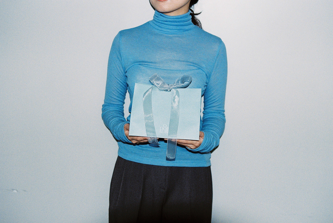
We Deliver Texture
We tried to deliver the unique character that the brand wants to create through 'Texture'. Texture is synesthetic, unlike the obvious visual stimuli shown by design elements such as color and type. The goal was to transform the unique atmosphere of the brand's scent into a visual and auditory texture and apply it to the identity.
우리는 브랜드가 만들어가고자 하는 고유한 캐릭터를 ‘텍스처’를 통해 전달하고자 하였습니다. 텍스처는 디자인 요소들이 보여주는 분명한 시각적 자극과 달리, 공감각적으로 인식할 수 있는 요소입니다. 브랜드의 향이 가진 고유한 분위기(Atmosphere)를 다양한 텍스처로 바꾸어 아이덴티티에 적용하는 것을 목표로 하였습니다.