


Hana Bank iBOOJA
Brand Experience Design
iBOOJA is an experiential financial platform for elementary/middle school students serviced by Hana Bank, also it is the first financial Parent technology service in South Korea to help children to form fun financial habits through various financial activities as collecting, using, making, and sharing by themselves. MovingStones has renewed the brand overall to suit children's standard so children could develop financial fun, and has developed 3D characters that project children's appearance to improve their sense of identity and immersion.


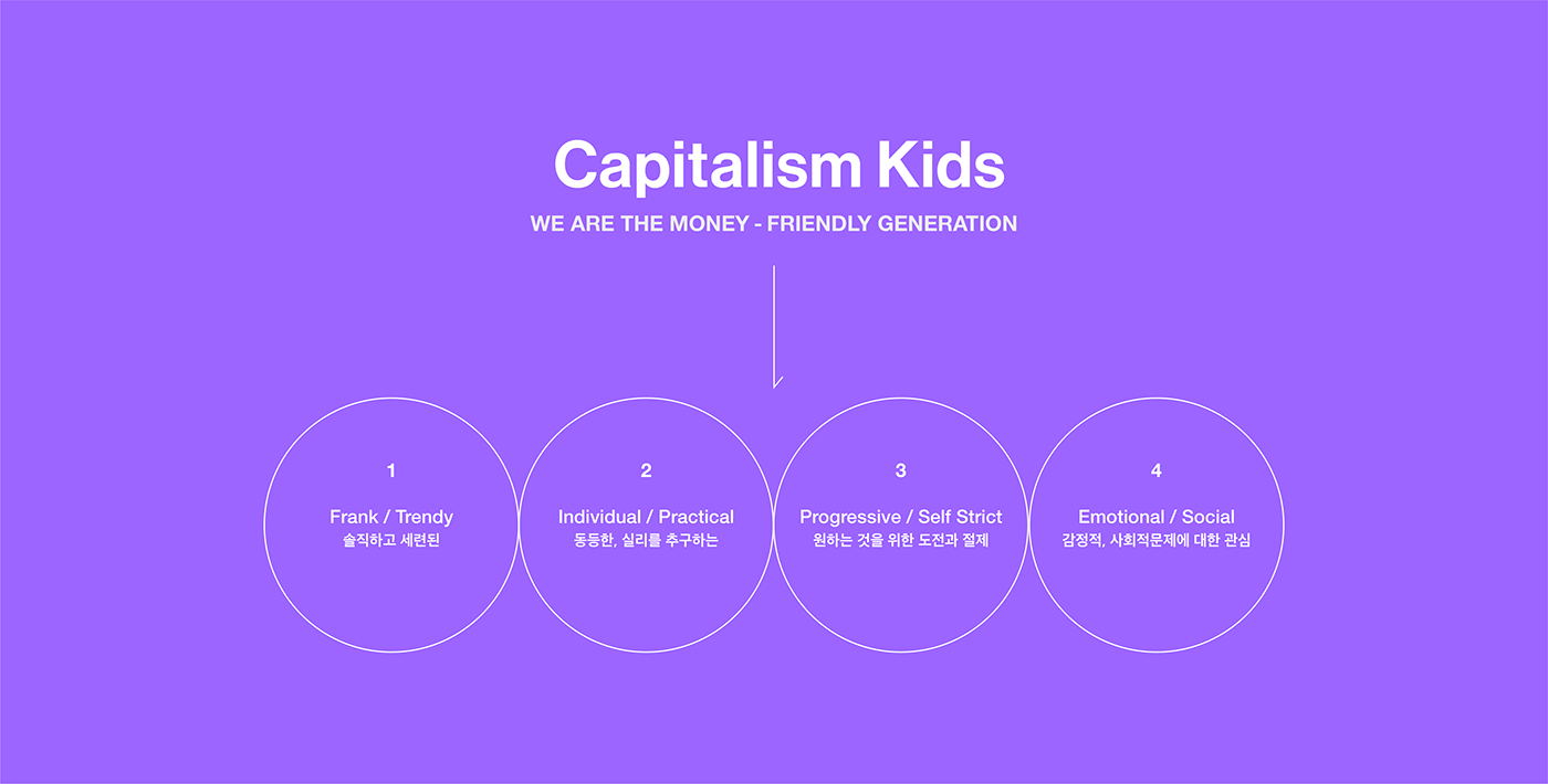
Trend Keyword
Prior to the brand renewal, it was necessary to redefine 'children', and we developed a brand strategy centered on 'Money-Friendly Generation' who have no prejudice to money and consumption and understand capitalist physiology well.
Brand Perspective
iBOOJA aims to expand children from the subject of 'child’ to the subjective perspective of "me" and make a habit of being rich with interest in finance.

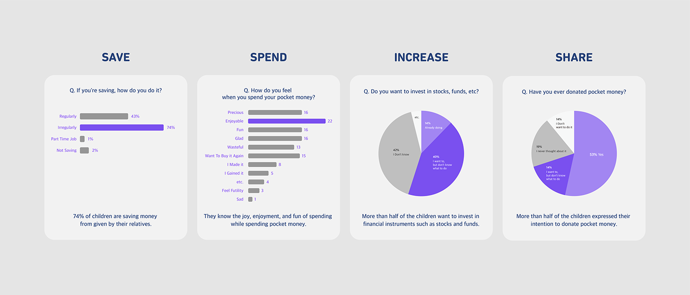
Research & Insight
Through the survey of children's financial habits, We were able to get an insight that they felt fun of spending pocket money, But had absence of fun and opportunity to collect, make money, and share.
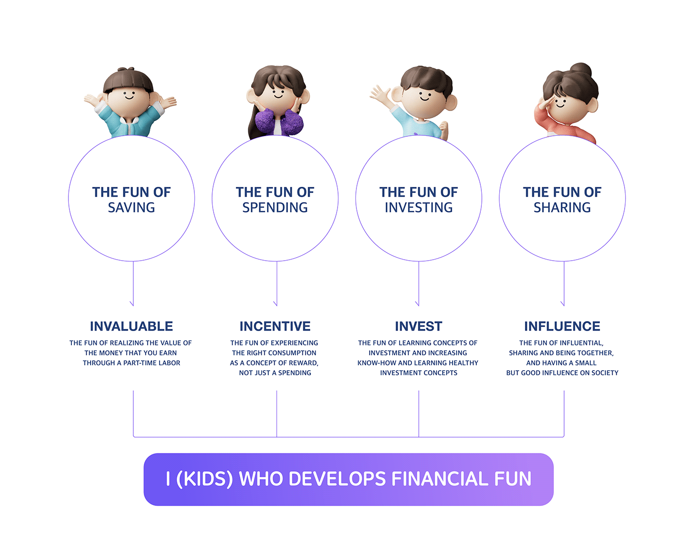
Brand Core Value
The core value of the iBOOJA is the value that becomes benchmark for the members to create the brand. Based on this value, we provide a brand experience that children grow into an 'i that acquire the fun of finance’


Brand Slogan
The brand slogan of iBooja is in the center of the brand and contains the essence of what it needs to offer to customers. The fun of financial habits experienced by oneself is nutrient that makes it easy for children to accept difficult finance and makes amazing results (Rich).
Brand Symbol / Logotype
The symbol of iBooja is designed by combining two forms, i and B. It represents the financial fun of using iBooja through the sense of motion that circle of i bounces up like playing ball. And based on this, the logo type also shows a unified design.


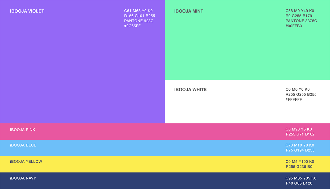
Brand Color
Violet and Mint were selected as the main colors through a teenagers' preferred colors survey. The secondary colors were selected based on the colors that go well with the character.
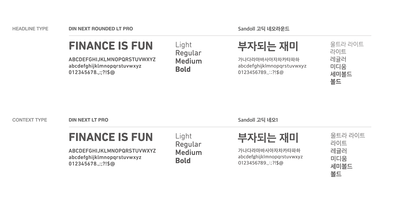
Typography
Using the typeface of the title and the text separately considering the brand symbol’s formative characteristics of iBooja and applied media.
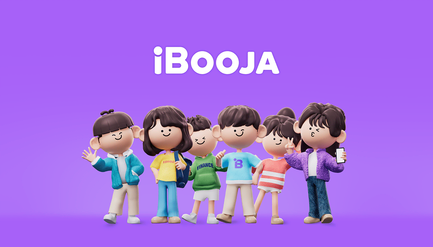
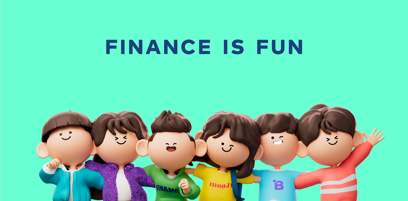
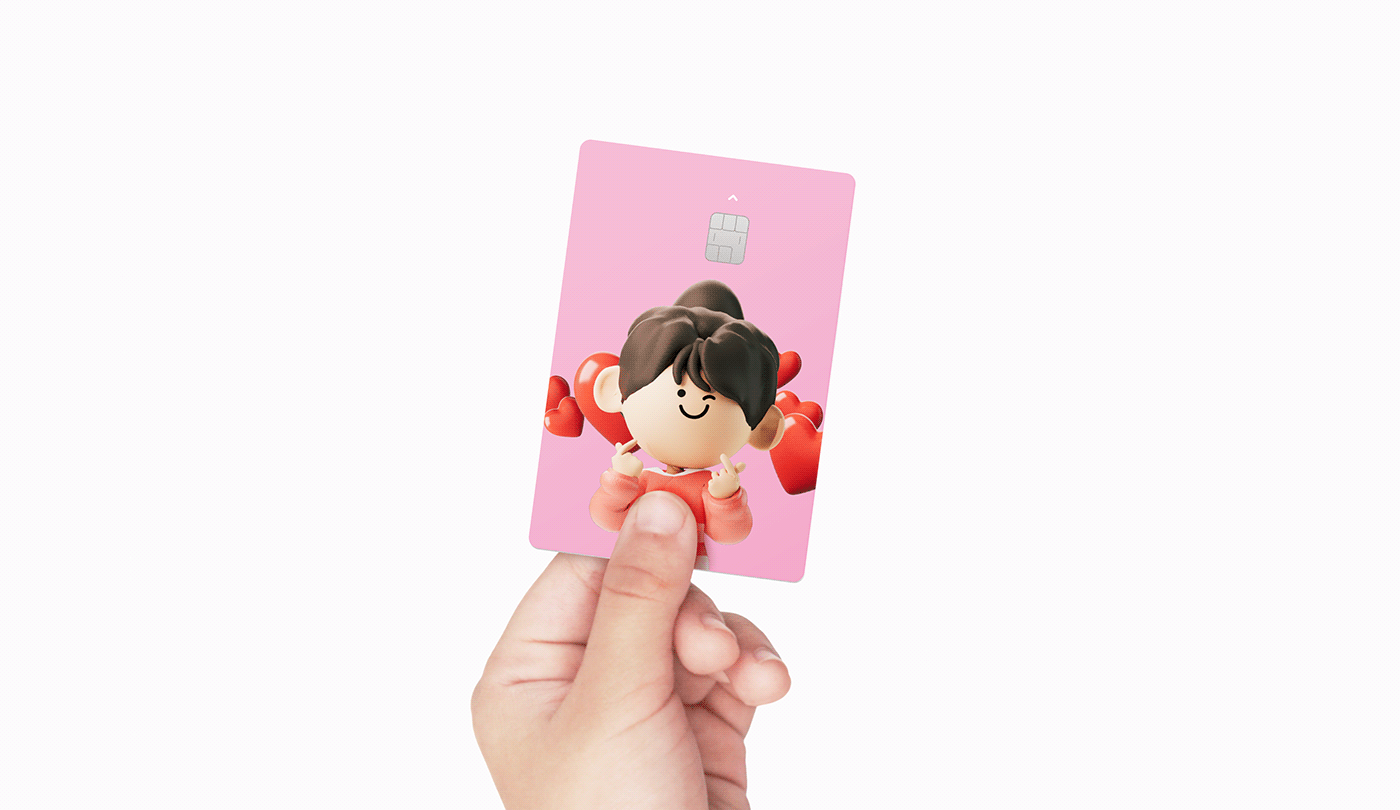
Brand Character
The character of iBooja expresses myself acquiring financial habits while feeling fun and joy as an avatar that projects me(i). Use it as the main graphic element in the Brand Communication contact.


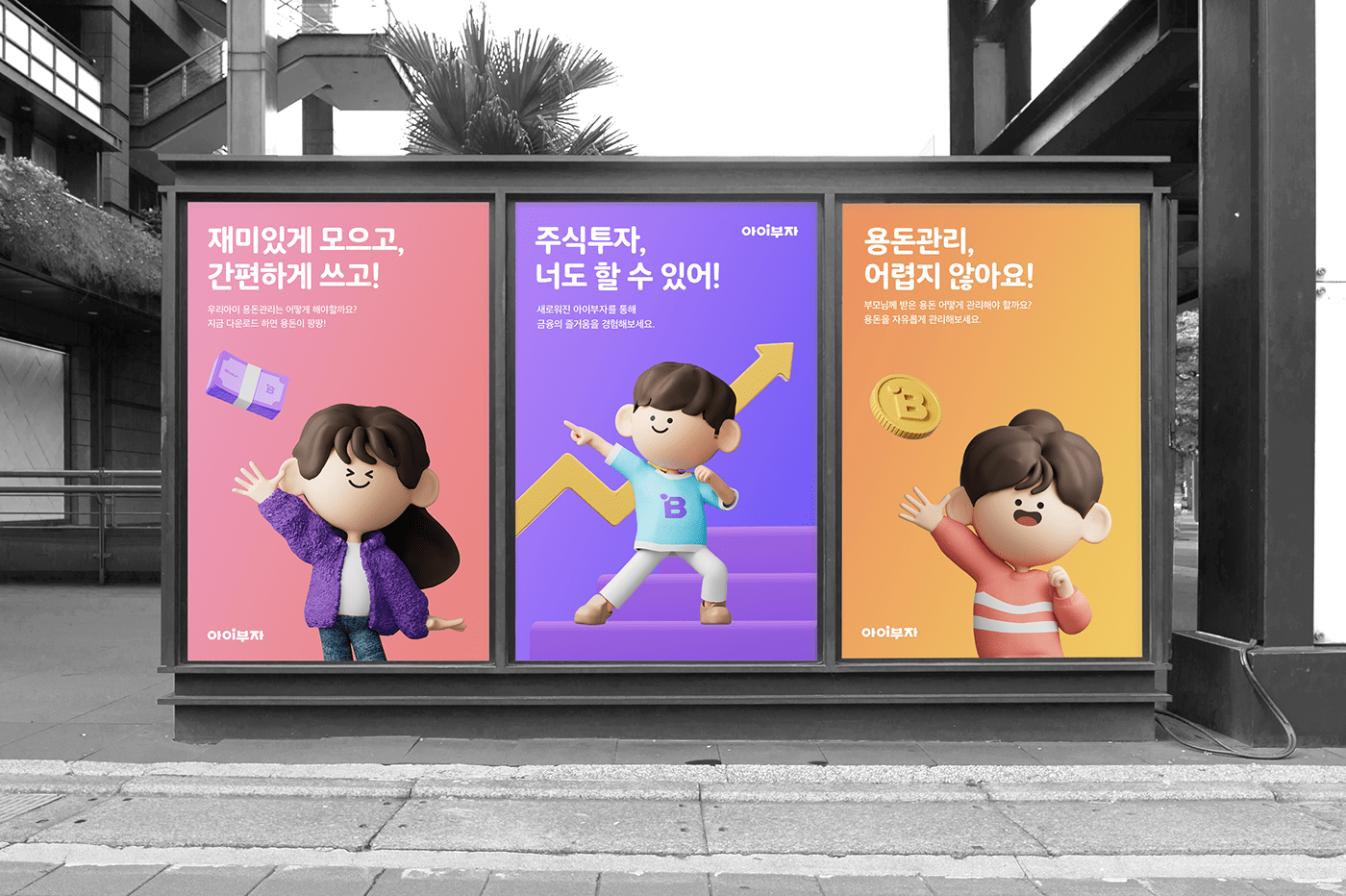
Key Visual
iBooja’s brand key visual is not only the brand identity but a combination of characters and graphic motifs, which is the main visual element for delivering messages effectively. It can be used as the main image in various media.


Applications
This is an example of application that utilized the newly renewed iBooja’s brand elements. It provides new and consistent brand experience for the iBooja at various customer contacts, including Marketing, Product UI, Communication, and Payment.


iBOOJA
Brand eXperience Design
-
Design
MovingStones Inc.


