


I'm working on set of small concise exercises to help expand my creativity. I call them Creative Katas, kata being a type of form practice from martial arts. Here's my fourth one.
See the rest at https://www.behance.net/collection/Creative-Katas/19514867.
Challenge: Create 3 different magazine covers
Restrictions: None
Background: Your fake client is Secret City Magazine, which targets Urban Explorers, a group of people who go out and explore abandoned buildings.
Freedom: The have no logos, or colors picked. Do the whole thing. Make logos, use whatever pictures. Do what you want.
Time Limit: Take a different approach here. Take long breaks between each one. That way instead of just knocking them out, you can review, figure out what worked. And hopefully each one should be better than the next. I’m taking a day between each.
Version 1
For inspiration, I looked to Google for inspiration on magazine covers.
For inspiration, I looked to Google for inspiration on magazine covers.

But the top results all look the same: portrait with text in the negative space. I wanted something different. Being that I’m on planes all the time, I went with US Airways in flight magazine. Hear me out - it focuses on cities instead of people, which I felt was good with the subject matter, and it had a very set structure I felt I could work with.
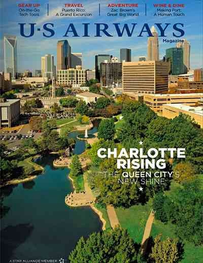
By emulating that to some degree, I came up with this:

I used several different weights of one font: Oswald. I took a sunset picture of Philadelphia for the cover story. I then made up other stories and added their headlines to the mix.
I’m sorta proud of this work. I think it’s the slickest, most polished of the bunch. That is a problem however. Urban exploration is not a polished activity. The work is decent, but it doesn’t hit the right tone. It could be an in flight magazine, and that just doesn’t fit.
Version 2
For the next one I had a better idea of what I should do. I needed to plan it out better, and make sure I got the tone right. I started by picking a color scheme. I created one on Kuler: https://kuler.adobe.com/Secret-City-color-theme-3734521/ based on some subway textures I had grabbed earlier.

With this done, I started working on a logo for the magazine using League Gothic (https://www.theleagueofmoveabletype.com/league-gothic) as my font. Which yielded this:

It feels a little like Soviet Propaganda, but I like it. Urban Exploration is subversive and often illegal. I’m pretty happy with it. It captures the mood correctly.
Next I grabbed a picture of an preserved building in Philadelphia - Eastern State Penitentiary (http://www.easternstate.org/). People have used it for urban exploration in the past. Also with the castle motif, I felt like it had the right feel for the piece. I chose Proxima Nova (http://www.marksimonson.com/fonts/view/proxima-nova) for the font after I saw a great pairing of it elsewhere. I combined it all into this:
Next I grabbed a picture of an preserved building in Philadelphia - Eastern State Penitentiary (http://www.easternstate.org/). People have used it for urban exploration in the past. Also with the castle motif, I felt like it had the right feel for the piece. I chose Proxima Nova (http://www.marksimonson.com/fonts/view/proxima-nova) for the font after I saw a great pairing of it elsewhere. I combined it all into this:

It’s got more character than the first one. But I’m still not happy with it. I think I ended up with a picture that was pretty appropriate, but didn’t have enough whitespace to do compelling text layouts. Or I don’t have enough experience to do so. Not a complete failure, but I don’t like it enough yet.
Version 3
I liked the color scheme and logo from the first one, but I wanted to challenge myself a little bit more. I wanted to confront something I shy away from. I can’t draw. I figured I would draw this next cover. I took inspiration from one of the fake articles I had in the magazine, on hand drawing maps. I figured I could hand draw some building maps and use them as the cover.
I started by drawing the buildings on my iPad.

I brought them into Photoshop and used the handwritten font Daniel (http://www.dafont.com/daniel.font) to annotate them. I did some work with a glow filter on the text to make it look like someone sightly erased the area the text went. I really like the effect.
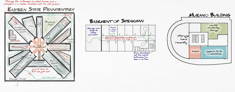
I tossed them together with some old paper texture, Museo Sans (http://www.exljbris.com/museosans.html) for the text, the logo from the second example and the structure of the first example came up with this:

I have to admit, I’m proud of this.
I like it aesthetically.
It matches the tone of the content.
I drew something for it.
It matches the tone of the content.
I drew something for it.
I feel like I really created something here. I took what I liked from previous examples and outside influences and combined it with content I created to come up with something new. In the process I really stretched both my creative and technical muscles.


