IT
Ciao, mi chiamo Carlo Nadalin e sono un Art Director con ventennale esperienza nel mondo della comunicazione e del graphic design.
Con questo rebranding ho voluto dare un segno di svolta alla mia identità professionale, costruendo un sistema visivo fortemente riconducibile alla mia persona e al mio lavoro.
EN
Hi, my name is Carlo Nadalin and I'm an Art Director with twenty years of experience in the world of communication and graphic design.
With this rebranding I wanted to give a turning point to my professional identity, building a visual system strongly attributable to my person and my work.
With this rebranding I wanted to give a turning point to my professional identity, building a visual system strongly attributable to my person and my work.
IT
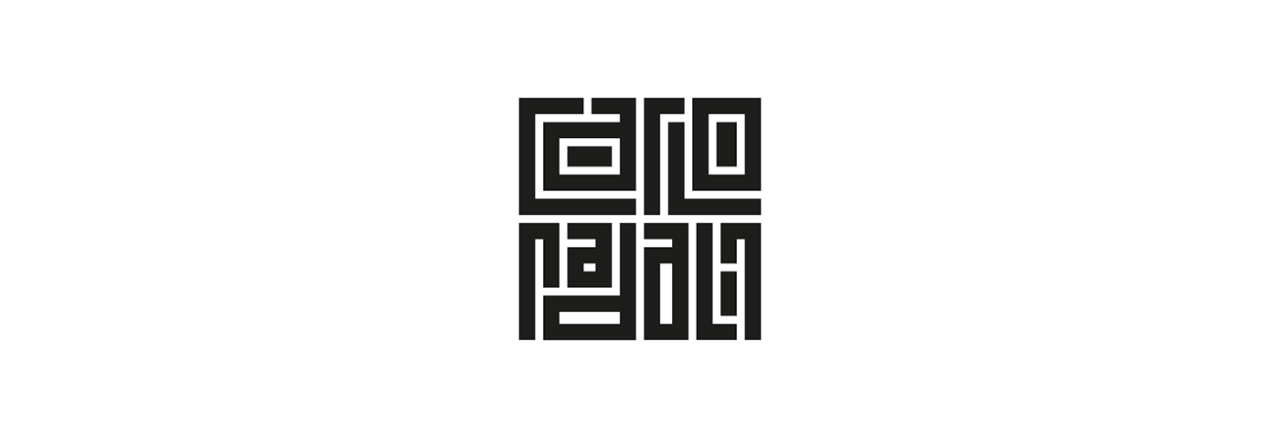
Trattandosi di un personal branding ho voluto puntare sul mio nome costruendo un logotipo in grado di trasmettere precisione e un'attenta gestione degli spazi, valori che sono alla base del mio approccio lavorativo.
EN
Being a personal branding, I wanted to focus on my name by building a logotype capable of transmitting precision and careful management of spaces, values that are the basis of my working approach.
IT
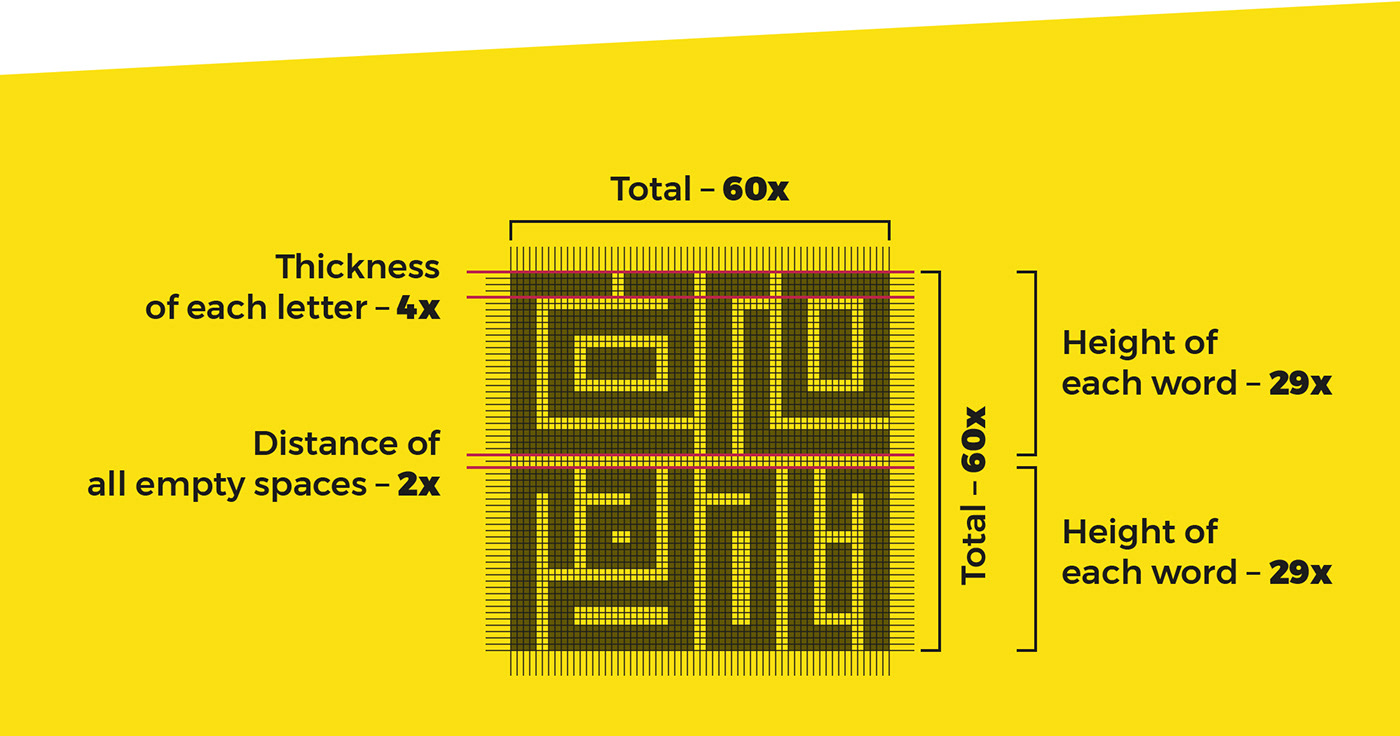
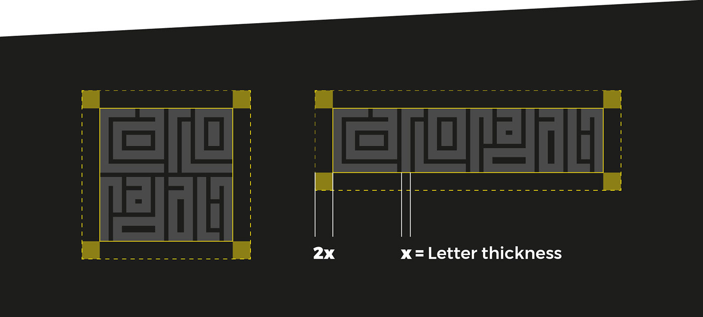
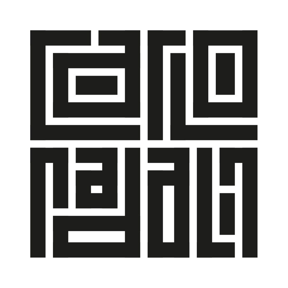
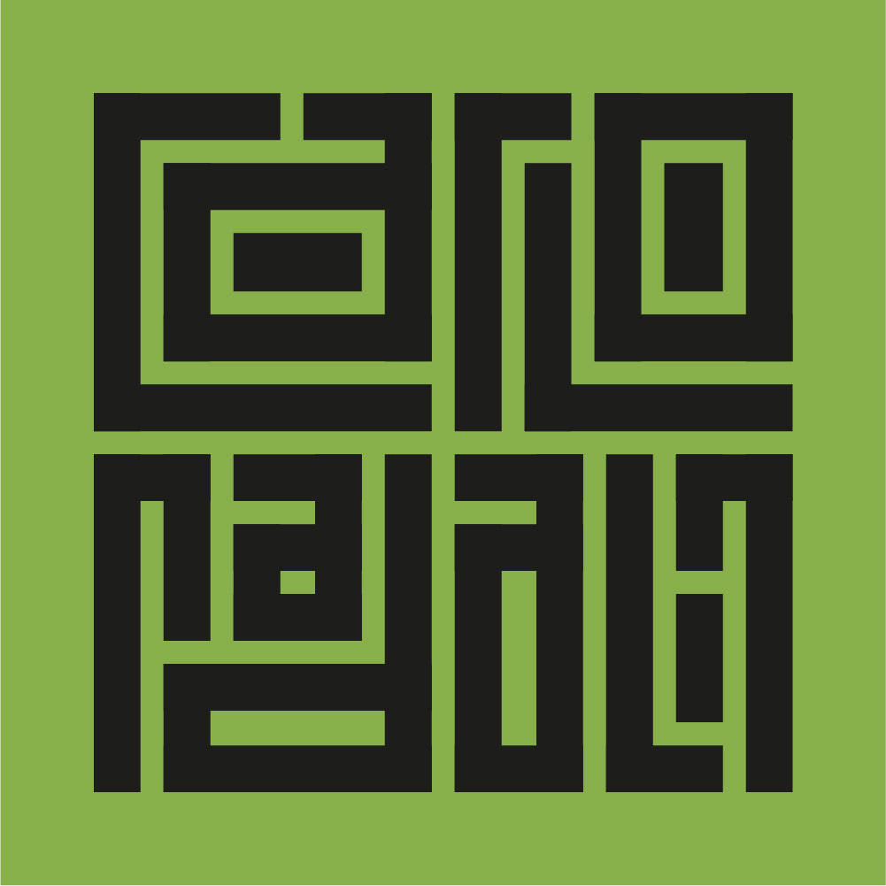
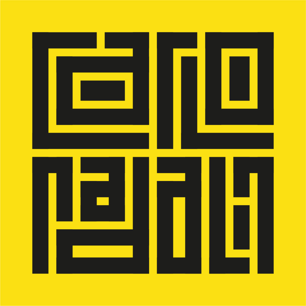
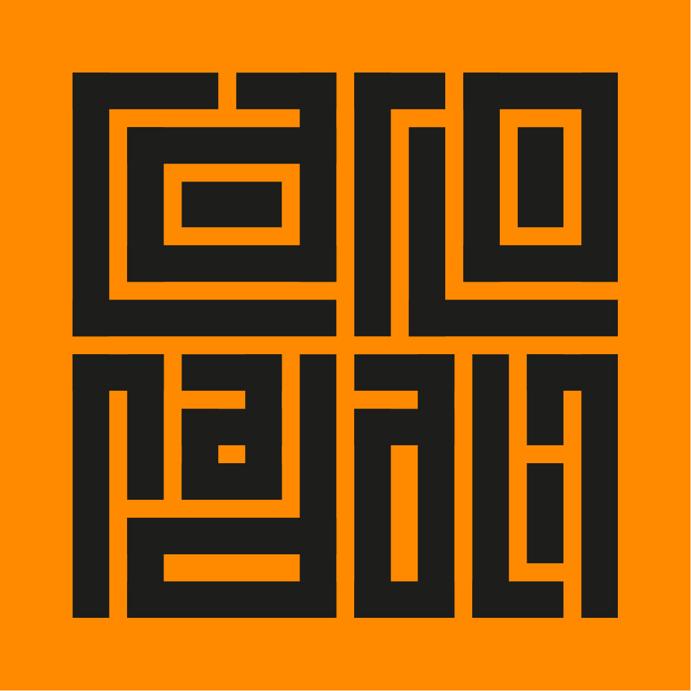
Il logotipo è costruito su una griglia quadrata che lo rende compatto e adatto a gran parte dei suoi utilizzi.
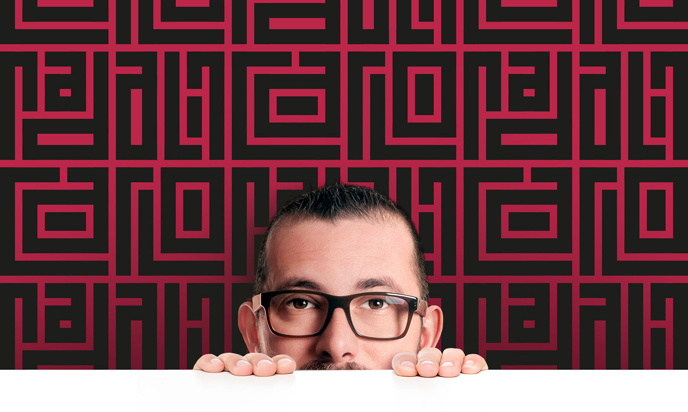
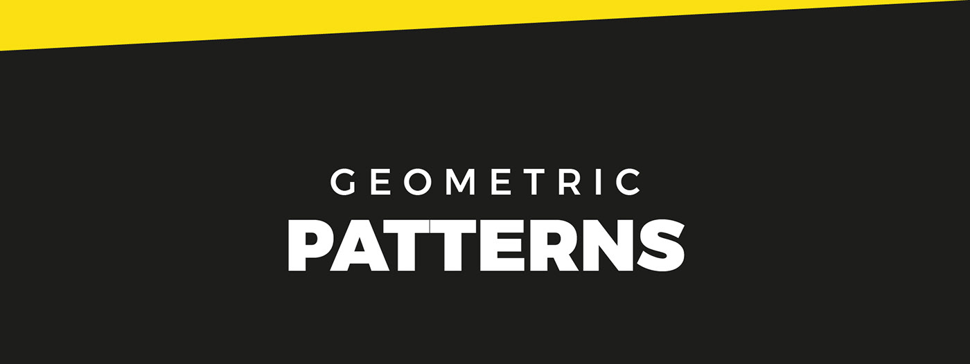
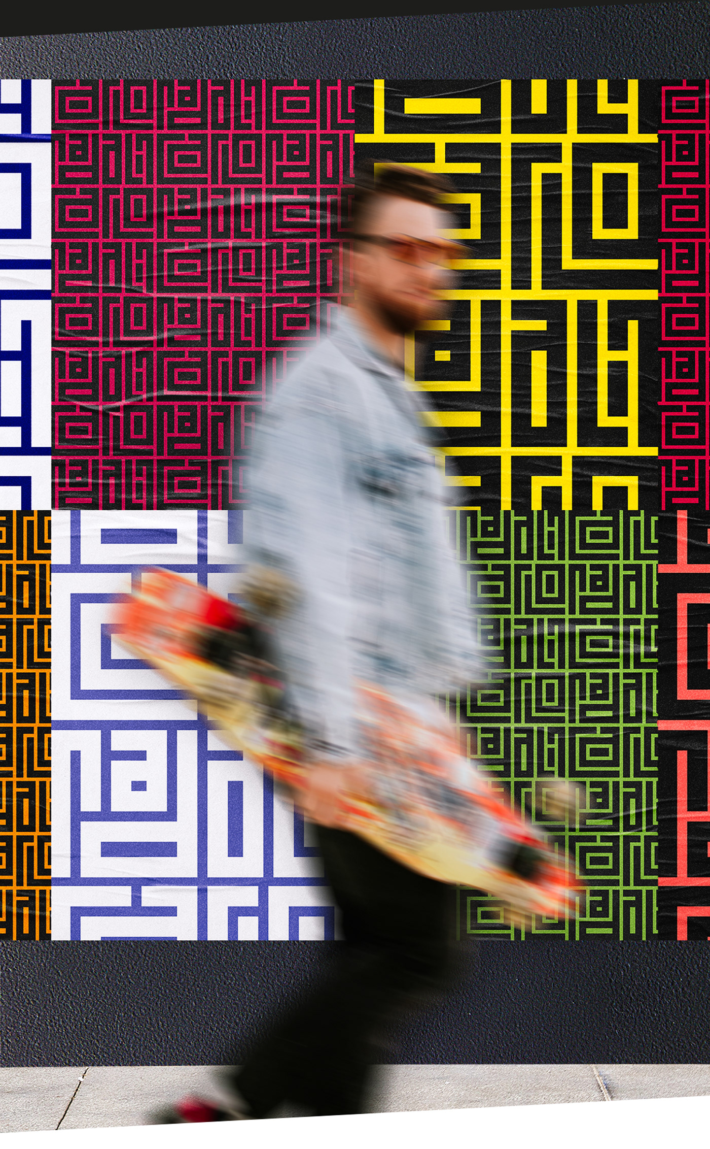
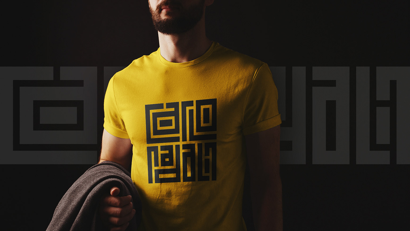
Grazie alla logica della costruzione è però possibile ottenere una versione secondaria in orizzontale semplicemente affiancando le due parole e, ripetendole, si ottiene un pattern grafico di design.
Grazie alla logica della costruzione è però possibile ottenere una versione secondaria in orizzontale semplicemente affiancando le due parole e, ripetendole, si ottiene un pattern grafico di design.
Questo permette di sfruttare al massimo le potenzialità del logotipo, che si adatta agli spazi e restituisce sempre un mood coerente e fortemente riconoscibile.
EN
The logotype is built on a square grid which makes it compact and suitable for most of its uses.
However, thanks to the logic of the construction, it is possible to obtain a secondary horizontal version simply by placing the two words side by side and, by repeating them, a graphic design pattern is obtained.
This allows you to make the most of the potential of the logotype, which adapts to spaces and always gives a coherent and highly recognizable mood.

IT
Per mantenere una coerenza stilistica nelle diverse situazioni di utilizzo, ho predisposto delle guidelines in cui vengono raccolte le principali informazioni come l'area di rispetto, la color palette, la tipografia ecc...
EN
To maintain stylistic coherence in the various situations of use, I have prepared guidelines in which the main information is collected such as the buffer area, the color palette, the typography, etc...
To maintain stylistic coherence in the various situations of use, I have prepared guidelines in which the main information is collected such as the buffer area, the color palette, the typography, etc...
IT
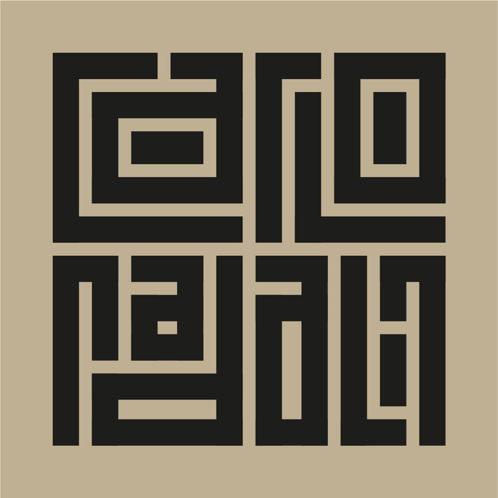
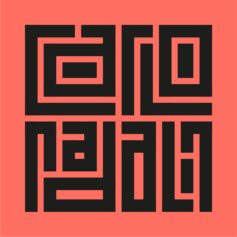
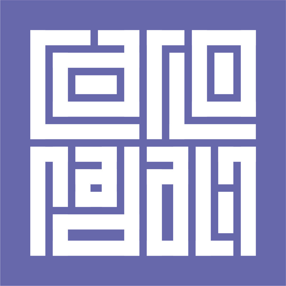
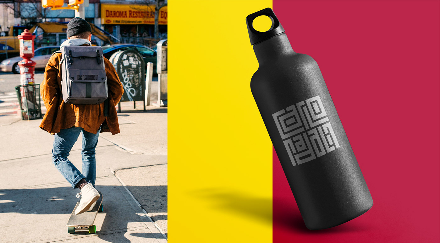
Ho costruito il logo pensando al suo utilizzo monocromatico in nero opaco, oppure bianco se utilizzato in negativo. Questo non è un fattore limitante in quanto è possibile utilizzarlo su qualsiasi sfondo, ottenendo un mood sempre in linea con il contesto e con ciò che si vuole comunicare (forza, eleganza, decisione, ecc.)
EN
I built the logo thinking about its monochromatic use in matte black, or white when used in negative. This is not a limiting factor as it is possible to use it on any background, obtaining a mood that is always in line with the context and with what you want to communicate (strength, elegance, decision, etc.)
I built the logo thinking about its monochromatic use in matte black, or white when used in negative. This is not a limiting factor as it is possible to use it on any background, obtaining a mood that is always in line with the context and with what you want to communicate (strength, elegance, decision, etc.)


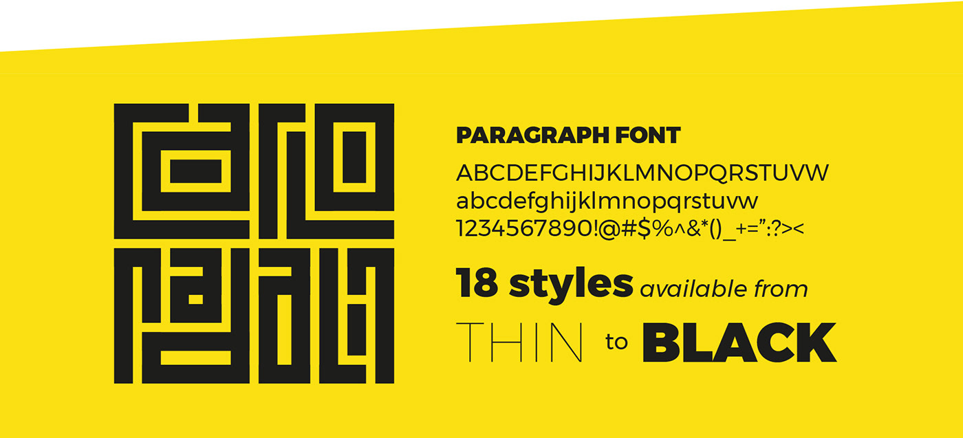
IT
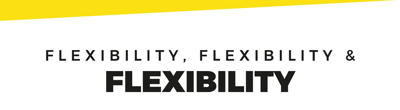
Sempre in un'ottica di flessibilità e semplicità di utilizzo ho scelto per la tipografia un GoogleFont, il Montserrat.
Un carattere geometrico con un'ottima leggibilità in riduzione e che, grazie ai suoi molti stili, mi permette di ottenere comunicazioni dinamiche anche quando fatte di solo testo.
EN
Again with a view to flexibility and ease of use, I chose a Google Font, Montserrat, for the typography.
Again with a view to flexibility and ease of use, I chose a Google Font, Montserrat, for the typography.
A geometric font with excellent legibility in reduction and which, thanks to its many styles, allows me to obtain dynamic communications even when made up of text only.

IT
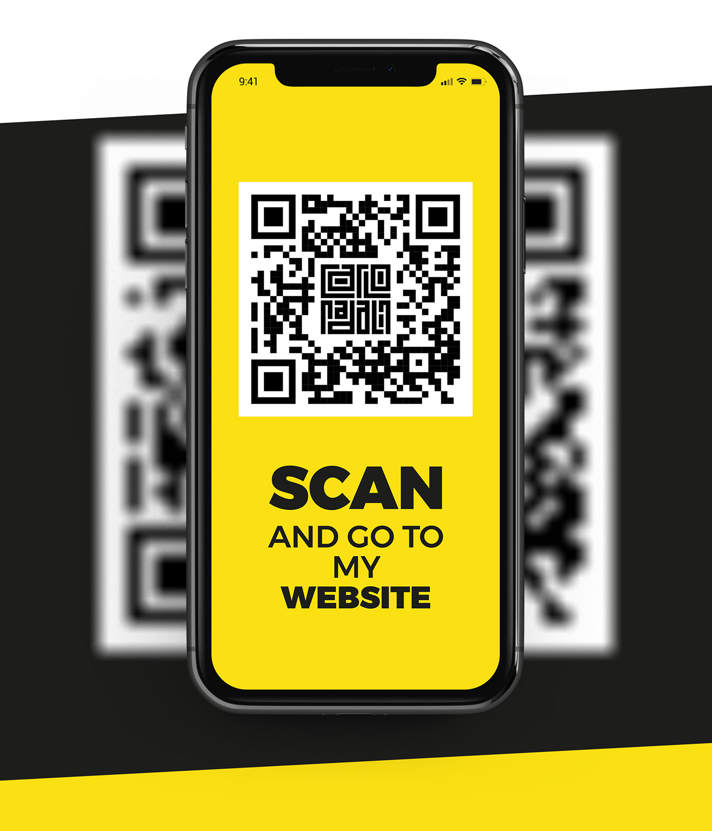
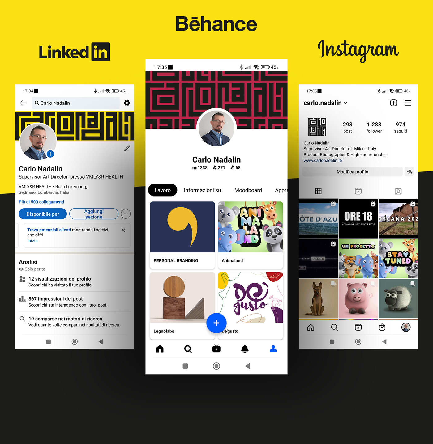
Data la costruzione del logo, potevo non creare un QR-Code personalizzato con rimando al mio sito?
Ho sviluppato successivamente tutti gli asset per le diverse piattaforme social, attribuendo a ciascuna un codice colore così da ottenere comunicazioni differenti, al tempo stesso coerenti e subito riconducibili alla mia persona.
EN
Given the construction of the logo, could I not create a personalized QR-Code with reference to my site?
I subsequently developed all the assets for the various social platforms, attributing a color code to each one so as to obtain different communications, at the same time consistent and immediately attributable to my person.
I subsequently developed all the assets for the various social platforms, attributing a color code to each one so as to obtain different communications, at the same time consistent and immediately attributable to my person.
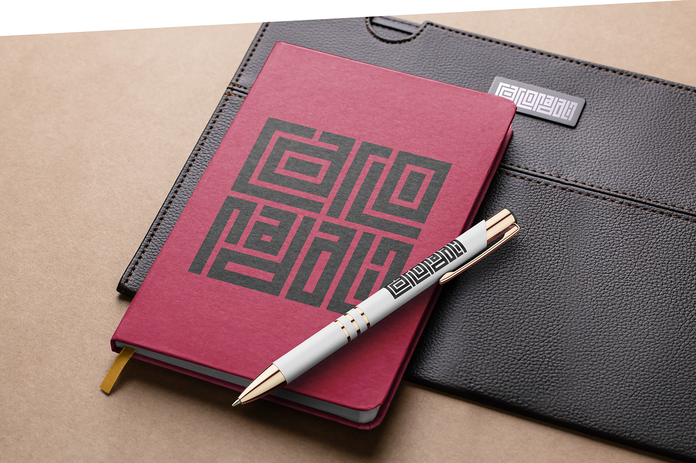
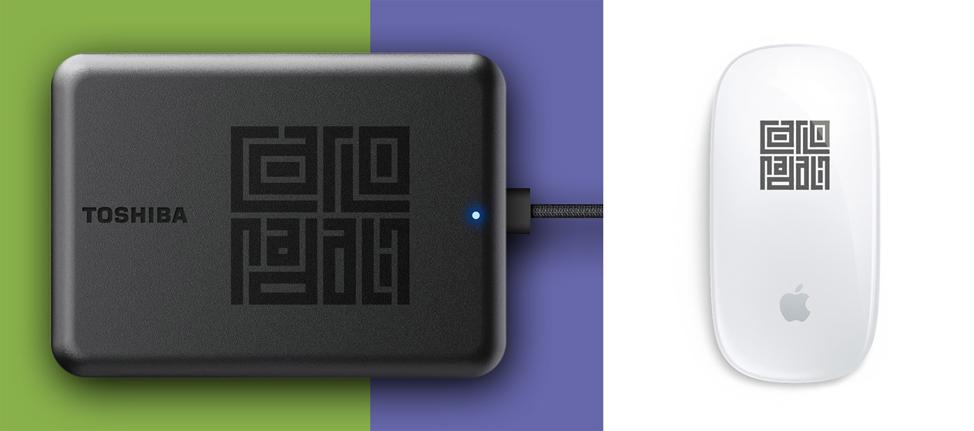
IT
Da creativo amo anch'io personalizzare ogni cosa, così mi sono immaginato come il logotipo potesse essere applicato a oggetti che realmente fossero utili nel quotidiano e... bhe gran parte di questi sono già in produzione :-)
EN
As a creative, I too love personalizing everything, so I imagined how the logotype could be applied to objects that were really useful in everyday life and... well, most of these are already in production :-)

THANKS FOR WATCHING & SUPPORT WITH A LIKE
What do you think of the project?
Write it to me in the comments, your feedback is important :-)
Write it to me in the comments, your feedback is important :-)