eureka
eureka is a Hong Kong-based architectural studio that aims to create meaningful spaces that can transform human behaviour. Named after a phrase that is usually exclaimed after a bright moment of illuminating discovery, eureka’s designs are created with a duality of functionality and poetry to create multi-layered architectural solutions for people.
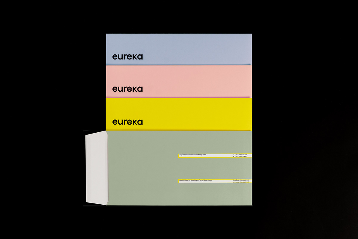
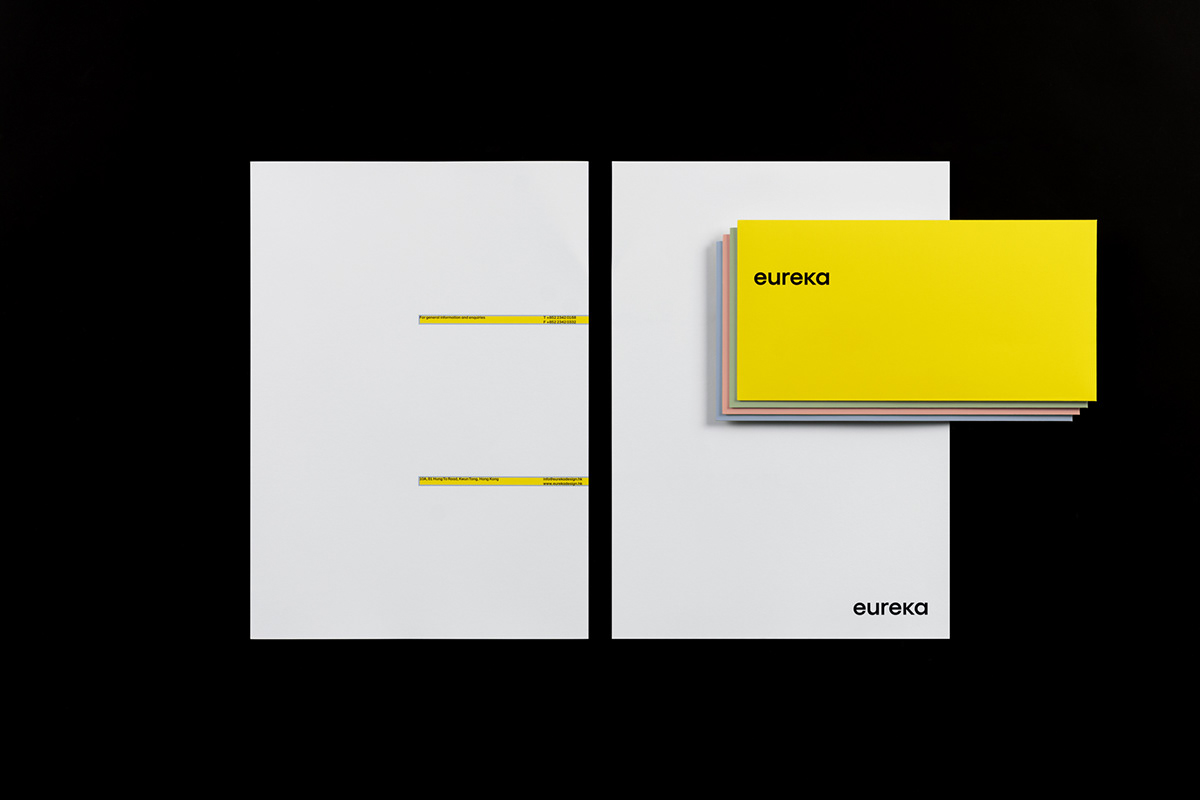
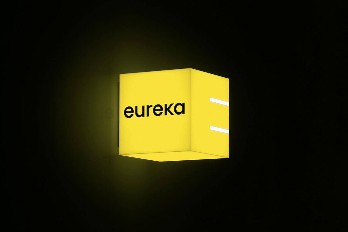
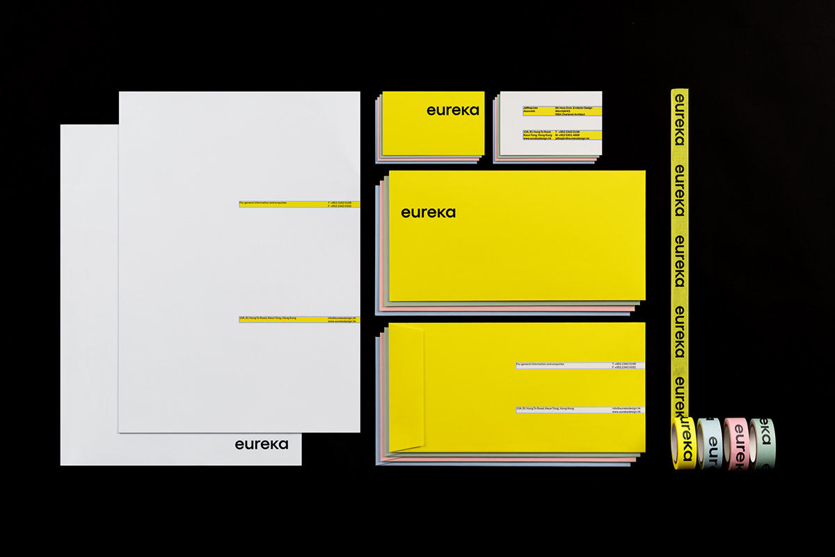
The identity for eureka visually simplifies and articulates its dual-focused design philosophy. For the logo, the letters are stripped to their most bold and basic shapes, representing the material honesty adopted in their architectural practice.
Communicating their practice of duality, two lines to the right-hand edge of all collateral to form a supersized and abstract letter ‘E’, representing eureka’s ever-present ethos in all their projects. The lines can be superimposed onto imagery, or become spaces for text and colour—blurring the boundaries between inside/outside and negative/positive space. The graphic language echoes eureka’s practice of connecting, integrating and merging spaces to maintain a balance between individual spaces and being part of the whole.