I was asked by British Food Store online to consult with them on what they could do to improve the look of their website, to make it more user friendly and less 'busy' looking. They didn't want a re-design of their site just a reduction and improvement on their content.
HOMEPAGE-
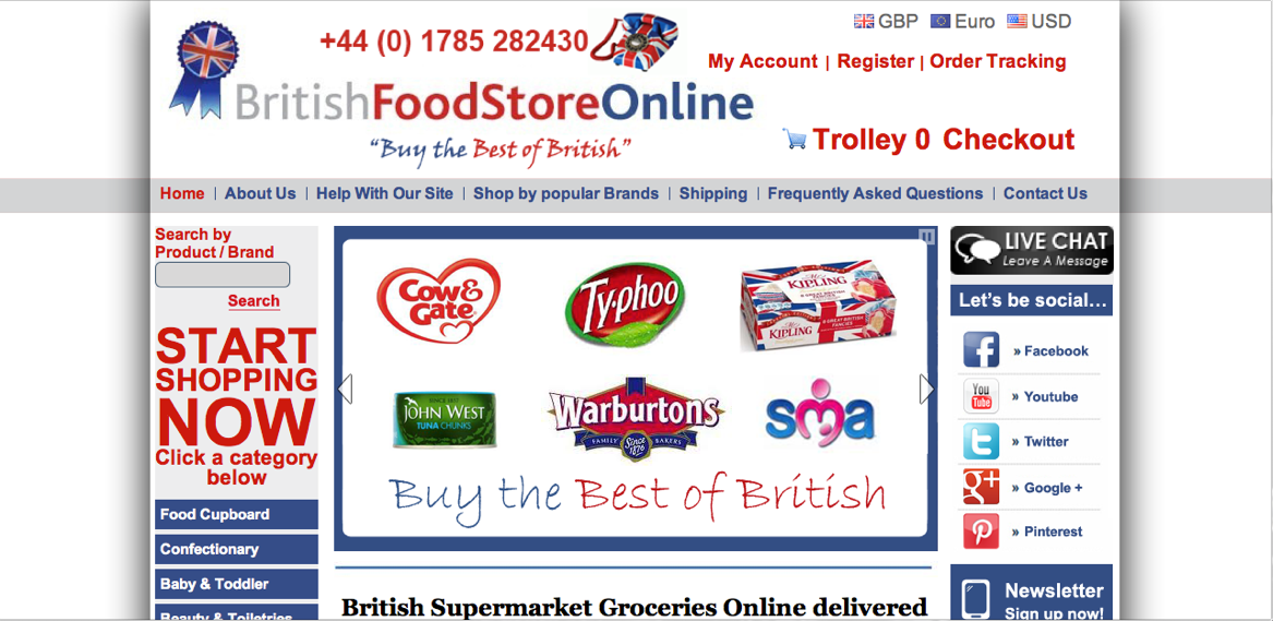
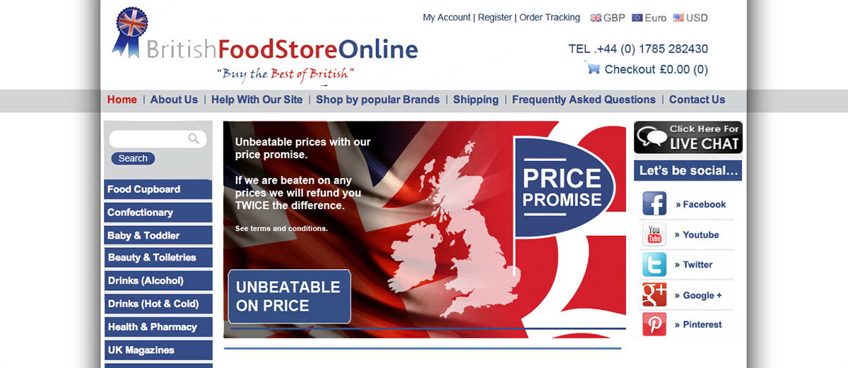
I started with the Homepage. This was their Homepage before any changes:
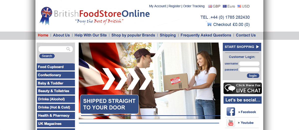
This was the design I changed the homepage to:

- I reduced the size of some of the elements in the header
- I deleted the phone image in the header and really cleaned and freshened the look of this up
- I designed the new slideshow to create more interesting slides. These slides introduce the
company and instruct the viewer what British Food Store Online do.
- I deleted the 'Start Shopping Now' text at the side of the sllideshow
All in all, I made the look of it a lot cleaner and more user friendly. Before, the viewer wouldn't have known where to look, but now it is simpler and straight to the point. Everything you would want in a homepage design to keep the interest of the viewer and introduce the company.
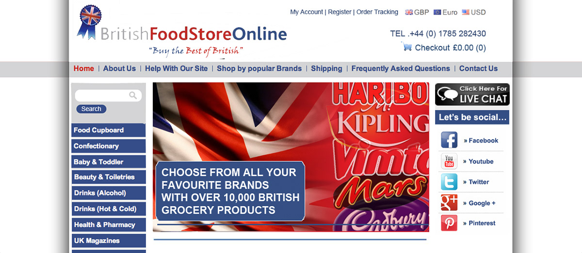
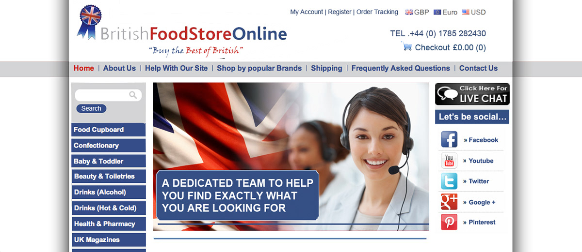
These are the remainder of the slides in the slideshow that I created:

HOMEPAGE - BELOW SLIDESHOW -
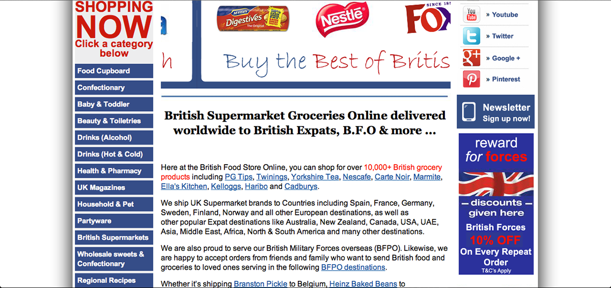
Here is what the homepage looked like before I changed anything (under the slideshow):
The changes I made:
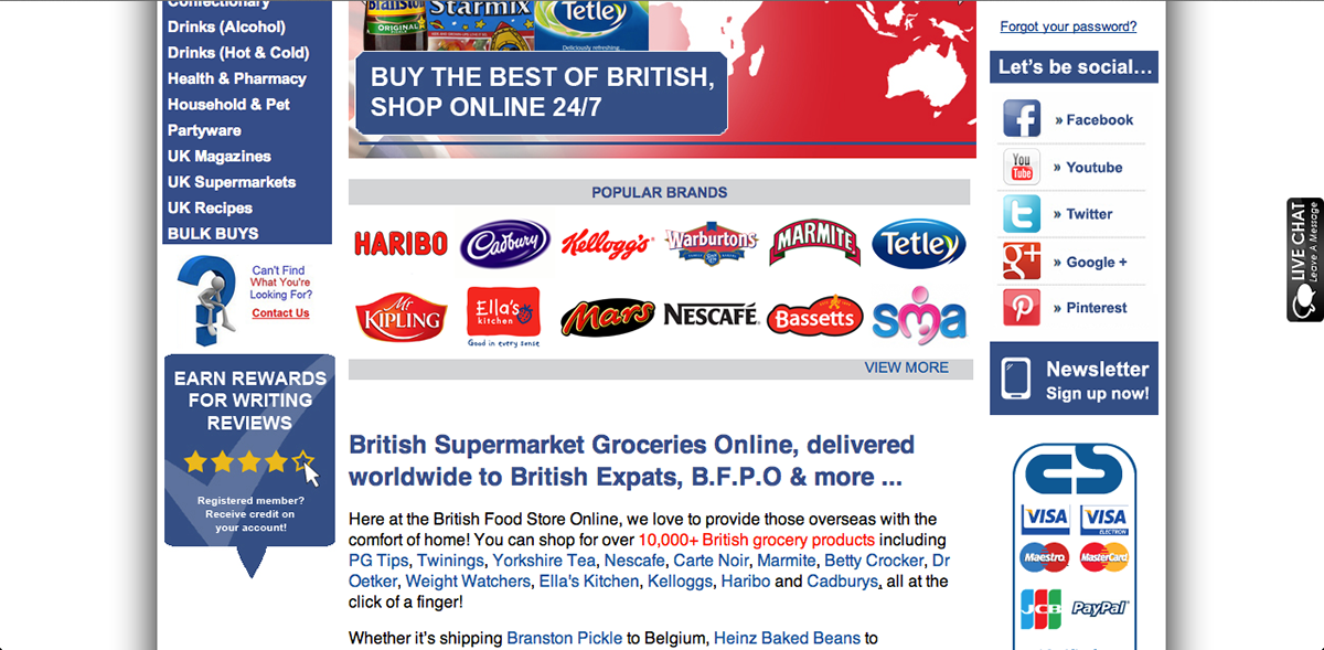
To further give an idea of what the company do, I moved the 'listed' popular brands from the side bar of the site to the main content area. I changed it from a list into the logos of the brands on a banner to add a visual element, whilst at the same time being effective even to glancing viewers as they are instantly recognisable and in the process give the viewer more of an idea what the company do.
In the process of the cleaning up of the design and function of the site, British Food Store implemented a rewards for reviews tool. To advertise this, I created the image on the left hand side of the site. The idea was also put across to add the live chat tool on the right hand side of the site.
HOW TO BUY PAGE -
This was the How to Buy page before I changed it:

Changes I made:
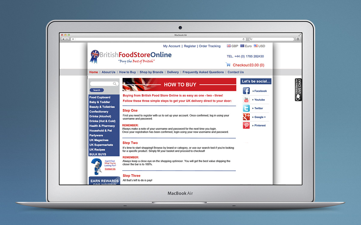
On all the pages I added a title banner at the top to add a visual element - help break up the text, but to also make it clear to viewers what page they are on.
As the original look of this page was very wordy, I thought it would be better to try and break the text up to make it more user-friendly and easier to read. To do this, I implemented dividing lines between sections and added the red colour for the main parts of the text.
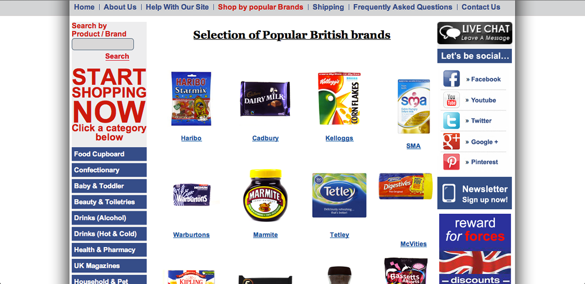
POPULAR BRANDS PAGE-
This was the popular brands page before I changed anything:
Changes I made:

PRODUCT PAGES-
Product pages before I changed anything:

Changes I made:
I made slight changes to the product pages. I changed the photo sizes so that they were all the same uniform size. I also neatened up the layout of the name of the product and the price and add to cart button. In addition, I also featured my title banner.
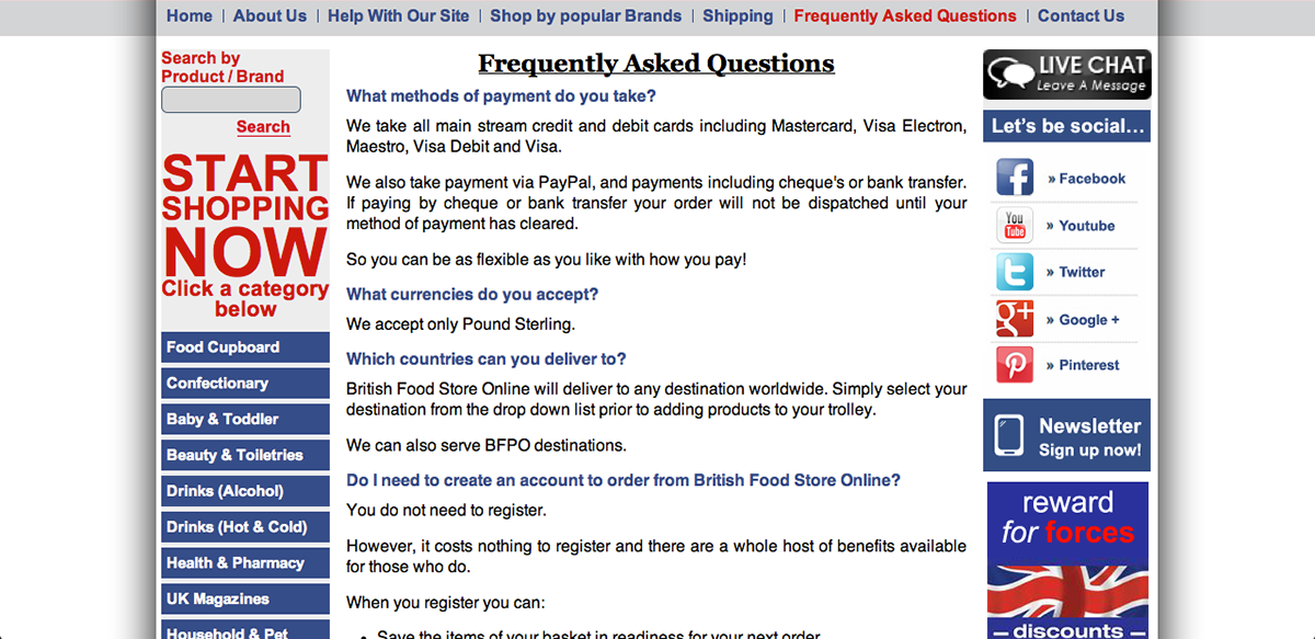
FAQ PAGE-
The FAQ page before i changed anything:
The changes I made:

As this page was once again very wordy, I added the title banner for visual effect. I also included the divider lines and red text for the questions to break up the text. In doing this, it is easier for the viewer to find the question that they are trying to find an answer for, more quickly. It also appears less wordy. Therefore, the less likely the viewer will lose interest when reading the text.


