Vanitee is an edgy, up market brand similar to All Saints. Their T-shirts are aimed at females and are about being vain, but in a good way.
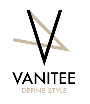
FINAL LOGO:

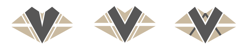
Taking their brand into account, the idea for lips as the icon came to mind. This is what I experimented with first. I tried to create the lips in an 'edgy' shape to go with the 'edgyness' of the brand:


I then tried the lips with metallic colours to go with the colours and metal/constructed looking materials they use in their T-shirts:


After experimenting with the lips, I also tried another idea. When people are vain they usually check themselves out in reflective surfaces/mirrors. I thought I could play on this symmetry/mirrored effect for the logo:


However, after experimenting with these. I felt that the lips idea works best, as it is the most iconic, would appeal to the target audience the most and visually looks the best. Therefore, I did a little more experimentation with the lip shape to refine it and see if there was a better way to visualise it:


I also found this typeface that I thought would really tie in well with the vanitee brand with the idea of symmetry and mirrors (the V and the A are the same shape and they lie next to each other in symmetry). I think the serif look to it also brings across the up-market feel:


After all the experimentation. The result and final logo was this:

It's nice and clean. Having the V shape in the lips in the shape chosen makes the V stand out the most and looks the most iconic. The typeface also works really well with the brand idea and the icon shape, to bring across an edgy, up-market feel.
T-SHIRT TAG:

The T-shirt tag links with the 'All Saints' feel and gives a quality brand feel. The diaganol lines also emphasise the mirror idea of the lines of symmetry.

