/packaging
Sammontana “I Classici”
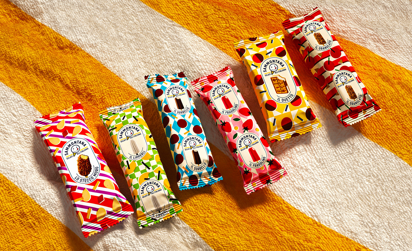
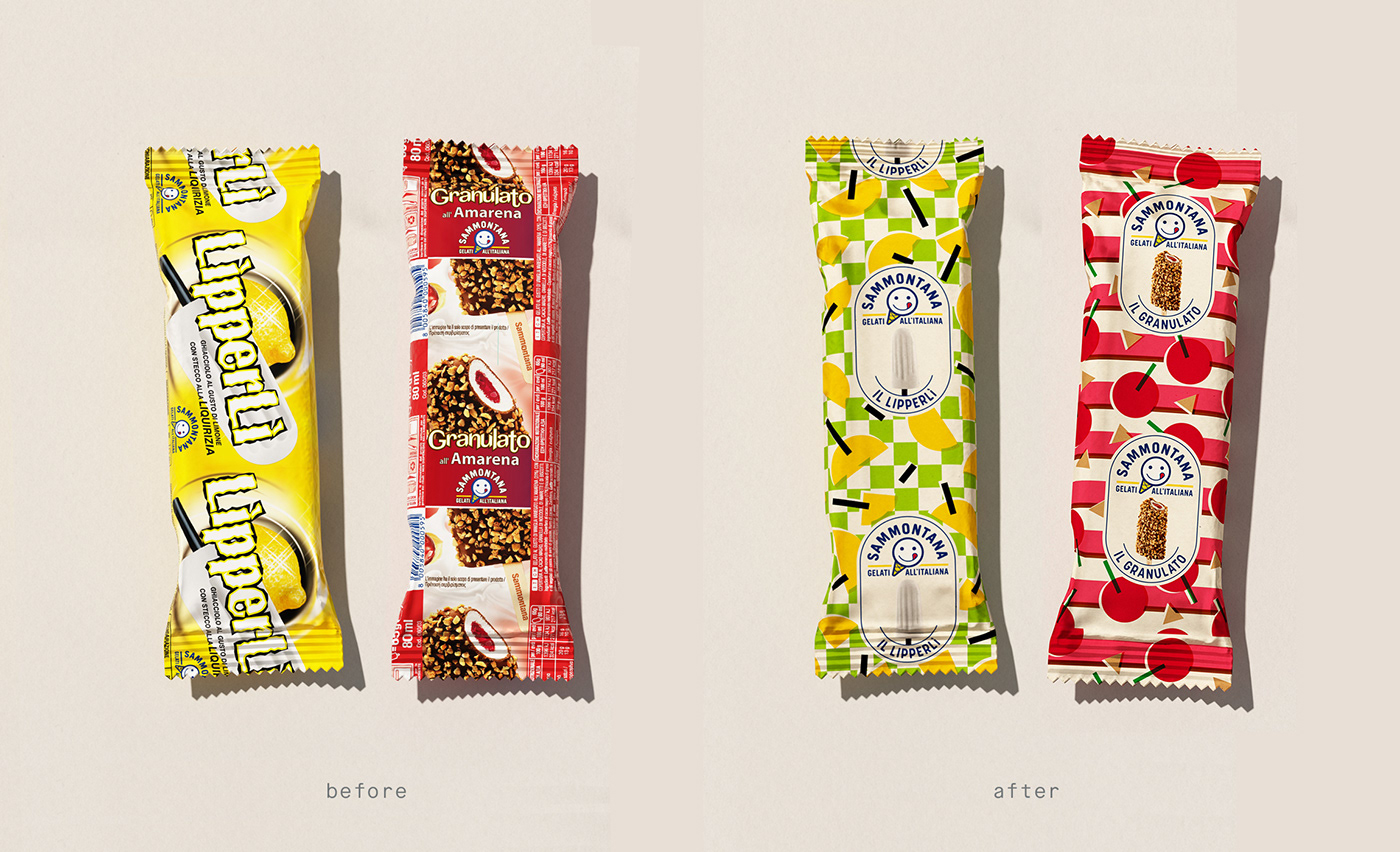
Complete restyling of the most iconic ice creams that belong to the summer memory of every Italian. Not old, just classic.
CLIENT
With over 70 years of history in ice cream making, Sammontana is the Italians’ favorite industrial ice cream and frozen goods brand. The Group operates in 5 production sites around the country and counts over 1000 employees.
ASSIGNMENT
The complete restyle of the most classic ice creams that belong to the summer memory of every Italian. The task was to create a consistent and recognizable product line, but with a different personality for each ice cream.
SOLUTION
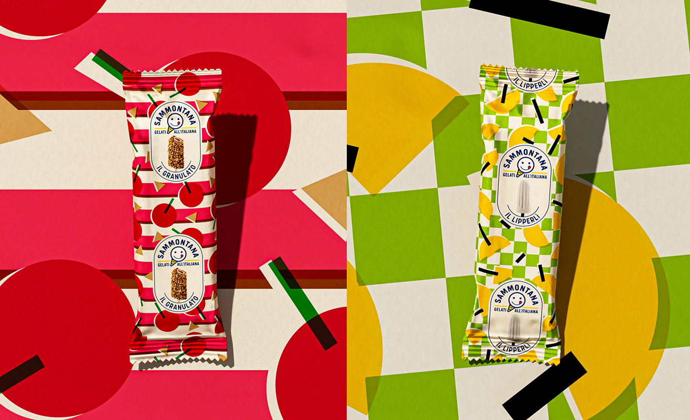
We started by investigating the Sammontana heritage archive, where we find a vast treasure of bold colors and illustrations, we immediately fell in love and wanted to bring back these nostalgic summer vibes. To help create a family feeling we have opted to have the logo, image and names of the ice cream all in the same designated area, that works like a label applied on the pack. Every ice creams has its own pattern, the colors and illustrations used give an idea of the flavor and texture of the product.
PROCESS
We create a format in which the logo and the photo are always positioned in the same position, to make it easier to recognize the product and the brand. Each ice cream has its own unique pattern, the colors and illustrations help the customer to recognize the flavor.
---
Executive Creative Director: Davide Mosconi
Designer: Anna Rodighiero
3D Artist: Gabriel Cellini
Photography: Food Pirate Studio
---
YEAR / 2022


