Amsterdam based Witfilm develops and produces creative, social documentaries and arthouse films. With a strong focus on concept development and through intensive coaching of filmmakers, this leads to innovative, visually powerful films and documentaries of an artistic nature on topics that are always thought-provoking.
Propagating Dutch Documentary and fiction
By making high quality films and documentaries that are visually exciting, Witfilm aims to contribute to a thriving documentary and film sector, both nationally and internationally. The old look and feel no longer met this ambition, so Witfilm asked us to help realize a new visual identity with a matching website.
By making high quality films and documentaries that are visually exciting, Witfilm aims to contribute to a thriving documentary and film sector, both nationally and internationally. The old look and feel no longer met this ambition, so Witfilm asked us to help realize a new visual identity with a matching website.
Tell a story. Show what happened. Change perspective.
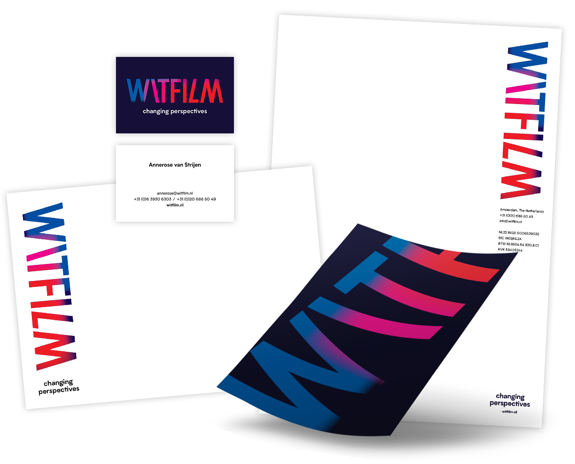
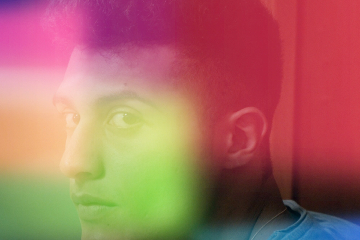
Witfilm productions are characterized by a carefully thought-out balance between experience, story and cinematography. With subjects that often are thought-provoking and that allow the viewer to change their perspective. We translated this change in perspective and Witfilms symbiotic way of collaborating with filmmakers into colored rectangled projections placed in perspective. A so-called ‘additive’ mixing has been applied to the rectangles; a color mixing with light in which the mixing of the basic colors red, green and blue results in white.
Witfilm productions are characterized by a carefully thought-out balance between experience, story and cinematography. With subjects that often are thought-provoking and that allow the viewer to change their perspective. We translated this change in perspective and Witfilms symbiotic way of collaborating with filmmakers into colored rectangled projections placed in perspective. A so-called ‘additive’ mixing has been applied to the rectangles; a color mixing with light in which the mixing of the basic colors red, green and blue results in white.
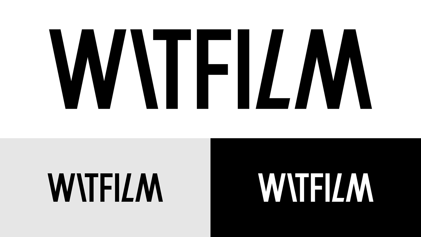
The word WITFILM is characterized by verticals and diagonals. Reversing the W and using it as M reinforces this rhythm. The white space that arises between the L and the M is optically corrected by putting the L in italics. This intervention and the slanting of the I underline the tagline ‘change perspective’ and give the logo its own distinctive appearance.