Parkinson’s disease is the fastest growing neurological disorder today. Yet little is known about the disease. It is time for more knowledge and insight, for better treatment, cure and ultimately the prevention of the disease. ParkinsonNL starts and stimulates new collaborations and fundraising with a clear message and objective; Stopping Parkinson’s starts today.
Fundraiser with a startup mentality
ParkinsonNL is a new fundraiser initiative in the field of Parkinson’s in the Netherlands. The fund operates from a startup mentality and their aim is to be impactful through groundbreaking research, innovation and distinctive fundraising and communication. A brand that should have a strong communicative image towards consumers, but also towards the business community, major donors, etc. The aim was to develop a strong brand identity that’s appealing to different target groups and that radiates these distinctive brand values in a contemporary way.
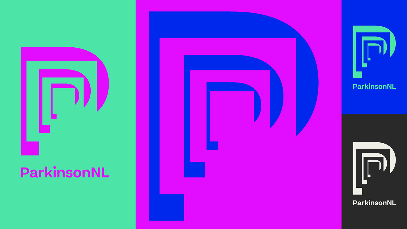
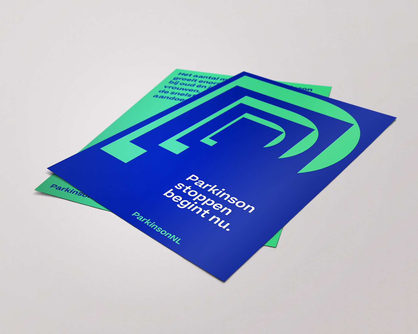
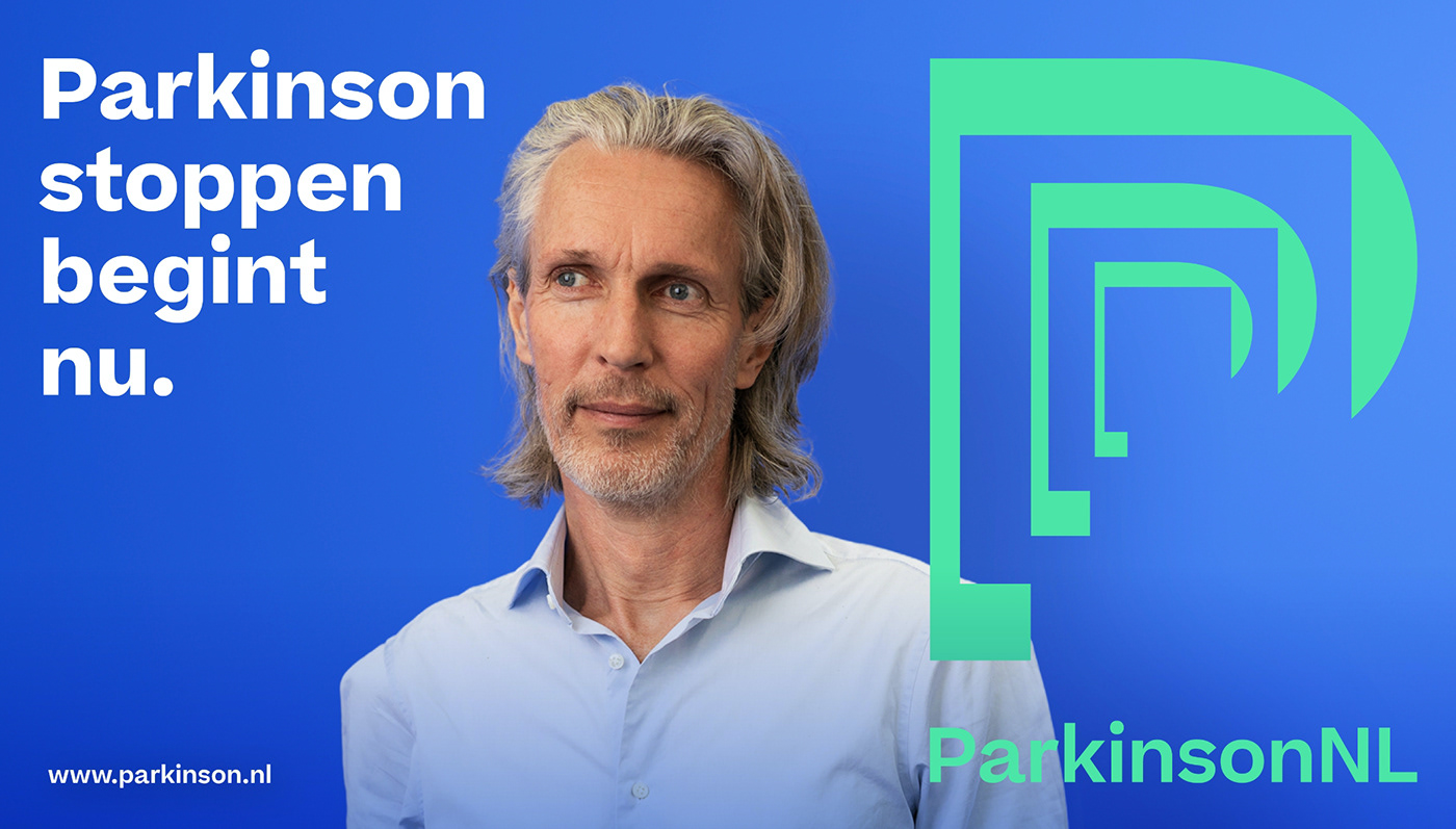
Moving borders
The ParkinsonNL logo is a visualization of how to show resilience in dealing with the complications of Parkinson’s. It is a process where you have to reinvent yourself over and over again. The disease forces patients to constantly create a new framework in order to be able to move forward from there. This is reflected in the logo and the design language.
The ParkinsonNL logo is a visualization of how to show resilience in dealing with the complications of Parkinson’s. It is a process where you have to reinvent yourself over and over again. The disease forces patients to constantly create a new framework in order to be able to move forward from there. This is reflected in the logo and the design language.