


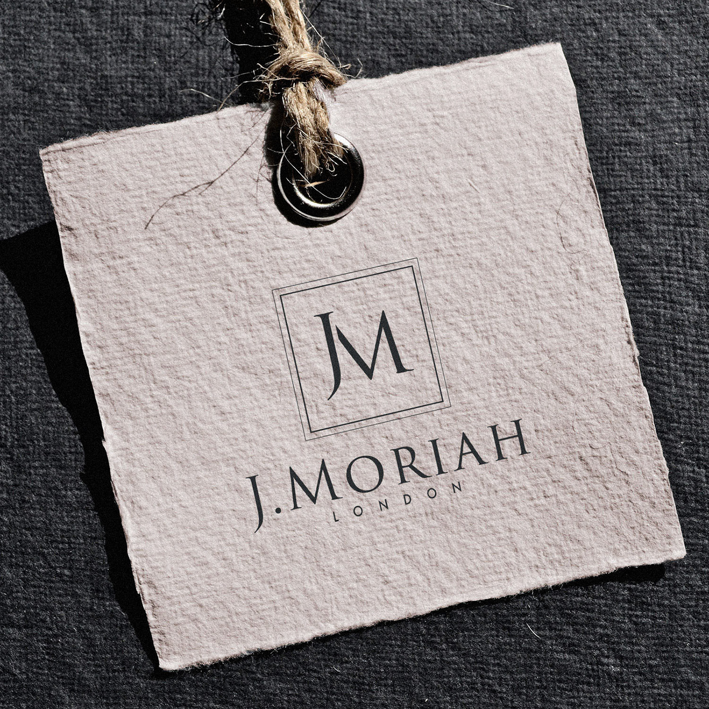

When J Moriah commissioned me to create their new logo and we discussed style, I laughed at how similar our taste was. In fact, J.Moriah shares the same ‘JM’ initials as my own brand! “Let’s create something similar, but even better”, I joked, and we set about the usual identity process, a clear direction in mind.
Well, I think we succeeded in creating something even better. Or at least, far better suited than my own brand would have been… Although using a simple monogram, the serifs, the elegant dual keyline, and the timeless classic Trajan Pro 3 font all position the brand perfectly to attract it’s ideal clientele.
J Moriah are a womenswear brand aimed at young women in their 20s & 30s. The main products are dresses and it’s girlish style with naive and dreamlike mood.
This was the target tone we identified before beginning concept generation;
Feminine or Masculine?: Very feminine
Young or Mature?: Fairly young
Luxurious or Economical?: Fairly luxurious
Modern or Classical?: Fairly classical
Playful or Serious?: Fairly serious
Stylised or Understated?: Very stylised
Simple or Complex?: Fairly complex
Subtle or Obvious?: Fairly subtle


