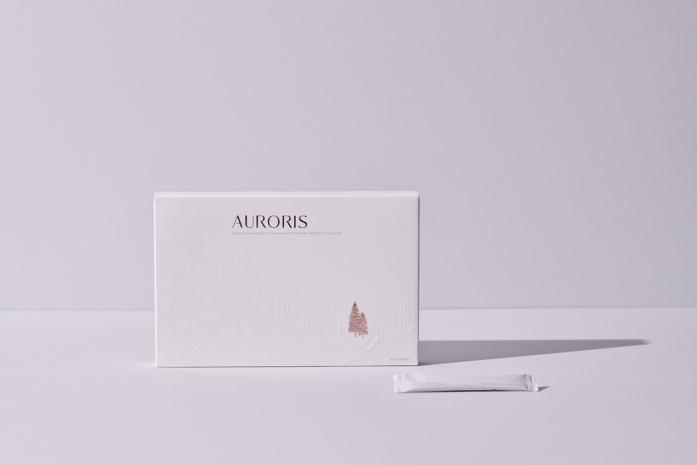

AURORIS White Branding + Packaging
Brand identity, logo design, and packaging design for AURORIS founded by a Malaysian beauty nutrition company that curates innovative products designed to address specific beauty needs of every woman.
The brand draws on the personal experience of the founder, the product’s skin-whitening promise, and winter tones – balancing the mood for summertime activities with an addition of AURORIS into one’s beauty routine for better skin days ahead.
At the core of AURORIS is the idea of anti-aging and skin whitening action – a novel health supplement made with NMN, rice ceramide, glutathione, mixed berries extract powder, and pomegranate extract powder.
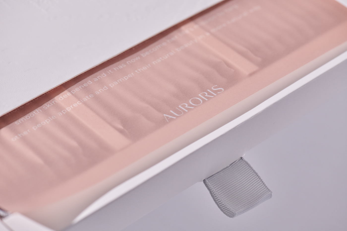
The branding for AURORIS had to channel both ageless beauty and lasting youth, a balance achieved through the use of white and rose gold colours and classy art direction. The logo – in an elegant-yet-bold san serif font – creates a sense of high quality, with the letters in upper case. The packaging design has white and rose gold as the recurring theme colours to evoke feelings of calm, purity, and wonder.
Client
AURORIS
Art Director
Jay Lim
Designers
Michelle Ku
Sammi
Photographer
Marcus Chan
Finishing
Texture paper as the surface of the outer box, rose gold stamping + 3D embossing