Coming soon to New York, House-Guest is an entertainment and hospitality brand that curates beautiful home improvements for hosts who are entertaining, and thoughtful gift options for guests being entertained.
A company focused on going above and beyond to foster these shared experiences, the challenge set for us was to create branding that reflected the meaningful connection between hosts and guests, that conveyed the quality of the House-Guest service, and that spoke to their target demographic.
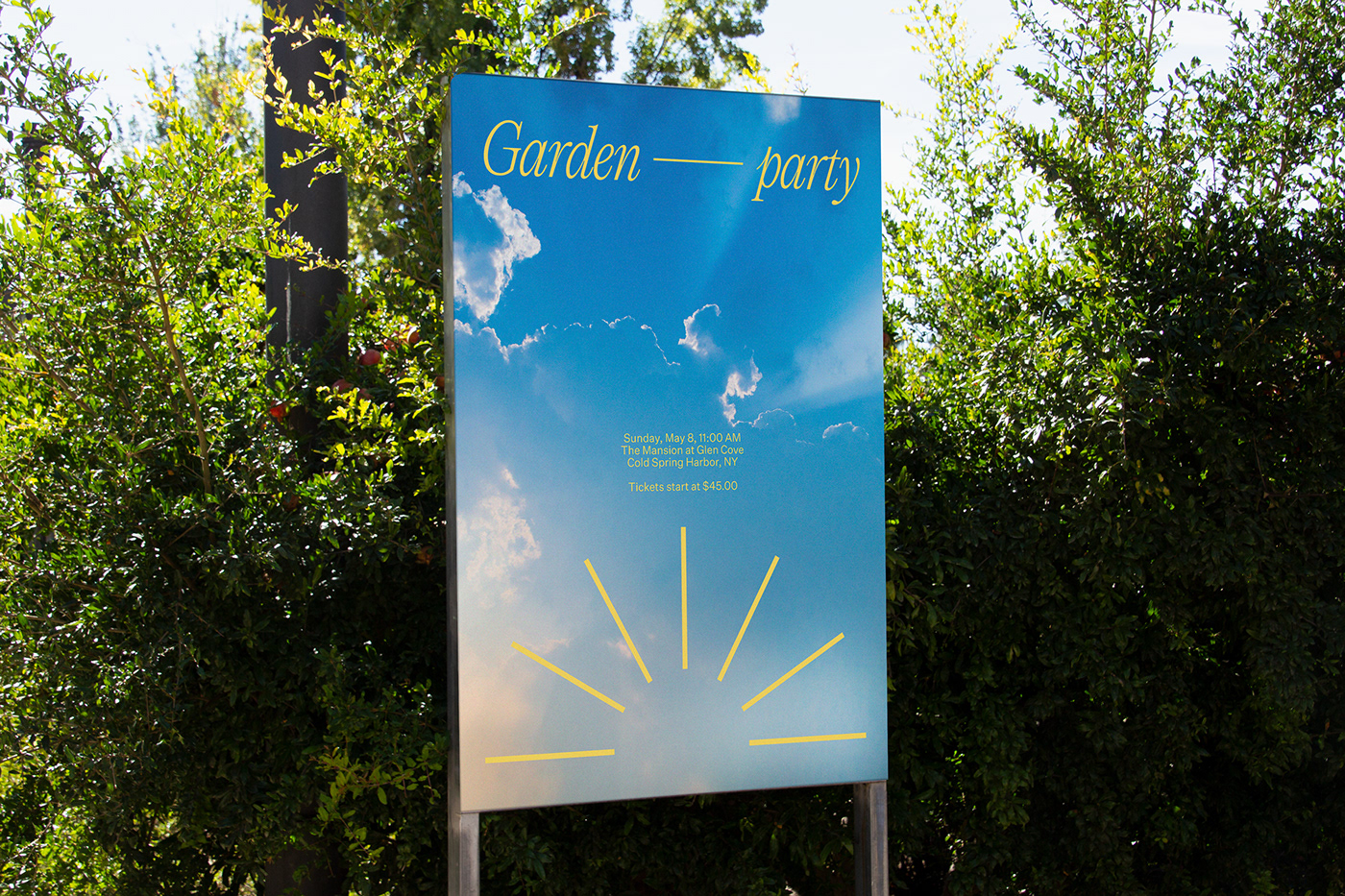
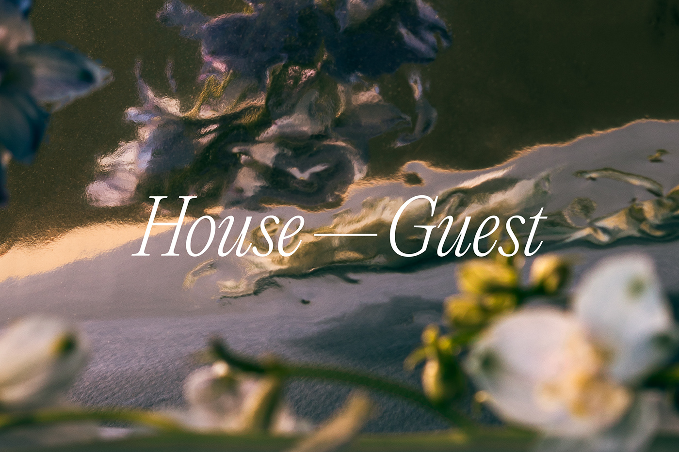
In building this brand identity, we started with a logo that was a simple representation of this connection, drawing a line between “House” and “Guest”. This line also gave us a versatile visual element that we could use throughout the brand (which we’ll be sharing soon).
The logo was also set in the Editorial New typeface, which we chose for its ability to embody the elegance and craft in the House-Guest offerings. And while it carries itself with sophistication, there is a characteristic warmth to the typeface to reflect the human touch that is such a central part to their personal service.
The primary colours we chose for the House-Guest brand identity were simple: black and white. This gave us a very functional palette for applications like product tags and store signage, but also set the foundation for a very active set of secondary colours.
In this secondary palette, we wanted to be quite open in the use of colour, focusing on tones that could be found in vibrant, idyllic natural surroundings. This reflects the scenery of their store location, just outside of NYC, but also allows the House-Guest marketing materials to shift as the product line-up changes with the seasons.
What’s more, being a company that enriches the hosting/entertaining experience, the vibrancy of this colour palette helps House-Guest to communicate themes of celebration and occasion, which so often bring people together.
The use of imagery also follows a similar theme, taking these natural scenes and moving them into an almost dream-like, stylised approach. This adds to the sophistication of the brand identity, while bringing an approachable artfulness to it.
See more of our work at: fookcommunications.com