

Make Ripples is an anti-racism not-for-profit founded on the idea that change happens when we each take practical and conscious action in our daily lives, communities, and workplaces – when we “make ripples where we are”. It exists to empower, inspire, and motivate people to continue taking action in whichever ways they can to make change sustainable and lasting.
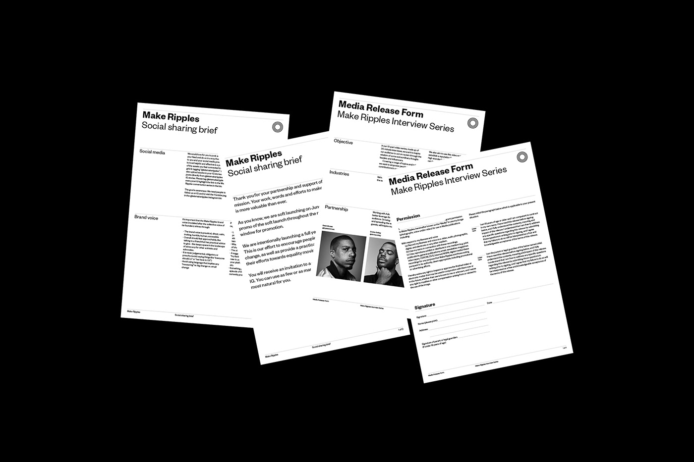
We helped to start this organisation, alongside an incredible founding team, by creating all of the branding and marketing materials – from the brand identity, to social media posts, to internal pitch materials.
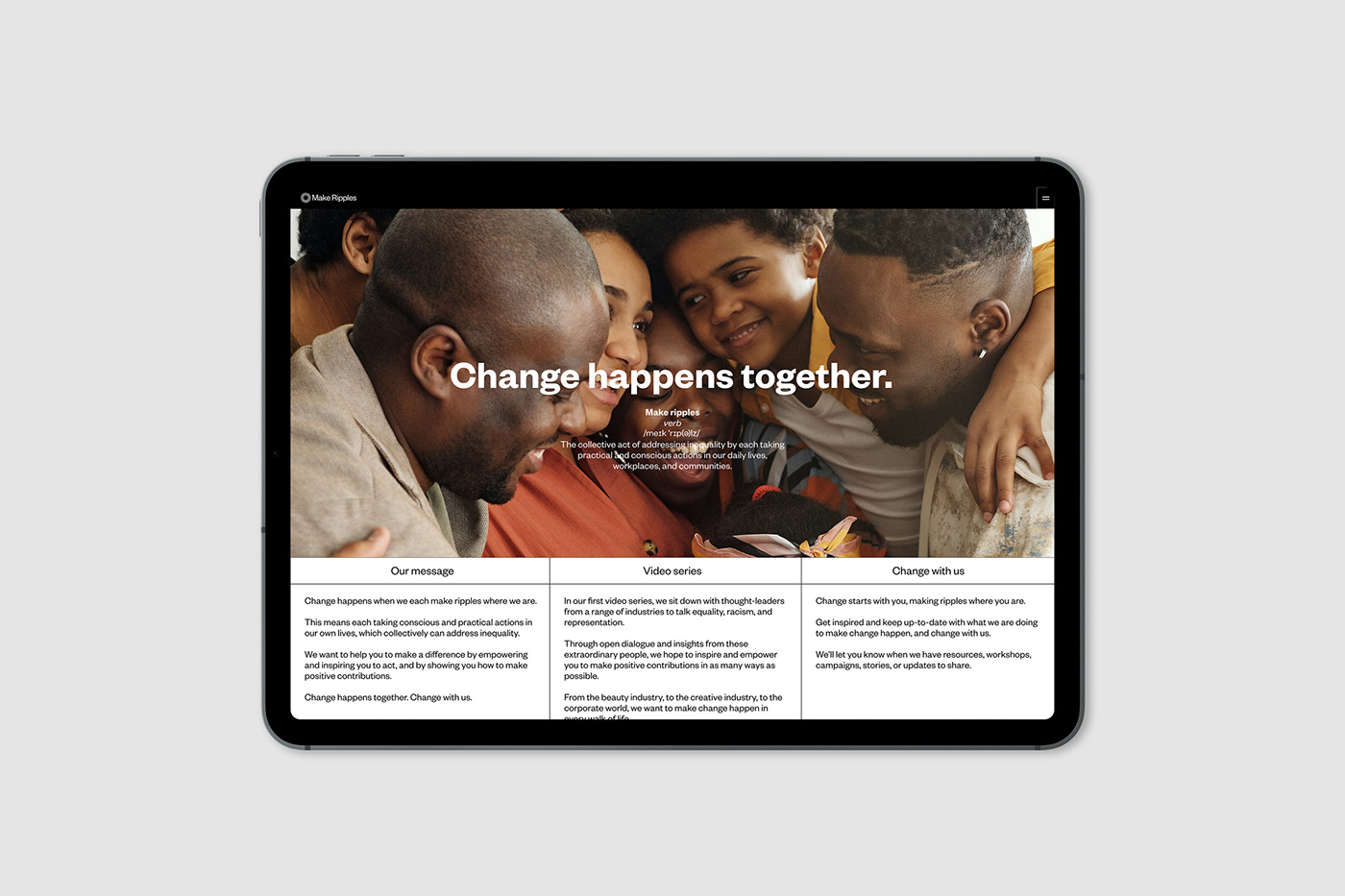
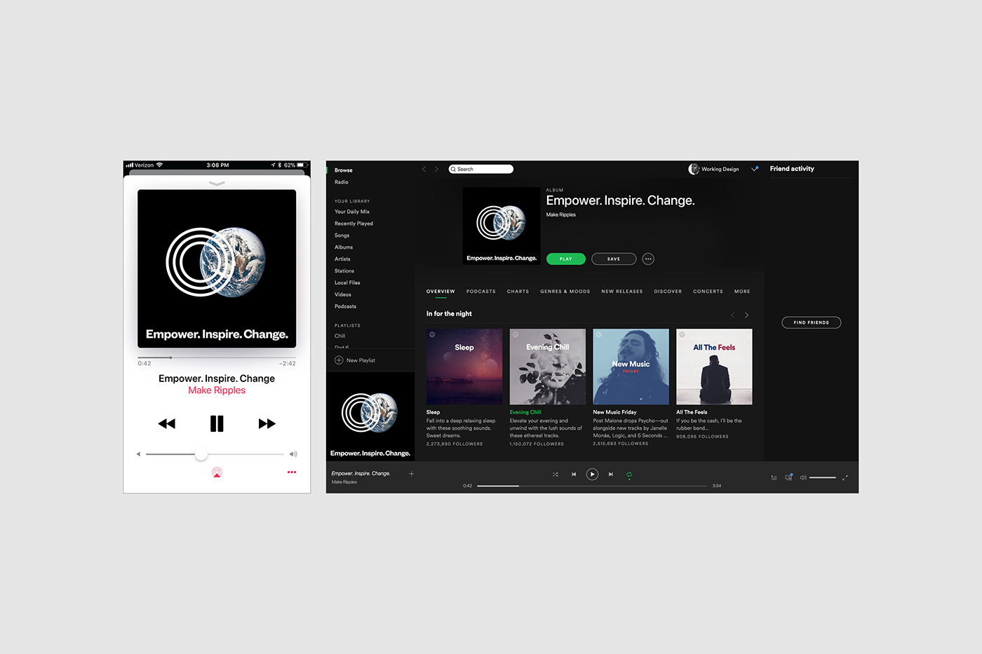
In shaping this brand and brand voice, it was crucial that we spoke to its core purpose. Not only did this have to reflect the ethos of “making ripples”, but it had to represent a brand that invited people in. With the idea that change happens together, Make Ripples needed a non-confrontational, non-judgemental, human, and accessible brand identity. At the same time, it had to have the power to speak directly when necessary. Both visually and in the language we use, this is a brand that doesn’t shout or antagonise, but speaks calmly and plainly about the need for action.
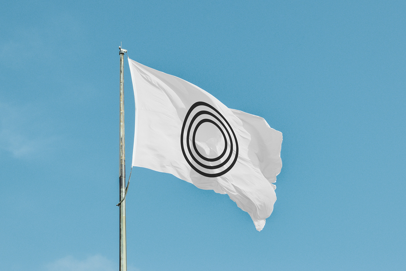
Starting with the logo, we designed a simple distillation of this central idea of making changes that reach farther than their initial impact. By avoiding visual complexity, we ensured approachability and clarity in the logo. The use of circles also implies the idea of the momentum for change being continuous, with that change coming from multiple places.
The primary colours were then chosen as black and white, being intentionally stark and simple. Wanting to help spread valuable and empowering messages, it is the words that come from Make Ripples that take precedence over colour and decoration. These colours also carry with them the implication of being able to start afresh, and having a blank state where each of us can colour, change, and shape the world to build a society better than before.
The brand typefaces continue these themes, and also help to achieve the perfect brand voice. Founders Grotesk, the primary typeface, was first conceived with the goal of portraying information in a serious yet daring tone. This helps Make Ripples speak directly and with authority on matters of race and equality, while also keeping the communication accessible.
The secondary typeface is Times New Roman. Created at the beginning of the modern era of printing, it was made to portray a sense of trust, which is exactly why we used it here. It helps to build a human relationship with the Make Ripples audience, adding approachability and trustworthiness.
Through this thoughtful and holistic approach to branding an organisation that operates in such a critical part of life, we have created a contemporary brand identity and brand voice for a modern form of advocacy. Make Ripples, with our help, is now moving into Canada, the UK, and the US as it spreads its message and ethos, working with incredible thought-leaders and organisations to educate and inspire action.
See more of our work at: www.fookcommunications.com