The team at Responsibli came to us with a bold vision: to change the world for the better through investing. It was then up to us to rename, rebrand, and reposition their company to help them grow towards this goal.
In their field of work - ESG finance (ESG meaning Environmental, Social, and Governance) - the aim is to encourage investments into companies and industries that are socially responsible, and that advance the interests of humanity in general.
In aiding this cause, Responsibli have created an incredibly powerful AI platform that collates unparalleled amounts of data and generates precise reports on just how socially responsible individual companies are. These reports are then used by analysts to determine whether they should invest, or recommend investing, in those companies, thereby impacting their investability and their share price.
With such an ambitious mission, there were a number of things we had to solve for them. Firstly, with financiers as the actual buyers of the product, this brand has to feel sophisticated, trustworthy, and robust.
But secondly, we couldn’t be weighed down by the image of finance companies of the past. So, another challenge for us was to create an identity to position them as a pioneering, forward-thinking, and innovative fintech company.
And while their buying audience is primarily finance professionals, it was also crucial to create an identity and a message that was understandable by a much broader audience. The more people that can understand ESG and its power, the bigger the push to reshape how investing works.
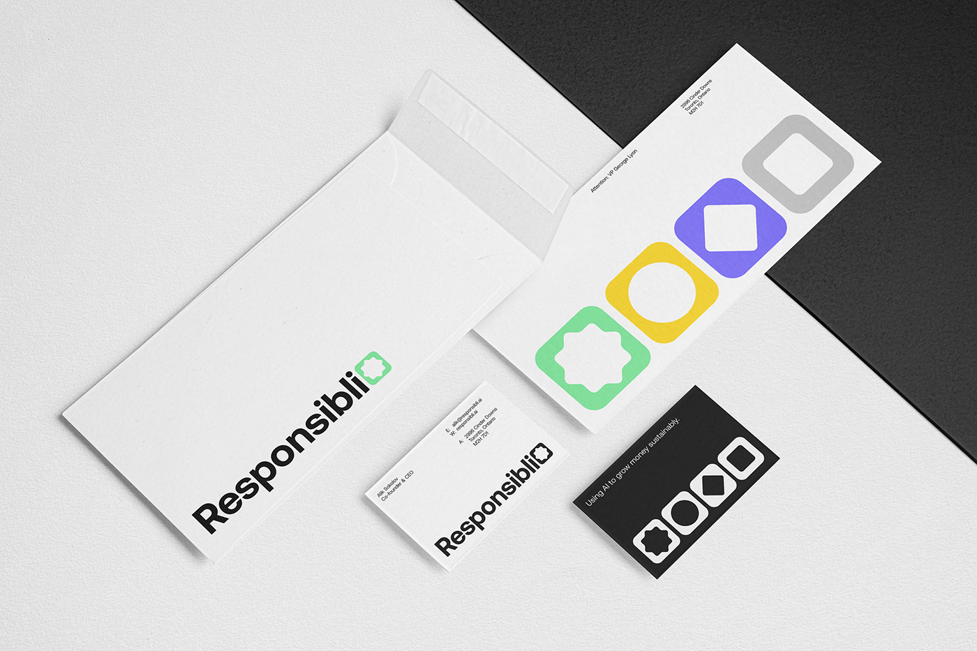
The first step, then, was choosing a name. After working through 50+ options, Responsibli was the one our client landed on. It drew a link to their previous name (“SR.ai”, an AI-themed twist on “SRI” or “Socially Responsible Investing”) and presents them as a contemporary company, while instantly communicating their values and their role in the investing world.
Then to the logo. The process here actually started with creating 3 symbols to represent the Environmental, Social, and Governance components of ESG investing. So, our ‘E’ icon represents the planet, the ‘S’ represents our societal connections, and the ‘G’ represents the importance of robust leadership.
The final logo then combines these elements, creating a symbol compromising the values the company represents in a clear, simple, and purposeful way.
We then needed a typeface to complement the logo and that worked throughout the brand, and so we selected Aeonik. One of the main reasons for this was its flexibility with mathematical and numerical symbols, which can allow the brand to express itself even in the nitty gritty of financial information.
But beyond this, Aeonik has the perfect characteristics for Responsibli. It’s robust, professional, and technical, and at the same time it carries just the right amount of personality to give the brand more approachability, and adds that forward-thinking and contemporary touch.
And then finally, our colour palette. With the overall inspiration of merging nature and technology, we selected green, yellow, purple, and grey as the primary colours.
Green offered an intuitive colour for sustainability and growth - both financial growth and otherwise. Yellow is synonymous with the sun and with life. Purple is a rare colour in nature, but one that has historically been associated with high value and distinction, and so a good choice for this particular industry. Finally, grey was introduced as a sturdy and grounding colour to balance the vibrancy of the others.
To then lean more into the technological than the natural, we adjusted the colours to make them more vibrant, and less typical of the ones you would find in nature.
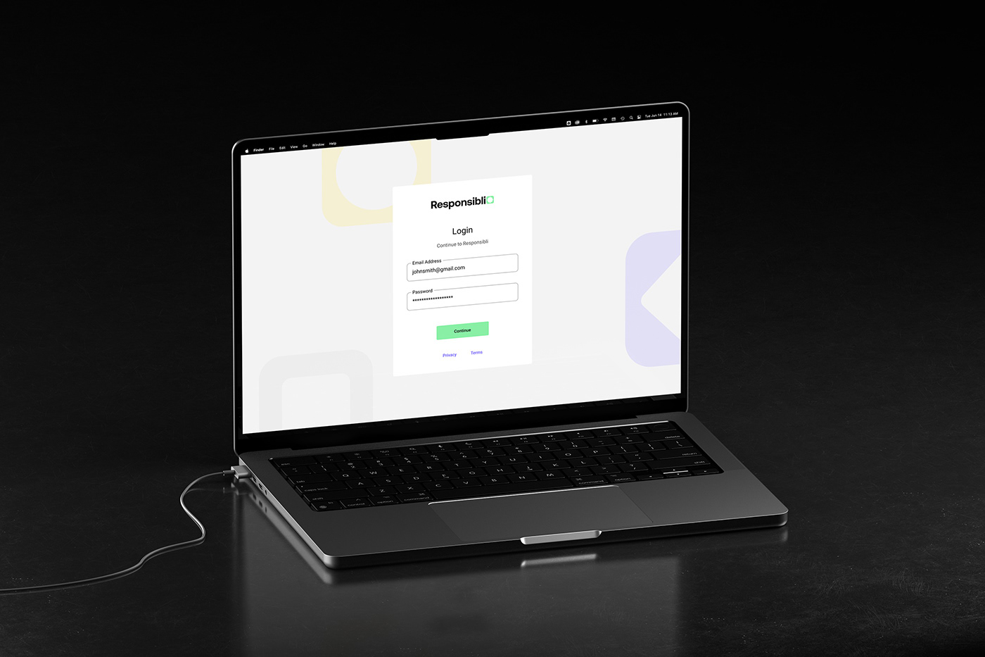
With this foundation, we then designed and built their new website, bringing to life the messaging and positioning we had planned in the branding stage. The identity set the foundation perfectly to deliver a well-defined and understandable value proposition.
During this process, we crafted messaging that was clear, direct, and unburdened by the inaccessible financial language of the past. We wanted this to be understandable by anyone, and not part of a club with its own industry words and terms.
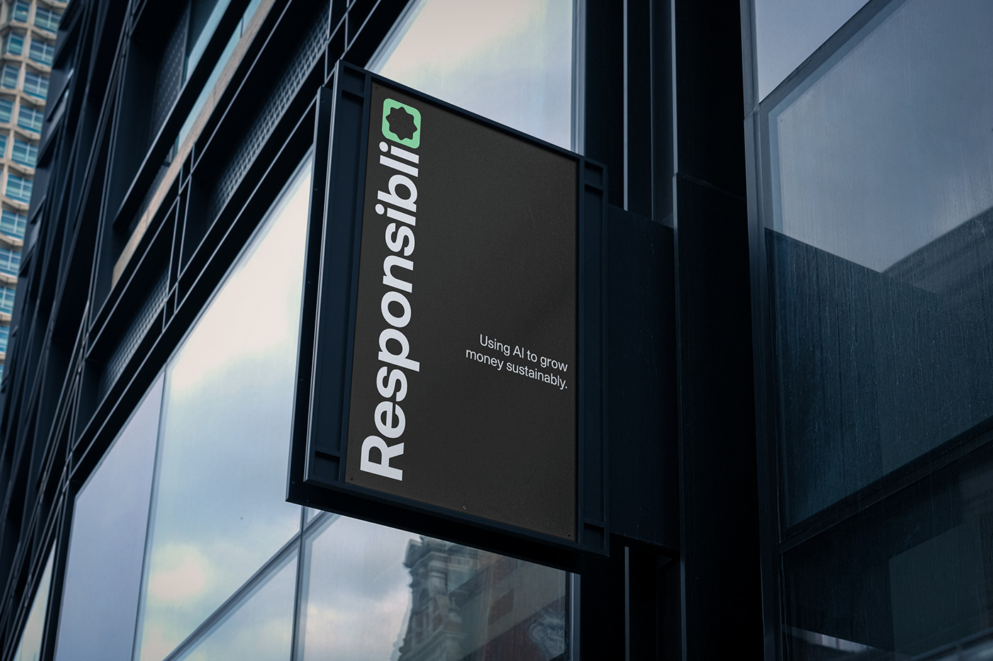
And beyond the website, this identity is now the foundation for the UI of their platform itself, for their internal investor materials, for their reports, and a range of other communication pieces.
By ensuring every part of this identity was pulling in the same direction, and inspired by the same values and mission that underpin Responsibli, what results is a cohesive, differentiated, and clear brand identity.
Our identity communicates who this company is, what they do, and speaks to the right people in the right way. It conveys trustworthiness, confidence, approachability, modernity, and sophistication, while clearly positioning the company as a pioneer in its field, with its eyes well and truly on the future.
It engages financial professionals, but also reaches out to a broader audience and shows the world that Responsibli is here to advance the cause of social responsibility.
And while it's early days for the Responsbli mission, our collaboration has equipped them with an identity that can grow with the company as they evolve into an industry leader.
See more of our work at: fookcommunications.com