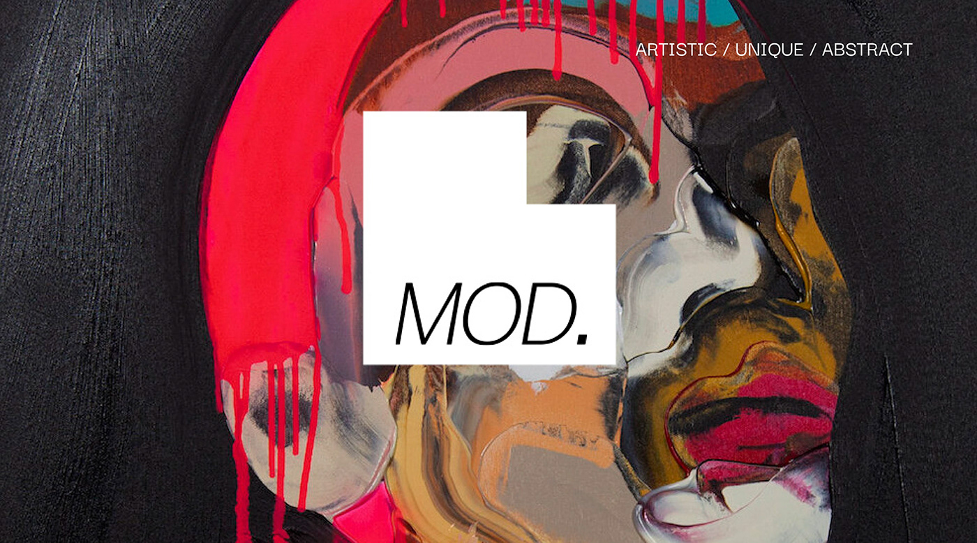
MOD CAPSULE HOTELS BRAND IDENTITY
A hotel can be more than just a place to rest. What if you could stay somewhere that was not only affordable, but helped you connect with locals, other travelers, and gave you access to many different amenities? With the increasing number of remote workers and young travelers, there is more of a need than ever to facilitate that audience. Check out some of my team & I's process here.
Art Direction: Jed Aldrich / Lauren Kotzman / Taylor Schober
Print / Digital Promo: Taylor Schober
Print / Digital Stationary: Lauren Kotzman
Web / Mobile: Jed Aldrich
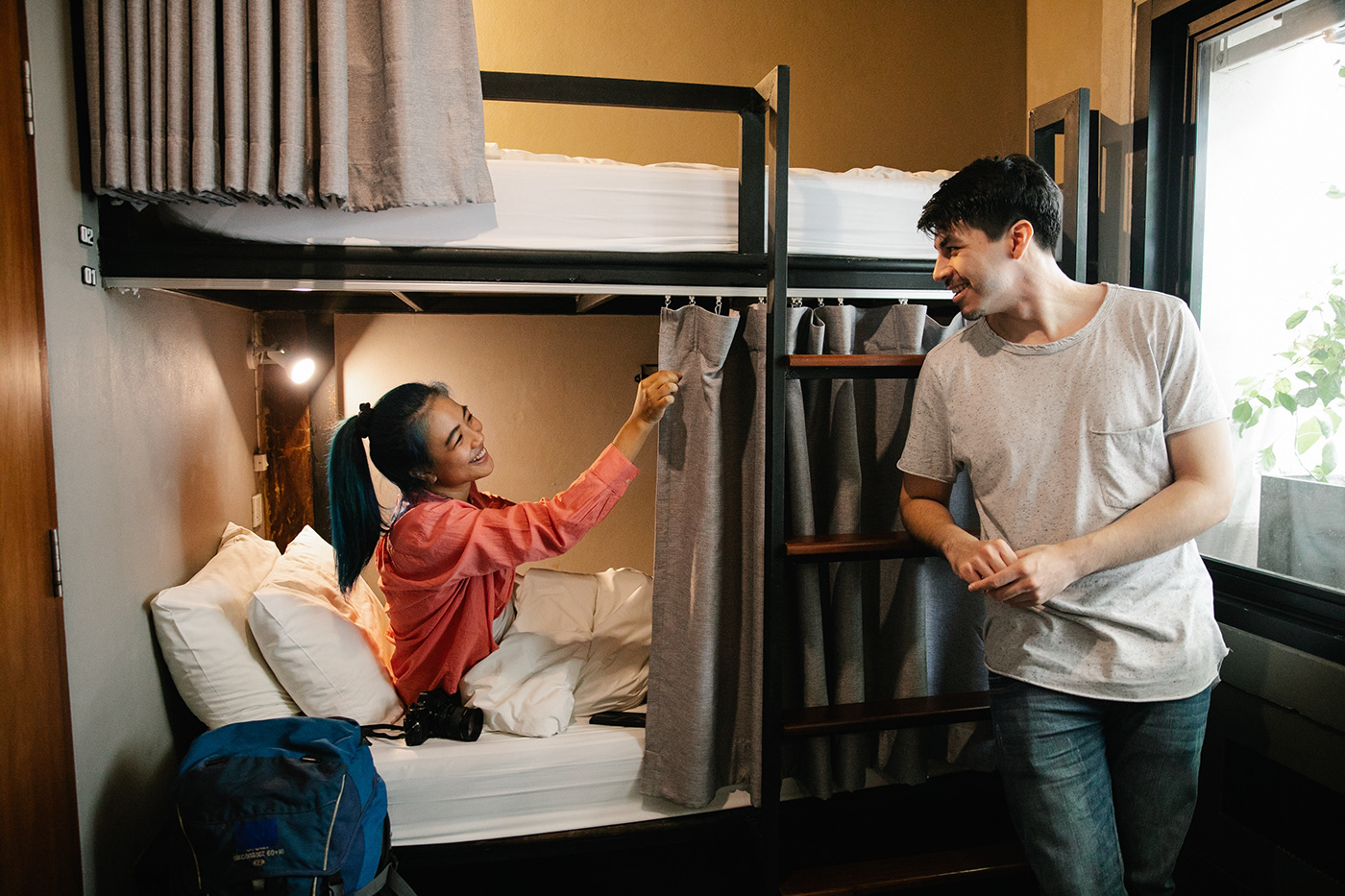
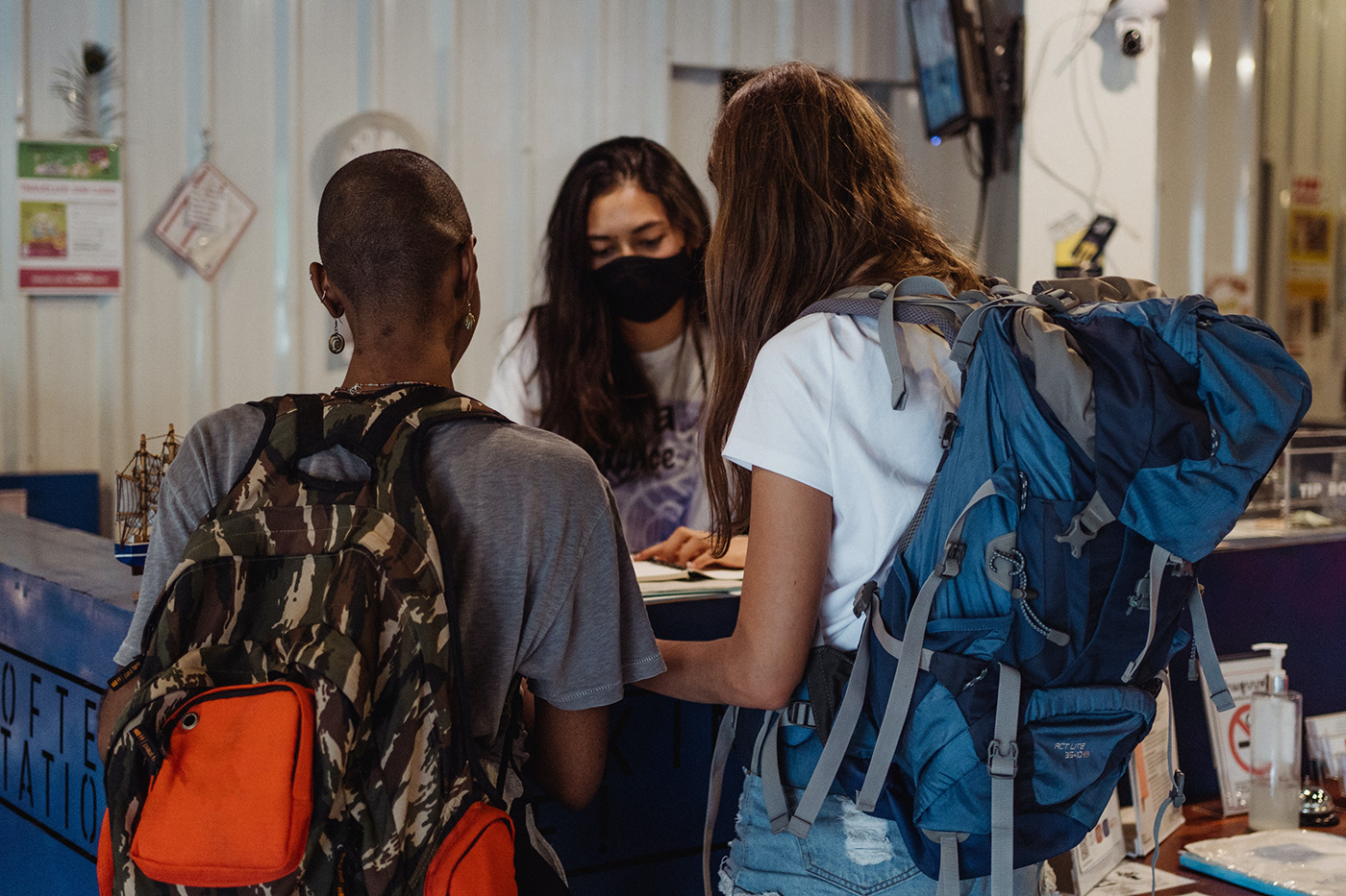
Our brand targets the nomad, collaborator, and storyteller. Our audience consists mostly of passionate individuals that are sensitive to the environments they place themselves in when they travel. They appreciate other cultures and surround themselves with all types of people in their regular lives, which keeps them inspired and collaborative. They are the people that are amongst the first of the pack to embrace new adventures.


Design Direction 1- Jed Aldrich
Design Direction 2- Taylor Schober

Design Direction 3- Lauren Kotzman


Just like MOD, these contact cards are punchy, bold, and irresistible. The square shape is a subtle nod to the capsule hotel aspect of the brand, and the bright colors convey an energetic and extroverted voice.

Our audience is always on the go, so we wanted to include as many digital-based assets as we could within the branding. Instead of a mail-out stationary set, a more practical solution for MOD would be sending out a printable digital stationary over email.

Guests appreciate personal touches, and MOD is all about making connections. A greeting card might be waiting on each capsule's bed upon guest arrival, which might include sightseeing recommendations or a guide to the area.

This full page print add captures the viewer's attention by using a simple call to action and the brand's tagline. The full bleed picture gives the viewer just enough context, but leaves them wanting to find out more.
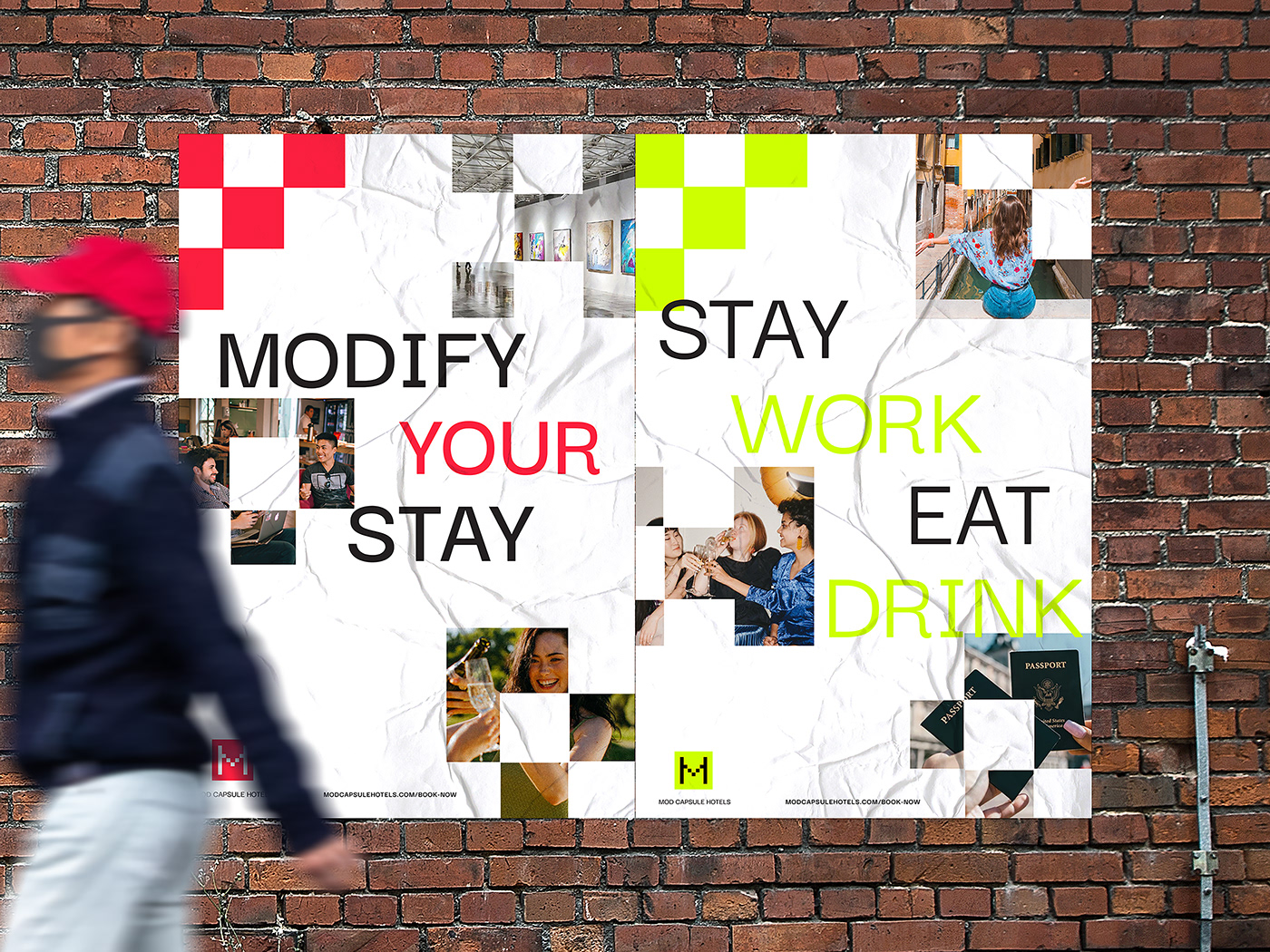
These posters are intended to bring just enough information to the viewer, while drawing them in and leaving them wanting to know more. Call to action is small at the bottom so that the viewer walks up closer to the posters.

A large-scale advertisement. The language gives life to the brand, and reinstates a secondary call to action besides "book now," since a large part of MOD's brand involves group travel and making connections.
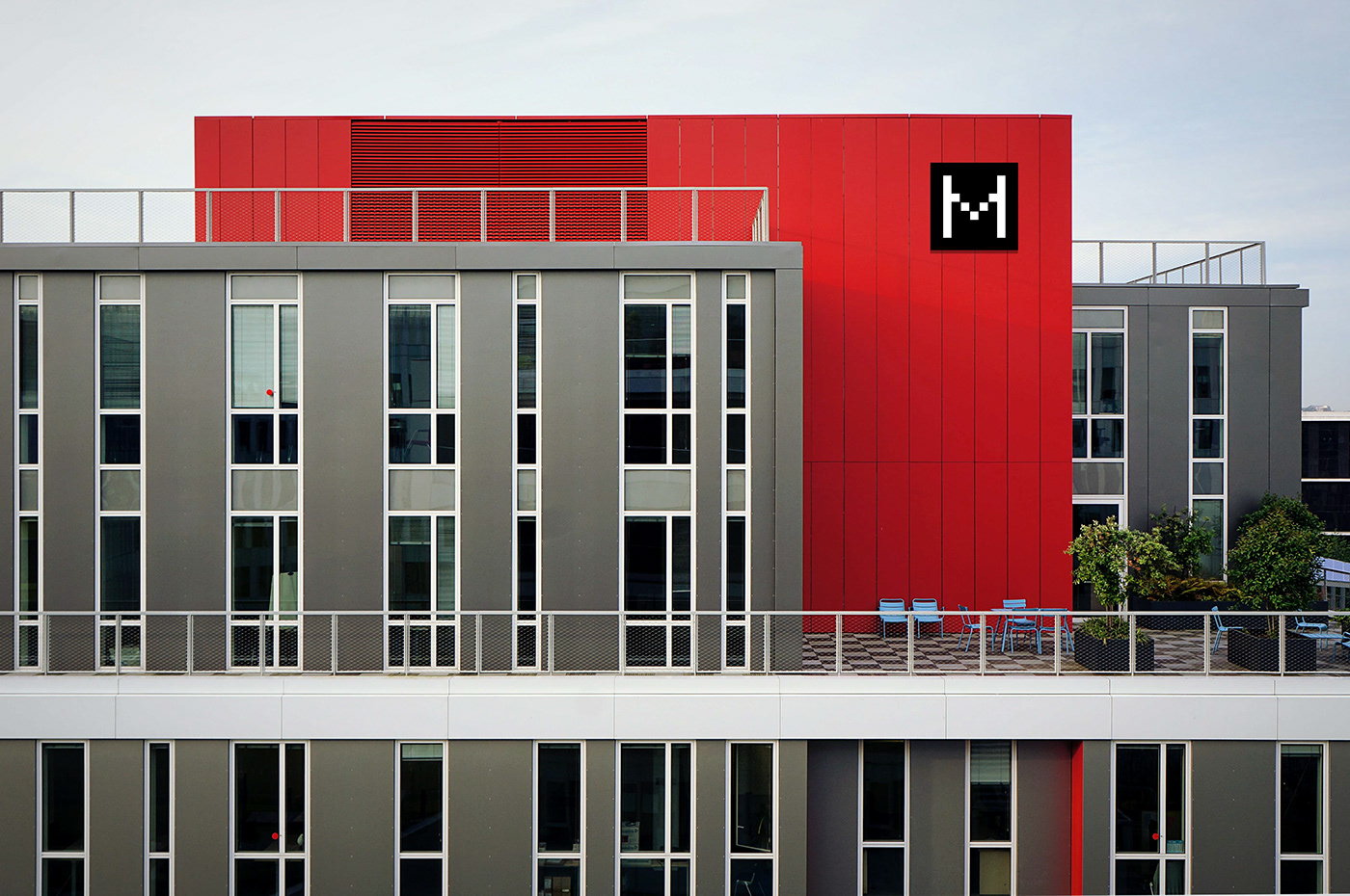
An example of what an exterior MOD location would look like in a particular city. A simplified version of the M is used for easier readability and recognition from a distance.

An environmental identifier that might be used behind a MOD counter or as you walk in, reinstating the brand at the actual location.

Landing page of MOD's website. The bright green and red colors that MOD uses for its brand are used sparingly here in order to avoid overwhelming the user. Instead, white space is employed for a clean look and the bright green is being used to indicate clickable buttons.
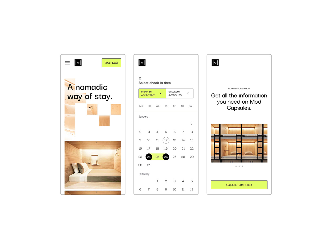
Home screen on mobile, onboarding screens, as well as what it would look like to book a stay at MOD. The mobile screens tie in well with the desktop version, and offer an easy UI/UX experience.
E-blasts could be sent out to people who have previously stayed at MOD or that have joined an email list. Testimonials provide MOD with another way to reinstate the brand and things that the hotel has to offer.
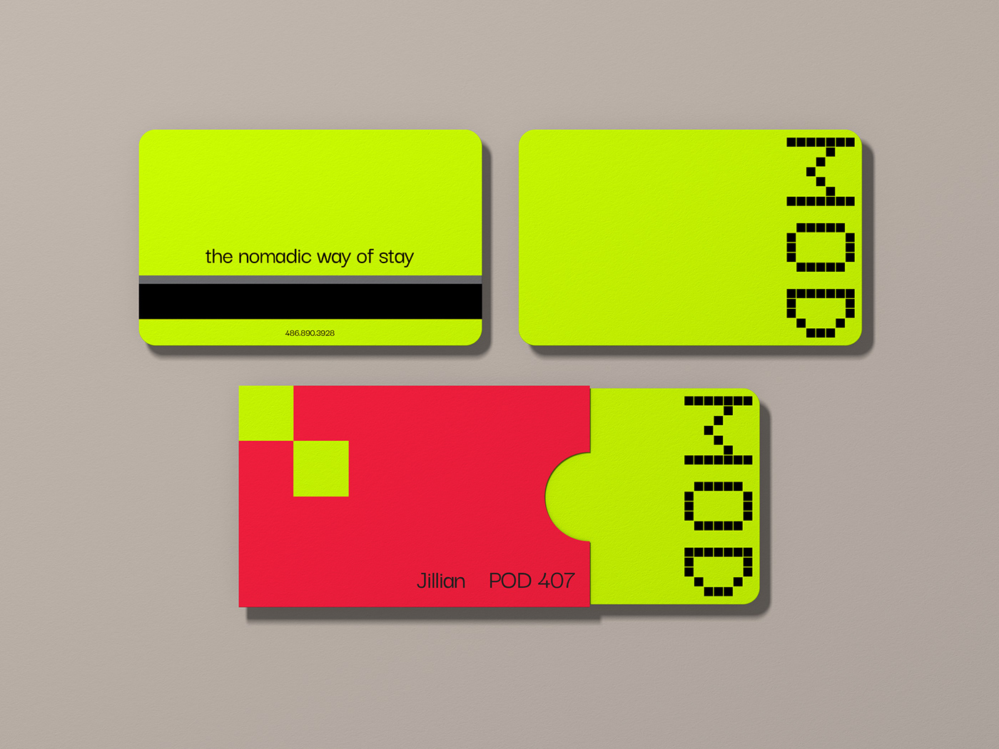
MOD's bold, bright green room key is sure to stick out in your bag amongst your other personal items.
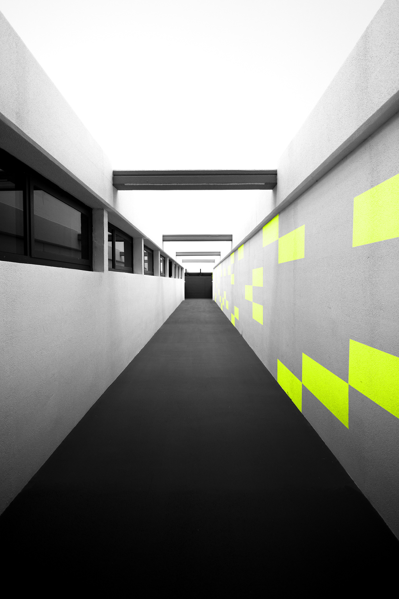
Environmental graphics reinstate the MOD brand in a subtle way, and help brighten up the space.
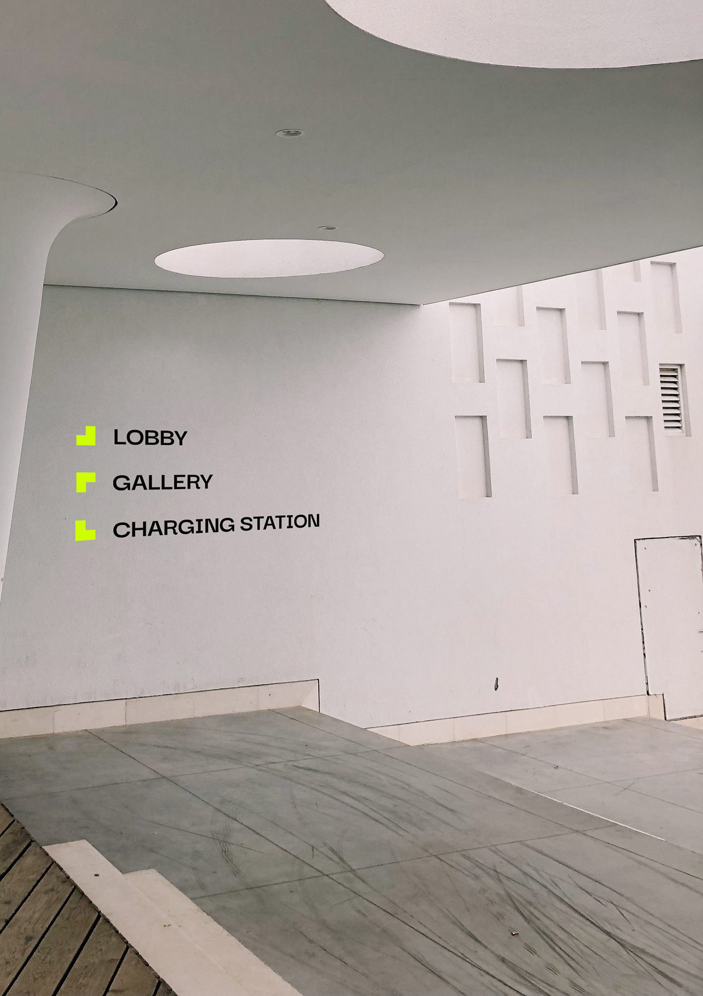
Each MOD location would have onsite amenities such as charging stations, art galleries, restaurant/bar, etc– so it would be important to include way-finding guides around the buildings to help people get around.

Example of what a way-finding guide would look like on the 4th floor of MOD. This would be repeated on each floor for ease of navigation.
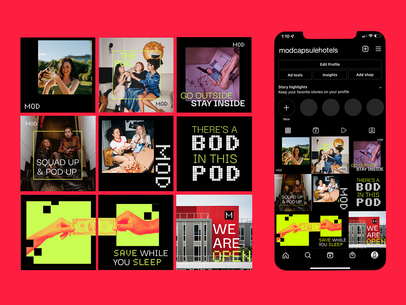
MOD's instagram grid is punchy, bold, and image-heavy. The language and photographic styling help convey MOD's voice (and make for a very share-able, pleasing instagram grid).

MOD's voice is cheeky, young, and extroverted. Wherever that voice can be employed– the stronger the brand becomes. Instead of using traditional "do not disturb" signs, MOD has cheeky sayings on each sign that indicate the person should come back later.
