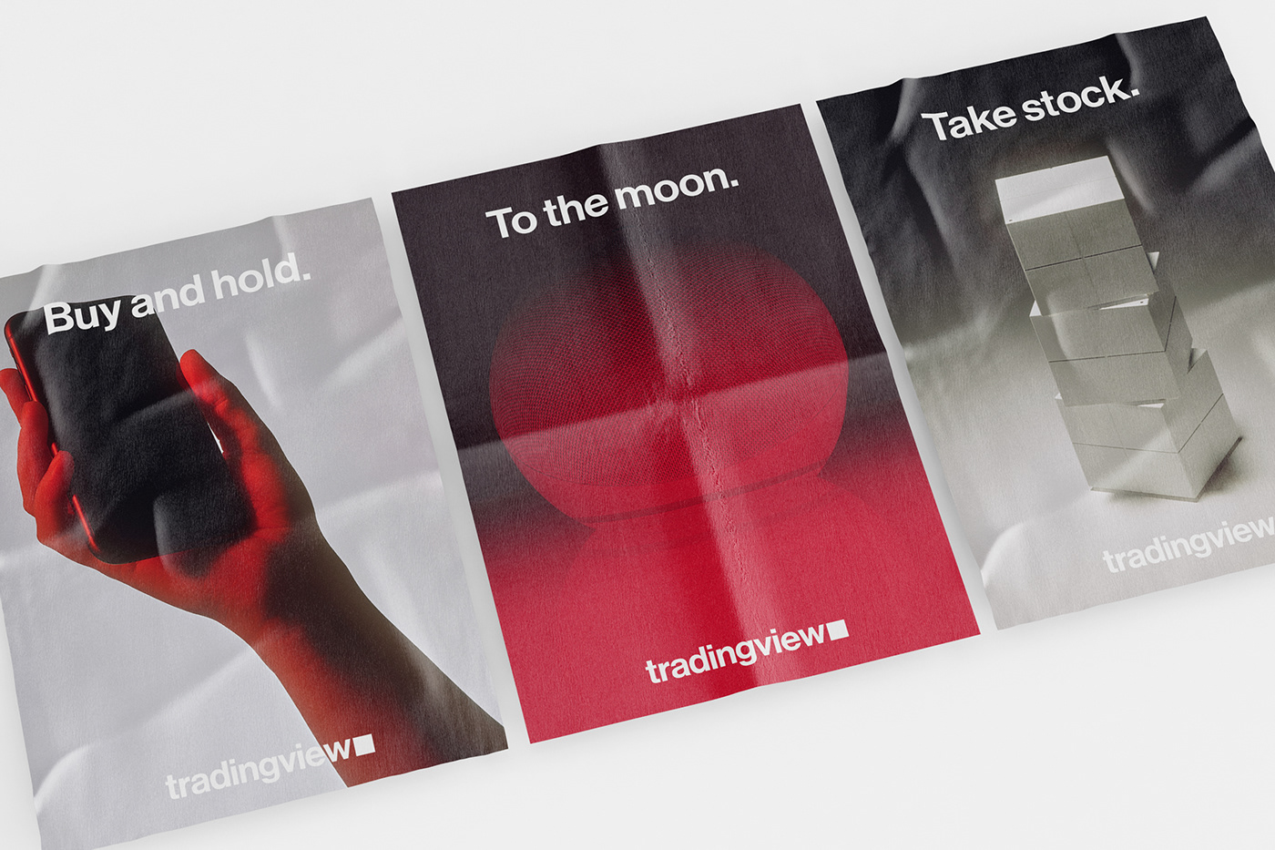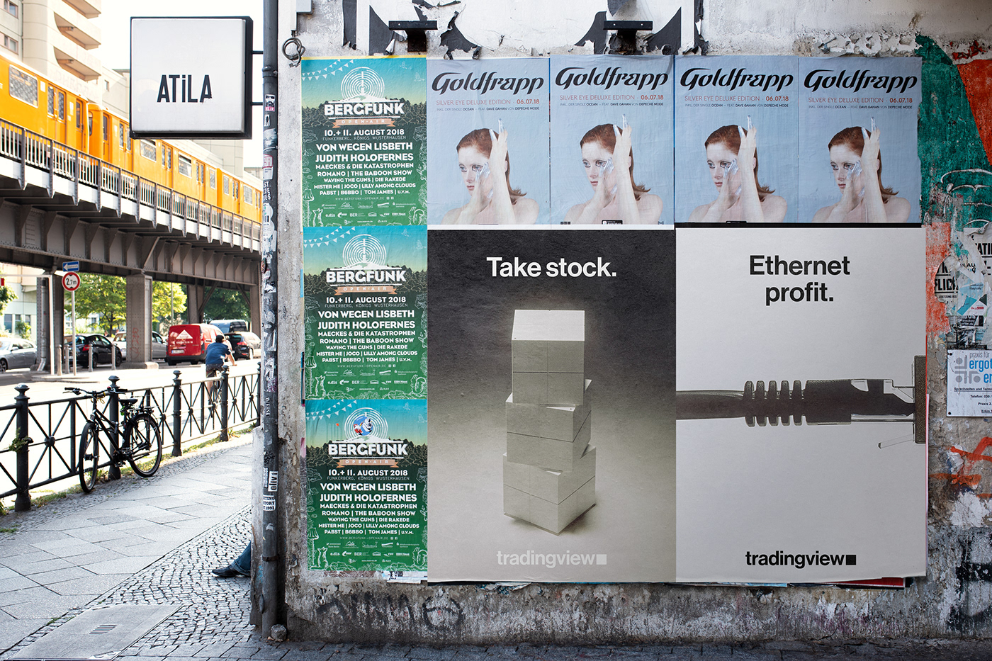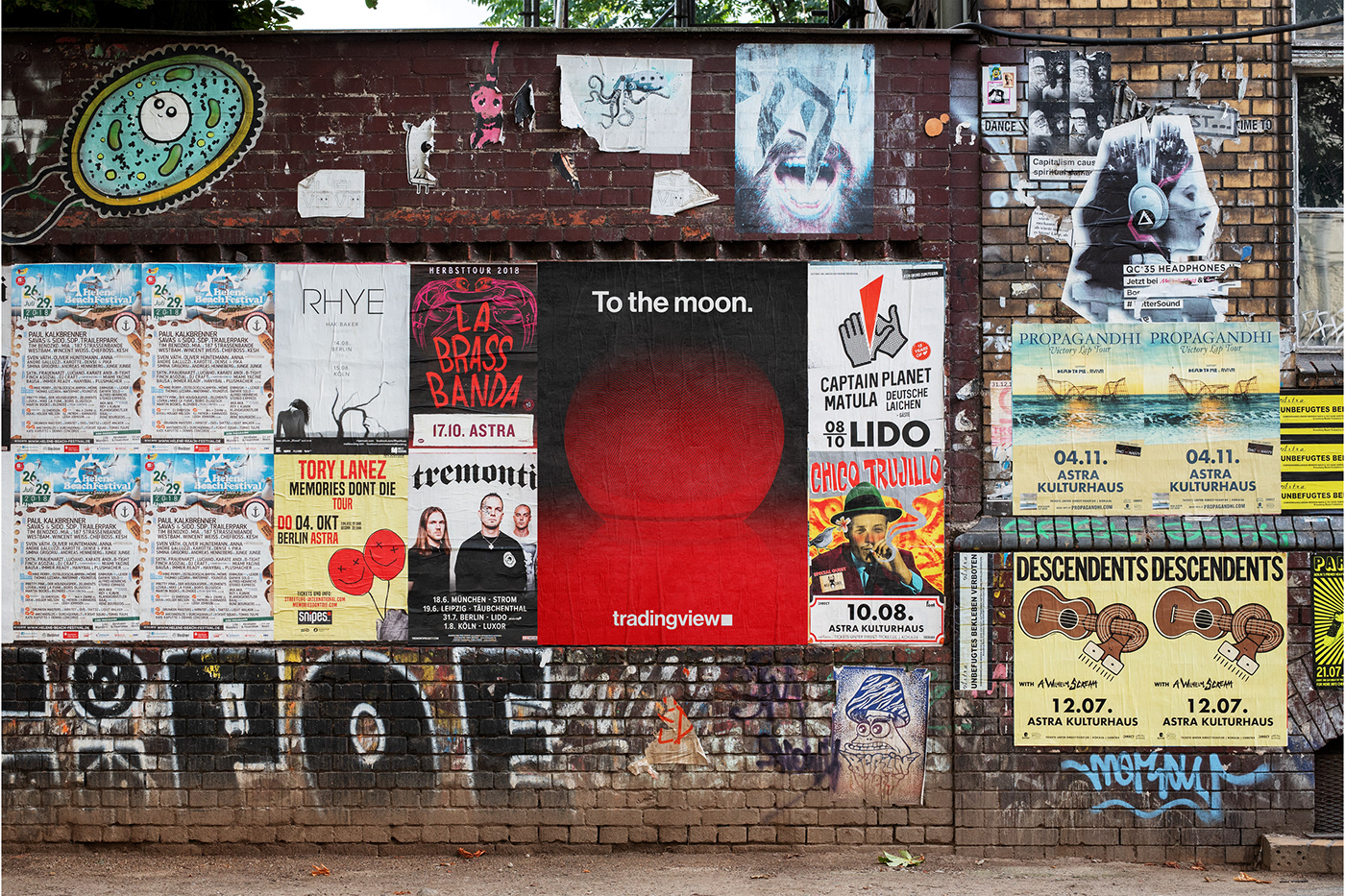
TradingView recently offered a bunch of Bitcoin for a rebrand project, so we threw our hat in the ring and created a refreshed visual identity for them, bringing it to life in this poster series.
Looking at the existing brand, their voice and tone emphasises clarity, openness, and accessibility. They avoid the stereotyped tropes around finance and investing, and instead 'normalise' the language around it. So we took this approachability angle and turned it up a little, leaning into more light-heartedness and punchiness.
For the imagery, we chose an art direction that had a darkness to it, so we could play on the often negative image surrounding stock markets. Combining this with the lighter tone of voice, we could make the 'dark side' more inviting.
See more of our work at: fookcommunications.com