Introduction
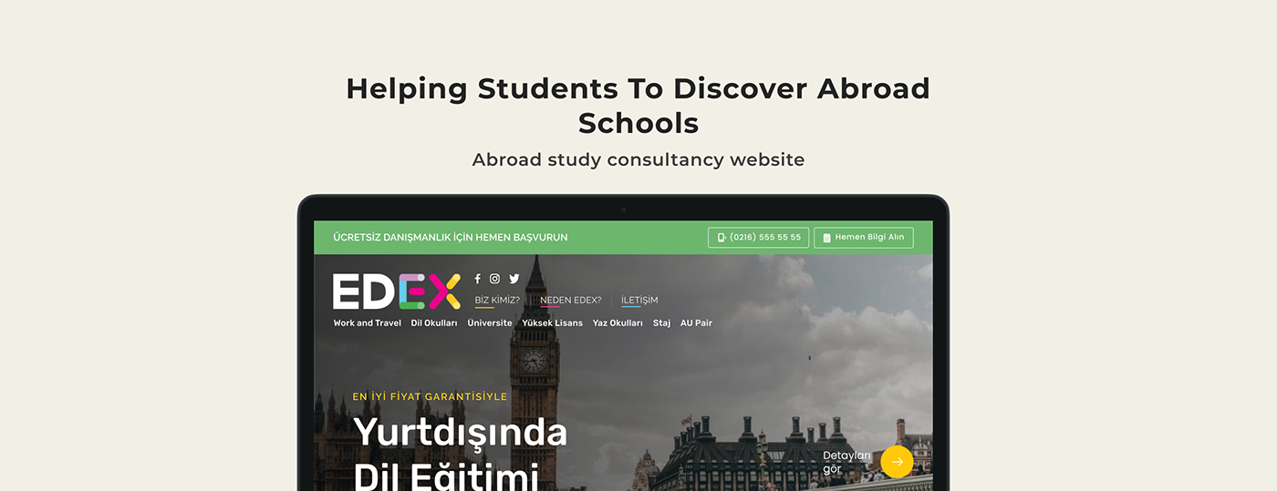
Edex is a consultancy firm that helps people who wants to get education and courses abroad and also students who wants to participate in abroad experiences such as work and travel or summer schools. The company was recently founded by people who were very experienced in the business.
Challenge
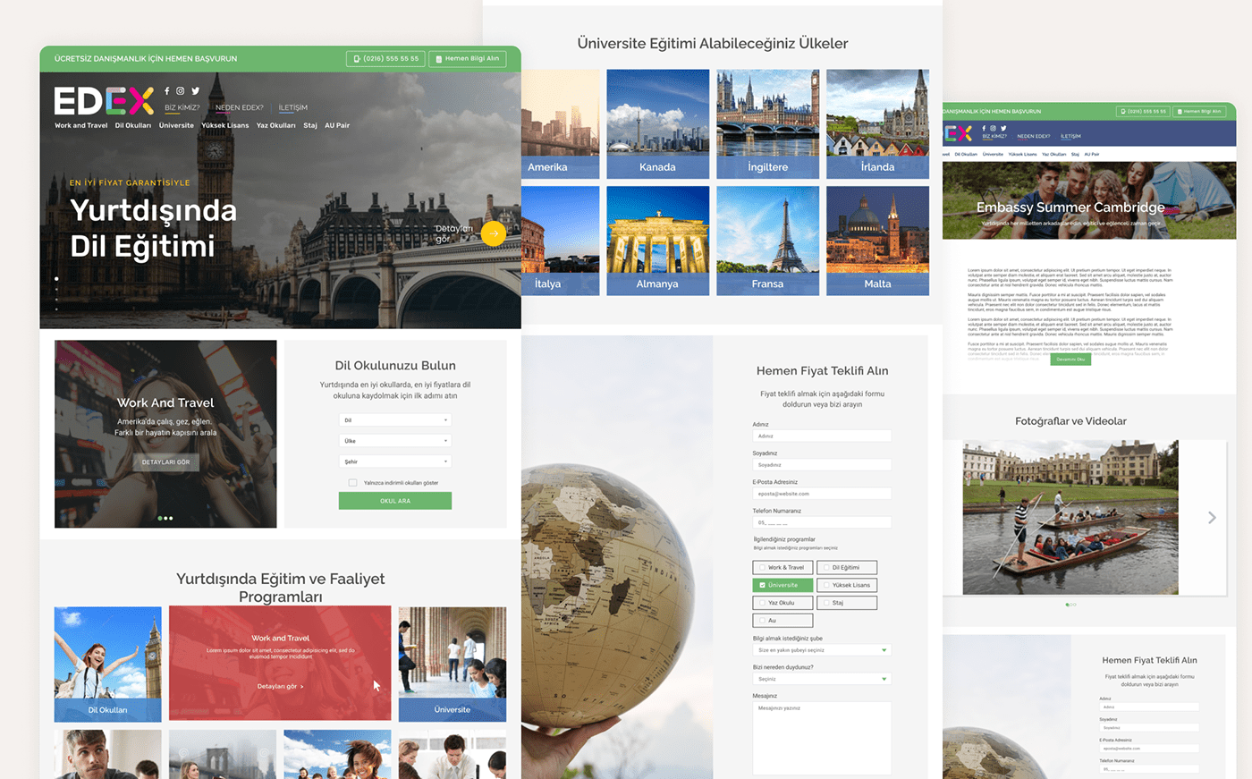
Project’s primary objective is to generate leads via web forms, email and phone calls while providing information about the programs, countries, as well as the schools and institutions that students will register to. This website should look warm and friendly to young people but at the same time it must also give the feeling of professionalism. I designed information architecture, layouts and interactions through wireframes, designed the interface and conducted user tests. I acted as a project manager and conducted communications and development process. I also acted as art director for branding, stationary design, appliance forms and expo materials by working with graphic designers and artists.
Audience
Primary target audience were university students and newly graduates. Young people between ages of 18-25 were interviewed. Main takeaways were many competitors’ websites being too bussiness-y and authoritarian and not looking very friendly or understanding. They needed to feel understood and not be seen just as a customer. The founders being in their late 30s, it is the companies vision to provide the guidence and help to their students they need, we listened to our audience as we should and decided to create a warm, fun, young design.
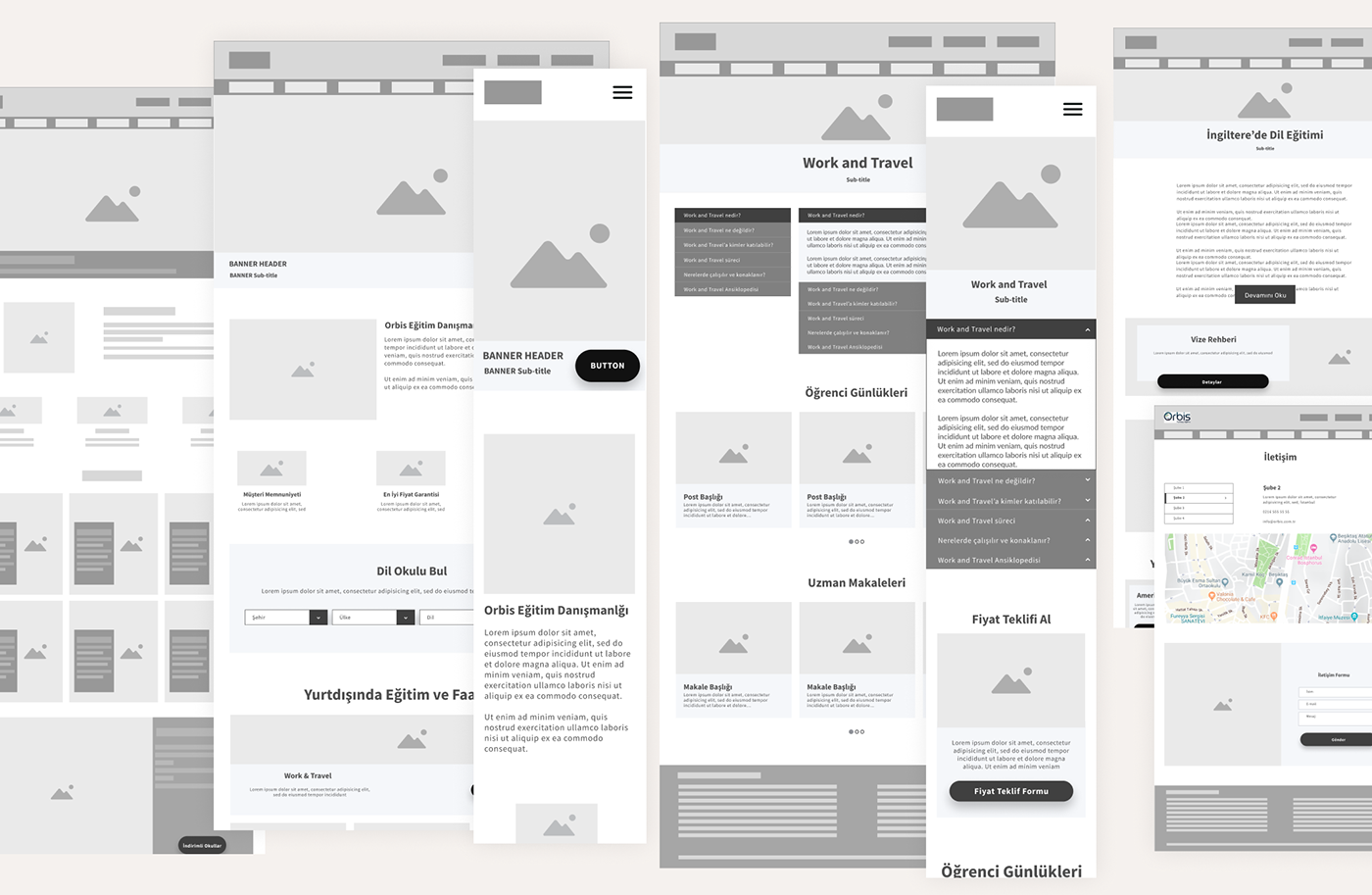
Wireframes
SEO being the one of the most important aspects of the project and having lots of information to share, we decided to go with accordion tabs and expandable text sections so we can bring long articles without smothering the visitors and letting them navigate within the pages.
Home page includes a hero section to post news and important information and other sections to show programs and the visa guide.
Home page includes a hero section to post news and important information and other sections to show programs and the visa guide.
UI Design
First round of UI design started with the objective of design and development process to completed within a short due date. Designs were to be renewed after a user base is established and having some user data. Brand colors were already determined as red and white. I used Raleway and Rubik font families as headings and Roboto for body typography.
Results
In around 2 and a half years this website generated more than 3,000 leads via webforms from around 63,000 visitors.
Thank you for reading. Say hello@nejatozalp.com


