Client
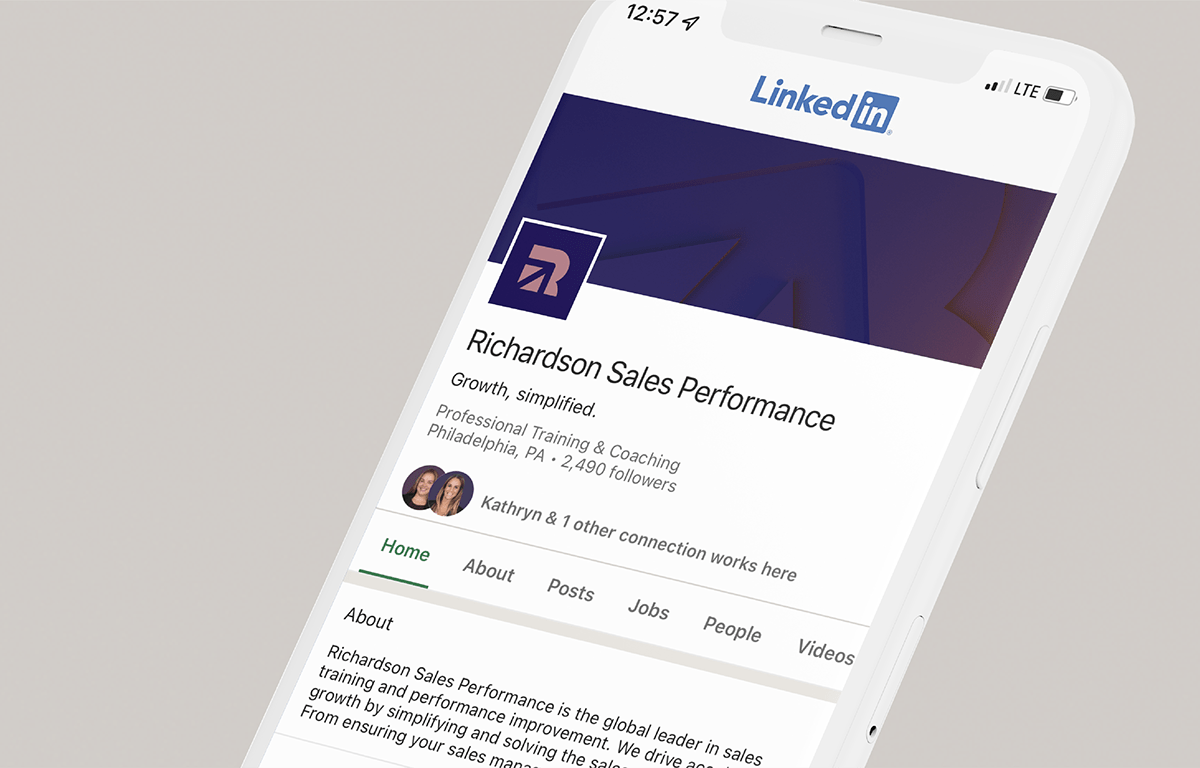
Richardson Sales Performance is the global leader in sales training and performance improvement. For over 40 years, Richardson has been equipping sales teams across industries and geographies with the tools and knowledge they need to stay ahead of buyers' changing needs.
Challenge
After the merger of two companies — Richardson Sales Training and Sales Performance International (SPI) — Crescenzi_Co was approached to create a new logo and visual identity system for the combined company, building from a new brand proposition developed by our friends at Doublebit Narrative.
Solution
Solution
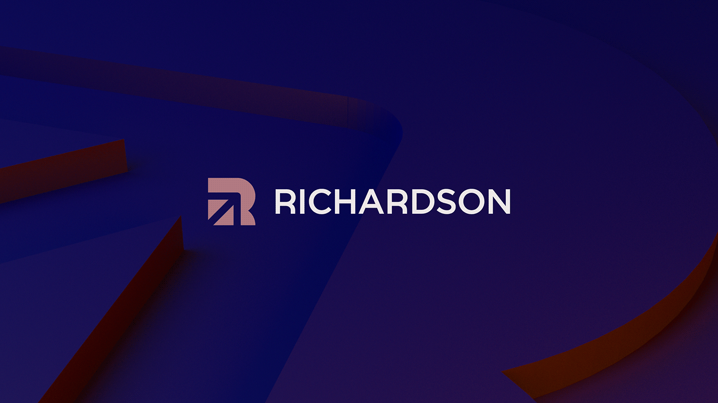
With the core idea of ‘Growth, simplified’ driving the creative development, we designed a powerful new symbol to bridge the visual equities of the two former companies: the R of Richardson intersected by an upward arrow inspired by the original SPI logo. A bespoke logotype references the round, geometric construction of the new mark.
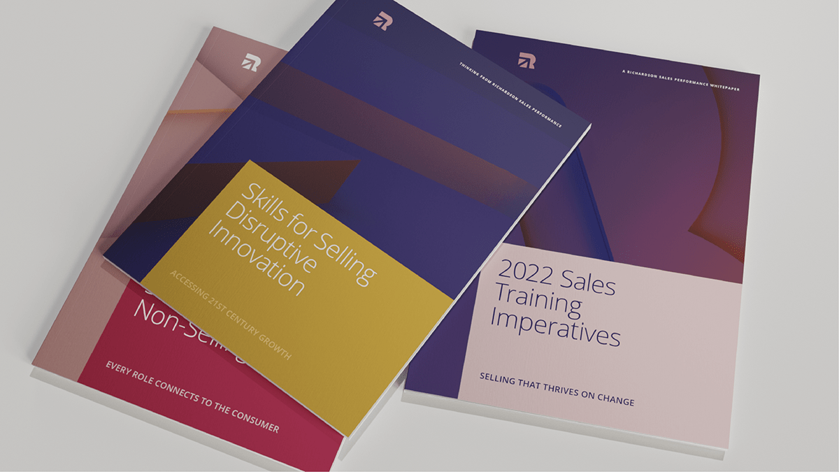
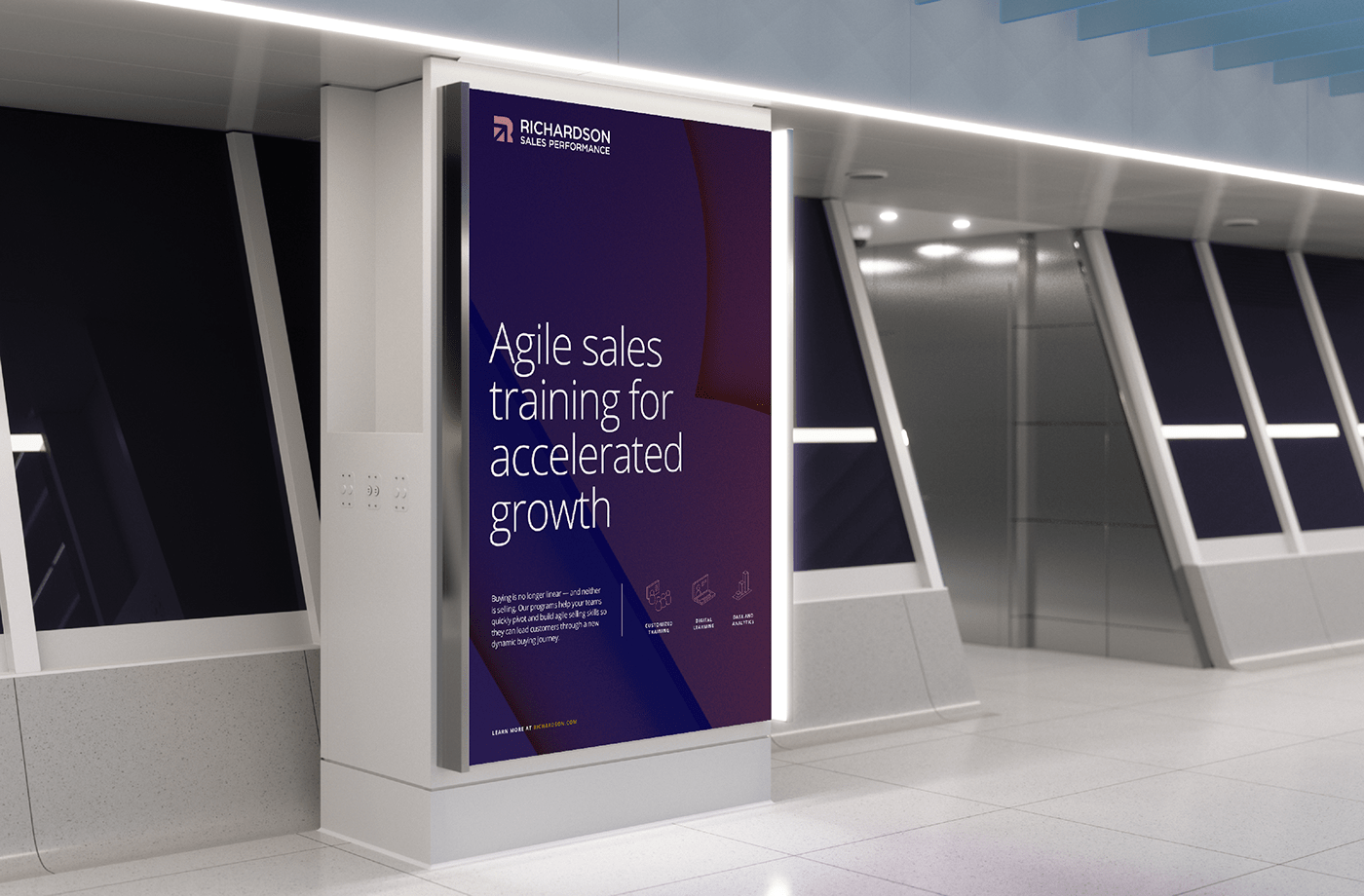
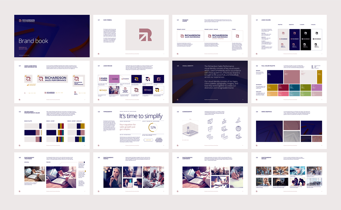
Beyond the logo, we designed a comprehensive identity program with icon set, whitepapers and publications, presentation templates and flexible guidelines to support both short-term integration of the two companies and long term vision for the combined business' leadership position.
Beyond the logo, we designed a comprehensive identity program with icon set, whitepapers and publications, presentation templates and flexible guidelines to support both short-term integration of the two companies and long term vision for the combined business' leadership position.
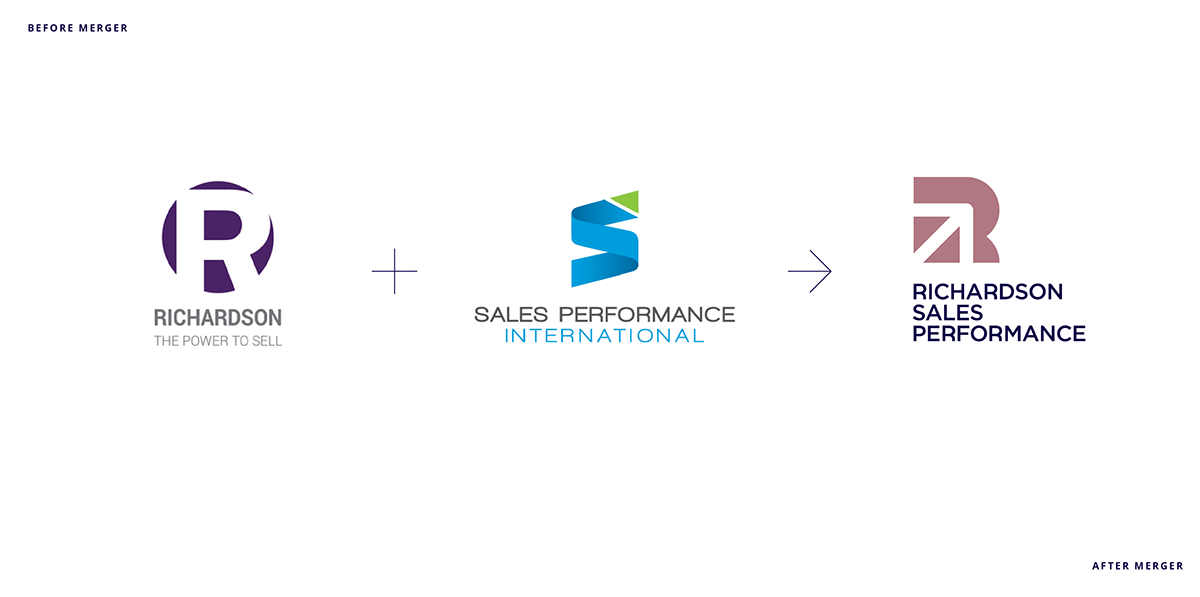
Logo variations


A major component of the Richardson Sales Performance visual identity are sculptural hero images emphasizing the metaphor of growth through abstract 3D extrusions of the new logo. These versatile graphics serve to announce the combined company’s greater reach and scale.