
The original logo pitch.

Various iterations of the logo. It was after this submission to the client that I realised 'Deathrow Hull' was a play on 'Jethro Tull' (which I only realised after saying the name out loud...), and so the final logo emphasised this.

The final logo, with more emphasis on 'Deathrow Hull'.

Printed T-shirts.
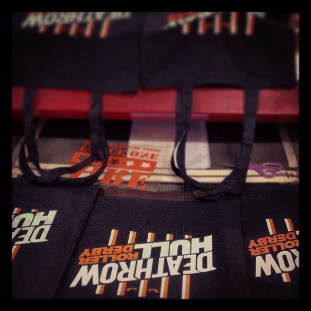
Printed Tote Bags.
I was contacted by Deathrow Hull, a recently established Roller Derby League based in Hull, to create a logo and branding guidelines. I pitched the original concept (top), which the client felt was along the right lines, but needed some work. Most notably, the colours needed to be changed as another Hull team used similar colours.
I refined the idea, finally arriving at the blue and orange logos, with the shade of blue dependent on the background. The logo is currently in use on the league's facebook and twitter pages, as well as on team merchandise (t-shirts, hoodies and tote bags).

