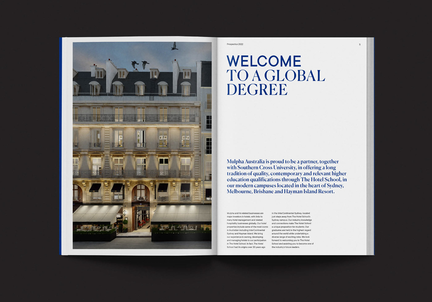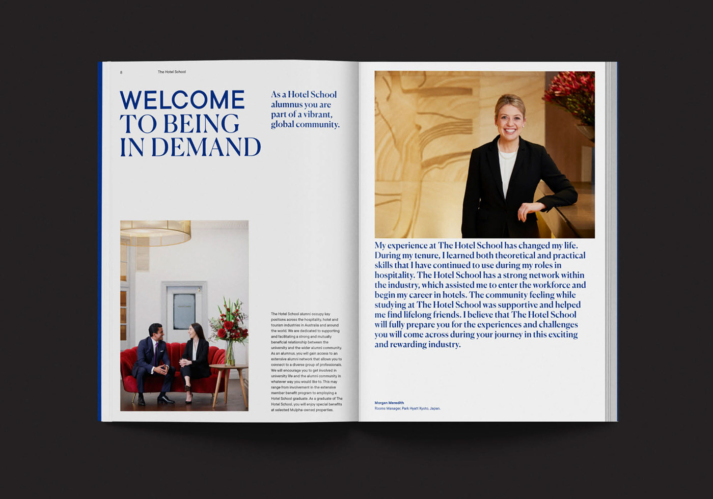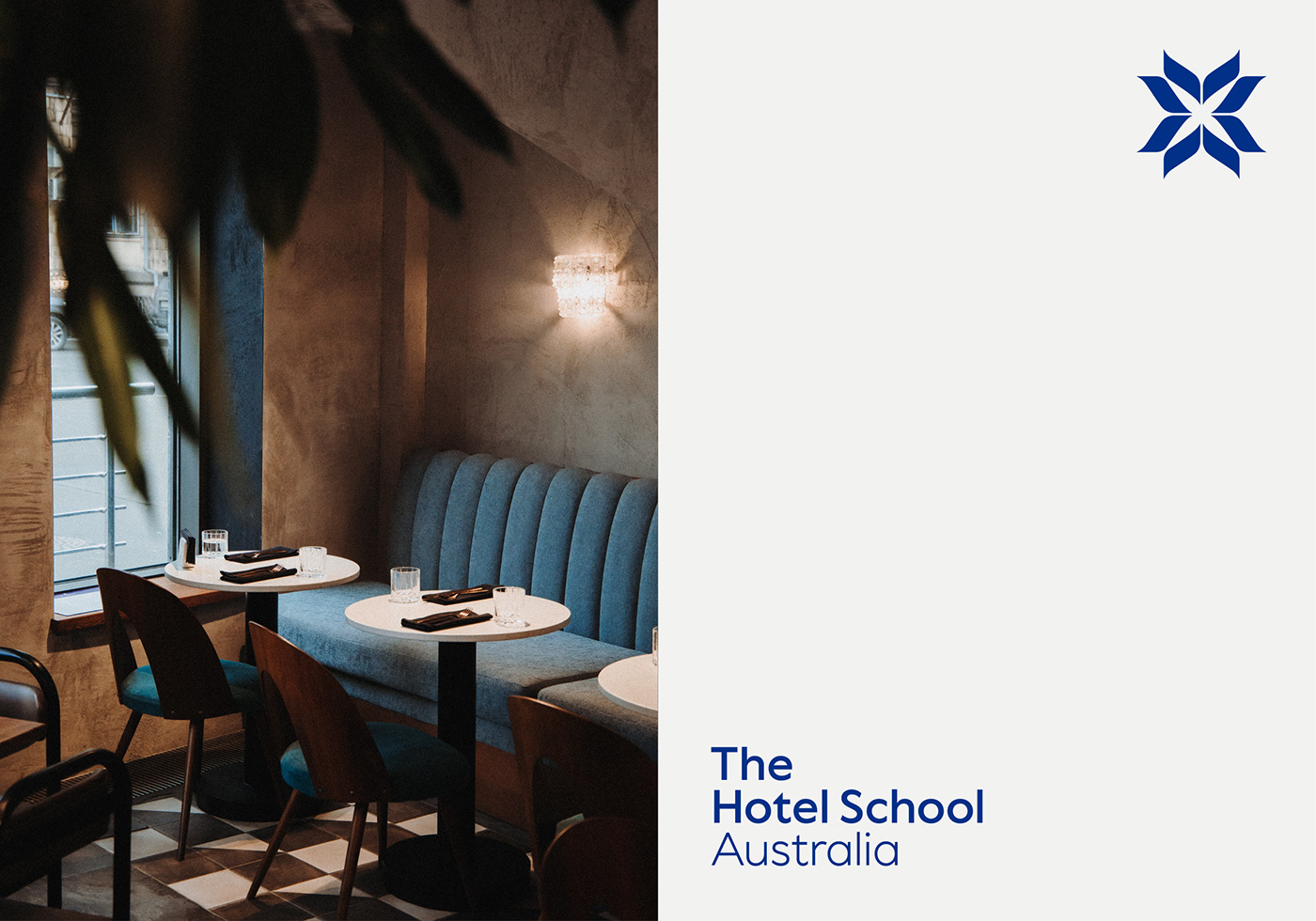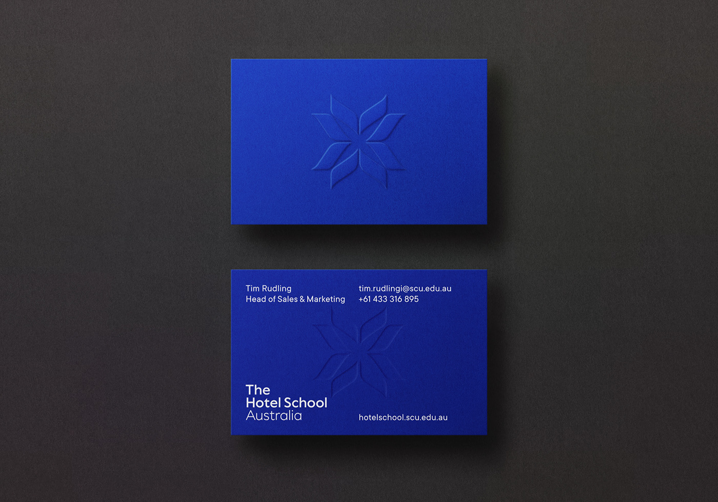
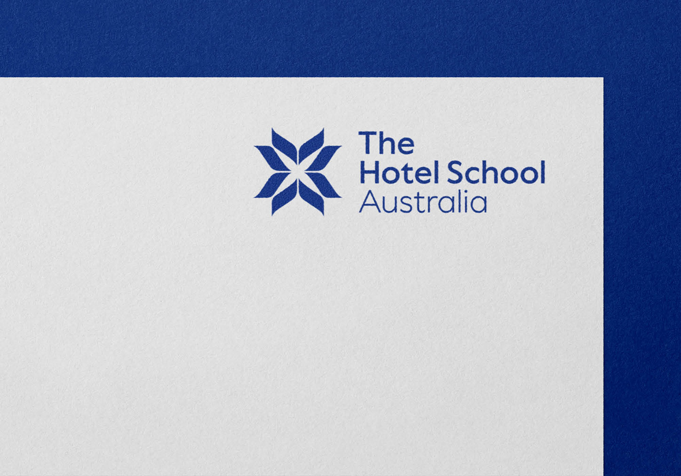
The Hotel School
Brand identity design for this hospitality management school that is a partnership between Southern Cross University and Mulpha (Property & Hospitality Investment).
Brand identity design for this hospitality management school that is a partnership between Southern Cross University and Mulpha (Property & Hospitality Investment).

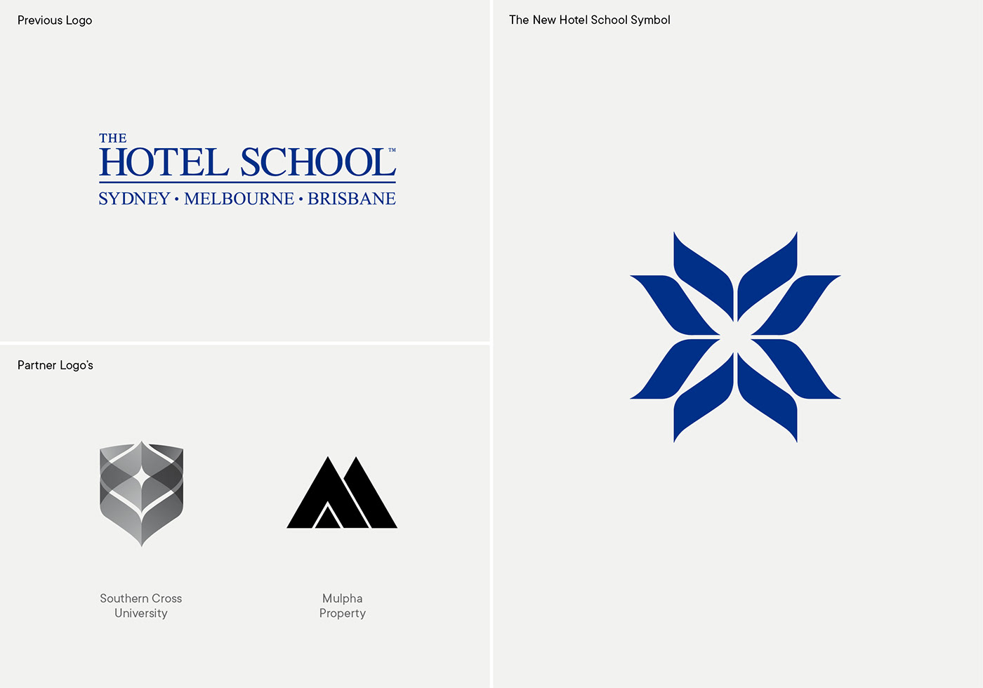
Creating The Hotel School Symbol
The Hotel School’s symbol was formed by repeating the main geometric graphic element from the Southern Cross University shield, whilst also borrowing the modernist stencil aesthetic from Mulpha’s symbol. The abstract symbol is initially seen as a flower, a metaphor that is particularly relevant to the hospitality industry (welcoming and shows attention to detail). It also has subtle connotations of a compass (guiding students through their studies and careers) and also converging arrows and connectedness (the meeting point of university and the hotel industry). It’s premium aesthetic conveys five star prestige.