

Corporate identity - Kelpies
Project Brief
I was required to conceptualize and create a visually appropriate and creative corporate identity for my assigned commodity. Each commodity was different and could be linked to a specific time frame and/or historical period. The commodity needs to be seen throughout the design created, even if in a novel or contemporary way. After conceptualizing the brand a name will be chosen and thus all the other visual elements will follow (visual elements entails logos, patterns, icons, illustrations, etc).
Project deliverables
- Final brand mood board.
- Comprehensive vertical narrative.
- Comprehensive vertical narrative.
Design strategy
The commodity I was assigned was "Fast food for the Merpeople". After my initial research, I realized that I'm going to have to translate this into something applicable to humans as we are not the same as merpeople and will need something a little different. This brought me to the idea of us eating what the merpeople would eat. But what does a merperson eat? After doing some research into this I concluded that they would probably eat seaweed, and other aquatic vegetation but not fish, as fish are friends, not food. This then inspired me to create a vegan-based fast-food brand that is all about being as eco-friendly as possible. My focus for the visuals of the brand was to incorporate the ocean and merpeople in some way into all the design elements. This can be seen throughout the project from the colour palette to the mascot to the logo inspiration. I wanted to keep the visuals simple and fun and stick to the general idea behind fast-food restaurants' designs which are bold and colorful. I also wanted to make the brand friendly and inviting as a lot of vegan-based companies and brands are very serious and I think that chases away people who are not vegan but would like to try the product and explore the brand further.
Research


Research done on mermaids as well as manatees and aquatic vegetation to ensure that my concept was solid.
Process work
Here is just some of the extensive process work done.

Rough logo exploration (hand drawn and digital)
Extended visual language exploration (Mascot, patterns and icons).

Brand mood board.
The vertical narrative
Mission statement
Here at Kelpies, we strive to bring you only the freshest vegan-based, aquatic vegetation fast food products. After extensive research into sustainability and quality, Kelpies is inspired by the Mer-people to bring you the most delicious grilled, fried and baked seaweed dishes, fit for the King of Atlantis himself.
Sourced from only the most sustainable aquatic vegetation farms, growing in and maintaining the purest water through our modern farming methods – we create a place that even the Mer-people would be happy to call home. Our vegan aquatic vegetation-based products are aimed at everyone, vegan or not, who wants to try something different - food from the sea, seafood with a vegan twist. We encourage anyone who wants a healthy tasty vegan meal, with the added bonus of feeling like a mermaid or merman to join us and feast on the best vegetation the ocean has to offer.
Logo development

Explanations from left to right
- A more structured and stiff logo. Then bringing in more of an abstract seaweed idea with the seaweed shape under the name. The colours were inspired by green seaweed floating around in the blue ocean.
-The logo now uses hand-generated letters and became more fluid-like and wobbly, this was inspired by seaweed floating in the water but took a less literal approach to show an actual seaweed shape.
-Small changes were made here, but they were needed. The letters were smoothed out and made to look less worried and distorted. The colours do need to change as this green is not very appetizing.

Final Logo
After some colour adjustments and slogan application to the finalized logo design, we now have a Kelpies logo that represents the brands' products through its fluidness and it’s a subtle representation of seaweed (or kelp) through its shape as well as its colour.
The kelp do's and kelp don'ts

Kelpies personal space rules

When placing the Kelpies logo the space left around the logo must always be the width of the “S” from the logo. When using the logo without the slogan the space around the logo stays the same.
Kelpies colours

The colours used were inspired by the ocean and all it has to offer, from the deep dark green of the seaweeds, the bright yellows and pinks found in the corals and seaweeds, to the actual colour of the water in the lagoons which is a peaceful turquoise. Kelpies wanted to keep it bright and fresh since it is a fast-food brand.
Kelpies fonts

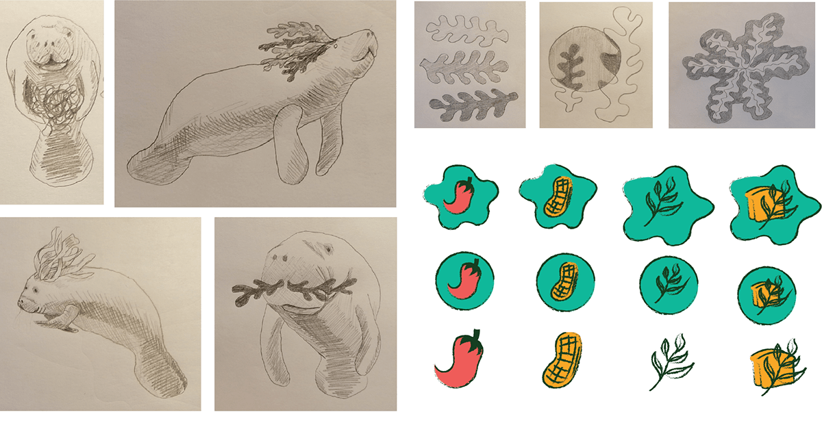
Extended visual language

The icons were inspired by icons generally seen on menus to indicate if there are any food allergies, spicy ingredients and if the food contains gluten.


The illustrations are of Kelpies mascot, Kel the manatee. This is because back in Christopher Columbus’s days he mistook a couple of manatees for mermaids and as Kelpies food products are inspired by the Mer-people it just makes sense to have a manatee as our mascot. Manatees are also an endangered species which plays into our vegan values and respect for the Earth which we maintain through our sustainable farming methods.

The patterns below were inspired by the very food products sold by Kelpies - Seaweed a.k.a kelp. The shapes were inspired by the actual shapes seen in the different types of seaweed and how the seaweed appears when growing in the water.


