

Information design: Staying Afloat

* Please note this is a university project completed in 2 weeks
Project brief
This project involved the research and design of a compelling infographic based on a chosen topic from one of three written pieces. The three pieces were about The Future of Work, The Future of Wellbeing, and The Future of the Planet. After becoming familiar with the texts we each had to gather research on our chosen topic. The infographic had to contextualize and distill informative facts in a way that expresses the chosen narrative . Viewers are guided through the information by a predefined journey that is well-structured, uncomplicated, and visually appealing.
Deliverables
1x infographic poster
Design strategy
Based on the given topic “The Future of the Planet”, this infographic is based on an emerging problem; will coastal cities adapt to rising sea levels and how? Cities are on the front lines of the growing physical risks associated with climate change. To protect the lives and livelihoods of urban residents, it is vital to adapt - and to start now. The challenge of this infographic was synthesising this pressing message with a single narrative? Backed up by 14 credible news sources, this infographic takes a look at three cities with divergent approaches to this urgent issue; the unprepared, the prosperous and those who work with nature.
The purpose of this infographic is to contextualize and distil informative facts about rising sea levels in a way that expresses the narrative; we need to learn to “live with the water”. Viewers are guided through the information by a predefined journey that is well structured, uncomplicated, and visually appealing - in hope to inspire change and action. To create an authentic tone, and truly let this campaign hit home, I linked it to the April 2022 Durban floods through the use of mock-ups created with photographs from the disaster.
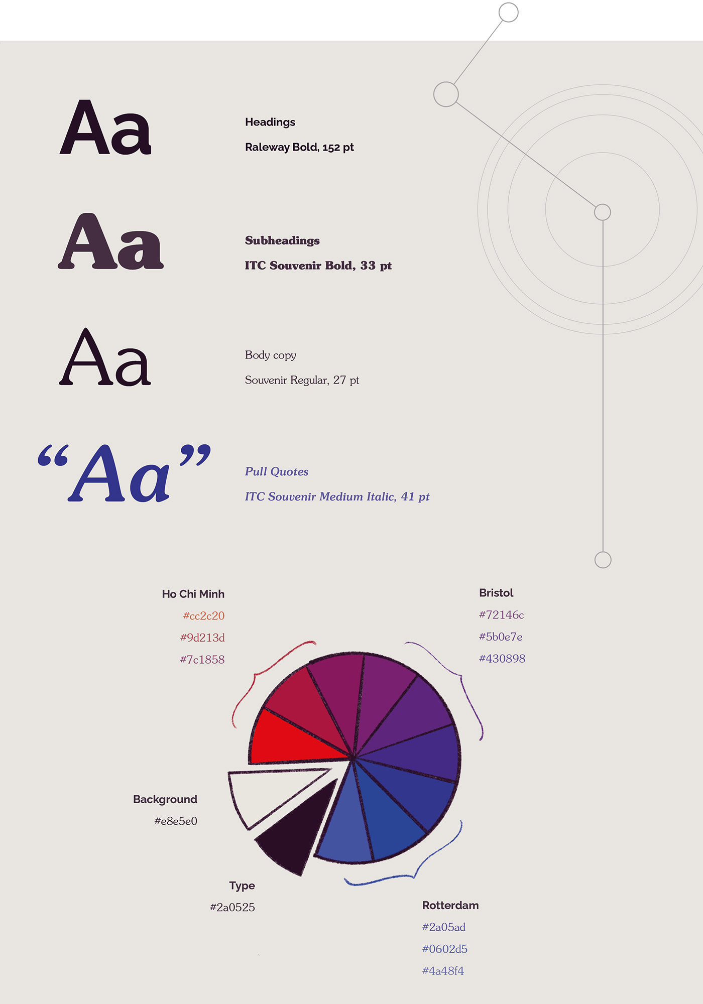
Typography & Colour Palette
Both the typography and colour choices help guide the narrative.The typography was chosen for its elegant curvatures and for the way letters join into one another - flowing like water. The colours run like a gradient starting with an urgent red for Ho Chi Minh (the city that is at high risk), and ending with a clean and calm blue for Rotterdam (the city that is learning to live with water).
Process highlights


Process sketches and GIF showing layout progress
The final infographic


Digital Information Visualisation
A local link
To create a tone of authenticity and truly let this infographic campaign hit home, I linked it to the April 2022 Durban floods. Africa, one of the most vulnerable regions to the climate crisis, is likely to get hotter at twice the global rate, with sea-level rise a consequence. During the floods more than 400 people died, over 12,000 houses were destroyed and an estimated 40,000 people were forced from their homes. Overall, the rain drove $1.57 billion in damages to infrastructure.
The World Weather Attribution service finds that climate change doubled the likelihood of the event; from an event expected once every 40 years to once every 20. Staying Afloat’s narrative encourages coastal cities to employ mitigation plans used in combination with adaptation plans to combat the sea-level rise problem. The damage caused by this year’s floods is testament to the fact that South Africa is far from ready. The following billboard mock-ups were created with images from the 2022 Durban floods to create a shock value - in hope to communicate the urgency & seriousness of this problem.


