

Typography: Generation Synergy
* Please note this is a university project completed in 2 weeks
The ISTD Student Assessment scheme is reviewed annually to ensure that it reflects current best practices in both design education and industry. Strategy, research, target audience, concept development, typography skills, specifications, presentation and credibility are considered for this project. One of the following briefs had to be completed for this project: Lighthouses of the World, Agenda for Sustainability, Shaping the World, A Colourful Story or Typography Research Unit.
Project deliverables
1. Research & concept development (process work attached here)
3. Final editorial layout deliverables
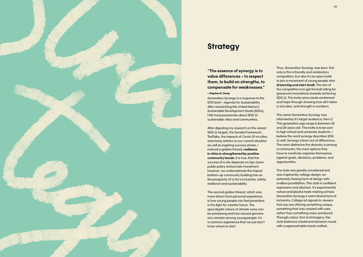
Design strategy
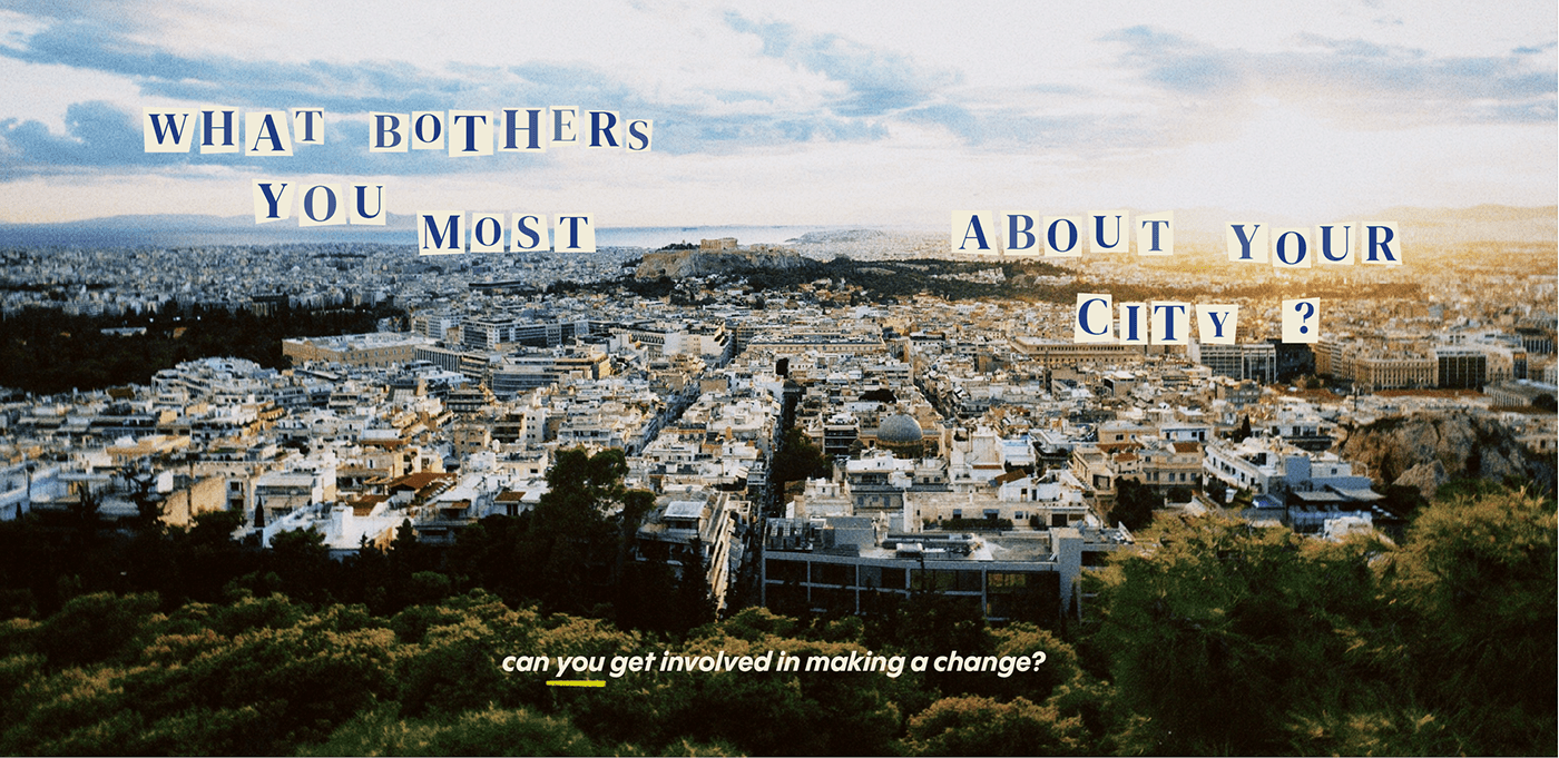
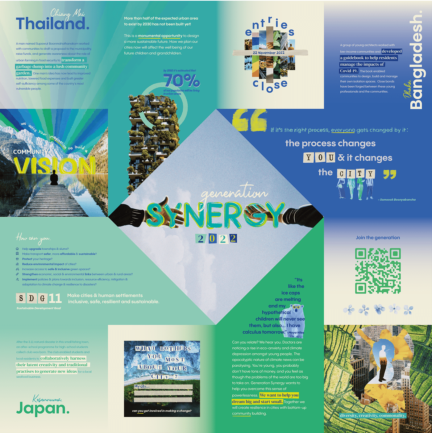
I chose Agenda for Sustainability along with SDG 11: sustainable cities and communities. After digesting my research, I noticed two golden threads;
1. resilience in cities in strengthened by positive community bonds and
2. young people can feel powerless in the fight for a better future.
The design solution, ideated from these two main ideas, is a non-profit organisation called Generation Synergy. This brand runs a yearly competition, inviting the youth to get their community together to create and enter in a project that promotes sustainability in their city. This is not just a celebratory competition, but also an open invite to join a movement of young people who dream big and start small. The deliverable is an invitation that would be handed out to schools & universities, showcasing the winning 4 projects from the previous year. The invite aims to create hope by showing people of a similar age to them are achieving amazing progress in the fight for a sustainable future. Rewarding these projects will spread the word about how all it takes is one idea, and strength in numbers to help achieve SDG 11. Drawing inspiration from nostalgic childhood origami in hope to engage with the target audience, the invitation is a pin-wheel twist. An additional deliverable is the frame-by-frame typographic animation further define the brand-tone. This could be used on social media. The collage art style makes use of mixed media and creates a spontaneous mood and helps communicate that these winning projects are offering something unique, something that was created with care.Through colour, font and imagery, the style echos the brand's identity; balancing bold and dynamic with approachable and hand-crafted.
Research & concept development
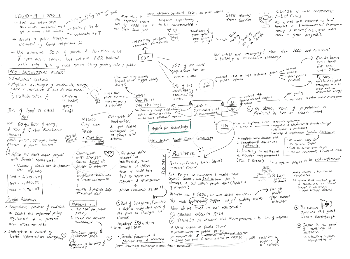
After choosing this specific SDG target, I dove into extensive research (on the varied SDG 11 targets, the Sendai Framework, TedTalks, the impacts of Covid-19 on cities, articles on our current progress towards meeting the targets, and inspiring success stories), eventually narrowing my list down to 14 sources. With these pinpointed topics, I created one A3 brain map to explore how these ideas could overlap in-search of a unique design solution.
The name Generation Synergy was informed by it’s target audience; Gen-Z. This generation age range is between 10 and 25 years old. The word synergy describes SDG 11 well; synergy is born out of differences. The more distinctive the diversity is among a community, the more options they have to creatively organize themselves against goals, decisions, problems, and opportunities.
*To see the full process work document click here.


Left: physically creating the origami. Planning & dividing space into quadrants.
Right: GIF showing some of the layout progression.


Join the movement
Generation Synergy's invitation (flat)

Invitation mockups (self-generated from scratch)
Generation Synergy in motion


Three of the 23 frames
The illustrated brand reveal


