


Branding and Identity:
How's Your Auntie
* Please note this is a university project completed in 2 weeks
Brief summary
Focused on branding and strategy development, this project aims to create a strong, cohesive, visual identity for a platform or institution. Brand strategies must be developed to guide the design process. The visual identity guide should contain enough information so that it can be handed over to any designer to work on the brand - it must include all the necessary visual assets and the tone of the brand in order to capture the essence of the brand successfully.
Project deliverables
1. Visual identity guidelines
1.1 Brand tone
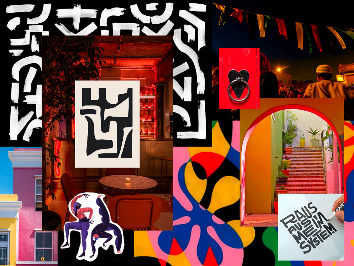
1.2 Brand mood board
1.3 Visual assets brain map
1.2 Brand mood board
1.3 Visual assets brain map
2. Visual Assets
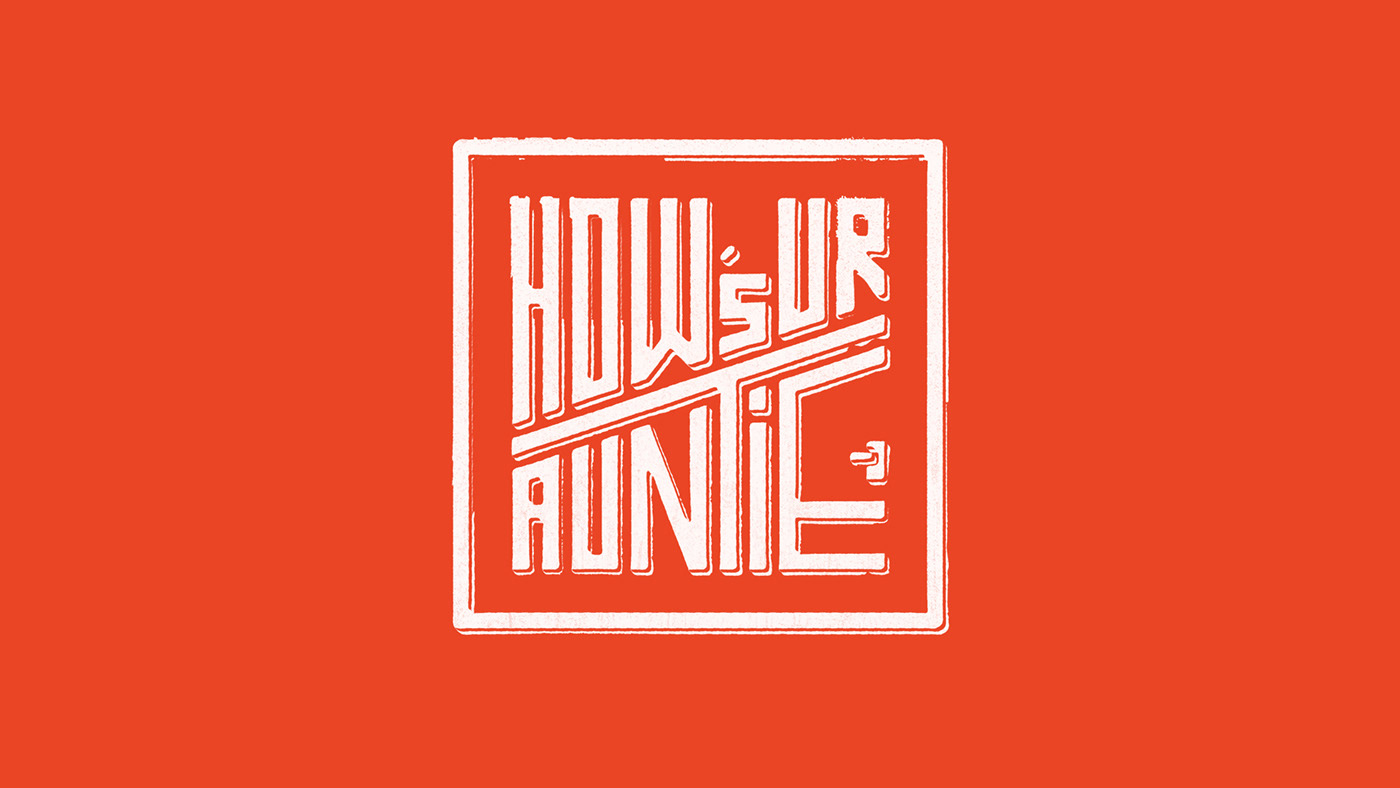
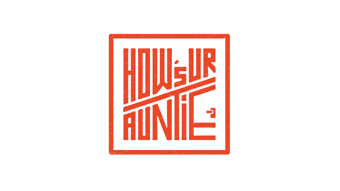
2.1 Logo
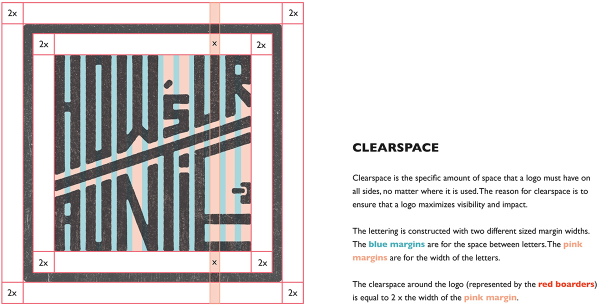
2.2 Logo system: Logo Variations, clear space, logo colour variation
2.3 Typography
2.4 Colour palette
2.2 Logo system: Logo Variations, clear space, logo colour variation
2.3 Typography
2.4 Colour palette
2.5 Graphics, imagery, illustration, iconography
2.6 Grid or layout structure
2.6 Grid or layout structure
3. Design applications
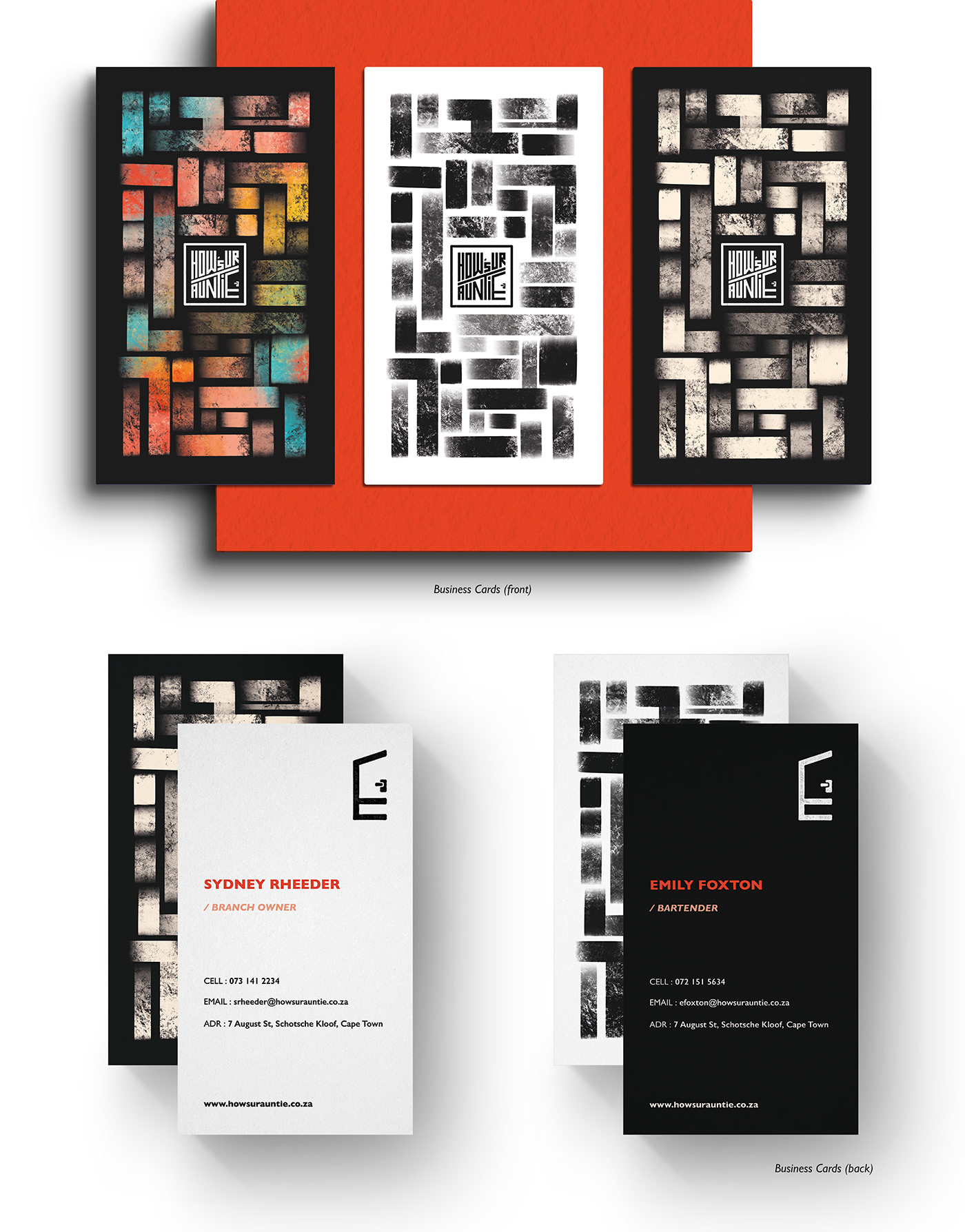
3.1 Business Card
3.2 Email Signatures for both web and mobile
3.3 Branded Collateral (1 x printed collateral and 1x social collateral)
3.4 Merchandise and promotional items
3.5 Spatial Branding (signage, wayfinding spatial brand application)
Design strategy
Context that inspired the strategy:
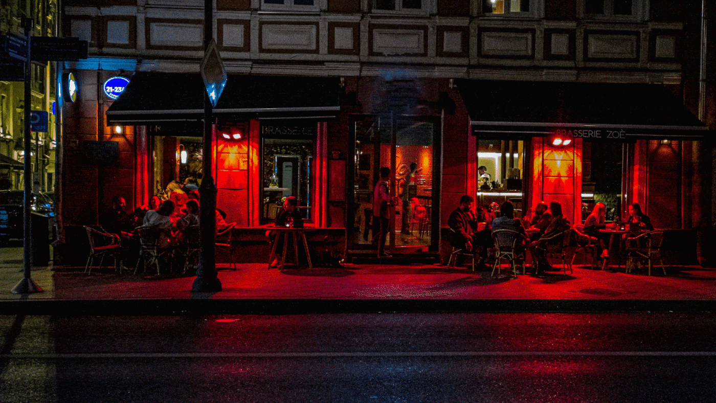
The Bo-Kaap is known for its distinctive pastel coloured houses and cobbled streets. The area is traditionally a multicultural neighbourhood and is the oldest surviving residential neighbourhood in Cape Town, dating back to the mid-18th century. These houses, known as huurhuisjes, were first let to immigrant artisans and craftsmen of European origin. However, after the emancipation of slaves in 1834, many freed slaves moved into the new parts of the Bo-Kaap. When slaves were finally allowed to buy the properties, all the houses were painted bright colours as an expression of their freedom. Many of the families in the Bo-Kaap have been living there for generations.
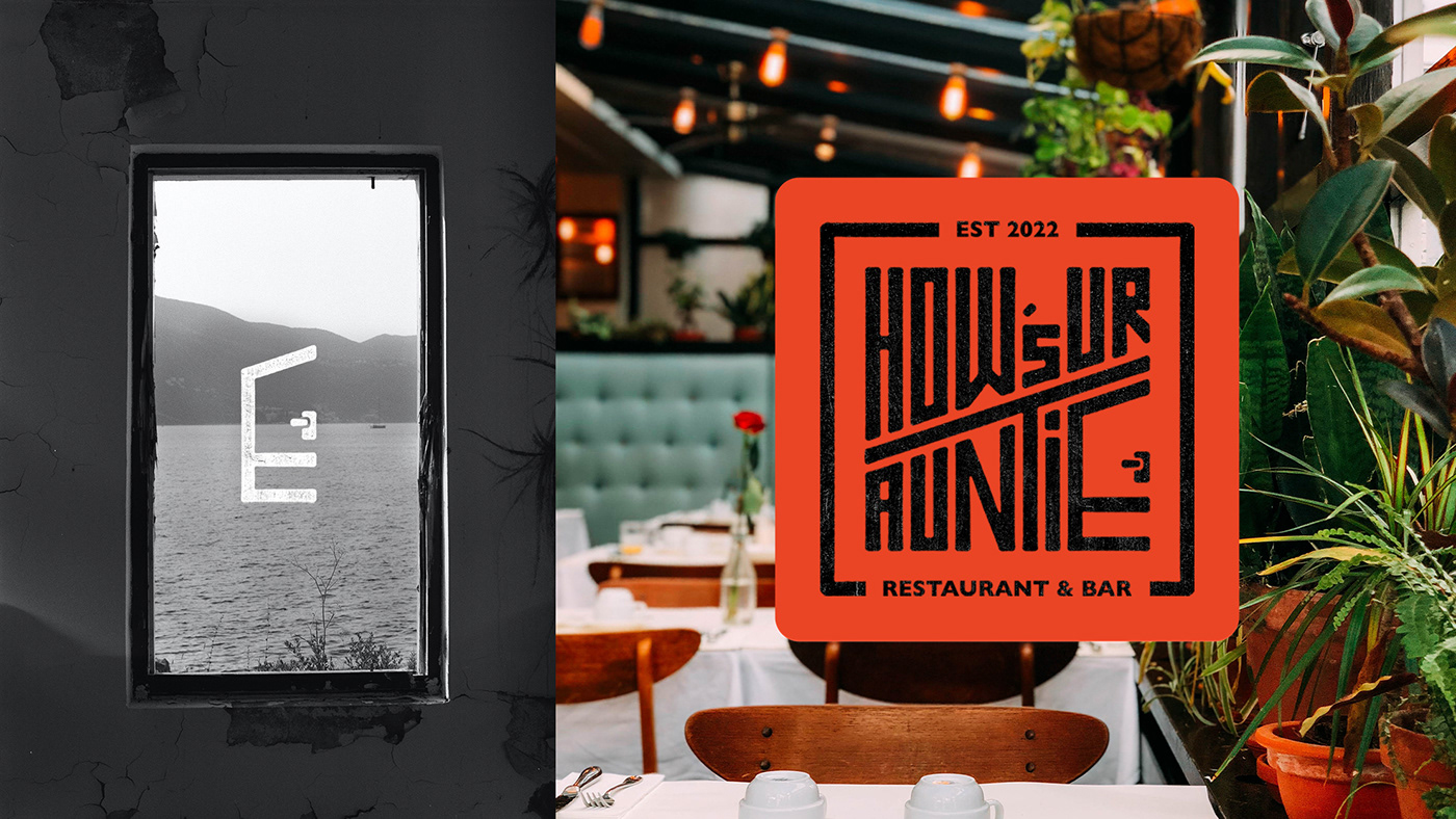
Bo-Kaap had recently been threatened by gentrification. Through peaceful protests, residents won back their homes & Bo-Kaap’s heritage status was officially approved! How’s Your Auntie is inspired by this - a restaurant that believes we have a responsibility to express our heritage & creativity tell the stories of our history, our people & our food. So what makes this concept unique? The menu is made up of customer’s family recipe entries. This way, the restaurant’s food reflects & celebrates South Africa’s blend of cultures. Just like Bo-Kaap's boundary-less walls where neighbours and children mingle in the street, this restaurant hopes you step out of your comfot zone. The most famous house, which is now the Iziko Bo-Kaap Museum has one very distinctive feature; the front door, with a separate top and bottom panel known as a boenonder (above-and-below) door. This inspired brand's the logo. Bo-Kaap’s unique, colourful & angular architecture informed the brand’s vibrant colour choices, crafted textures & shape language. How’s Your Auntie invites you to dive into diversity, dance with a stranger & join us on a journey of flavour discovery.
Brand revamp

Logo before and after redesign
The main downfall of the old design was the logo; it looked unfinished. I reworked the spacing between letters and proportions of the actual letters themselves (look at the letter "w" for example). The old logo was created with a brush, whereas the new logo is vectorised. The new logo is still crafted to have a rustic, stamp-like feel, only now it is more intentional and controlled. All the edges are slightly rounded, softening the logo. The logo, when used on a larger scale has secondary lines that make it look 3 dimensional, mimicking the Bo-Kaap architecture. When scaled down, these lines get lost so there is a secondary, more simplified version of the new logo as well.
The old logo reduction was quite serious and didn't communicate anything about this restaurant. Instead, the new logo reduction makes use of the "E" that looks like a door; a fun symbol of the Bo-Kaap. This is more recognisable and unique to this brand identity. The new logo has been updated on every element in my designs.
The display of elemts in the old design lacked crafting and felt messy. I payed more attention to detail with how I used textures and re-defined the way I wanted to unpack this brand. I reworked aspects such as the brand strategy, moodboard, clearspace, use of photography & the colour ratios within brand elements. A small change that made a huge difference was I brought in the colour white (not just off-white like before). This really cleaned up the logo and made it pop against other colours. I created new animations to bring the brand to life such as the logo reveal above and the Instagram screens below.
Click here to view the old brand design.
1. Visual identity guidelines

Visual moodboard

Brain map
2. Visual assets
Logo full colour


Logo monochromatic & inverse

Logo reduction / favicon
Logo option to be used on smaller scale
Logo application
space filler

3. Design application

Logo illustration

Email signatures - flat & mocked up
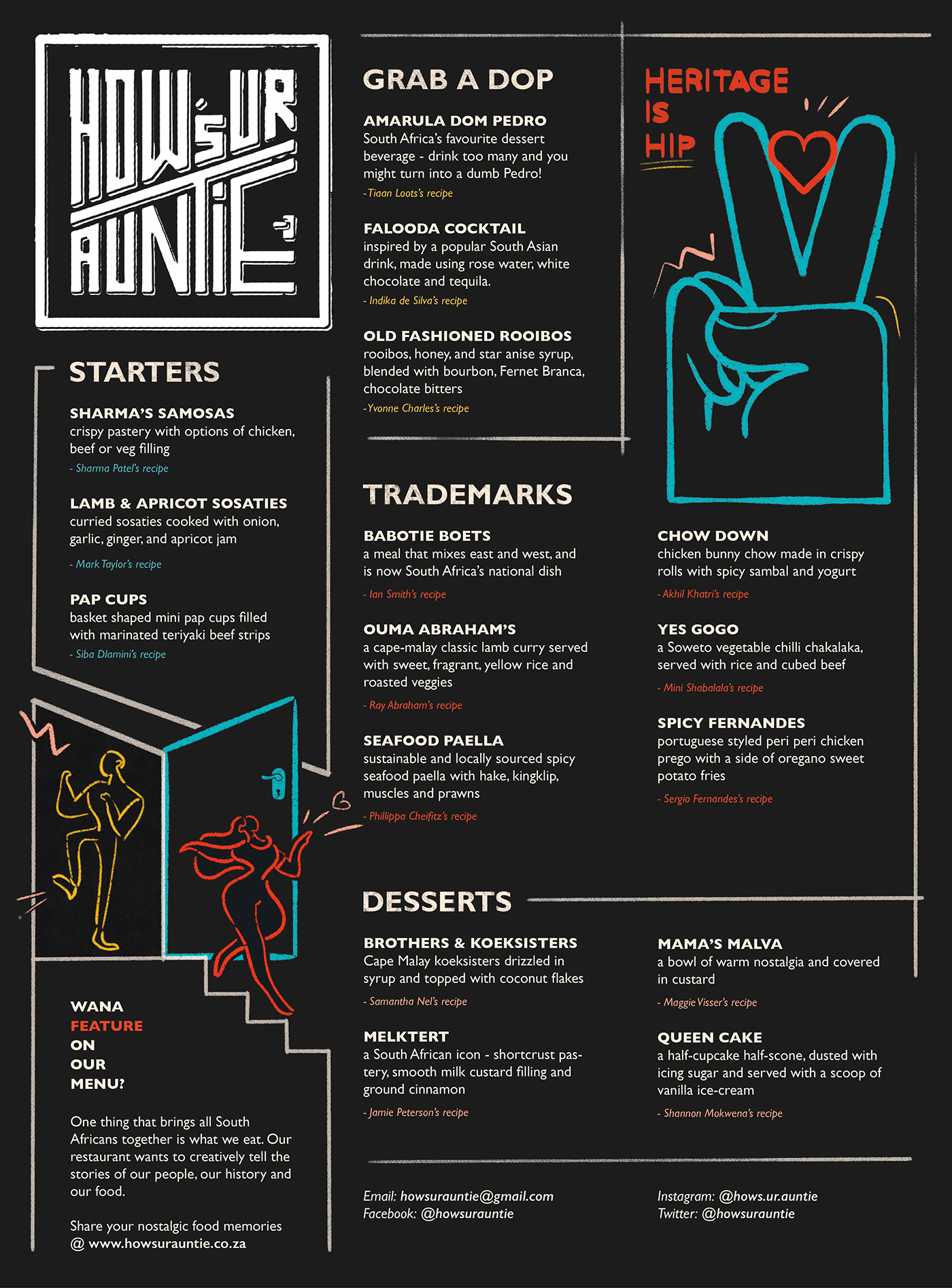
The creation of the menu design involved extensive food research. Special attention was paid to copywriting and coming up with unique meal names. Notice how each meal has the author / creator's name underneath it.
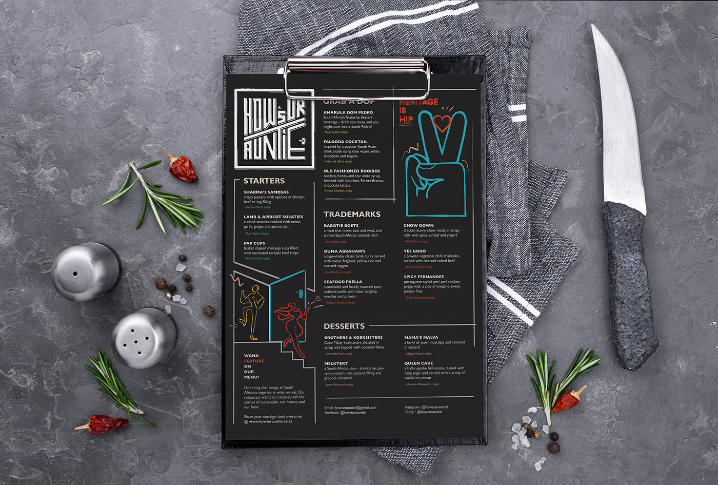
Menu mockup

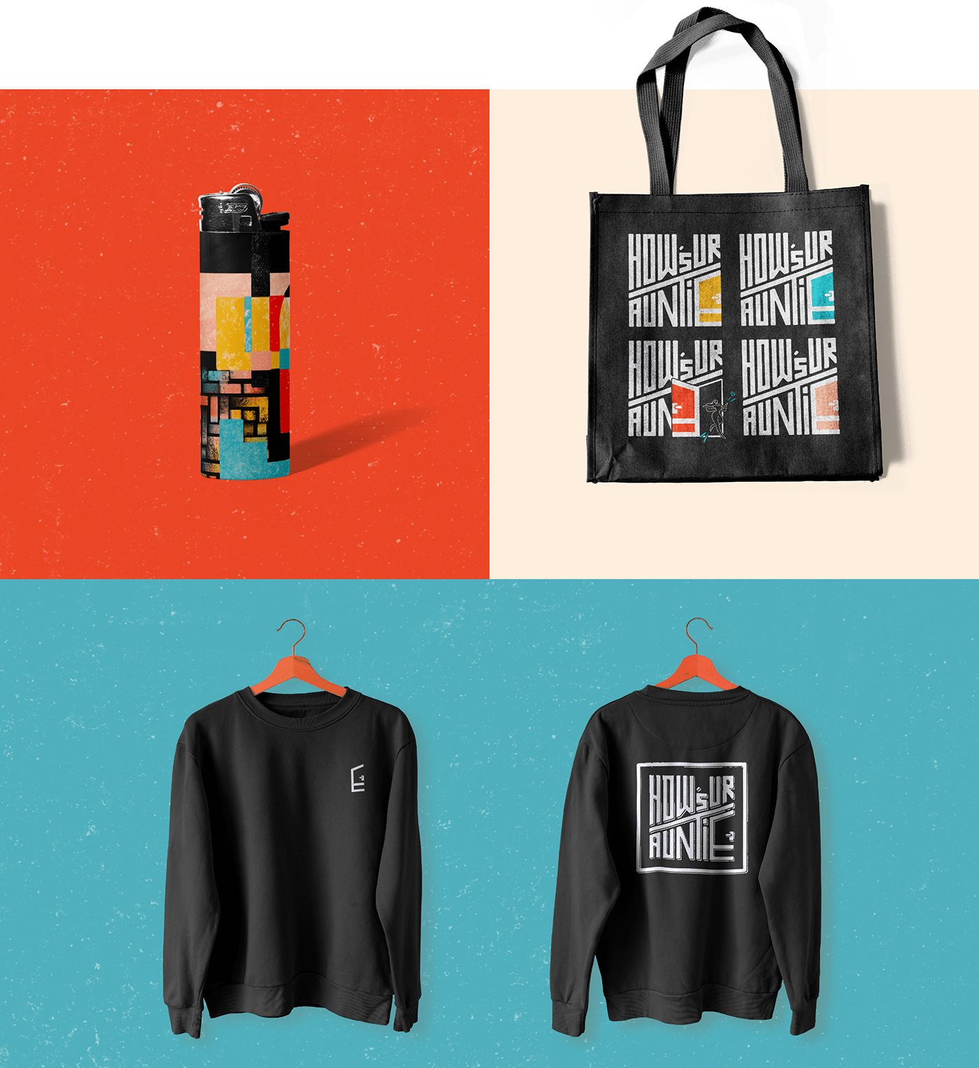
Brand merchandise


Spatial & way-finding


