Oliver Bentleys Brand Development & Packaging Case Study
Baked with love.
Brand a premium pet product to capture the air of a historic British Tea company. Oliver Bentleys, a purveyor of premium dog products, is changing the overly cartoonized pet market with their gourmet biscuits and sophisticated packaging, elevating dog biscuits to the realm of art.
Biscuits to bark home about
Do you want the very best for your pets? Are you the type of person that appreciates artisanal bread and fine chocolate from a chocolatier? Do you buy and value premium brands? Do you consider your dog more than a pet but a member of the family who deserves to eat as well as you? Then we have the perfect dog biscuit for you.
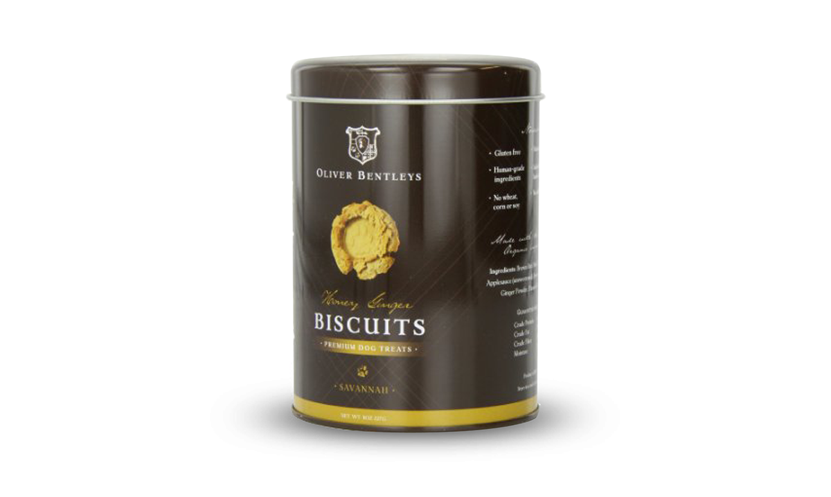
Oliver Bentleys makes premium treats called Ollie B. Biscuits that are hand-baked and hand-stamped in small batches. These gourmet biscuits are made using only human-grade, organic ingredients and specially formulated to serve a high nutritional purpose. Ollie B. Biscuits are 100% gluten free with no wheat, corn or soy, and never, ever, any additives, preservatives or fillers. These unique artisanal-shape biscuits are stylishly packaged in attractive tins so as to give dog owners a reason to keep their dog treats on the counter next to the human cookie jar.
Building the Brand
A brand is not a logo or product. It’s not a veneer to be applied to a business. It is a collection of perceptions in the mind of tribe—both employees and customers. It makes the product more salient, more meaningful, more interesting, and more compelling than it would be without branding. It defines the value of the brand in the customer’s mind. The associations with the brand must make customers chose it over other options, and cause them to make a behavior change, aka to buy your product. Marketing people often talk about managing their brand, but what most of them mean is managing their product, sales, or distribution. Those are all important. But to really manage a brand is to manage something much less tangible. Branding is developing the message. It is discovering the intangible aspects of the brand. Brand design then takes those intangible values and embodies those into brand elements. Brand marketing then communicates the brand story to customers. The product makes the brand experience personal. In branding and marketing it isn’t just the visual and verbal cues that matter, it is the total sensory experience of the brand. This is the story about putting all of the pieces of the Oliver Bentleys brand puzzle together.
Brand Essence
The brand essence represents the one idea that is the spirit of the brand. Every brand needs an idea to drive it, one that is unique, simple and true. It’s the seed that when planted grows into the brand. An effective essence provides a foundation on which to build a deep and compelling impression of a brand. A unifying theme for brand associations. Everything else in the brand emerges from this essence. It should build over time into a compelling brand story. At the heart of our identity is our essence, encapsulated in the word “loyalty.” This is not only about the Oliver Bentleys company, but also about the canines and humans who have contact with it and its products. Oliver Bentleys doesn’t just bake biscuits, they metaphorically give everyone who buys biscuits an Ivy League degree and blue-blood heritage.
Heritage. Premium. Crafted. Artisanal. These are at the core of what Oliver Bentleys is about. We represent the heritage of family, premium quality ingredients, dedication to craftsmanship, and appreciation of small-batch, artisanal products. These are the values that everyone who engages with Oliver Bentleys brand can hope to experience. The focus of the brand is on health, happiness, and well-being of your canine children. To help communicate this we have created a consumer focused tagline “to make more dog tails wag more often.” As every pet parent knows when dogs are healthy and happy they wag their tails…more often.
Brand Story
Far from being window dressing, brand stories are key business drivers. The more coherent and compelling your brand story, the more it will power the success of your enterprise. So, we developed a backstory to infuse the brand with meaning, history, heritage, and vision. This story adds a bit of history to the brand about how the Cavalier King Charles Spaniel came to hold such a high position of prominence in British Society.
"Previously lost in the back waters and tidal creeks just outside the new world city of Savannah, Georgia, a small and unassuming ship captain’s chest was found. In it, among the captain’s personal affects, was his ships’ log and personal diary. The log and diary were wrapped in a tattered piece of cloth of a unique and striking plaid pattern and curiously accompanied by a seaman’s daily ration or what was called a sea biscuit. The biscuit had a small paw print pressed into it. Between the pages of the captains log and diary was a small cameo carving of a dog bust and a smaller equally weathered swatch of the same plaid, with which the items had been bundled. Both the cameo and the plaid swatch marking the page beginning a series of entries chronicling how a small King Charles Spaniel named Oliver Bentley, referred to in the diary and log as Ollie B. and at times just Ollie, during an ill-fated voyage at sea saved the life of the then exiled young King of England, Charles II."
It’s a magical story, albeit a bit tongue-in-cheek, it winks at you as if to say, let me spin you a yarn. It gave the company ties to historic Britain, maritime voyage, custom tartans, family crests, and aged wooden crates. Cavalier King Charles Spaniel featured in the story was a prominent dog in British royal families, and became the mascot for the company. The story infused the company with history and gave it the feeling of an ancient tea company. It was utilized to infuse all of our brand identity design with meaning.
Brand Character
Personality and style have a lot to do with defining the brand and building the experience. Brands are no longer static elements that sit on a page. In the age of shifting media, where brands exist across many different screens, brands are now living and breathing characters. The brand character is essential to creating a living and breathing brand that can evolve over time to meet the changing demands while being recognizable. Brands are becoming more like people. Character development in branding is about developing a character that can run, dance, play, and move across any application. It is the personality behind a brand that gives life to the identity.
As it is rare that people’s personalities are pure expressions of a single archetype, the model I employ uses a hierarchy of 3 archetypes— one dominant and 2 supporting archetypes—based on Jung’s archetypal theory. Archetype theory says that all characters can be understood relative to a universal system of 12 personality types. For centuries archetypes have been used by writers, philosophers and psychologists to make sense of the variations in human personality traits. I integrate three archetypes to provide the basis for character development and build a unique character based on these universal archetypes. This provides a shortcut to meaning because we intuitively get archetypes.
Oliver Bentleys character is defined as a “Nobel Pet” identified in the backstory and embodied in the mascot Ollie B. This character integrates caregiver, ruler, and lover. Caregiver nurturing our best friends the way they loyally protect us. Ruler elevating the status of the humble dog biscuit to the realm of art and tie to royal families. And a Lover passionately loving our pets they way they love us. With the brand as a character in the brand story it is easier to evolve that character over time to meet a changing market. It is a living breathing brand character that like a human grows and evolves over time.
Brand Mascot
The Oliver Bentleys mascot was derived from the magically crafted backstory about a noble dog, Oliver Bentley. The Cavalier King Charles Spaniel originated in Great Britain. They are descended from the toy spaniels so well loved by royalty in the sixteenth, seventeenth, and eighteenth centuries. These sharp nosed, flat-headed spaniels can be seen in many paintings of the time, by such artists as Titian, Reynolds, and Romney. These spaniels became very popular during the reign of the Stuarts. Charles I kept a spaniel named Rogue while residing at Carisbrooke Castle, however it is Charles II that this breed is closely associated and it was said of him that "His Majesty was seldom seen without his little dogs.” There is a myth that he even issued an edict that no spaniels of this type could be denied entry to any public place.This meant that dogs were even allowed in Parliament, a definite first for the time. The Cavalier King Charles Spaniel is an eager, affectionate and happy dog, always seeming to be wagging its tail.
The story we wrote, naturally inspired the company mascot Oliver Bentley, a Cavalier King Charles Spaniel. Cavaliers were THE royal dog for the British Royal family. The client even adopted a Cavalier and named him Oliver Bentley to serve as the official company mascot in the store and at events. In more formal settings we utilize the full moniker Oliver Bentleys, but for more informal applications we developed the idea to utilize his nickname Ollie B. When we needed a trendier image for collars and dog beds we would use the Ollie B. Brand to keep certain aspects of the company from becoming too stuffy. The mascot provides a cute and lovable icon to attract buyers and make them fall in love with the brand.
Brand Design
The story doesn't stop at the creative copy, it flows into the brand elements, packaging, website, and marketing. The story infused the company with history and gave it the feeling of an ancient tea company. It was utilized to infuse all of our brand identity design with meaning. We used it to tie together all of the brand elements in a creative way. It guides the design, color palette and infuses every touch point with meaning. Research for the brand included British historical ships, royalty, aged paper, high-end specialty products, old British sea biscuits, tartan plaids and family crests. The objective was to create a look that had heritage and historical influences but look modern too. It is a prestigious and royal look. The look can be described as “Harry Potter meets the Queen.”
We integrated the brand story into the very fabric of the company. We combined the backstory with the creation story to provide meaning and direction, inspiring brand identity development. We developed a full cast of characters (aka brand elements) that when combined tell the brand story across all touch points. These brand characters include shield logo, the seal of approval, paw print, Ollie B. the mascot, the custom plaid pattern, rich mahogany and gold colors, captain’s journal, aged paper, nautical symbols, reclaimed wood and metal, shipping crates, and metal tins. The Oliver Bentleys brand is one that is layered with multiple meanings and historical references, creating a tactile and organic image relating to the hand-made quality of the treats while also exuding a high-end elegance to be sold in premium pet boutiques, specialty stores and high-end hotels that pamper pooches. An identity steeped in heritage, that would project luxury lifestyle.
Luxury products not only cost more, they need to speak visually to the luxury market. Luxury products are characterized by a recognizable style, strong identity, high awareness, and enhanced emotional and symbolic associations. They evoke uniqueness and exclusivity, and are interpreted in products through high quality, controlled distribution and premium pricing. Refined type and refined sense of style with a bit of edge. The brand needed to provide an air of aristocracy but be approachable. The brand embodies old-world heritage combined with a modern luxury brand. The visuals needed communicate sophistication while verbiage communicate the organic nature of the ingredients. The identity echoed this sentiment, departing from the traditional cartoon identities of many pet products and features old-world, luxury from the company crest, custom tartan plaid, jewel toned colors creates a brand with heritage and prestige. We didn’t have a product and we didn’t know the specific price point. So, the focus was to create a cult worthy aesthetic look and feel for the brand. A brand people didn’t just want to buy, but wanted to buy into.
Brand Elements (Characters)
logo
The identity and branding are based around royal coat of arms and family crests. The unique shield shape for the logo has distinctive ears that resemble and reinforce the image of the dog bone. The logo was designed as a family crest, incorporating the shape of a dogs face. I illustrated a bust of a cavalier into the crest.
biscuit
Our Ollie B. Biscuits are more than a treat. They are a symbol of one man’s love for his best friends. It’s a symbol of love from our customers to their pet’s as well. The shape and color were inspired by the backstory of the sea faring Cavalier. Small round golden biscuits hint at a chest of golden doubloons one might have found on a royal ship. Gourmet biscuits with craftsmanship comparable to that of artisanal bread or finely made chocolate from a chocolatier that look like a tin of gold coins.
sensory
Sensory branding was also an integral part of both product development and branding with Oliver Bentleys. Smell is one of the most powerful senses. Scent branding is a relatively new field, but more and more companies are realizing the power of scent to build brand experiences. As we were developing the product, we built in a scent profile different from any other dog biscuit. Fresh ginger not only provides a functional benefit, it also provides the signature scent that is highly recognizable from other dog treats.
color palette
The brand colors were inspired by the backstory drawing from both tri-colored Cavalier and nautical shades of British blue and red. Gold being inspired from both royalty and gold coins. The secondary color palette of rich jewel tones—deep vermillion to ochre yellow, emerald green, sapphire blue and touches of gold.
mascot
Cavalier King Charles Spaniel featured in the story was a prominent dog in British royal families, and became the mascot for the company.
The mascot Bentley, a King Charles Cavalier Spaniel, provides a cute and lovable icon to attract buyers and make them fall in love with the brand.
plaid/tartan
Heavily influenced by British heritage, we developed a custom tartan pattern that will be used in the future on product designs like dog collars, dog beds, and coats. Our custom plaid pattern keeps a traditional look while being flexible to be utilized in different and trendy colors palettes.
tins
Selecting tea tins to package the biscuits as the original sea biscuits were packaged in tins too. The tins have become an icon in and of themselves, providing differentiation at the point of sale.
LOGO DEVELOPMENT


INSPIRATION


COLOR PALETTE

Brand Experience Effect
Our interactions with brands shape our perceptions over time. Brand experiences define our thoughts, attitudes, and behaviors towards brands and the value it has in our lives. At Oliver Bentleys we consciously developing and delivering consistent brand experience across the marketing plan from brand identity, packaging, website, advertising, retail environment, and even customer service. The Oliver Bentleys experience effect connects the expressions of the brand together across all the elements of the marketing plan to create a consistent yet tailored brand experience whether it’s online, offline, or at retail. We create an experience that our customers can see, touch, taste, smell, and hear in every way, that delivers more than just a product.
At Oliver Bentleys we view brand elements as characters telling the brand story across all touch points. So, the parts they play are different across each touch point. A combination of brand elements, are crafted to work in synergy across the whole brand experience. All of the touch points work in concert to create the brand experience effect.It’s finding the right balance point between formulaic vs individualized. Oliver Bentleys is a small company so our strategy was to lean on the side of being more formulaic in our design approach. The visuals are highly consistent as are our branded environments. We remain flexible in the copy and message tailoring the message to the unique application to make it effective. This creates an extremely identifiable brand across a more limited range of touch points on a limited marketing budget.
The Oliver Bentleys brand system was applied to packaging, retail, merchandising, collateral, website, social, apparel and advertising. The corporate identity features the brand elements prominently to communicate a company with old-world heritage. We utilized gold ink on key pieces of the company identity system to communicate luxury. The plaid and other regal elements are down played in the treats packaging, to allow the organic quality and focus to shift to the high-quality organic ingredients. The custom plaid will play a dominant role in lifestyle products, integrating eco-friendly materials. The retail environment is a critical part of the Oliver Bentleys experience, continuing the feeling of heritage and British charm. The brand textures of aged metal and reclaimed wood become more prominent in store environment and product displays. Each time and with each marketing vehicle, we consciously build a positive experience with the same brand equity and the same brand voice, tailoring the experience to fit the vehicle. The experience effect takes integrated marketing to the next level by ensuring that the marketing is not only integrated and consistent, but also tailored to each particular touch point.
Brand Packaging that is quite fetching
One of the most important touch points for Oliver Bentleys is packaging. Packaging is so important because it serves many different roles in creating the brand experience. It creates shelf impact at retail, educates about health benefits of ingredients, usage instructions for presenting the biscuits, creates an aesthetic appeal of a premium brand. Biggest challenge was to include just the right amount of information while keeping the packaging refined and elegant to be on display in the customers’ homes, make it beautifully consistent with the brand character.
Design strategy was to create a high-end packaging experience similar to British tea company or gourmet chocolate company. Inspired by the historic Huntley & Palmers, the first biscuit company, we decided to package the biscuits in a metal tin similar to the original sea biscuit packaging which came in square tin with clear top. The tins were originally created for a more practical use—the airtight storage of biscuits so that they could be transported to distant customers and stay oven-fresh and unbroken. Sold in large solid tins for purchase by travelers and in the store there were smaller 7lb tins with glass lids. Biscuits could be measured out and purchased in smaller quantities and placed in sacks. The packaging engaged shoppers at the shelf, but once home it also creates a unique experience at home. These tins provide visual differentiation on the store shelf. Not only differentiation in the store but at home as well. Because our customers often keep biscuit tins on the counter, it further serves the purpose as secondary advertising to our customers’ friends.
PACKAGING SKETCHES / 2012

PACKAGING CONCEPTS / 2012


Brand Management and Evolution
Brand management today should be about determining what cannot change and what must change. In 2012, demand had grown to the point that we needed to increase production and outsource packaging. In order to meet product demand, we increased production capacity by securing the use of a larger commercial kitchen, which forged a partnership with a local cookie company. At the same time, we sourced and began outsourcing production of new printed tins to a company in China, which greatly increased the prestige of the product while lowering costs. The larger printed tins also allowed us to increase brand storytelling at the point of purchase.
We overhauled the Oliver Bentleys packaging and expanded the product line to meet product demand and business vision. Getting continuous feedback from customers is crucial in a small start-up company. We do insight work at the front end of the process and use their experiences to inspire and inform our work and product development. Meeting consumers, watching how they shop, and sitting in their homes informs our decisions.Our partnerships with distributors allows us to get constant feedback that we take into consideration when evolving the product and brand experience. For the third packaging evolution, we conducted an international brand audit to determine which elements of the packaging were most iconic. When updating the packaging we followed the 70/30 rule. 70 percent consistency with 30 percent flexibility. This allowed us to maintain brand familiarity while refining and evolving the brand image in a more sophisticated application. I developed a long-term design strategy to take Oliver Bentleys into the future. Based the new design strategy on the established look but refined the image to be more sophisticated. Instead of developing one design, I developed a comprehensive, scalable design system that meets immediate needs and sets a strong foundation for future flavors to be seamlessly rolled out in the future. Each flavor will have it’s own secondary color, the perception and meaning of each color should correspond to the unique ingredient in each different product. It should be instinctive to associate that color with that flavor and ingredient. The updated design system is simple, sophisticated and communicates with brilliant boldness, all while embracing the Oliver Bentleys brand.
BISCUIT TINS / 2013


Oliver Bentleys Tribe
The Oliver Bentleys Pack is a tribe of pet parents who are devoted to their fur children. They travel from around the world to meet Ollie B. in the Oliver Bentleys store in Savannah, GA. Our fans have such loyalty for the company they have even been inspired to create videos of adoration for these one-of-a-kind biscuits.They have taken the Oliver Bentleys story and turned it into a personal story about Yoda's brand experience. A special thank you to Yoda and the creators of the video, his owners Jay Joo and Mira. We are so pleased our Ollie B. Biscuits inspired you to create such a wonderful video gift for us. Thank you.
CUSTOMER VIDEO
Beyond biscuits
Brand launched in 2008, the result is a graphic visual identity which reflects a rich brand steeped in heritage and prestige. The result is an immersive brand experience that has a devoted international following. I won 4 Addy Awards for Brand identity, logo, marketing, and packaging. I have acted as consulting creative director for all future marketing, campaign, and design needs. Over the next 5 years gained dedicated customers not only in the U.S. but began attracting significant interest overseas. In 2012, sales and demand had reached a level that we secured a packaging vendor in China to produce printed tins. In 2013, a third packaging evolution version was born. The company was able to move to a larger commercial kitchen space and outsourced packaging production overseas. In 2013, Oliver Bentleys opened a store in one of the most affluent areas in Tokyo, Japan, and launched a new line of pet greeting cards “From the Dog.” The brand is a great success story of one man’s love for his best friend.


